Matplotlib and small multiples
July 15, 2013 at 8:13 AM by Dr. Drang
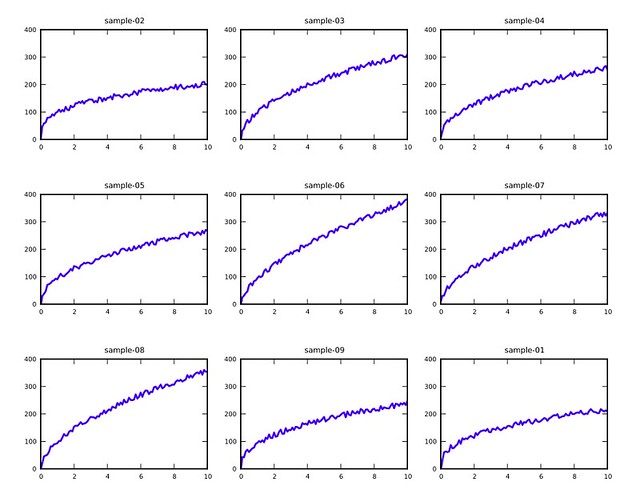
Last week I had to plot the results of dozens of tests in a way that made it easy to see the similarities and differences. My first instinct was to put several of them together on the same plot, but that just looked like a jumbled mess. Then I remembered the small multiple plots from Edward Tufte’s Envisioning Information and realized that would work well if I could generate arrays of small plots easily. Fortunately, Matplotlib has a nice subplot command for just that purpose, and I had my plotting done in a jiffy.
What I wanted was something that looked like this:
(These are all from fake data, by the way. For this post, I created a bunch of files called sample-nn.csv with values from 0 and 10 and values generated from the formula
where , , were chosen randomly for each plot [ was, of course less than one] and was chosen randomly for each data point.)
The Python script I used to create the multiple plots was called plotall, and it was called from the command line like this:
plotall plots.pdf 3 3 sample-0*.csv
where the first argument is the output file name, the second and third are the number of subplot rows and columns, and the rest are the data files. In this case, I was able to use the shell wildcard to specify data files sample-01.csv through sample-09.csv.
Here’s the plotall source code.
python:
 1:  #!/usr/bin/python
 2:
 3:  import matplotlib.pyplot as plt
 4:  import sys
 5:  from os.path import basename, splitext
 6:
 7:  outfile = sys.argv[1]
 8:  rows = int(sys.argv[2])
 9:  cols = int(sys.argv[3])
10:  infiles = sys.argv[4:]
11:
12:  plt.figure(1)
13:  font = {'weight' : 'medium',
14:          'size'   : 5}
15:  plt.rc('font', **font)
16:  plt.subplots_adjust(hspace=.5)
17:
18:  for n, fn in enumerate(infiles):
19:    print fn
20:    plt.subplot(rows, cols, n)
21:    plt.axis([0, 10, 0, 400])
22:    plt.xticks(range(0, 11, 2))
23:    plt.yticks(range(0, 410, 100))
24:
25:    f = open(fn)
26:    title, ext = splitext(basename(fn))
27:    plt.title(title)
28:    x = []
29:    y = []
30:    for line in f:
31:        (first, second) = line.split(',')
32:        x.append(float(first))
33:        y.append(float(second))
34:
35:    plt.plot(x, y, linewidth=1.5)
36:
37:  plt.savefig(outfile, format='pdf')
Lines 7-10 parse the arguments. As you can see, there’s no error checking. I felt justified in this because I’m the only one using the script, and I’ll understand the error messages if I give it bad input.
The parameters in Lines 13-16 were arrived at through trial and error to make the subplots look decent. Before I added these lines, the default values put the subplots too close to each other with oversized fonts.
Line 19 starts the loop that goes through all the input data files and creates a subplot for each. Line 21 invokes the subplot command, which tells Matplotlib the number of rows and columns in the subplot array and where the current subplot is to be placed. For a small multiples comparison to work, all the subplots have to have the same plot limits and the same tick spacing. That’s done through Lines 22-34. The values are obviously specific to the data sets I’m plotting and would be specified as parameters at the top of the script if I weren’t so lazy.
The title for each subplot is extracted from the name of its data file in Lines 27-28. By using functions from the os.path library, I can provide data files from any directory without worrying about the paths showing up in the titles. Lines 31-34 suck the data into a pair of lists that are specified in the plot command on Line 36.
Finally, Line 39 writes the multiple plot array out to a PDF.
This is the sort of thing that could be done interactively in IPython, but I chose to do it in a saved script so I’d have it for later reference. I liked the way the plots turned out, and I’m sure I’ll use this technique again.
Update 7/15/13
Thanks to James Cash (@jamesvnc) on Twitter for reminding me to use enumerate in the loop through the data files.

