Multiple axes and minor tick marks
July 28, 2013 at 1:15 AM by Dr. Drang
Many of the tests I’ve been running over the past few weeks have generated two sets of data that I’ve wanted to plot on the same graph. The problem is that the values in these two sets are wildly different and can’t be put on the same graph at the same scale. The traditional solution to this problem is to use two vertical scales: one shown along the left side of the plot and the other shown along the right side. This is a common enough situation that Matplotlib has a standard procedure for handling it.
Let me start by saying that when making graphs with Matplotlib, my goal is to use the simplest technique I can to get the results I want. That means starting with the procedural approach of the pyplot module. This module establishes, by default, a “current plot,” and its drawing, scaling, and annotating functions are directed toward that current plot. It also has functions for creating new plots, which change the current plot and therefore change the target of the drawing, scaling, and annotating functions. One of these target-changing functions is subplot, which I talked about in a previous post.
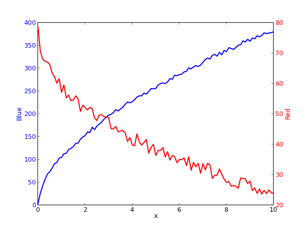
Another such function is twinx, which is the key to plotting with two vertical scales. Calling it creates a new plot on top of the current one that shares the current plot’s x axis. The new plot then becomes the current plot and is the target of all subsequent plotting commands. Here’s a simple plot of two sets of data: a collection of pairs and a collection of pairs. The first set is plotted in blue against the left axis, and the second is plotted in red against the right axis.
Here’s the script that generated the graph:
python:
 1:  #!/usr/bin/python
 2:
 3:  import matplotlib.pyplot as plt
 4:  import sys
 5:
 6:  # Get the values into x, y1, and y2.
 7:  x = []
 8:  y1 = []
 9:  y2 = []
10:  for line in sys.stdin:
11:    vals = line.split(',')
12:    x.append(float(vals[0]))
13:    y1.append(float(vals[1]))
14:    y2.append(float(vals[2]))
15:
16:  # Plot y1 vs x in blue on the left vertical axis.
17:  plt.xlabel("x")
18:  plt.ylabel("Blue", color="b")
19:  plt.tick_params(axis="y", labelcolor="b")
20:  plt.plot(x, y1, "b-", linewidth=2)
21:
22:  # Plot y2 vs x in red on the right vertical axis.
23:  plt.twinx()
24:  plt.ylabel("Red", color="r")
25:  plt.tick_params(axis="y", labelcolor="r")
26:  plt.plot(x, y2, "r-", linewidth=2)
27:
28:  plt.savefig("Two axes.png", dpi=75, format="png")
29:  plt.close()
The stuff in Lines 6-14 isn’t germane to our plotting discussion—it’s just a way of populating the x, y1, and y2 lists.
The plot of the y1 data is generated in Lines 16-20. Lines 17-18 set the axis labels, and Line 20 does the plotting. The only thing that sets this apart from the basic examples you’ll find in the pyplot tutorial is that I made the axis label blue in Line 18 and made the tick labels blue in Line 19.
The plot of the y2 data starts with the twinx call on Line 23. This creates a new plot on top of the old one in which the y-axis ticks and labels will appear on the right instead of the left. Lines 24-26 are structure just like Lines 18-20 of the y1 plot. There’s no need to give any commands for the x axis in this section because the x axis is already defined.
Finally, Line 28 writes the graph out to a PNG file. I’m not a big fan of the dpi parameter, but that’s how you control the size of the PNG. The default value of dpi for PNGs is 100, and the default size of the output file is 800×600 pixels. To increase or decrease the size of the output file, you increase or decrease the dpi value proportionally. Thus, to get 600×450 output, I set dpi to 75. Would it be better to set the height and/or width in pixels directly? Yes, but this is how Matplotlib works.
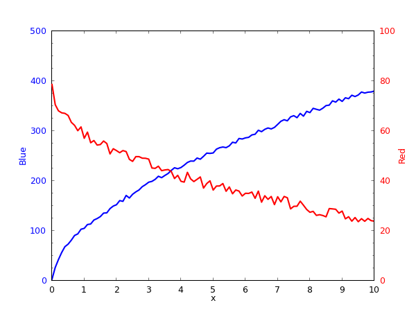
The graph above is OK considering how little work we put into it, but the scales and tick spacing of all the axes look like what they are: chosen by an algorithm instead of a person. We can do better. What I wanted instead was something that looked more like this:
Both vertical axes now start at zero, and their tick spacing is consistent. You might disagree with my choices for the upper limits—I could have chosen 400 and 80 and made fuller use of the space—but I wanted them to be nice round numbers.
You’ll also note that each vertical axis now has minor ticks. This is, unfortunately, an addition that cannot be made in the procedural interface. We’ll have to dip into Matplotlib’s object-oriented system. Because I’m lazy, we’ll do as little as possible to add the minor ticks.
Here’s the new script:
python:
 1:  #!/usr/bin/python
 2:
 3:  import matplotlib.pyplot as plt
 4:  from matplotlib.ticker import AutoMinorLocator
 5:  import sys
 6:
 7:  # Get the values into x, y1, and y2.
 8:  x = []
 9:  y1 = []
10:  y2 = []
11:  for line in sys.stdin:
12:    vals = line.split(',')
13:    x.append(float(vals[0]))
14:    y1.append(float(vals[1]))
15:    y2.append(float(vals[2]))
16:
17:  # Plot y1 vs x in blue on the left vertical axis.
18:  ax = plt.subplot(1, 1, 1)
19:  plt.xlabel("x")
20:  plt.xlim(0, 10)
21:  plt.xticks(range(11))
22:  plt.tick_params(axis="x", pad=8)
23:  plt.ylabel("Blue", color="b")
24:  plt.ylim(0, 500)
25:  plt.yticks(range(0, 501, 100))
26:  ax.yaxis.set_minor_locator(AutoMinorLocator(4))
27:  plt.tick_params(axis="y", labelcolor="b", pad=8)
28:  plt.plot(x, y1, "b-", linewidth=2)
29:
30:  # Plot y2 vs x in red on the right vertical axis.
31:  ax2 = plt.twinx()
32:  plt.ylabel("Red", color="r")
33:  plt.ylim(0, 100)
34:  plt.yticks(range(0, 101, 20))
35:  ax2.yaxis.set_minor_locator(AutoMinorLocator(4))
36:  plt.tick_params(axis="y", labelcolor="r", pad=8)
37:  plt.plot(x, y2, "r-", linewidth=2)
38:
39:  plt.savefig("Two axes with minor ticks.png", dpi=75, format="png")
40:  plt.close()
Most of the lines are the same as in the previous version. We’ll concentrate on the differences.
First, you’ll note the subplot command on Line 18. We’re not doing this because we intend to make multiple plots in the same figure, we’re doing it to give us the ax return value, which is an instance of the Axes class that we’ll need later to create the minor ticks. The three arguments of subplot are the number of rows, the number of columns, and the position of the current plot within that grid. As you can see, we’re just making one graph.
The xlim and xticks commands in Line 20-21 set the limits of the x axis and location of the major tick marks along it. Line 22 pushes the tick labels along the x axis down a bit. You’ll notice that in our first plot the x and y labels sort of ran into each other at the lower corners. The pad argument will give them some breathing room.
Lines 24-25 do for the y axis what Lines 20-21 did for the x axis. Line 27 sets the tick label color (as in our previous graph) and adjusts the padding to match that of the x axis.
Line 26 is the big change from our previous approach. Here, we’re starting with the ax instance of the Axes class, working down the object hierarchy to the yaxis of ax, and then setting the location of the minor tick marks. To do this, we’re using the AutoMinorLocator function of the ticker module (imported on Line 4), whose argument is the number of minor intervals we want between the major ticks. Note that this is the number of minor intervals, not the number of minor tick marks; the number of marks will be one less than this argument.
The new and changed commands in Lines 31-37 are basically analogous to those in Lines 18-28. The only one worth special comment is Line 31, where we’re now collecting the Axes instance output of the twinx command so we can use it as the target of the set_minor_locator method in Line 35.
I don’t understand why the pyplot module doesn’t have convenience functions for creating minor ticks. It seems to me that minor ticks are at least as common as multiple vertical scales and that it wouldn’t be especially difficult to have ymticks and xmticks commands in pyplot to handle their creation. Maybe that’s in development.
Update 7/28/13
OK, so the pyplot module does have function for turning minor ticks on via the procedural interface. It’s called minorticks_on, and its description is right there on the plotting commands summary page I’ve visited dozens of times. Why I didn’t see it, and why none of my Google searches for info on minor tick marks linked to it, I have no idea, but I’m grateful to Ilya Brooks—who maybe should start vetting my Matplotlib posts before publication—for pointing it out to me.
It appears, though, that minorticks_on is a pretty worthless command. If you use it, the spacing of the minor ticks is automatic, outside of your control. And the minor ticks will appear on both axes, whether that’s what you want or not. This is pretty weird, because the procedural interface gives you fairly decent control over the major ticks. None of the examples in the Matplotlib docs use minorticks_on, and I can understand why. I doubt I’ll ever use it myself.


