The RSS reader search continues
November 21, 2013 at 8:07 PM by Dr. Drang
As I mentioned on Monday, I’m on the hunt for an RSS reader to replace Reeder. I still like the way Reeder displays articles, and I like its navigation features, but I’ve decided that its lack of Reading List integration is a deal-breaker. I thought I found a good replacement in NewsFeeds, an app with great promise, but wound up back with Feed Wrangler, which I still consider my rebound app after the breakup with Reeder.
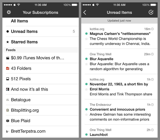
NewsFeeds makes a good first impression.1 Signing in with your FeedBin or Feed Wrangler account is fast and obvious. The list views, of both subscriptions and articles, are clean and easy to read.
The article reading view is clean without believing that clean means huge margins (the Reconnaissance reader falls into that trap).
Reading List integration is just as it should be. Tap and hold on a link in an article and a pane slides up with Add to Reading List as one of its choices.
After reading my first article in NewsFeeds, I was ready to move it onto my home screen. I figured I’d do the in-app purchase to the professional version even though I didn’t need any of the professional features.
Then I tried to move on to the next unread article.
As best I can tell, there is no way to move directly from one article to the next. Swiping, dragging, tapping near the bottom to reveal hidden navigation buttons—nothing worked. The only way I’ve found for moving to another article is to use the back arrow at the top of the screen to return to the article list and then tap on the next article in the list. That’s no way to work your way through a list of articles.
I don’t usually write about software I don’t use, but I’m making an exception here because I don’t understand how an app that was so carefully designed in other ways2 could be so wrong on this fundamental piece of user interaction. It never occurred to me that someone would build an RSS reader that didn’t let you move directly from article to article.
Maybe I’m missing something, and there really is a way to go to the next article. I’d be a little embarrassed to have missed it, but I’d be happy to have found my new reader.


