An anachronistic survey of Twitter apps
September 21, 2014 at 7:02 PM by Dr. Drang
I’d prefer to stop using Dr. Twoot, my cobbled-together, not-meant-for-anyone-but-me, not-actually-an-app Twitter app, but the state of Twitter apps on the Mac isn’t allowing me to. I simply can’t find one I like as much. Once upon a time, a review of OS X Twitter apps would be a display of innovation and fun. Now it’s kind of sad. But here goes…
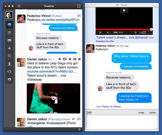
Given how much I like Tweetbot on iOS, I figured Tweetbot for the Mac would be a natural. It isn’t. I don’t like the dark theme, I don’t like the limited control I have over text size, I don’t like the strip of tools along the left side of the window, and I especially don’t like the way embedded images are cropped and/or expanded to fit a fixed rectangle within a tweet.
The purpose of showing a decent-sized embedded image in a tweet is to allow the user to see what it is without the need to expand it further. Tweetbot’s automated crop/zoom routine forces the image into a 9:5 rectangle, which almost never serves the image well. In this case, it ruined Federico’s joke.
Expanding the image is easy on the iPhone because your finger is right there as you scroll through your timeline. On the Mac, though, you may be scrolling any number of ways: the arrow keys, the spacebar, two-finger swipes on the trackpad. Regardless, opening the image to see it full-sized (and then closing it afterward) is a distraction on the Mac that it isn’t on the iPhone.
In fact, what really bugs me about Tweetbot on the Mac is that it just doesn’t feel like a Mac app. The dark window chrome isn’t in keeping with the general OS X aesthetic, where dark windows are usually associated with temporary heads-up displays. When an app takes over the entire screen, as on iOS, it defines the entire experience and can have whatever look it wants. But when it shares the space with a background and a Dock and other apps, it needs to consider how it fits in with them. Like a new building in a city, it should fit in with the neighborhood. Tweetbot doesn’t.
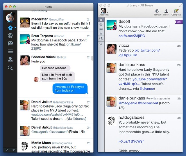
Twitterrific does a better job of fitting in, but its features are in desperate need of a refresh. It doesn’t show inline images at all, and its options for URL shortening and image uploading are hopelessly out of date. You can’t choose Twitter’s native services for either. And like Tweetbot, it seems to think the user can’t be trusted to pick a font size that works, offering only three sizes: Ridiculously Small; Too Small For Me; and Come On, I’m Not That Bad Off.1
The official Twitter app is surprisingly tolerant with regard to font size, offering every point size from 11 to 18. Unfortunately, like Tweetbot and Twitter’s own web app, it crops and zooms images into a rectangle that almost never matches the aspect ratio of the original. And it’s kind of stingy in the number of services it’s willing to show images from.
(That, by the way, is where Tweetbot really shines. It’ll show images—OK, parts of images—hosted almost anywhere. It did not, for example, have a corporate snit and decide to “punish” Instagram by no longer inlining its images.)
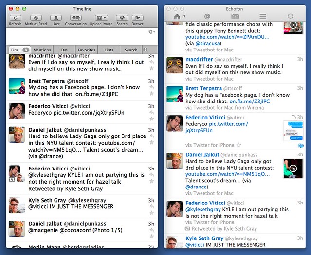
Echofon has a clean, simple layout and, like Twitter, trusts the user to choose his or her own font size. It also has a nice slide-out drawer for viewing conversations. I’m not thrilled with washed-out blue it uses as a link color, but I could live with it. Sadly, its image display is anemic. It uses square thumbnails for every image, and their largest size is 48×48 pixels. Too bad. I like a lot about this app.
YoruFukurou has a somewhat cluttered layout, but it allows for a lot of customization in color and font size. Unfortunately, it doesn’t let you to use Twitter’s native image uploading, and it doesn’t display inline images at all. Like Twitterrific, it seems out of date.
There are, of course, lots of other Twitter apps out there, but it isn’t the active playground it used to be—Twitter’s hostile behavior toward 3rd party developers took a lot of the fun, and the opportunity to make money, out of it a few years ago. I assume Twitterrific and YoruFukurou are behind the times because their developers just don’t think it’s worth the effort.
I, on the other hand, have kept adding little features to Dr. Twoot. It now supports Twitter’s new multi-image service, and it can display both Instagram photos and YouTube videos inline. It’s not as ecumenical in this regard as Tweetbot, but it handles the great majority of images in my timeline.
At some point, though, I’ll need to stop. A day will come when my courage fails, when I forsake Dr. Twoot and break its bonds to Twitter. But it is not this day.
-
Actually, the biggest font size in Twitterrific works for me in the tweet text itself. It’s the huge size of the user names that puts me off. ↩


