Labeling time series
January 30, 2015 at 12:19 AM by Dr. Drang
Today I made a simple time series graph for a report. I’m happy with the way it turned out, but I’m kind of embarrassed at the hackey way I got it that way.
The values to be plotted were temperature readings from a local NCDC weather station. I had a text file with lines that looked like this:
2015-01-04-09-28  29
2015-01-04-09-53  27
2015-01-04-09-55  26
2015-01-04-10-23  25
2015-01-04-10-31  24
2015-01-04-10-40  24
2015-01-04-10-53  23
2015-01-04-10-55  23
2015-01-04-11-01  23
2015-01-04-11-08  22
The first item on each line is a date/time stamp in YYYY-MM-DD-hh-mm format. The second is the temperature in Fahrenheit.1 Although I’m displaying this excerpt here with spaces separating the fields, the input file had them separated with tabs.
After consulting the Matplotlib documentation and looking at a couple of examples, I wrote up a simple plotting routine,
python:
 1:  #!/usr/bin/python
 2:
 3:  from matplotlib import pyplot as plt
 4:  from matplotlib import dates
 5:  from datetime import datetime
 6:  import sys
 7:
 8:  d = []
 9:  t = []
10:  for line in sys.stdin:
11:    dstamp, temp = line.rstrip().split('\t')
12:    d.append(datetime.strptime(dstamp, '%Y-%m-%d-%H-%M'))
13:    t.append(int(temp))
14:
15:  days = dates.DayLocator()
16:  hours = dates.HourLocator()
17:  dfmt = dates.DateFormatter('%b %d')
18:
19:  datemin = datetime(2015, 1, 4, 0, 0)
20:  datemax = datetime(2015, 1, 12, 0, 0)
21:
22:  fig = plt.figure()
23:  ax = fig.add_subplot(111)
24:  ax.xaxis.set_major_locator(days)
25:  ax.xaxis.set_major_formatter(dfmt)
26:  ax.xaxis.set_minor_locator(hours)
27:  ax.set_xlim(datemin, datemax)
28:  ax.set_ylabel('Temperature (F)')
29:  ax.plot(d, t, linewidth=2)
30:  fig.set_size_inches(8, 4)
31:
32:  plt.savefig('temperatures.pdf', format='pdf')
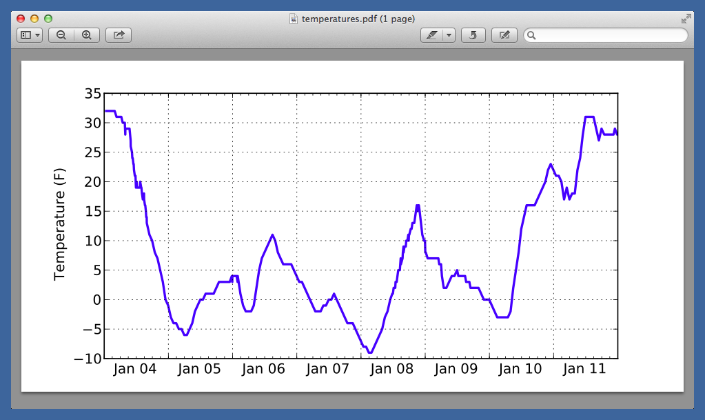
and got this result:

There are a few things wrong with it. First, there are way too many minor tick marks. A minor tick every hour is just too often. I fixed that by changing Line 16 to
python:
16:   hours = dates.HourLocator(interval=3)
A minor tick every three hours looks much less cluttered.
Second, the plot needed a grid to make it easier to keep the reader’s eye aligned with the axes. I inserted the line
python:
27:  ax.grid(True)
just before the ax.plot command.
The biggest problem, though, was the location of the date labels. As you can see, they’re centered under the major tick marks associated with midnight of each day. Having a label aligned with a single tick mark would be fine if I had just one data point per day, but in this case there are about 40 temperature readings each day. The labeling of the axis should reflect the fact that a day is the entire block of time from one midnight to the next.
I see time series labeled like this fairly often, and will probably not surprise you to hear that it annoys the shit out of me. It seems to be most common for data series that stretch out over years. A year’s worth of daily figures should not have a label like “2014” centered under the tick mark for January 1. Changing the text of the label to something like “1/1/14” is more accurate, but it’s lazy and inelegant. The best way to say “this is 2014” is to have obvious marks at either end of the year and center the year label between them.
The same principle holds for my temperature data. I already had the days’ borders marked with major tick marks and (after adding the ax.grid(True) line) vertical grid lines. All I needed to do is scootch the day labels to get them centered between the borders.
It was at this point that I cheated.
There is, I’m sure, a Matplotlib command for moving labels the way I wanted, but all I could find on short notice were ways to move the labels closer to or farther from the axis—nothing about moving them along the axis. And I really wanted to get my report out the door and into the hands of my client.
So…
python:
 1:  #!/usr/bin/python
 2:
 3:  from matplotlib import pyplot as plt
 4:  from matplotlib import dates
 5:  from datetime import datetime
 6:  import sys
 7:
 8:  d = []
 9:  t = []
10:  for line in sys.stdin:
11:    dstamp, temp = line.rstrip().split('\t')
12:    d.append(datetime.strptime(dstamp, '%Y-%m-%d-%H-%M'))
13:    t.append(int(temp))
14:
15:  days = dates.DayLocator()
16:  hours = dates.HourLocator(interval=3)
17:  dfmt = dates.DateFormatter('              %b %d')
18:
19:  datemin = datetime(2015, 1, 4, 0, 0)
20:  datemax = datetime(2015, 1, 11, 23, 59, 59)
21:
22:  fig = plt.figure()
23:  ax = fig.add_subplot(111)
24:  ax.xaxis.set_major_locator(days)
25:  ax.xaxis.set_major_formatter(dfmt)
26:  ax.xaxis.set_minor_locator(hours)
27:  ax.set_xlim(datemin, datemax)
28:  ax.set_ylabel('Temperature (F)')
29:  ax.grid(True)
30:  ax.plot(d, t, linewidth=2)
31:  fig.set_size_inches(8, 4)
32:
33:  plt.savefig('temperatures.pdf', format='pdf')
I added a bunch of space characters to the front of the date formatting string in Line 17. After two or three attempts, I arrived at something that looked reasonably centered.

You may have noticed the other bit of hackery: to avoid having a “Jan 12” label sticking off the right edge of the plot, I changed the upper bound in Line 20 to just before midnight on January 11. The one second difference can’t be seen in the plot, and it means “Jan 11” is the last label.
Almost everyone who works with computers has resorted to tricks like this at one time or another. We know it’s wrong, and we’re ashamed that we don’t know “the right way” to accomplish our goals. But mixed with the shame is a perverse pride in the ability to get something done even when we don’t really know what we’re doing.
-
If you go on Twitter to tell me I should be using Celsius, I will block you. This report is being written for an audience that’s more comfortable with Fahrenheit, so that’s how I’m reporting the data. ↩
