
Ticked
September 19, 2015 at 5:55 PM by Dr. Drang
Last month, John Gruber was worried about the way the quotation marks looked in late betas of San Francisco, iOS 9’s system font.
Apple changed the quotes and apostrophes in SF in iOS 9b5. They’re curly now, not angular. I think I prefer the old ones.
— John Gruber (@gruber) Aug 7 2015 7:30 PM
It’s hard to show, because the downloadable fonts are still the old ones. But here’s old/new:
— John Gruber (@gruber) Aug 7 2015 7:31 PM
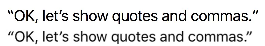
He’s talking about typographer’s quotation marks, which are styled to distinguish between opening and closing marks, not typewriter quotation marks, which aren’t. In Georgia, the font I use here, it’s the difference between these three:
‘ ’ '
You can see why sometimes people call typographer’s quotes “curly quotes” and typewriter quotes “straight quotes.” In many fonts, though, there’s no curl to the curly quotes. Here are those same three symbols in Verdana:1
‘ ’ '
Given the overall look of San Francisco—and especially its commas—Gruber thought Verdana-style block quotation marks looked better. By the Apple Event on September 9, it was apparent that Apple agreed with him:
San Francisco’s quotes are right again in the build of iOS 9 on the hands-on demo units.
— John Gruber (@gruber) Sep 9 2015 8:54 PM
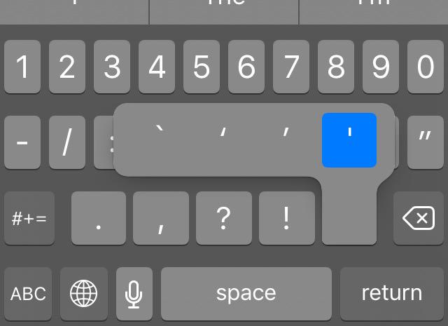
A significant difference, though, is that while the early versions of San Francisco’s opening quotes were slanted down and to the right (like Verdana’s), the final versions are slanted down and to the left, just like its closing quotes.2 The only difference now between San Francisco’s opening and closing quotation marks is the tapering. The ticks of the opening quotes are fatter on the bottom, while the closing ticks are fatter on the top. You can see that—maybe—in the iOS 9 keyboard.

You may need to zoom in to see the differences.
As you might guess, a well-seasoned iPhone user like me has a hard time distinguishing between the opening and closing marks because the taper is subtle. I complained about that last night,
I guess I’ll have to figure out opening and closing quotes by position.
— Dr. Drang (@drdrang) Sep 18 2015 6:59 PM
and Gruber responded,
@tantramar @drdrang The curling of quotes should be handled by software, not the typist.
— John Gruber (@gruber) Sep 19 2015 12:29 AM
This is mostly correct, but not fully correct. The smart quotes algorithm, which is the software he’s referring to, does an excellent job of substituting the correct typographer’s quotation mark for a typewriter mark, but it’s not perfect. In particular, it can’t handle leading apostrophes, which it believes are opening single quotes. For example, instead of
If it were done when ’tis done…
Back in the ’70s…
the smart quotes algorithm will give you
If it were done when ‘tis done…
Back in the ‘70s…
In cases like this, the typist must enter the correct mark directly—software is of no help. Keep this in mind when you’re writing a paper on Shakespeare or disco.
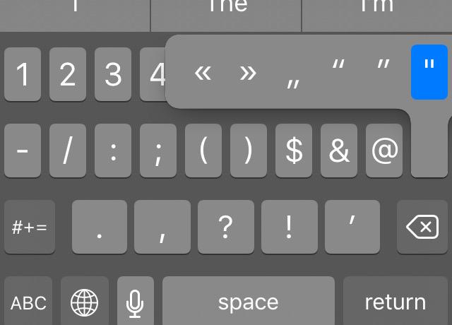
On the Mac, I have 30 years of muscle memory to tell me that ⌥⇧] gives me the apostrophe I want. On iOS, I have to rely on the keyboard popup. Fortunately, Apple was rational in its placement of the marks within the popup: the opening single quote is to the left of the closing single quote/apostrophe. So the mark I’ll most commonly need to place by hand is the one immediately to the left of the typewriter mark.
I doubt this ambiguity in quotation marks will cause the wailing and gnashing of teeth that the iOS 7 & 8 Shift key did, because few people bother with the quote mark popups, but it’s a similar issue. Because the iOS keyboard relies on visual cues, those cues must be strong enough to be seen at a glance. I like the look of San Francisco’s opening and closing quotation marks, but they don’t provide strong cues.