Apple sales
August 1, 2017 at 9:14 PM by Dr. Drang
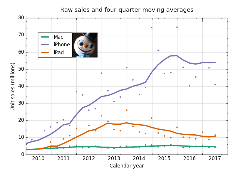
You’re probably exhausted from looking at all the plots at Six Colors, 512 Pixels, and (especially) MacStories. I hope you won’t mind two more, especially if they include supercute branding.
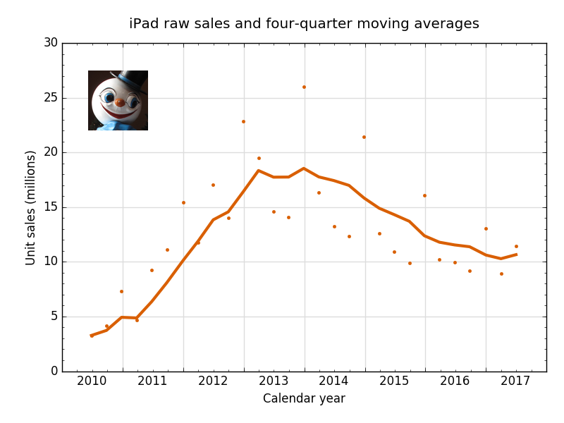
Fitting all the important stuff into a single graph has the advantage of brevity, but to appreciate the big story,1 it’s better to plot the iPad figures on their own, so the sales aren’t squeezed into the lower third of the graph.
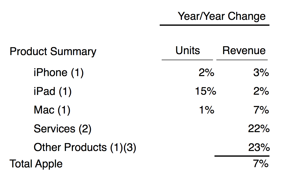
A real, live, honest-to-goodness, actual rise2 of 15% in year-over-year unit sales led to an upturn in the four-quarter moving average, the first since the end of 2013. No one needs to root for Apple to make more money, but this is the kind of news that might encourage developers to support the iPad and make it a better product for all of us.
But the other half of the iPad story is less encouraging. iPad revenue increased by only 2%.

So the average price dropped by
or about 11%. As John Gruber says, this means the rise in sales was driven by the low-end iPads, not the Pros. This seems unlikely to prod developers into making high-end apps, especially apps that rely on Pro-only features like the Pencil.3
But let’s see the glass as half full. It’s been empty for quite a while.
-
It’s a big story because I now have an iPad. ↩
-
As opposed to just decreasing at a slower rate. ↩
-
I’m still going to urge Craig Hockenberry and the Iconfactory folks to stick with Linea and (please please please) add the ability to import images so I can use it to annotate photos. ↩


