Plotting my Apple sales plots
July 25, 2018 at 10:03 PM by Dr. Drang
Last week, Jason Snell wrote a nice post on how he automated his system for producing and uploading the many charts he makes whenever Apple posts its quarterly results. It’s a Mac-centric system, based on Numbers, Image Magick, SCP1, and Automator. A few days later, in a heroic Twitter thread, Jason took up the challenge of creating an iOS workflow that did the same thing. I’ve been expecting a blog post with full writeup, but there’s been nothing so far. Maybe he’s cleaning it up around the edges.2
I am not heroic. The creation of my charts is automated automatically (so to speak) because they come from Python scripts. And I can generate them from iOS through the simple expedient of using Prompt to log into my Mac from my iPad or iPhone and then typing the name of the necessary script at the command line.
What’s that? You don’t think logging onto a Mac and running a Terminal command is “generat[ing] them from iOS”? Well, I’ve already told you I’m not heroic; you shouldn’t be surprised that I’m also a cheater.
Cheater or not, I was inspired by Jason to add a few things to my Apple chart-making scripts. Two of them, reducing the size of the graphic via OptiPNG and uploading the resulting file through STFP, were things I used to do at the command line after making a chart. Another was analytic: to the raw sales and four-quarter moving average, I added a companion line that tracks the year-over-year sales associated with the current quarter. People seem to like year-over-year data, and it was easy to include. Finally, I thought the branding joke of putting my giant snowman head in a prominent place of every graph had worn thin, so I made the head much smaller and tucked it into a less conspicuous spot.
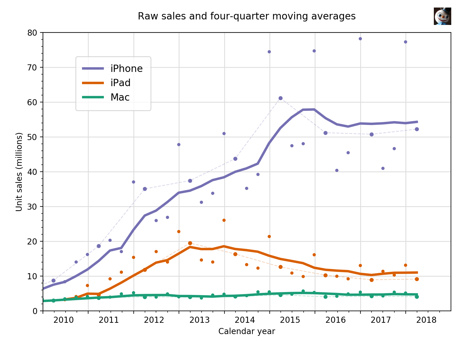
The result, still using the results reported three months ago, looks like this:

The year-over-year tracking is done by making those raw sales dots slightly bigger than the others and connecting them with a thin, faint, and dashed line. My goal was to maintain the prominence of the moving average while making easier to see the year-over-year changes. One thing I’d never noticed before was that the Jan-Mar quarter used to have above average iPhone sales but hasn’t since 2015.
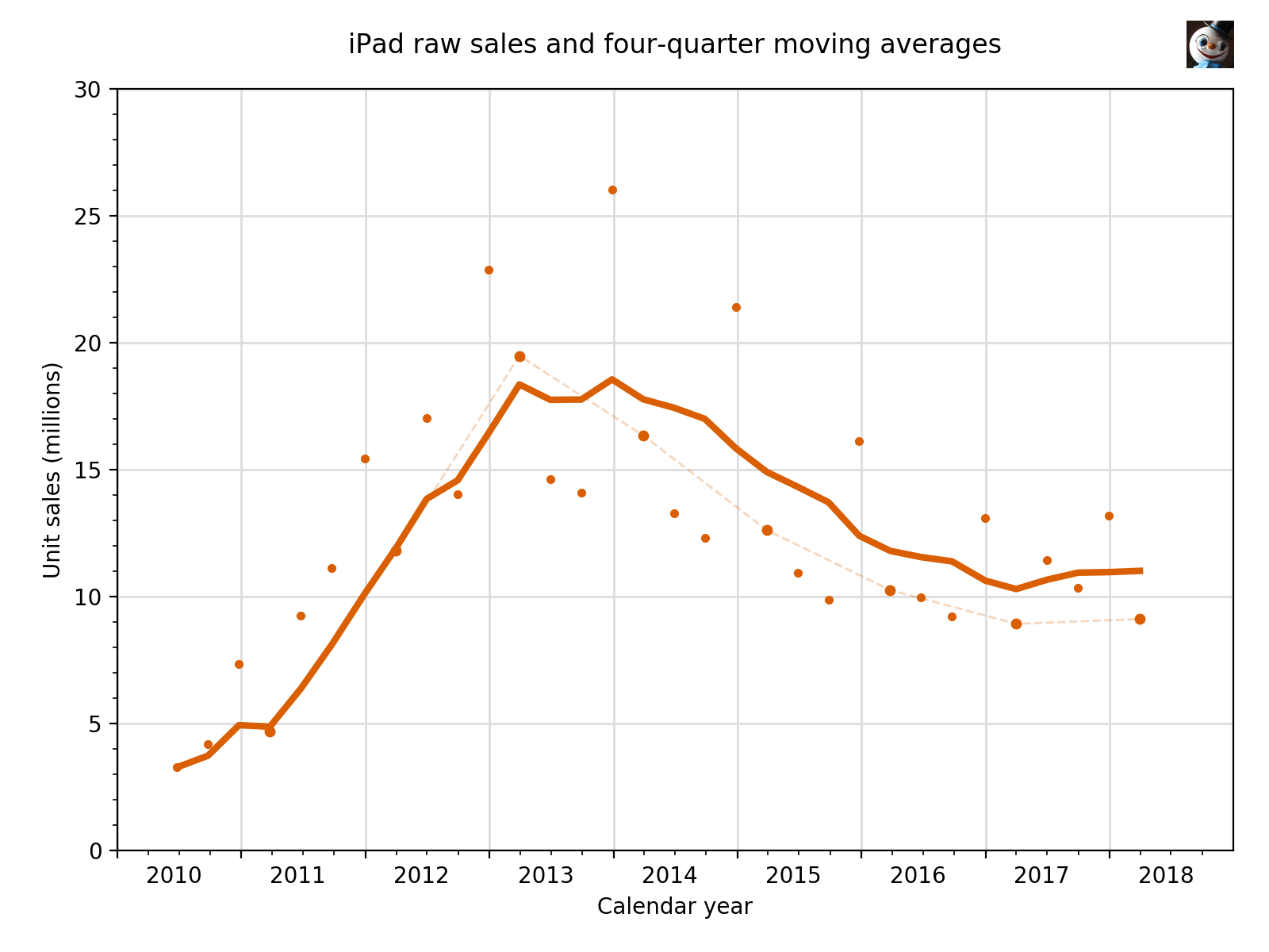
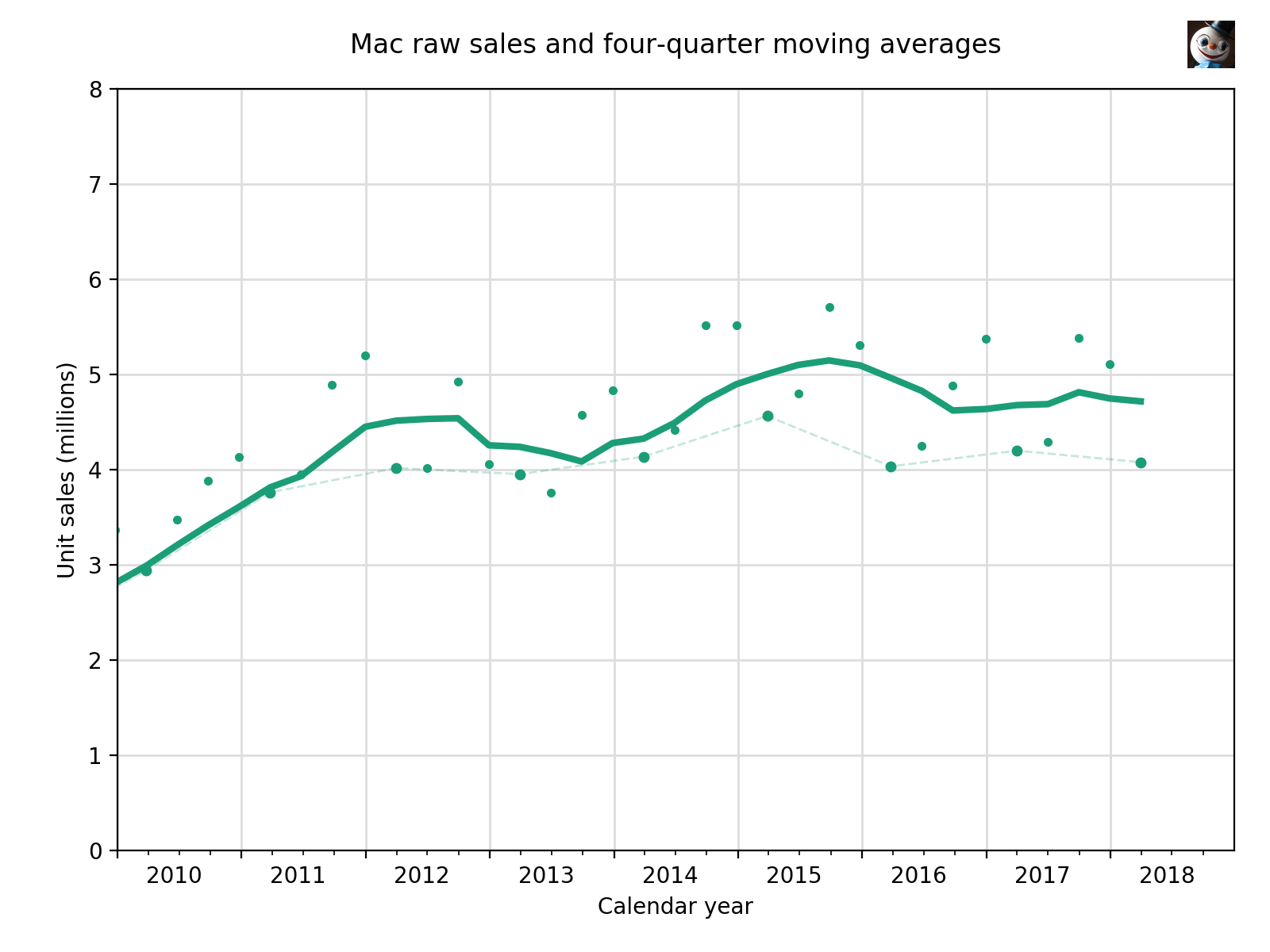
The plot above was made to compare the three product lines. Because the iPhone sets the plot’s scale, it also serves as a decent plot of the iPhone itself. But it’s terrible at showing the evolution of iPad and Mac sales, so I also make individual plots for them.


The data is kept in files that look like this,
2016-Q1 2015-12-26  74.779
2016-Q2 2016-03-26  51.193
2016-Q3 2016-06-25  40.399
2016-Q4 2016-09-24  45.513
2017-Q1 2016-12-31  78.290
2017-Q2 2017-04-01  50.763
2017-Q3 2017-07-01  41.026
2017-Q4 2017-09-30  46.677
2018-Q1 2017-12-30  77.316
2018-Q2 2018-03-31  52.217
with one line per quarter, with the quarter’s name, end date, and sales separated by whitespace. There’s a file like this for each of the devices.
The script I use to make the first plot is this:
python:
  1:  #!/usr/bin/env python
  2:
  3:  from datetime import date, datetime
  4:  from sys import stdin, argv, exit
  5:  import numpy as np
  6:  import matplotlib.pyplot as plt
  7:  import matplotlib.dates as mdates
  8:  from matplotlib.ticker import MultipleLocator
  9:  from PIL import Image
 10:  import paramiko
 11:  import subprocess
 12:
 13:  # Initialize
 14:  phoneFile = 'iphone-sales.txt'
 15:  padFile = 'ipad-sales.txt'
 16:  macFile = 'mac-sales.txt'
 17:  firstYear = 2010
 18:  today = date.today()
 19:  baseFile = today.strftime('%Y%m%d-Apple sales')
 20:  pngFile = baseFile + '.png'
 21:  pdfFile = baseFile + '.pdf'
 22:  dest = '/path/to/images{}/{}'.format(today.strftime('%Y'), pngFile)
 23:
 24:  # Read the given data file and return the series.
 25:  def getSeries(fname):
 26:    global lastYear, lastMonth
 27:    dates = []
 28:    sales = []
 29:    for line in open(fname):
 30:      if line[0] == '#':
 31:        continue
 32:      quarter, edate, units = line.strip().split('\t')
 33:      units = float(units)
 34:      qend = datetime.strptime(edate, '%Y-%m-%d')
 35:      dates.append(qend)
 36:      sales.append(units)
 37:    ma = [0]*len(sales)
 38:    for i in range(len(sales)):
 39:      lower = max(0, i-3)
 40:      chunk = sales[lower:i+1]
 41:      ma[i] = sum(chunk)/len(chunk)
 42:    return dates, sales, ma
 43:
 44:  # Make new series with just the latest quarter for every year.
 45:  def getYoY(d, s):
 46:    dyoy = list(reversed(d[::-4]))
 47:    syoy = list(reversed(s[::-4]))
 48:    return dyoy, syoy
 49:
 50:  # Read in the data
 51:  phoneDates, phoneRaw, phoneMA = getSeries(phoneFile)
 52:  padDates, padRaw, padMA = getSeries(padFile)
 53:  macDates, macRaw, macMA = getSeries(macFile)
 54:  phoneDatesYoY, phoneRawYoY = getYoY(phoneDates, phoneRaw)
 55:  padDatesYoY, padRawYoY = getYoY(padDates, padRaw)
 56:  macDatesYoY, macRawYoY = getYoY(macDates, macRaw)
 57:
 58:  # Tick marks and tick labels
 59:  y = mdates.YearLocator()
 60:  m = mdates.MonthLocator(bymonth=[1,
 61:   4, 7, 10])
 62:  yFmt = mdates.DateFormatter('                %Y')
 63:  ymajor = MultipleLocator(10)
 64:  yminor = MultipleLocator(2)
 65:
 66:  # Plot the raw sales data and moving averages.
 67:  # Connect the year-over-year raw data.
 68:  fig, ax = plt.subplots(figsize=(8,6))
 69:  ax.plot(phoneDates, phoneMA, '-', color='#7570b3', linewidth=3, label='iPhone')
 70:  ax.plot(phoneDates, phoneRaw, '.', color='#7570b3')
 71:  ax.plot(phoneDatesYoY, phoneRawYoY, '.', color='#7570b3', markersize=8)
 72:  ax.plot(phoneDatesYoY, phoneRawYoY, '--', color='#7570b3', linewidth=1, alpha=.25)
 73:  ax.plot(padDates, padMA, '-', color='#d95f02', linewidth=3, label='iPad')
 74:  ax.plot(padDates, padRaw, '.', color='#d95f02')
 75:  ax.plot(padDatesYoY, padRawYoY, '.', color='#d95f02', markersize=8)
 76:  ax.plot(padDatesYoY, padRawYoY, '--', color='#d95f02', linewidth=1, alpha=.25)
 77:  ax.plot(macDates, macMA, '-', color='#1b9e77', linewidth=3, label='Mac')
 78:  ax.plot(macDates, macRaw, '.', color='#1b9e77')
 79:  ax.plot(macDatesYoY, macRawYoY, '.', color='#1b9e77', markersize=8)
 80:  ax.plot(macDatesYoY, macRawYoY, '--', color='#1b9e77', linewidth=1, alpha=.25)
 81:
 82:  # Add a grid.
 83:  ax.grid(linewidth=1, which='major', color='#dddddd', linestyle='-')
 84:
 85:  # Set the upper and lower limits to show all of the last year in the data set.
 86:  # Add a year if the sales are for the last calendar quarter.
 87:  lastYear = macDates[-1].year
 88:  lastMonth = macDates[-1].month
 89:  if lastMonth == 12:
 90:    lastYear += 1
 91:  plt.xlim(xmin=date(firstYear, 1, 1), xmax=date(lastYear, 12, 31))
 92:  plt.ylim(ymin=0, ymax=80)
 93:
 94:  # Set the labels
 95:  plt.ylabel('Unit sales (millions)')
 96:  plt.xlabel('Calendar year')
 97:  t = plt.title('Raw sales and four-quarter moving averages')
 98:  t.set_y(1.03)
 99:  ax.xaxis.set_major_locator(y)
100:  ax.xaxis.set_minor_locator(m)
101:  ax.xaxis.set_major_formatter(yFmt)
102:  ax.yaxis.set_minor_locator(yminor)
103:  ax.yaxis.set_major_locator(ymajor)
104:  ax.set_axisbelow(True)
105:  plt.legend(loc=(.08, .72), borderpad=.8, fontsize=12)
106:  fig.set_tight_layout({'pad': 1.5})
107:
108:  # Save the plot file as a PNG and as a PDF.
109:  plt.savefig(pngFile, format='png', dpi=200)
110:  plt.savefig(pdfFile, format='pdf')
111:
112:  # Add the logo to the PNG and optimize it.
113:  plot = Image.open(pngFile)
114:  head = Image.open('snowman-head.jpg')
115:  smallhead = head.resize((60, 60), Image.ANTIALIAS)
116:  plot.paste(smallhead, (1496, 26))
117:  plot.save(pngFile)
118:  subprocess.run(['optipng', pngFile])
119:
120:  # Upload the PNG
121:  ssh = paramiko.SSHClient()
122:  ssh.set_missing_host_key_policy(paramiko.AutoAddPolicy())
123:  ssh.connect(hostname='host.com', username='user', password='password', port=6789)
124:  sftp = ssh.open_sftp()
125:  sftp.put(pngFile, dest)
Much of the script has been explained in that earlier post. Here, I’ll just discuss the new stuff.
The getYoY function in Lines 45–48 uses slices to create the lists of dates and sales for the year-over-year subset of the full data. The slice itself, [::-4], works backward from the end of the list, so I included the reversed function to put the year-over-year lists in chronological order. This isn’t necessary for plotting, but I figured future me would expect all of the lists to be in the same order if he was going to do something else with them.
Lines 71, 75, and 79 plot the year-over-year quarters with a slightly larger dot. This dot goes over and hides the raw data dots that are plotted in Lines 70, 74, and 78. Lines 72, 76, and 80 plot thin (linewidth=1), faint (alpha=.25), dashed ('--') lines connecting the year-over-year dots.
After the plot is saved as a PNG (Line 101), I use the Python Imaging Library to add my head near the upper right corner (Lines 113–117). Then I run the file through OptiPNG via the subprocess library.
Finally, in Lines 121–125, I use the paramiko library to establish an SSH connection to the server and upload the file via SFTP. The file name uses the current date as a prefix (Line 19), and the destination directory on the server is named according to the year: imagesyyyy. This path is set in Line 22.
You’ll note that in addition to the PNG file, the script also generates a PDF. I almost never use the PDF, but if I want to annotate the plot before publishing it, I get better results if I annotate the PDF in OmniGraffle and then export the OG file as a PNG.
As I said, this script produces the plot with sales of all three devices. The individual iPad and Mac plots are produced with similar scripts that import only one device’s sales. I should also mention that this script has evolved over the past three years, and it’s likely to contain lines of code that no longer do anything but haven’t yet been deleted. In addition to being a coward and a cheat, I’m also lazy.
The results for the Apr-Jun quarter are going to be posted next Tuesday. I’ll be traveling that day and probably won’t be posting updated plots until the day after. Until then, you’ll just have to get by with charts from Jason and the other usual suspects.
-
If you’re wondering why I’m linking to a generic Unix man page site instead of to Apple, it’s because Apple has either taken its man pages offline or changed their fucking URLs again. ↩
-
Sneakily, Jason didn’t write a new post, he updated the original with the iOS stuff. Scroll down to the bottom to see it. ↩
