Drawing the quarters
November 1, 2018 at 9:03 PM by Dr. Drang
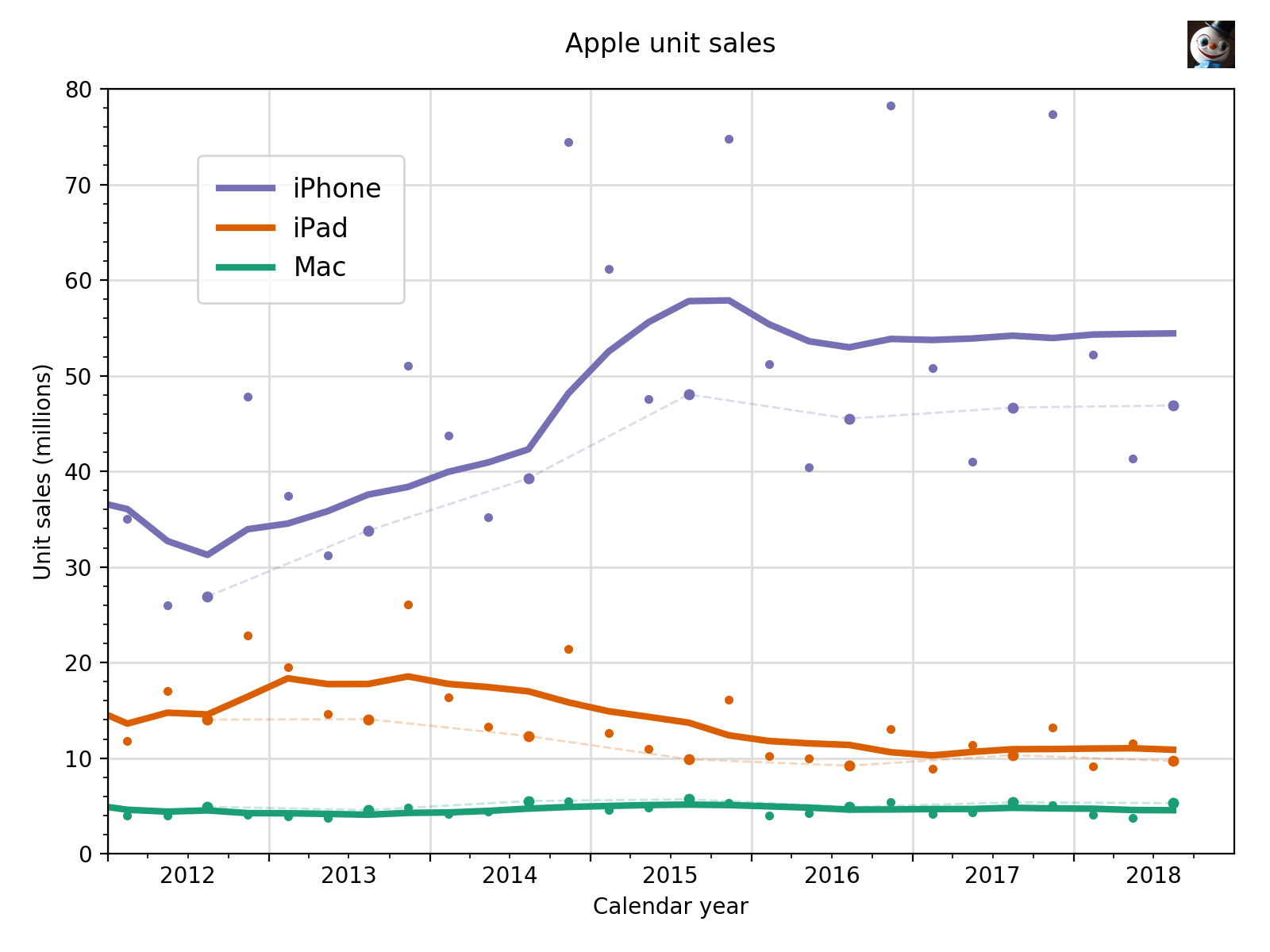
As you probably heard on Twitter, or from the usual sources, Apple announced that today’s quarterly figures will be the last to include unit sales for the Mac, iPhone, and iPad. I’ve been posting plots of units sales since April of 2015, when I shook up the staid world of Apple punditry by introducing it to the four-quarter moving average. It’s a sad day here at Drang Global Headquarters as we post the last of its kind:

The dots are the raw sales figures, the thick solid lines are the four-quarter moving averages, and the thin dashed lines connect the same quarters in consecutive years, giving a sense of the year-over-year changes. You can see why Apple isn’t particularly interested in showing these figures anymore—you have to get out a magnifying glass to see any recent growth.
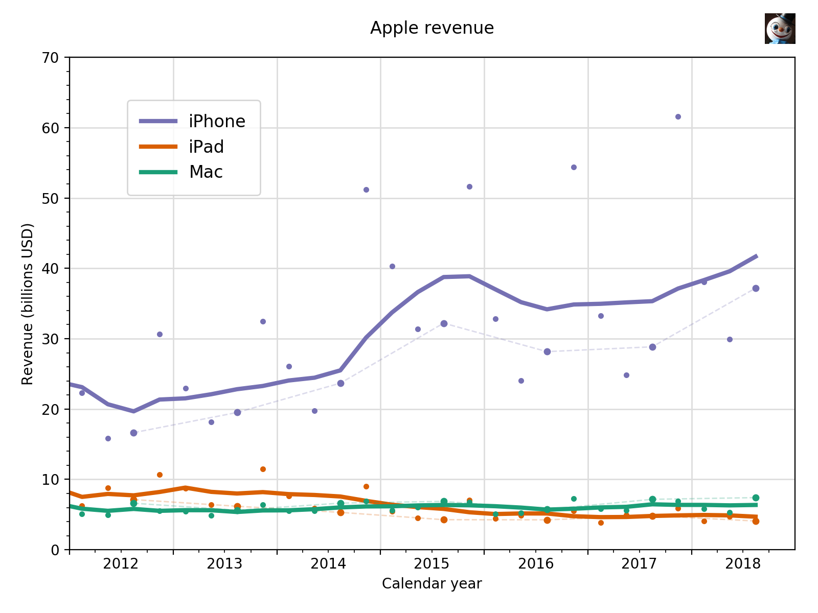
Oddly enough, back in August, after the last set of quarterly results came out, I decided it was time to start plotting revenue. Not because I had any inkling that Apple would stop providing unit sales, but because I wanted to compare these three products to Services and Other Products, the two remaining categories in Apple’s quarterly reports. So I dug back through the reports and added revenue to my data files for the Mac, iPhone, and iPad. This data update and a few small edits to my plotting script allowed me to quickly produce a new version of the chart above, but with this one focused on revenue:

You can see why Apple prefers to talk revenue.
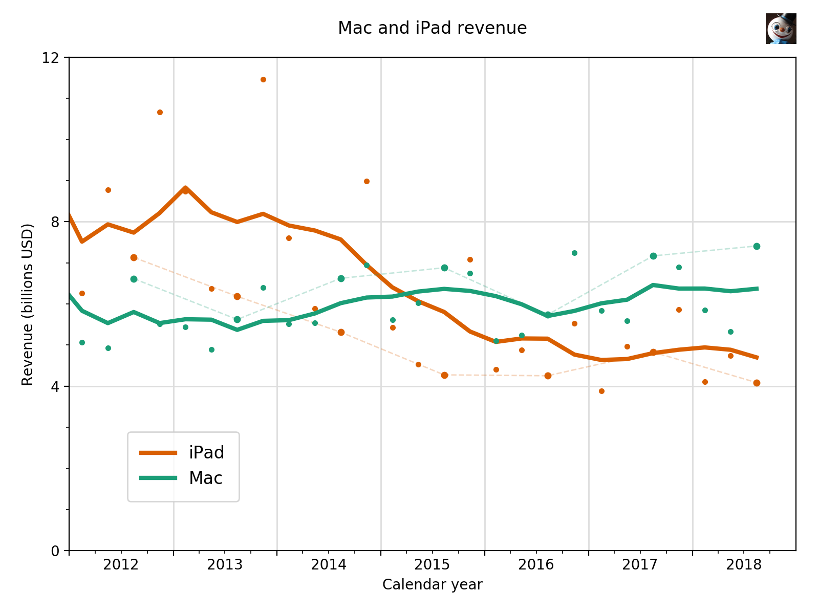
The dominance of the iPhone makes it hard to see the Mac and the iPad down there in the mud, so let’s show them all by themselves:

(Stephen Hackett, feel free to use this the next time your co-hosts talk about the fading Mac platform. Do it quickly, though, as I suspect the iPad will rebound next quarter.)
Of course, in true best-laid-plans style, I didn’t get around to making data files for Services and Other Products, so I can’t make the plots I intended to. Next time.
