New Apple graphs
January 30, 2019 at 11:46 PM by Dr. Drang
It’s a month after the end of a fiscal quarter and time for another round of graphs showing Apple’s performance. As always, you can get a full meal of graphs from Six Colors and MacStories. Here, you’ll be served an amuse-bouche.
The big difference this quarter is that Apple’s report no longer contains unit sales for its devices. As it’s unit sales that I’ve been graphing for the past few years, I had to either give up or figure out a new set of graphs to produce. I chose the latter, but I’m not sure if I’ll keep doing this every quarter. Generally speaking, I don’t find the money Apple makes as interesting as the devices it has out in circulation. It’s the devices that change the world, not Apple’s bottom line. On the other hand, revenue is certainly related to device sales, and moving from unit sales to revenue allows me to talk about services, which are becoming a larger part of the Apple story.
Whatever I decide to do in the future, here’s how I looked at the data for Apple’s holiday quarter. The first thing to know is that Apple breaks down its revenue into five product categories:
- iPhone
- Mac
- iPad
- Wearables, Home, and Accessories (which I will call Other, as Apple used to)
- Services
The first three are our old friends, the fourth is a lumping together of all the other hardware Apple sells—Watches, AirPods, HomePods, and so on—and the fourth is the category Tim Cook flogs every chance he gets.
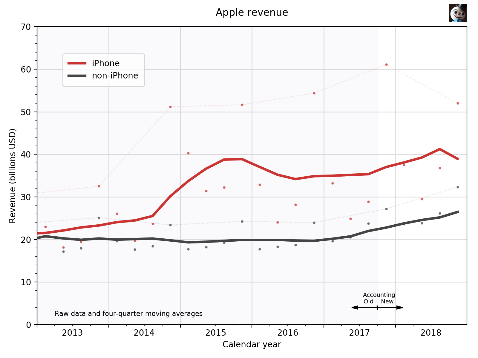
It doesn’t take much analysis to realize that none of the latter four categories comes anywhere close to the iPhone as a revenue generator.1 The iPhone accounts for about 60% of Apple’s income, so I decided the best way to start the presentation of the quarterly results was to aggregate the latter four categories and display that alongside the iPhone.
There’s a lot in here, so let’s go through it piece by piece.
First, Apple’s fiscal year starts at the end of September of the previous calendar year, and I think it’s easier—especially if you want to compare Apple’s performance with the release of products or the introduction of new services—to deal with dates in the regular calendar we all use. So I plot things by calendar year.
Second, I got into this Apple graphing business because I found it difficult to interpret graphs of raw quarterly data. Most of Apple’s sales are so strongly seasonal that it’s hard to see trends unless the data are smoothed. I chose a simple moving average smoother; the smoothed data are calculated by adding the current quarter’s revenue and those of the previous three quarters and dividing that sum by four. The thick solid lines shown in the graph are these moving averages.
Next, the raw revenue figures are plotted as points. In the graph, these are smaller and somewhat muted in color so they don’t detract from the moving averages. I’ve plotted them as dots at the middle of the quarter to which they apply and have connected the dots of the most recent quarter in previous years with a light dashed line. This gives a sense of the year-over-year change.
Finally, Apple just made a change to the way it assigns revenue to the five categories, and it’s published an explanation that also recalculates the revenue in those categories for the four previous quarters.2 Here’s what Apple says:
Starting in 2019, in connection with the adoption of the new revenue accounting standard, Apple will classify the amortization of the deferred value of Maps, Siri and free iCloud services, which are bundled in the sales price of iPhone, iPad, Mac and certain other products, in Services net sales. Historically, Apple classified the amortization of these amounts in Product net sales consistent with its management reporting framework. As a result, the 2018 net sales information has been reclassified to conform to the 2019 presentation.
In a nutshell, by reclassifying some portion of the sale price of its devices as going toward Maps, Siri, and iCloud, Apple has boosted its services revenue by about $640 million per quarter. As a consequence, it has reduced the quarterly revenues for the iPhone ($450 million), the Mac ($70 million), the iPad ($110 million), and the other devices ($10 million).
Thus, comparing revenue figures before the 2017 holiday quarter to figures after that quarter is not an apt3 comparison. The Six Colors crew have done their best to account for this change by estimating how Apple would have presented its revenue figures using the new system for all of the previous quarters, not just the most recent year’s. I decided to avoid the perils of estimation by using shading to partition the graph into two sections, one for the old accounting method and one for the new. The reader is alerted to the change and can make their own judgments about comparisons across the section boundary.
On the scale of the graph above, the adjustment from the old method to the new would be barely noticeable. $450 million is less than one-quarter of the distance between the minor tick marks on the vertical axis, or about the diameter of one of the raw revenue dots. No big deal.
What is a big deal is the downward kink in iPhone revenue caused by the most recent quarter. It’s not just that Apple missed the estimate it made three months ago; it’s not just that iPhone revenue is down from the year-ago holiday quarter; it’s that iPhone revenue is down from the holiday quarter of two years ago. Unsurprisingly, Apple has been focusing on its overall revenue, which although down, is buoyed by the continuing upward trend of the non-iPhone revenue.
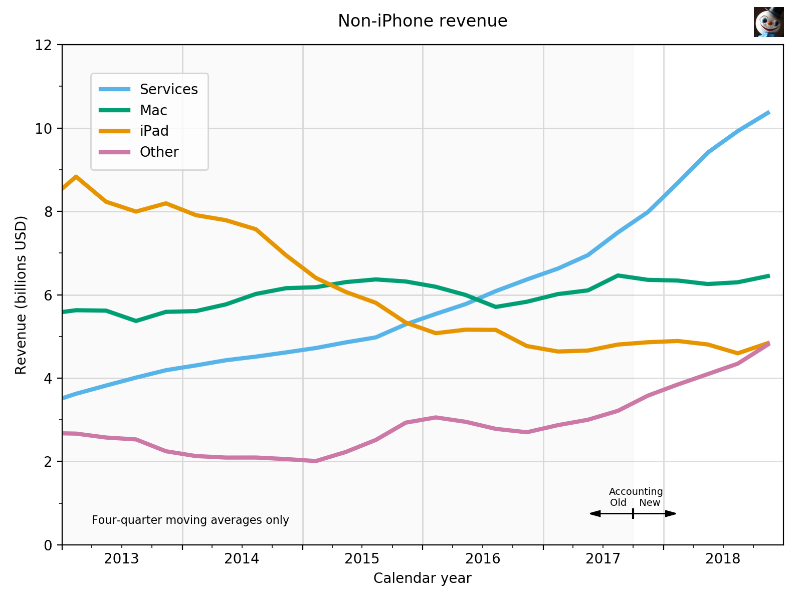
And speaking of non-iPhone revenue, let’s split that out into its four components. This makes for a nice graph, because they are all of comparable scale.
On this scale, the $640 million that Apple has robbed from Peter to pay Paul is not insignificant. The Services revenue in the unshaded area would be noticeably below what I’ve plotted if we were still using Apple’s old accounting method. Still, Services is rightly considered Apple’s biggest growth category, even though it is growing at a slower rate than it was a few quarters ago.
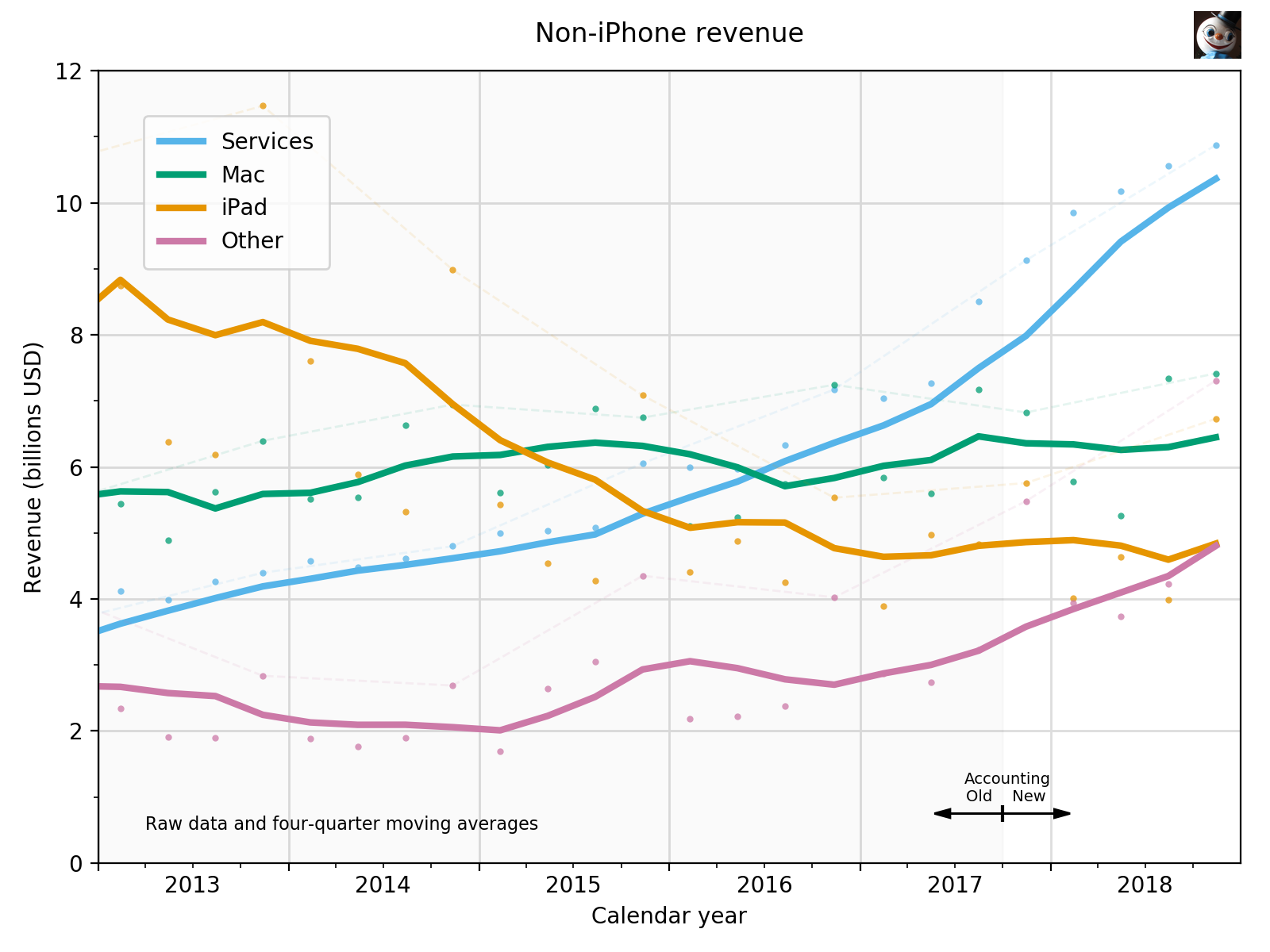
Down further on the graph, we see that the iPad is about to be overtaken by Other, an ignominious position for what used to be the top dog of the non-iPhones. In fact, if we were to look at the raw revenue figures instead of the moving averages, we’d see that the iPad has come in below Other for the past two quarters.
But we can’t look at the raw figures because I didn’t plot them. Why not? Because doing so makes a mess.
It’s not impossible to interpret this graph, but who’d want to? Plotting two aspects of four data sets that intersect one another is just too much at once. If we want to look at the raw data of these, it’s best to plot no more than two on the same graph.
You certainly can’t explain Apple in two graphs, but I think these do a good job of presenting an overview of the company’s progressions and regressions from the product side. One unaddressed problem with them is that they don’t account for inflation—something I didn’t have to worry about when I was plotting unit sales. Apple doesn’t account for inflation either, of course, but that doesn’t mean I shouldn’t. If I’m going to keep doing this, I’ll have to decide on an inflation index and a basis year.
-
The same was true with unit sales, which is why I typically broke out the Mac and iPad sales into their own graphs. ↩
-
Big thanks to Jason Snell for pointing me to this document. I could see in the consolidated financial statement that the previous year’s revenue figures had changed from the values reported last year, but I didn’t understand the changes until I saw the recalculations. ↩
-
I will not use the phrase “apples to apples.” Even I have some dignity. ↩


