Transparency
February 11, 2019 at 8:27 PM by Dr. Drang
Today I upgraded the OS on my work iMac to Mojave. The upgrade took maybe an hour and had no hiccups, which I was glad of. I haven’t used it enough to know whether any of my software is broken1, but I have used it enough to know that Apple is making visual changes to the user interface that certainly don’t enhance the user experience and probably detract from it.2
I’m not talking about Dark Mode. Personally, I think Dark Mode is a step back to the light-on-dark terminals I used back in the 70s and 80s, and I have no interest in working on a system that reminds me of those days. But that’s more a matter of taste than usability—done right, Dark Mode can be just as usable as the classic mode. I’m talking about Apple’s inexplicable embrace of transparency.
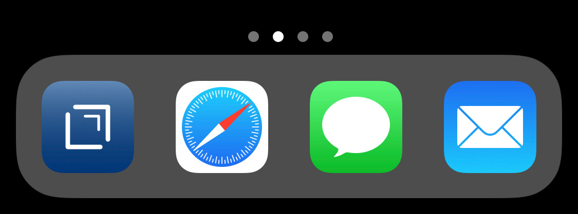
Here’s my Dock after the upgrade. My Desktop color for years has been Solid Aqua Dark Blue3, and now the Dock is just about the same color because of the transparency.

Why should the Dock appear as if it’s transparent? It’s not as if there’s anything interesting behind the Dock. That space can’t be used for icons, and I wouldn’t put any there even if it could be. So there’s no value is seeing through the Dock, but there is value in distinguishing the icons in the Dock from those that may be next to it on the Desktop. The distinction between the icons in the Dock and those on the Desktop is unnecessarily reduced by the excessive transparency of the Mojave Dock.
In case you’re wondering, I do have the “Reduce transparency” box checked in the Accessibility System Preference. That used to make the Dock more opaque than it does now.
Strangely, Apple keeps the Dock pretty distinct on the iPad.

It’s not as distinct on the iPhone. Maybe there’s some setting difference I don’t know about, or maybe it has something to do with the OLED screen.

In any event, what’s weird about this is that the Dock doesn’t need to be as distinct on iOS as it does on the Mac, because tapping any icon on iOS, Dock or not, launches the app. That’s not the case on the Mac, where icons on the Desktop are just files, and the distinction between Dock and not is more important.
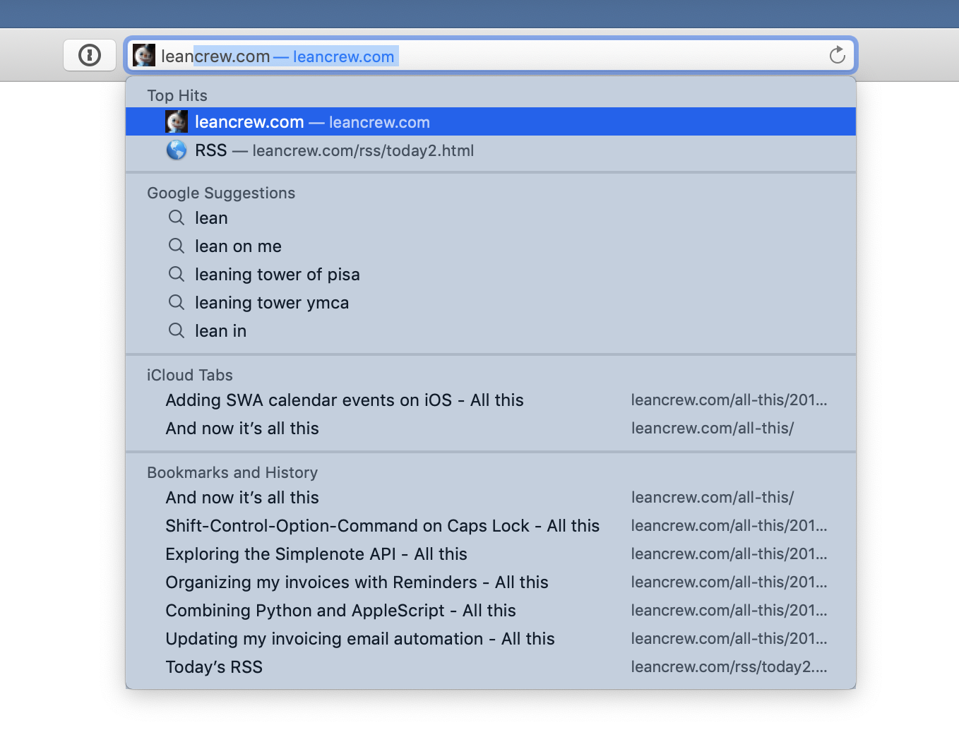
What bothers me most, though, is that transparency has no real meaning on the Mac. It’s just decoration, not tied to any spatial sense that we expect from our experience with the physical world. For example, if you start typing in the URL field in Safari, the menu of suggestions that extends down from the URL field takes on a lighter version of the Desktop color, basically the same “semi-transparent” color in the background of the Dock.

This is ludicrous. This menu isn’t directly in front of the Desktop, it’s in front of the browser window (which is white because I was on Google’s home page when I took the screenshot). There is no reason for it to look like you’re seeing through it to the Desktop. That it looks that way screws up the sense of layering, especially since it still has that shadow around its border.
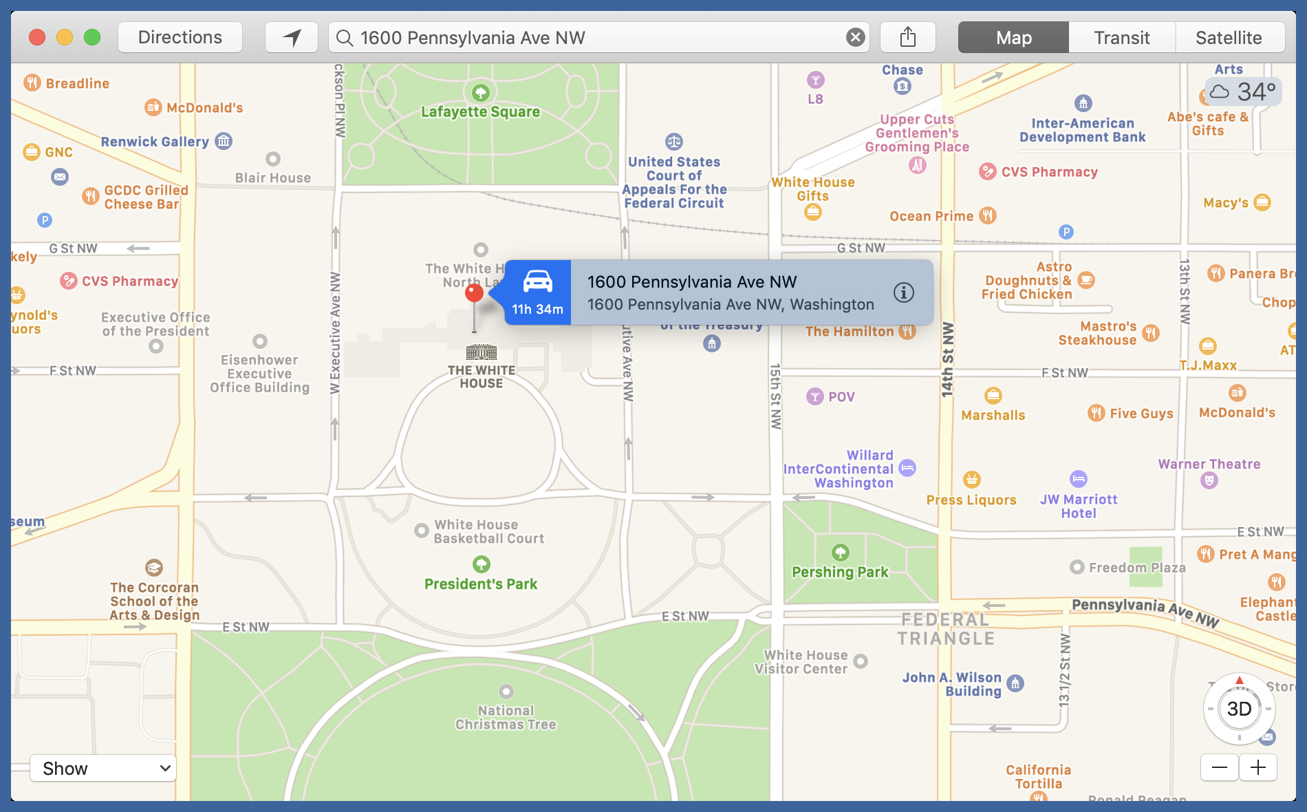
This absurd fake transparency isn’t confined to Safari. The little popup boxes that appear in Maps have the same muted Desktop coloring even though their conceptual position is floating on top of the map, not on top of the Desktop.

I can get rid of the ersatz transparency by checking the “Increase contrast” box in the Accessibility System Preference, but that also adds thicker border lines around windows and buttons, which I’d rather not have.
To summarize, there are three things wrong with transparency in Mojave:
- It doesn’t help. Unlike other graphical flourishes in macOS, like the genie effect, it doesn’t do anything to help the understand the conceptual stacking of the UI elements.
- It gets things wrong. It always “shows through” the Desktop, no matter what is directly behind the supposed transparent element.
- It can’t be turned off without messing with other UI features. Unlike previous version of macOS, “Reduce transparency” doesn’t reduce all the transparence. As best I can tell, the only thing “Reduce transparency” still does is make the menu bar and its menus opaque.
It’s possible there are some settings I can change, through either System Preferences or defaults write, to get the user interface I want. I have, after all, been using Mojave for only a few hours. But it’s bothersome that Apple has chosen a default look that takes away from the experience of using a Mac.
-
Several utilities walked me through upgrades after the final reboot of the system, an indication of how good most of the well-known Mac developers are at treating their customers. ↩
-
And yes, I know Mojave was released months ago and this is all old hat. But it’s new hat to me, so I’m going to talk about it. ↩
-
Apple removed this color from the standard list in Mojave, but I had the fortune of saving it (RGB values of 61, 101, and 156) in a couple of places. ↩
