Charting is such sweet sorrow
May 1, 2019 at 11:37 PM by Dr. Drang
Yesterday, Apple released its revenue figures for the Jan-Mar quarter. I wasn’t sure I’d bother making charts this time, but there were a couple of things I thought worth showing. I do think, though, that this will be the last time I’ll go through this exercise.
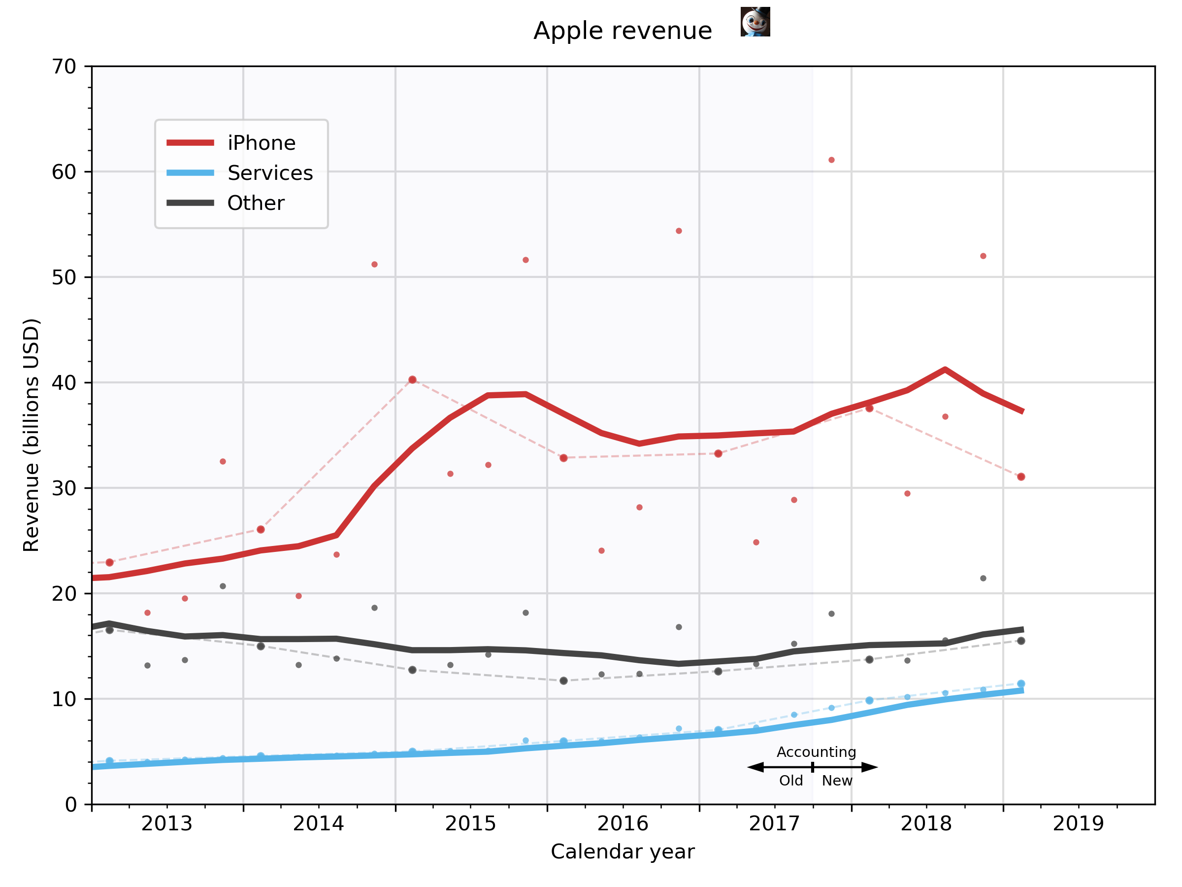
First, let’s split the company into three parts and see how they did. Last time, I split the company into iPhone and non-iPhone; this time, with Services making up 20% of the company revenue, I decided to promote it to a category plotted on its own in a graph that is still dominated by the iPhone.

As with previous charts, the dots represent the raw quarterly revenue figures, the light dashed lines connect the Jan-Mar quarters of previous years (a way of seeing year-over-year performance), and the thicker solid lines represent the four-quarter (trailing) moving averages. “Other” is the “everything else” category, including Macs, iPads, Apple Watches, AirPods, HomePods, and so on. The background color difference in 2017 represents the time at which Apple changed the way it divvied up revenue between hardware and services.
The first thing to note is that iPhone revenue stunk. You have to go back to 2014, when the iPhone 5S was the flagship, to find a lower Q21 revenue figure. And yet I read that Apple’s stock went up 5% yesterday because Wall Street thought the numbers would be worse.
The second thing that jumps out as me is that Services, unlike everything else, does not have huge seasonal swings in revenue. This is probably something we all would have guessed, but it’s nice to see that our guesses were right. It’s also clear that the lack of seasonality means the moving average line, because it’s a trailing MA, will always run below the raw data. It’s time for a better smoothing algorithm.
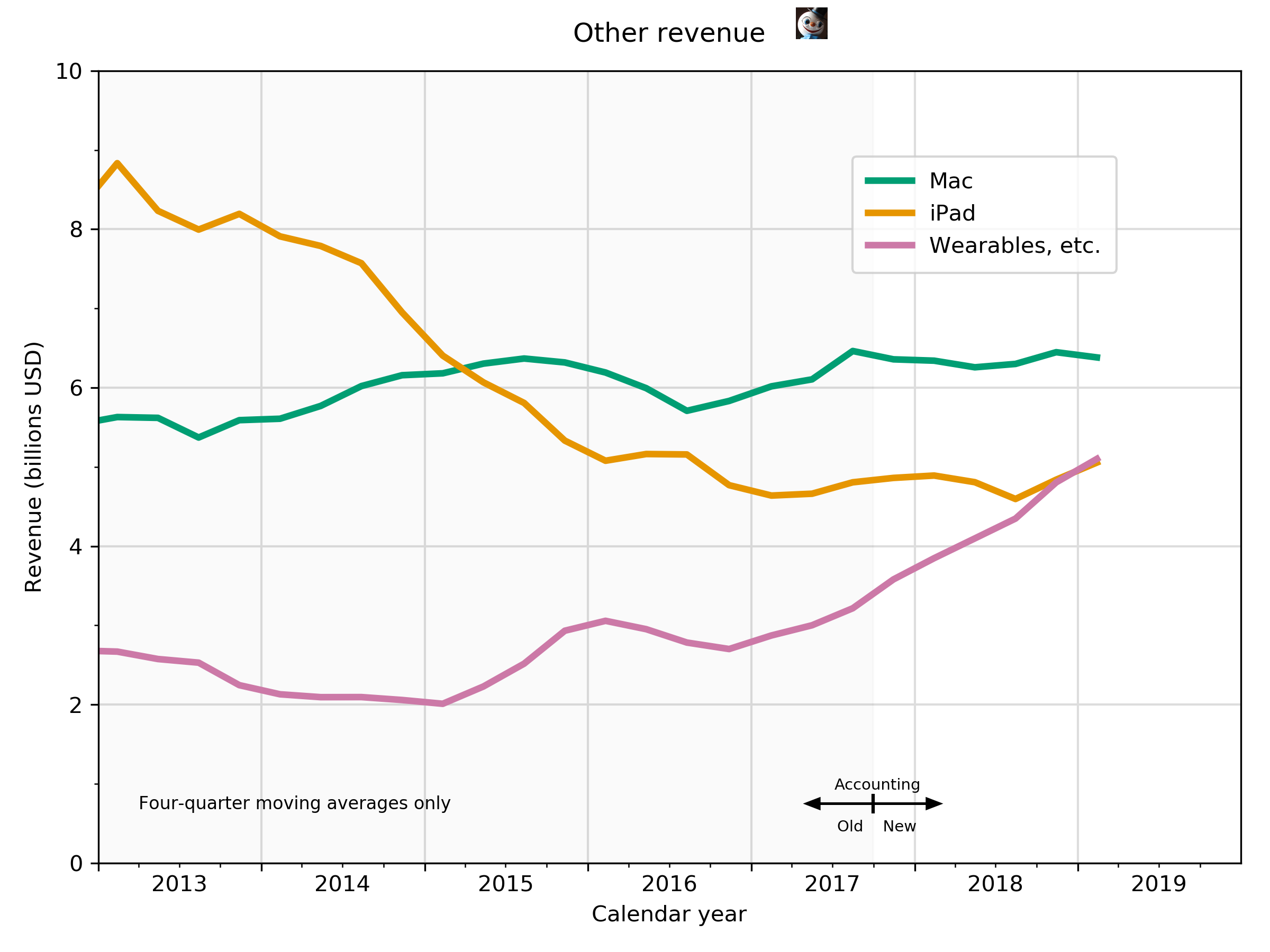
Now let’s take the Other category and split it up. Unfortunately, Apple limits the granularity of its reporting, so the best we can do is break it into three parts: Mac, iPad, and the miscellaneous category it calls “Wearables, Home and Accessories” (no serial comma).

I don’t show the raw revenue figures here because it would be too messy.
The main takeaway from this graph is that despite the iPad’s recent growth, it’s still being overtaken by the Wearables. It looks like the Mac will be next, but I doubt I’ll be plotting the data when that happens.
There are a couple of reasons I think it’s time for me to hang up my Apple graphing spurs:
- Six Colors and MacStories have this beat covered more fully than I would ever want to. I started doing this four years ago because none of the Apple bloggers at the time were smoothing the data to make trends easier to see. But they’ve been using moving averages for years now, and while I still think my graphs do a better job of comparing a lot data in a small space while not getting cluttered, that small advantage isn’t worth maintaining.
- Apple stopped reporting unit sales last quarter, and I just don’t care as much about revenue as I do (did) about unit sales. I know they’re tied together, but the emphasis has been turned around. Unit sales are about what Apple is doing for us; revenue is about what we’re doing for Apple.
-
While I prefer to plot results using calendar quarters, sometimes it’s easier to just give up and refer to Apple’s stupid fiscal quarters. ↩
