Commenting on Shortcuts, Part 1
January 25, 2020 at 10:59 AM by Dr. Drang
A couple of weeks ago, I said I was experimenting with a new way to present and comment on Shortcuts. I used it in that post and in my most recent one. Although I can’t say the workflow is in final form (is any automation really finished?), it’s complete enough to present.
In the past, I’ve presented Shortcuts by taking a series of screenshots and stitching them together with PicSew. Then I’ve explained how they work in a paragraph or two below the image. The problem with this approach is that the images are often quite long, which means the reader has to scroll back and forth a lot between the image and the description. Also, there’s no convenient way to refer to individual actions within a shortcut because Shortcuts doesn’t include step numbers in its editor.
I could be more diligent about adding comments to my shortcuts, but comments take up a lot of vertical space in a shortcut and I think they make it harder to understand because you see less of the logic at one time.1 I tend to use fewer comments when programming in Shortcuts than I do when programming in, say, Python for just this reason.
So what I’ve been doing recently is cutting up my shortcuts into individual steps and presenting them in a table with three columns: a left column for the step number, a middle column for the actions themselves, and a right column for a comment. Here’s an example for a shortcut that parses a list of Reminders to show me the total amount of my unpaid invoices:
| Step | Action | Comment |
|---|---|---|
| 1 | 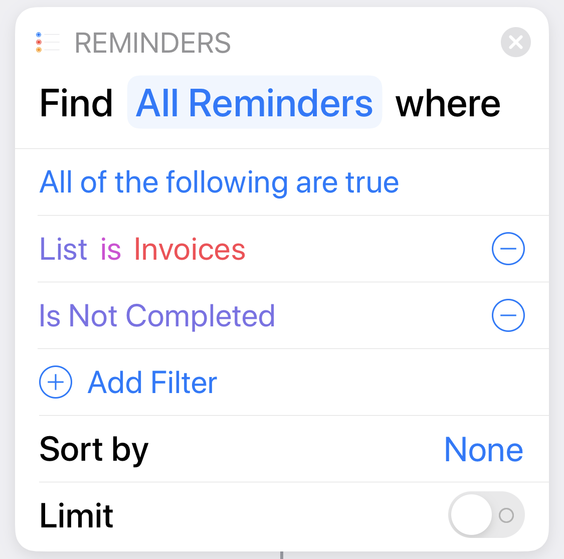 |
Get all the outstanding invoices. |
| 2 | 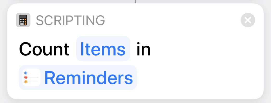 |
Count them. We’ll use this number later in the output. |
| 3 | 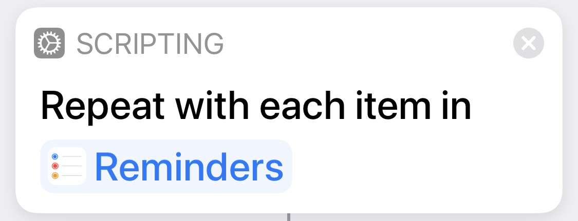 |
Loop through the unpaid invoices. |
| 4 | 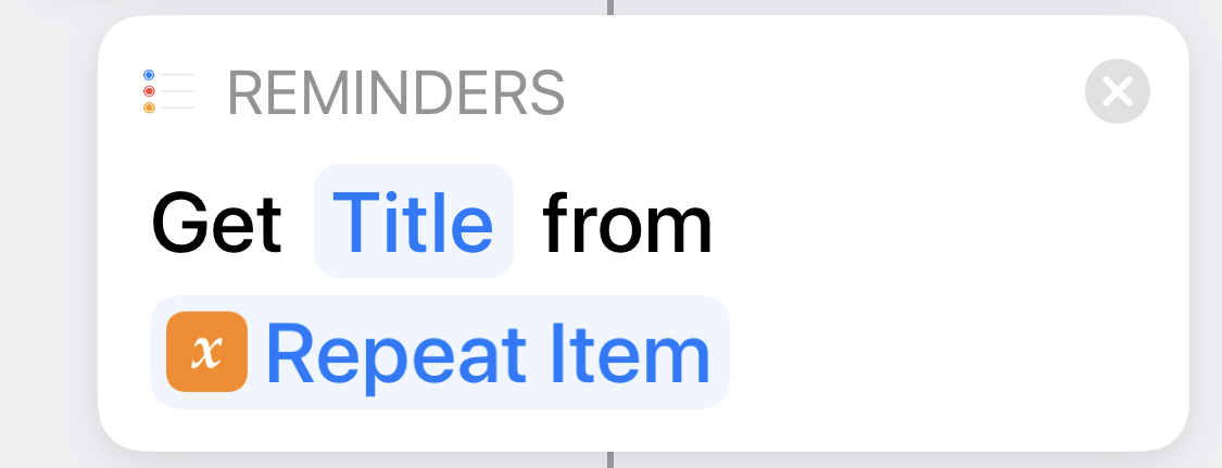 |
The Title of each reminder includes the amount in parentheses. |
| 5 | 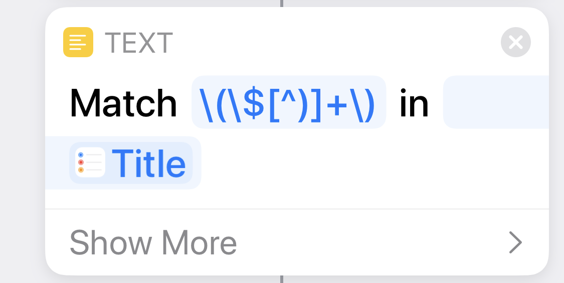 |
Extract the amount. This includes the parentheses and dollar sign. |
| 6 | 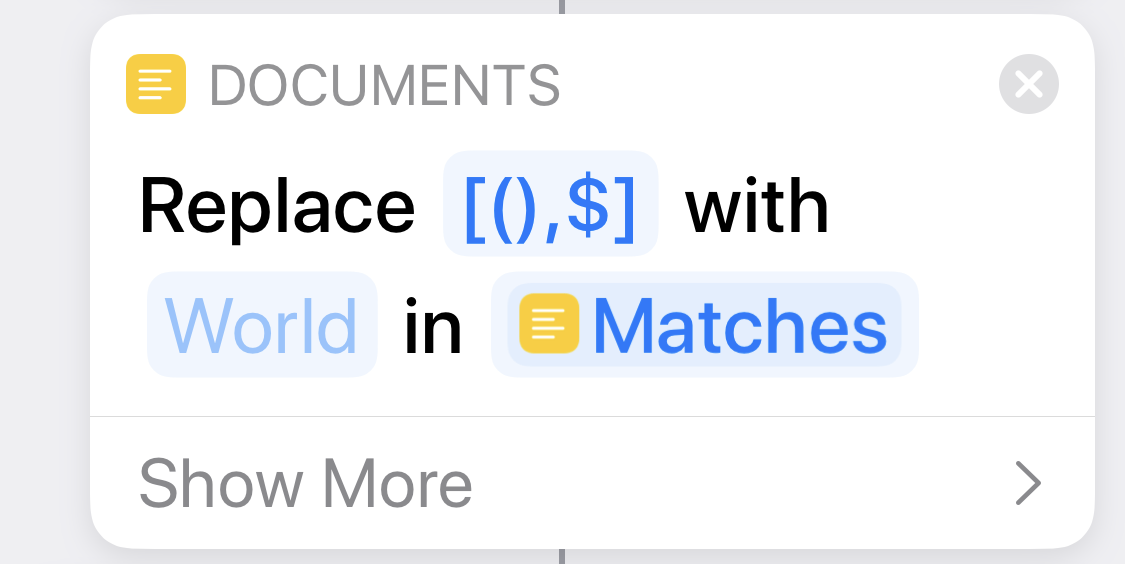 |
Delete the parentheses and dollar sign. |
| 7 |  |
When the loop ends, we have a list of all the amounts. |
| 8 | 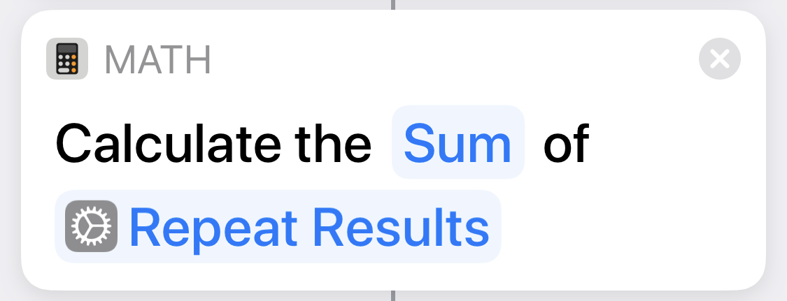 |
Add up the amounts. |
| 9 | 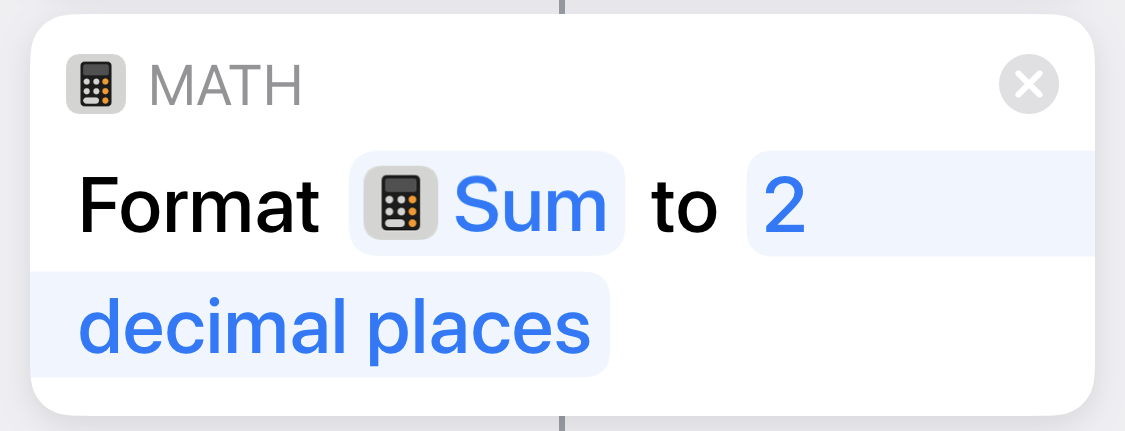 |
Make sure we show two decimal places even if the sum doesn’t need them. |
| 10 | 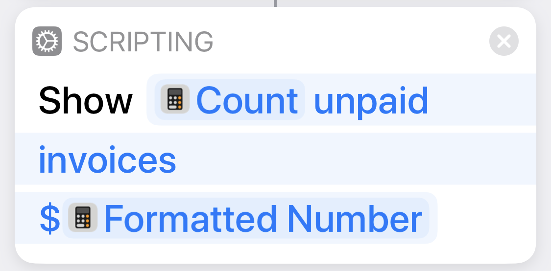 |
Display the number of unpaid invoices from Step 2 and the total amount. |
If the shortcut is meant to be run from the Share Sheet, it starts with a Step 0 that shows what input the shortcut accepts. This example doesn’t have that, but many of my shortcuts do.
The HTML for the table is pretty straightforward:
xml:
<table width="100%">
<tr><th>Step</th><th>Action</th><th>Comment</th></tr>
<tr>
  <td>1</td>
  <td width="50%"><img width="100%" src="https://leancrew.com/all-this/images2020/20200125-Unpaid%20Step%2001.png" alt="Unpaid Step 01" title="Unpaid Step 01" /></td>
  <td>Get all the outstanding invoices.</td>
</tr>
<tr>
  <td>2</td>
  <td width="50%"><img width="100%" src="https://leancrew.com/all-this/images2020/20200125-Unpaid%20Step%2002.png" alt="Unpaid Step 02" title="Unpaid Step 02" /></td>
  <td>Count them. We'll use this number later in the output.</td>
</tr>

[several more rows…]

<tr>
  <td>9</td>
  <td width="50%"><img width="100%" src="https://leancrew.com/all-this/images2020/20200125-Unpaid%20Step%2009.png" alt="Unpaid Step 09" title="Unpaid Step 09" /></td>
  <td>Make sure we show two decimal places even if the sum doesn't need them.</td>
</tr>
<tr>
  <td>10</td>
  <td width="50%"><img width="100%" src="https://leancrew.com/all-this/images2020/20200125-Unpaid%20Step%2010.png" alt="Unpaid Step 10" title="Unpaid Step 10" /></td>
  <td>Display the number of unpaid invoices from Step 2 and the total amount.</td>
</tr>
</table>
Here in the early stages of development, I’m explicitly including width attributes, but I suspect I’ll be switching to classes that can be controlled by CSS. The site already has some generic CSS that give tables a certain look; I’ll simply have to extend that.
To generate this table, and the images for the individual steps it contains, I run a script called splitflow. My workflow consists of
Taking a series of screenshots of the shortcut on my iPhone and saving them to the folder on my Mac that contains
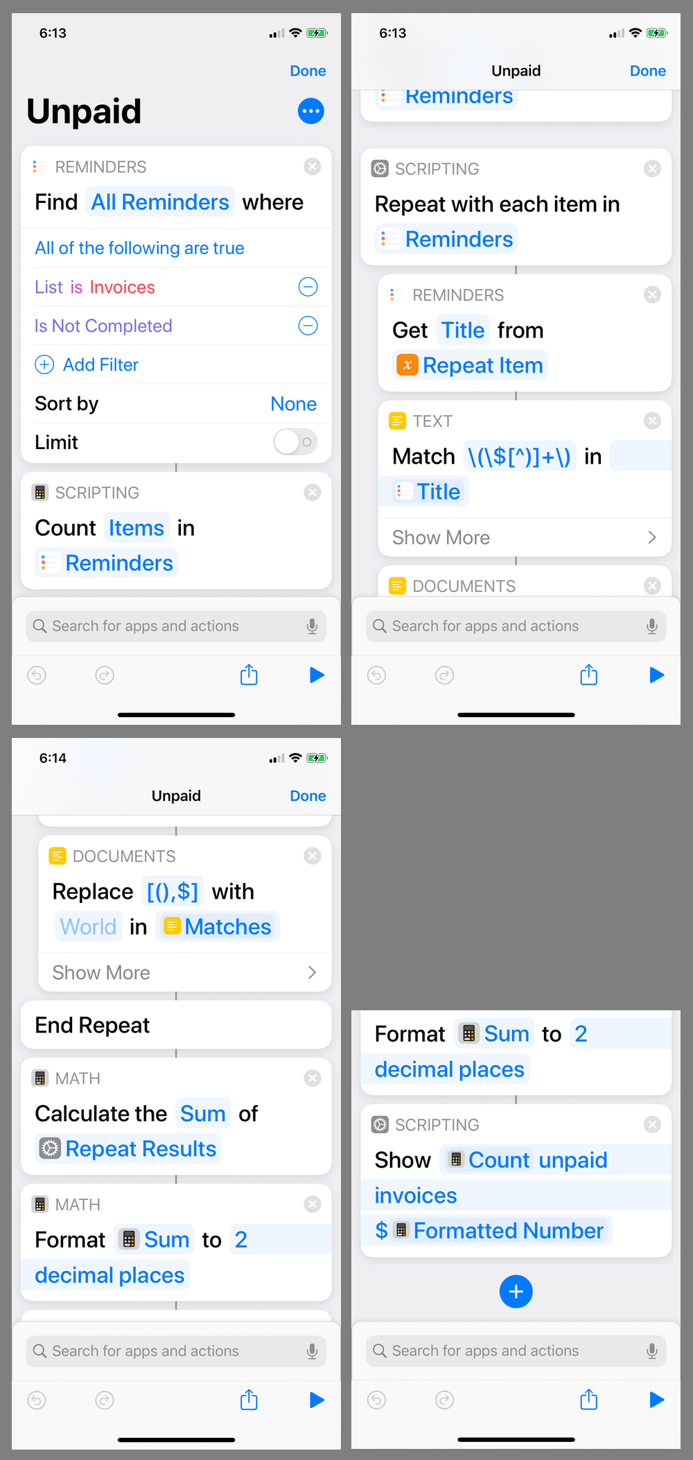
splitflowand a few ancillary image files. iOS now has a option that makes this simple. I give the screenshots sequential names, like A1, A2, A3, etc. to make the next step easier.The key is to ensure that each step can be seen in full in one, and only one, screenshot. This often means the last screenshot will have to be cropped at the top to avoid duplicating one of the actions. Here are the four screenshots used for the shortcut shown above:
Moving to my Mac, opening Terminal in the
splitflowdirectory, and running thesplitflowcommand on those images. This creates the images for each step of the shortcut and prints out the HTML for the table. The command line looks like this:splitflow -t Unpaid A*The
-toption sets the “title.” This string is included in each output image’s filename, coming between the date and the step number. For the shortcut above, the filenames are20200125-Unpaid Step 01.png 20200125-Unpaid Step 02.png … 20200125-Unpaid Step 09.png 20200125-Unpaid Step 10.pngand the
srcattributes in the table’s<img>tags refer to these files. If the title is more than a single word, it must be enclosed by quotation marks in the command line.- Uploading the image files to the server.
- Pasting the HTML for the table into the blog post and editing the comments (which
splitflowcreates as generic placeholders) to reflect what each action does.
As is often the case, it takes me longer to describe what I do than to actually do it.
By the way, in case you’re wondering, I do still write my posts in Markdown and the flavor of Markdown I use does support tables. But I can’t control the width of the columns using Markdown-style tables, so it’s better to go straight to HTML. One of Gruber’s smartest moves was to recognize that he couldn’t cover everything and allow HTML to be embedded in Markdown.
To keep this post to a reasonable length, I’m going to save the details of splitflow for another day. But I will give a brief outline of how it works.
The hard part, of course, is identifying the individual steps within the screenshots. Luckily for me, some very smart people did the difficult work by creating the OpenCV library and the Python interface to it. All I had to do was read the documentation, create some template images to search for, and then experiment with the matching parameters until I got something that worked.
Here are the three template images that splitflow searches for in the screenshots.

These were all cut from screenshots of a shortcut. The Accepts image on the left is what we see in every shortcut that runs from the Share Sheet. It’s always the same height, so we can search for the entire left portion of it. The other two are the left top and left bottom corners of actions. Because actions can be of various heights, we need to search for both the top and the bottom to grab the entire action.
Many of you could write your own version of splitflow right now; all you need is the link to OpenCV. But I’ll go through what I did in the next post.
-
This is a problem with any visual programming environment once the code gets beyond a few steps. ↩
