Not fully transparent
July 1, 2020 at 7:34 AM by Dr. Drang
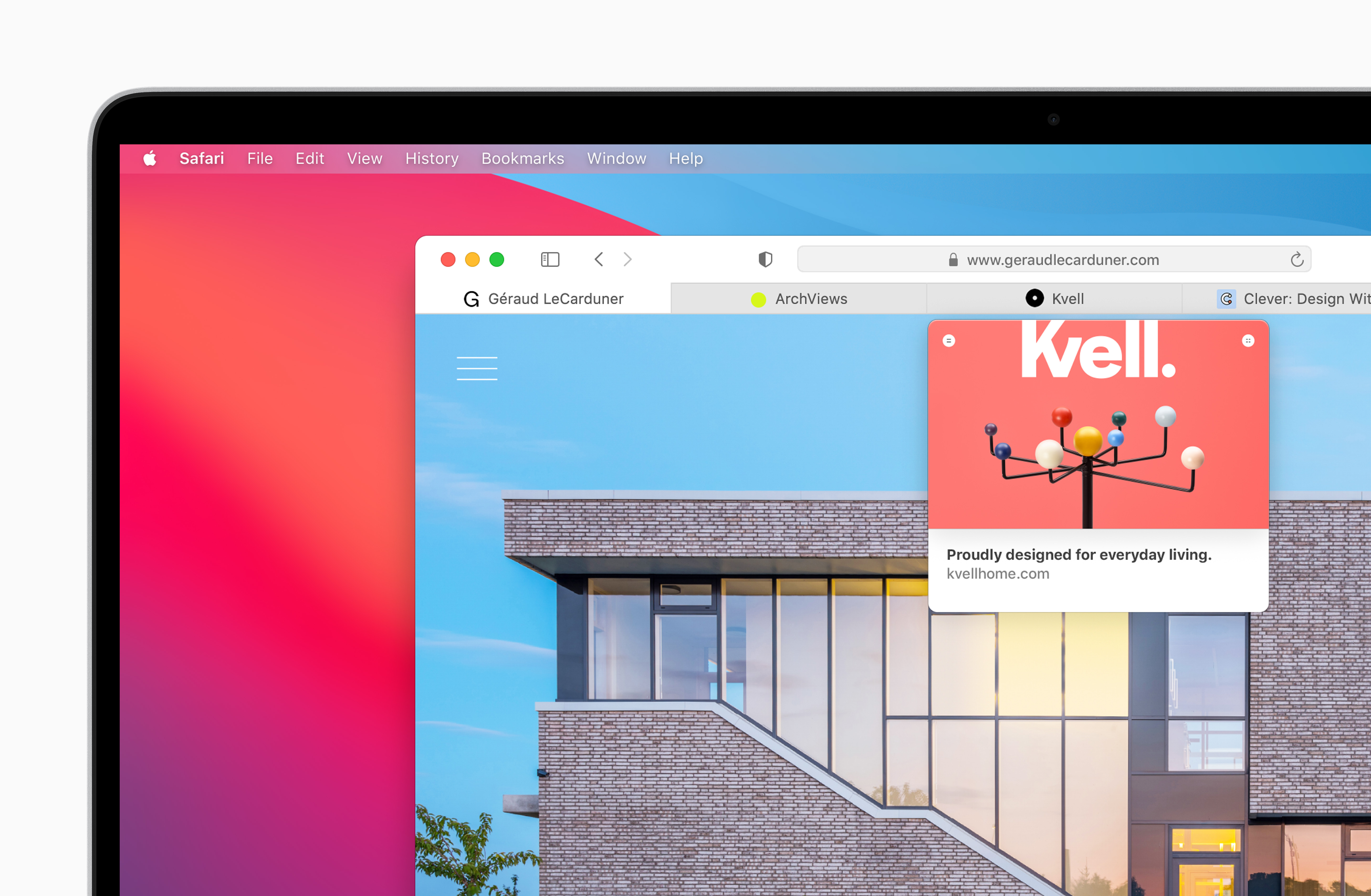
Has anyone explained why Apple is touting the translucent menu bar in Big Sur? Craig Federighi pointed it out in the keynote last week, and either Bob Borchers or Ronak Shah (I can’t remember which) mentioned it their interview on this week’s Upgrade.

It is, of course, an awful feature, an impediment to usability because it makes the menu bar harder to read. Even Apple’s own PR screenshots have terrible contrast. But Apple has obviously abandoned “design is how it works” in favor of “that looks so cool, dude,”1 so that’s not the reason I’m surprised to be hearing about it.
No, I’m surprised to be hearing about it now because the translucent menu bar is a really old feature. It was introduced in Leopard, which means it’s been around almost as long as Intel Macs… and is clearly going to outlive them.
So I’m suspicious of this promotion of an old feature as if it were new. When Apple sends people out to talk, it expects them to stay on-message, and the translucent menu bar is apparently part of the message of Big Sur. And because I can’t figure out why they’re doing this, I feel myself sinking into paranoia (they’re not going to take away the Accessibility setting that turns this abomination off, are they?) and Kremlinology.
Update Jul 1, 2020 12:20 PM Jason Snell tells me the difference in Big Sur’s menu bar is that it’s even closer to transparent than before. Great. At least we can still turn it off.
Update Jul 1, 2020 11:45 PM I see, from Michael Tsai’s link that Craig Hockenberry has been tracking the menu bar transparency fiasco from the beginning.
-
Lots of Apple’s design decisions—Dark Mode comes to mind—suggest to me that it’s been taken over by people who, when they were teenagers, were big fans of the Enlightenment window manager and whose taste has not improved with age. ↩
