Things and 1Password
August 22, 2021 at 3:17 PM by Dr. Drang
A couple of applications have announced changes recently, and I have thoughts.
First, when the addition of Markdown to Things was announced, I was indifferent. I seldom add notes to tasks, and even when I do, it’s never more than a few words—not enough to take advantage of Markdown formatting. And after using the newer version of Things for about a week, I still don’t see any reason for me to add more extensive notes to tasks.
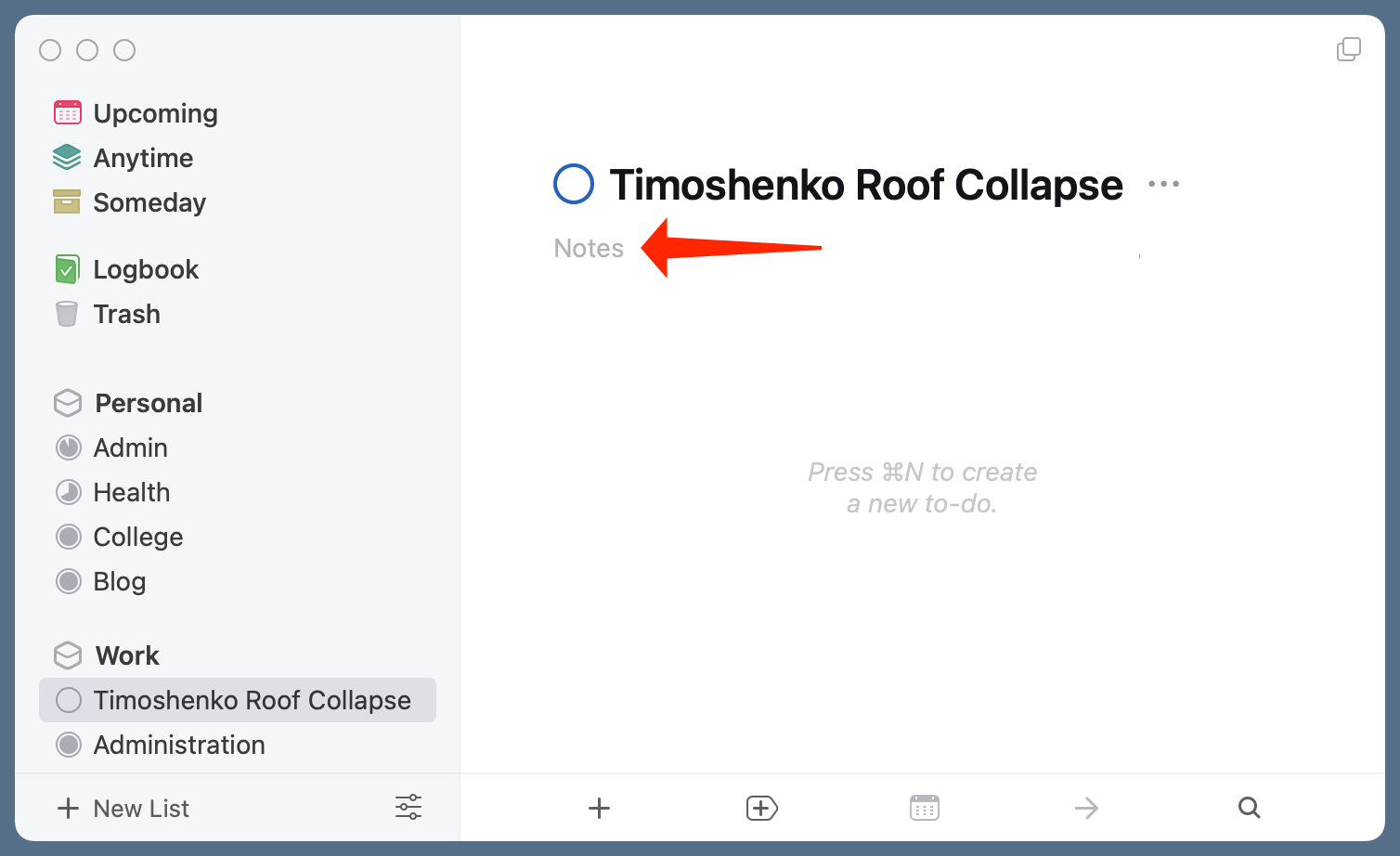
But the first time I created a new project after updating Things, I realized where Markdown could help me: to summarize the project in its notes field.

This is where I can put the project budget, the name of the client, and any other relevant information. It’s not as though I don’t have this project summary information elsewhere, but that’s the problem: it’s elsewhere—usually several elsewheres. Putting it all together in the place I use to track the project makes it much more convenient. I could’ve been doing this all along, of course, but because the formatting of notes was limited, it never occurred to me to do so.
There is one important Markdown feature missing. Cultured Code addresses it in the FAQ:
Can I hide links behind text? – Not at this time. Links will be displayed at full length.
That’s too bad, because I’d like to have links to certain documents in the project summary, but I’d rather not clutter my notes with long, messy links like
file:///Users/drdrang/Library/ Mobile%20Documents/com~apple~CloudDocs/ projects/timoshenko.roof/proposal/proposal.pdf
in which the entire URL is visible.
The second app is 1Password. An awful lot of digital ink has been spilled recently regarding its upcoming shift to Electron for handling its user interface on the Mac. I suppose I shouldn’t have any opinions about this, as I left 1Password for iCloud Keychain over two years ago, but I couldn’t help wondering about the fuss.
Look, I’ve been a Mac user since 1985, so I understand the desire to go to war to defend native user interfaces over lowest-common-denominator, weblike interfaces. But I wouldn’t choose 1Password as the hill to die on.
Maybe I was just a weird user, but I almost never had the full 1Password app open. My interaction with it was mostly through very simple dialog boxes, as it asked me if I wanted to save new login credentials or insert old ones. What I remember most about 1Password—and what was one of its best features—is that I didn’t interact with it much at all.
Now, if the new 1Password chews up memory and processor cycles as it runs in the background, that’s worth complaining about. The backend portions written in Rust shouldn’t create bottlenecks, but we’ll see how that goes as it moves from beta into production.
Update 08/22/2021 3:12 PM
This is an unusual update, as I’m writing it before posting. But I just listened to the second half of this week’s Connected and Myke made the same point about 1Password being an app that doesn’t get a lot of user interaction. So I could either dump a post that I’ve been writing off and on for nearly a week (I am a slow writer, but most of the delays in getting this finished had to do with a short vacation and moving a kid back to college), or go ahead and publish it while acknowledging Myke’s primacy.
