Recall this analysis
October 4, 2021 at 10:43 AM by Dr. Drang
We’re now several years into the trend of “data journalism,” and I’m still not sure whether I like it. On the one hand, it’s nice to see reporters writing about numbers; on the other hand, numbers typically aren’t their strong suit. Too often we get articles whose sole purpose seems to be to show off some colorful graphs.
Last Thursday, the San Francisco Chronicle published this article, entitled “If California was made up of just these 35 counties, Gavin Newsom would have been recalled.” That a similarly-titled article could be written about almost any election—”Some people voted for, others against”—didn’t prevent the Chronicle from going with this dog-bites-man story.
The article starts with this long bar chart of counties:

The counties are ordered according to their percent of Yes votes (in favor of recall), and the bars represent the cumulative percentage of Yes and No votes as we include the votes of each county in turn. If you think that’s a contrived and tortuous way to present the data, you’re not alone. The reporter, Nami Sumida, spent five paragraphs explaining it, and I’ll bet those paragraphs were written at the insistence of confused and math-averse editors.
The flip from cumulative Yes to cumulative No comes when we add the Ventura County vote. If you put the effort into counting down the list, Lassen through San Diego is 35 counties, hence the title of the piece.
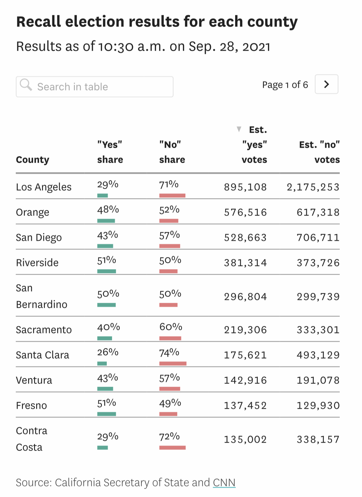
If you’d like to see the numerical results for each county, the article gives them to you in a series of tables that look like this:

The colors in this table made me see red. Or maybe green. Using the same color to represent contradictory data is just inexcusably sloppy work. Maybe if the editors hadn’t been so confused by the construction of the bar chart, they would have noticed that Sumida flipped the meaning of red and green in the middle of the article.
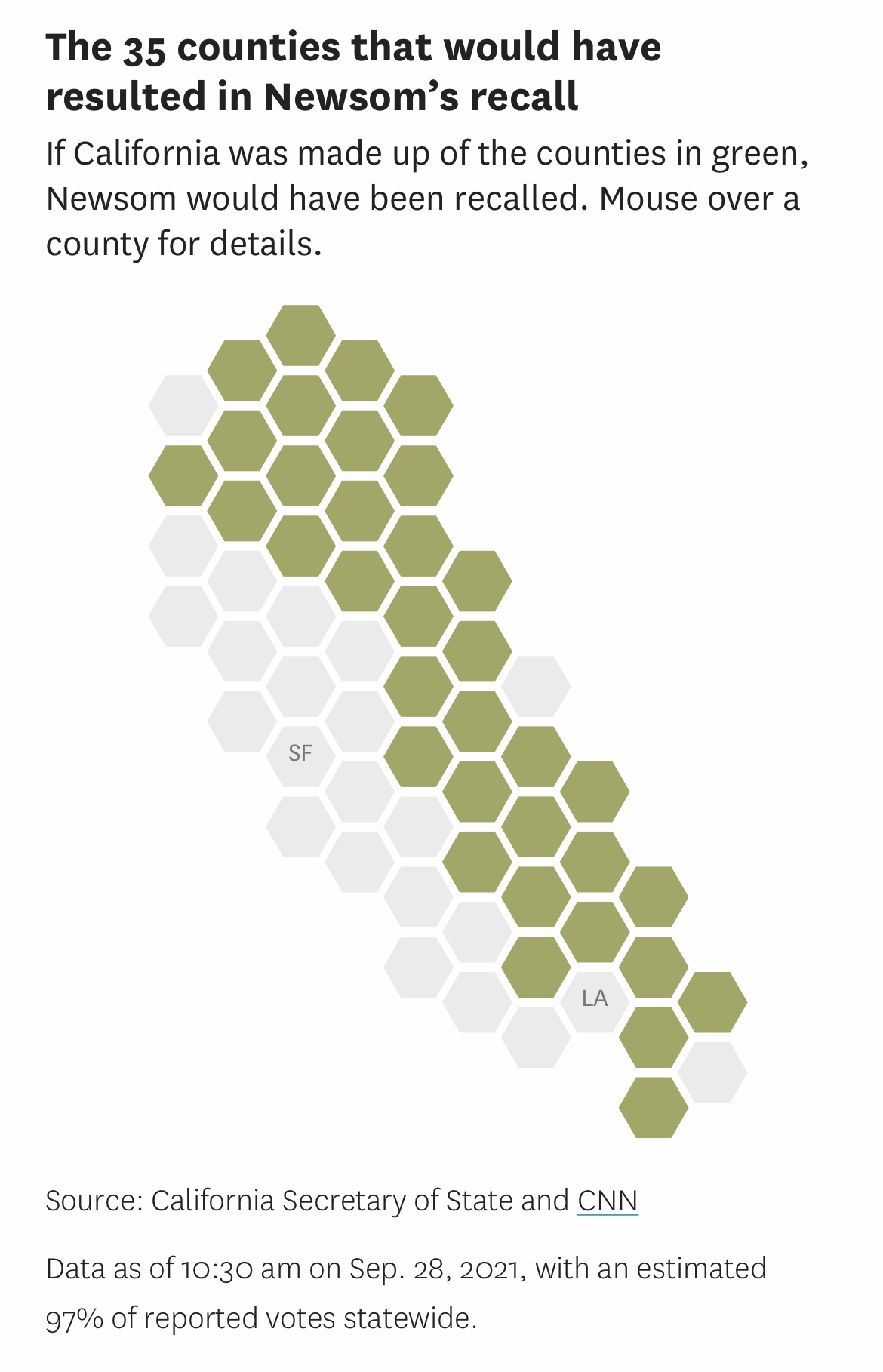
The article also includes this stylized map of California, with each of the counties represented by a hexagon in its approximate geographic location and the titular 35 counties tinted.1

This use of equal-sized hexagons in place of actual geographic shapes has become a popular way to make colored maps without over-representing large areas. In this case, of course, it has the effect of under-representing populous areas, making it seem as if each county counts as much as every other county in the recall vote. This will be a surprise to both the 10,000,000 residents of Los Angeles County and the 1,200 residents of Alpine County.
You might look at the map and think that 35 counties had a majority of Yes votes. I wouldn’t blame you if you did. That’s normally how people use color when showing election results on a map. But six of these counties—San Diego, Mono, San Joaquin, Nevada, Orange, and San Bernardino—had a majority of No votes. It’s just that if you add their votes to the 29 counties that really did have a majority of Yes votes, you still end up with a Yes majority.
Are there other ways to take a subset of California’s 58 counties and get a majority of votes in favor of recall? God, yes. Even if we restrict ourselves to subsets of 35, there are (that’s 8.8 quadrillion) ways to combine 58 things, taking them 35 at a time. Only a small fraction of these combinations will yield a majority of Yes votes, but even a small fraction of 8.8 quadrillion is a big number. Taking the election results (as of October 1) from the California Secretary of State’s office and using the combinations function from Python’s itertools module, I wrote a short bit of brute force code and in a few minutes found over ten million combinations that did the trick.2 And you don’t have to use a subset of exactly 35 counties.
This is perhaps the weirdest thing about the article. It’s clearly intended to slice up California in a way to show that Newsom is unpopular across some large chunk of the state. What other purpose is served by including counties that voted to retain him? So why not go for the gusto? Why not work out the largest number of counties which, when added together, would have arrived at a majority for recall?
It isn’t hard to do. Instead of ordering the counties by their percentage of Yes votes, order them by their margin of Yes votes. Like this:
| County | Yes | No | Margin | CMargin | |
|---|---|---|---|---|---|
| 1 | Kern | 117,584 | 73,781 | 43,803 | 43,803 |
| 2 | Shasta | 49,141 | 21,655 | 27,486 | 71,289 |
| 3 | Placer | 103,192 | 80,088 | 23,104 | 94,393 |
| 4 | Tulare | 63,680 | 40,640 | 23,040 | 117,433 |
| 5 | El Dorado | 58,062 | 39,743 | 18,319 | 135,752 |
| 6 | Stanislaus | 81,456 | 68,085 | 13,371 | 149,123 |
| 7 | Tehama | 15,958 | 6,186 | 9,772 | 158,895 |
| 8 | Madera | 25,638 | 16,233 | 9,405 | 168,300 |
| 9 | Sutter | 20,216 | 11,484 | 8,732 | 177,032 |
| 10 | Kings | 19,710 | 11,242 | 8,468 | 185,500 |
| 11 | Riverside | 362,958 | 355,630 | 7,328 | 192,828 |
| 12 | Fresno | 130,580 | 123,433 | 7,147 | 199,975 |
| 13 | Yuba | 14,839 | 7,784 | 7,055 | 207,030 |
| 14 | Butte | 42,703 | 35,707 | 6,996 | 214,026 |
| 15 | Lassen | 8,532 | 1,600 | 6,932 | 220,958 |
| 16 | Calaveras | 14,559 | 8,018 | 6,541 | 227,499 |
| 17 | Tuolumne | 15,832 | 9,850 | 5,982 | 233,481 |
| 18 | Amador | 12,895 | 6,957 | 5,938 | 239,419 |
| 19 | Siskiyou | 11,282 | 6,951 | 4,331 | 243,750 |
| 20 | Glenn | 6,317 | 2,479 | 3,838 | 247,588 |
| 21 | Merced | 29,926 | 27,517 | 2,409 | 249,997 |
| 22 | Plumas | 5,106 | 3,008 | 2,098 | 252,095 |
| 23 | Mariposa | 5,375 | 3,376 | 1,999 | 254,094 |
| 24 | Colusa | 3,977 | 1,996 | 1,981 | 256,075 |
| 25 | Modoc | 2,508 | 706 | 1,802 | 257,877 |
| 26 | Del Norte | 5,137 | 3,454 | 1,683 | 259,560 |
| 27 | Inyo | 4,128 | 3,496 | 632 | 260,192 |
| 28 | Trinity | 2,699 | 2,106 | 593 | 260,785 |
| 29 | Sierra | 1,064 | 616 | 448 | 261,233 |
| 30 | Alpine | 218 | 340 | -122 | 261,111 |
| 31 | Mono | 2,186 | 2,719 | -533 | 260,578 |
| 32 | Lake | 3,728 | 5,605 | -1,877 | 258,701 |
| 33 | San Bernardino | 282,659 | 285,596 | -2,937 | 255,764 |
| 34 | San Benito | 9,181 | 12,595 | -3,414 | 252,350 |
| 35 | Nevada | 25,273 | 29,702 | -4,429 | 247,921 |
| 36 | Imperial | 12,193 | 18,210 | -6,017 | 241,904 |
| 37 | Mendocino | 11,870 | 21,852 | -9,982 | 231,922 |
| 38 | San Luis Obispo | 47,882 | 59,364 | -11,482 | 220,440 |
| 39 | Humboldt | 15,442 | 28,810 | -13,368 | 207,072 |
| 40 | San Joaquin | 79,097 | 94,109 | -15,012 | 192,060 |
| 41 | Napa | 17,747 | 37,134 | -19,387 | 172,673 |
| 42 | Yolo | 24,273 | 51,405 | -27,132 | 145,541 |
| 43 | Santa Barbara | 57,355 | 92,905 | -35,550 | 109,991 |
| 44 | Orange | 547,685 | 586,457 | -38,772 | 71,219 |
| 45 | Solano | 58,277 | 97,839 | -39,562 | 31,657 |
| 46 | Monterey | 38,169 | 80,664 | -42,495 | -10,838 |
| 47 | Ventura | 136,389 | 182,158 | -45,769 | -56,607 |
| 48 | Santa Cruz | 24,188 | 86,669 | -62,481 | -119,088 |
| 49 | Marin | 22,701 | 105,508 | -82,807 | -201,895 |
| 50 | Sonoma | 45,443 | 142,866 | -97,423 | -299,318 |
| 51 | Sacramento | 218,432 | 327,482 | -109,050 | -408,368 |
| 52 | San Mateo | 64,250 | 226,891 | -162,641 | -571,009 |
| 53 | San Diego | 502,226 | 671,379 | -169,153 | -740,162 |
| 54 | Contra Costa | 128,259 | 321,242 | -192,983 | -933,145 |
| 55 | San Francisco | 47,053 | 292,180 | -245,127 | -1,178,272 |
| 56 | Santa Clara | 166,827 | 468,486 | -301,659 | -1,479,931 |
| 57 | Alameda | 108,081 | 465,901 | -357,820 | -1,837,751 |
| 58 | Los Angeles | 853,398 | 2,072,346 | -1,218,948 | -3,056,699 |
Each county’s CMargin column is the cumulative margin from the top of the list. By ordering them this way, the Yes margin gets nibbled away as slowly as possible as you move down the list. As you can see, if the Chronicle had ordered the counties this way, they could’ve written an article with the headline “If California was made up of just these 45 counties, Gavin Newsom would have been recalled.”
And we still wouldn’t be any smarter.
