Integers, decibels, and graphs
August 20, 2022 at 2:14 PM by Dr. Drang
Earlier this week, John Cook wrote a couple of posts (first, second) about decibels and their analog to bases other than 10. In the second post, he included a graph for which he has some reservations. I thought I’d see if I could improve the graph. I think I did, but I have my own reservations.
First, let’s remind ourselves of what decibels are. Decibels are a way of representing the ratio of signal strengths on a logarithmic scale. The ratio of the powers of two signals, , is said to be decibels when that ratio is
An interesting thing about the decibel scale is that the power ratio gets very close to integer values for certain values of . Here’s a table where I’ve highlighted the four ratios that are pretty close to integers.
| Decibels, n | Power ratio, r |
|---|---|
| 1 | 1.259 |
| 2 | 1.585 |
| 3 | 1.995 |
| 4 | 2.512 |
| 5 | 3.162 |
| 6 | 3.981 |
| 7 | 5.012 |
| 8 | 6.310 |
| 9 | 7.943 |
This relatively large set of near-integers sparked Cook’s curiosity.
Is base 10 unique in this regard? If we were to look at the analogs of decibels in other bases, would we see a higher or lower proportion of near integers? For example, we could look at the base 12 (duodecimal) analog of decibels, or “duodecibels” for short. Or we could look at the base 16 analog “hexadecibels.”
For these analog decibels, which I will hereby refer to as “decibels” (in quotes), the equation for the power ratio is
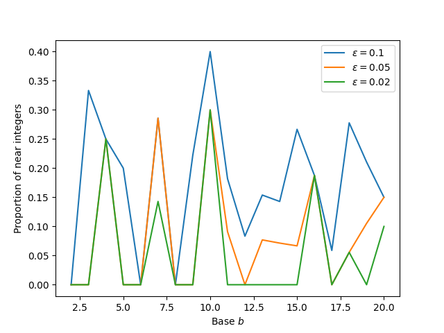
Cook calculated the ratios for a large number of bases and counted how many were close to being integers. “Close” being a matter of taste, he counted for three levels of closeness: within 0.10 of an integer, within 0.05 of an integer, and within 0.02 of an integer. He called these levels and produced this graph:

Cook uses matplotlib to make most of his graphs, and here we can see that he’s allowing its defaults to give the graph a couple of stylistic shortfalls. The bases are all integers, but the x-axis tick labels are in multiples of 2.5 units. The legend doesn’t use consistent numbers of decimal places. But these are small things, easily fixed. Cook’s reservation is about using connecting lines.
I first made this plot using discrete markers rather than connected lines. Generally that’s a good thing to do for functions only defined on integers. But the plot was hard to read. Connecting the lines makes it easier to see which values correspond to the same value of ε.
It is easier to see what’s going on than if he’d just done a scatter plot, but there are still problems, mainly because of the common results for different values of and the order of plotting that covers up certain parts of the orange and blue plots.
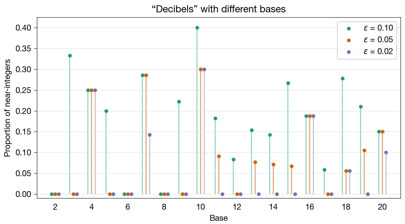
My fix, to avoid both connecting lines and cover-ups, was to apply a technique that Kieran Healy often uses to good effect: jittering. Or something very like jittering, anyway. Because the bases are discrete and our audience knows they take on only integer values, we can shift them horizontally just a bit for each value of without fear of confusion. Here’s what I came up with:

The change in horizontal position for each value of prevents overlap. The light vertical lines connect the results to the appropriate base, and by not drawing tick marks on the horizontal axis, we avoid any suggestion that the blue and purple values represent non-integer bases. In a sense, we’re treating the bases as categories and plotting columns for each .
I did try this first with columns only, but it didn’t make a strong enough visual impression, mainly because the columns had to be thin to stay clustered near the integer bases. Adding the marker at the top of each column improved the appearance, and when I did that, I was able to lighten the color of the columns to make the markers the focal point while still providing a visual connection to integer bases. Here’s a closeup of the cluster at , where you can see the lightening clearly:

You’ll also notice that I changed the aspect ratio of the graph, stretching it out horizontally to give better separation of the clusters. Even with the stretching, there wasn’t enough room to include all the bases along the horizontal axis. Even without labels, I think it’s clear where the odd bases are.
Minor changes included shifting the colors to a “colorblind safe” set from ColorBrewer and adding light horizontal grid lines to make the values easier to read, especially those from the higher bases.
Overall, I think this addresses Cook’s proper concern with having connecting lines that don’t represent actual connections while still providing a clear indication that base 10 is special in how many near-integer powers it has. It is a bit on the anemic side, but I can’t make the markers any bigger without overlapping.
