Cleaning and graphing baseball data
February 28, 2023 at 12:16 PM by Dr. Drang
If any of you followed the link in yesterday’s post to my old writeup from a decade ago, you noticed that the scripts I wrote back then used the csv and cPickle libraries to read, filter, and store the baseball game data. Now I find it more natural to use pandas for all of that, so I wrote all new code instead of trying to edit the old stuff. This post goes through the steps.

First, I downloaded all the game data from Retrosheet. Back in 2012, I had to download each year’s data individually; yesterday, I was able get every year in a single zip file called gl1871_1922.zip. Unzipping this gave me a text file for each year, with names like gl1871.txt. Also, there were files for playoff, World Series, and All Star games.
I wanted to look at only regular season games from the “modern era.” The modern era could have lots of definitions, but I chose to start with 1920, the year Babe Ruth began playing with the Yankees. So I deleted all the files except gl1920.txt through gl2022.txt.
These are CSV files without a header line. Each line represents a game, and there are 161 fields in each line; Retrosheet has an index that describes the fields. The files have DOS/Windows (CRLF) linebreaks, so I started off by converting them to Unix (LF) linebreaks with
dos2unix gl*.txt
You can find the dos2unix utility in many places on the internet. I installed it via Homebrew.
Strictly speaking, this conversion wasn’t necessary, as none of my subsequent manipulations required Unix linebreaks, but I did it anyway because it’s safer in general to have Unix-style files when you’re going work in a Unix environment.
I concatenated all files together:
cat gl.*.txt > gl.csv
This gave me a 184 MB CSV file with no header line. There are command-line tools for manipulating and filtering such files, but I decided to use pandas because that’s what I’m most familiar with. I opened a Jupyter console session and ran these commands:
python:
import pandas as pd
df = pd.read_csv('gl.csv', header=None, parse_dates=[0], usecols=[0, 3, 4, 6, 7, 9, 10, 18])
df.to_csv('games.csv', index=False)
The second line imported just the fields I wanted into the dataframe. In order, they were the date (0), visiting team (3), visiting team league (4), home team (6), home team league (7), visiting team score (9), home team score (10), and game duration in minutes (18).1 If you compare these number to the Retrosheet index, you’ll see that my numbers are one less than the index’s. That’s because pandas starts its numbering at zero instead of one.
With this done, I had a new CSV file called games.csv that was a lot smaller, only 6.1 MB. This file had a header line of
0,3,4,6,7,9,10,18
which isn’t very useful. I opened it in BBEdit and edited that line to be
Date,VTeam,VLeague,HTeam,HLeague,VScore,HScore,Time
To get the statistics I wanted to plot, I opened a new Jupyter console session and ran these commands:
python:
1:  import pandas as pd
2:  from scipy.stats import scoreatpercentile
3:  df = pd.read_csv('games.csv', parse_dates=[0])
4:  df['Year'] = df.Date.dt.year
5:  for y in df.Year.unique():
6:    p25 = scoreatpercentile(df.Time[df.Year==y], 25)
7:    p50 = scoreatpercentile(df.Time[df.Year==y], 50)
8:    p75 = scoreatpercentile(df.Time[df.Year==y], 75)
9:    print(f'{y},{p25:.2f},{p50:.2f},{p75:.2f}')
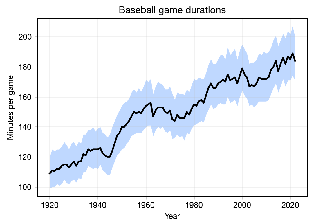
The dt.year property gets the year from the date. The scoreatpercentile function returns the value in the given list at the given percentile. So the loop in Lines 5–9 goes through each year, determines the 25th, 50th, and 75th percentile values for all the game durations of that year, and prints out the result in this form:
1920,99.00,109.00,120.00
1921,100.00,111.00,125.00
1922,100.00,110.50,124.00
1923,102.00,112.00,125.00
1924,101.00,112.00,125.00
1925,102.00,114.00,127.00
<etc>
I copied the output, saved it to a file called gametimes.csv, and added this header line:
Year,Q1,Median,Q3
This is the data I wanted to plot.
I didn’t trust myself to write the plotting code interactively, so I created this gametime-plot.py file:
python:
 1:  #!/usr/bin/env python3
 2:
 3:  import pandas as pd
 4:  import matplotlib.pyplot as plt
 5:
 6:  # Import game time data
 7:  df = pd.read_csv('gametimes.csv')
 8:
 9:  # Create the plot with a given size in inches
10:  fig, ax = plt.subplots(figsize=(6, 4))
11:
12:  # Add the interquartile range and the median
13:  plt.fill_between(df.Year, df.Q1, df.Q3, alpha=.25, linewidth=0, color='#0066ff')
14:  ax.plot(df.Year, df.Median, '-', color='black', lw=2)
15:
16:  # Gridlines and ticks
17:  ax.grid(linewidth=.5, axis='x', which='major', color='#bbbbbb', linestyle='-')
18:  ax.grid(linewidth=.5, axis='y', which='major', color='#bbbbbb', linestyle='-')
19:  ax.tick_params(which='both', width=.5)
20:
21:  # Title and axis labels
22:  plt.title('Baseball game durations')
23:  plt.xlabel('Year')
24:  plt.ylabel('Minutes per game')
25:
26:  # Save as PNG
27:  plt.savefig('20230227-Baseball game durations.png', format='png', dpi=200)
28:
I think this is pretty straightforward. Normally, my plotting scripts include commands for setting the tickmark placement, but in this case matplotlib’s defaults were just fine. The main work is done in Lines 13–14, where the fill_between shades in the interquartile range and plot runs a thick black line along the median.
I could’ve combined the code that calculates the percentiles with the code that does the plotting into a single script, but for a one-off like this, I usually prefer to take it one step at a time so I can check the intermediate results. Even if I had combined all the code here into a single script, it would have been simpler and easier to read than what I did back in 2012. That’s all due to pandas.
-
Most of these fields were unnecessary for what I was plotting, but I kept them in case I wanted to do some other analyses. ↩

