Weight and measure
November 21, 2024 at 12:53 PM by Dr. Drang
Back in the summer, I decided to get more serious about controlling my Type 2 diabetes, and I enrolled in a program that I found through my insurance company. Overall, things have gone quite well: my blood glucose is down, my weight is down, and I’ve been able to cut my medications to about a third of what I was taking before.
But nothing is perfect, and the iPhone app that comes with the program (which I’ll call the “program app” here) is kind of clumsy and limited. I don’t imagine that the most talented programmers work for the company that runs this program. For example, the app monitors my weight by syncing with a smart scale, but the way it graphs the data is just silly:
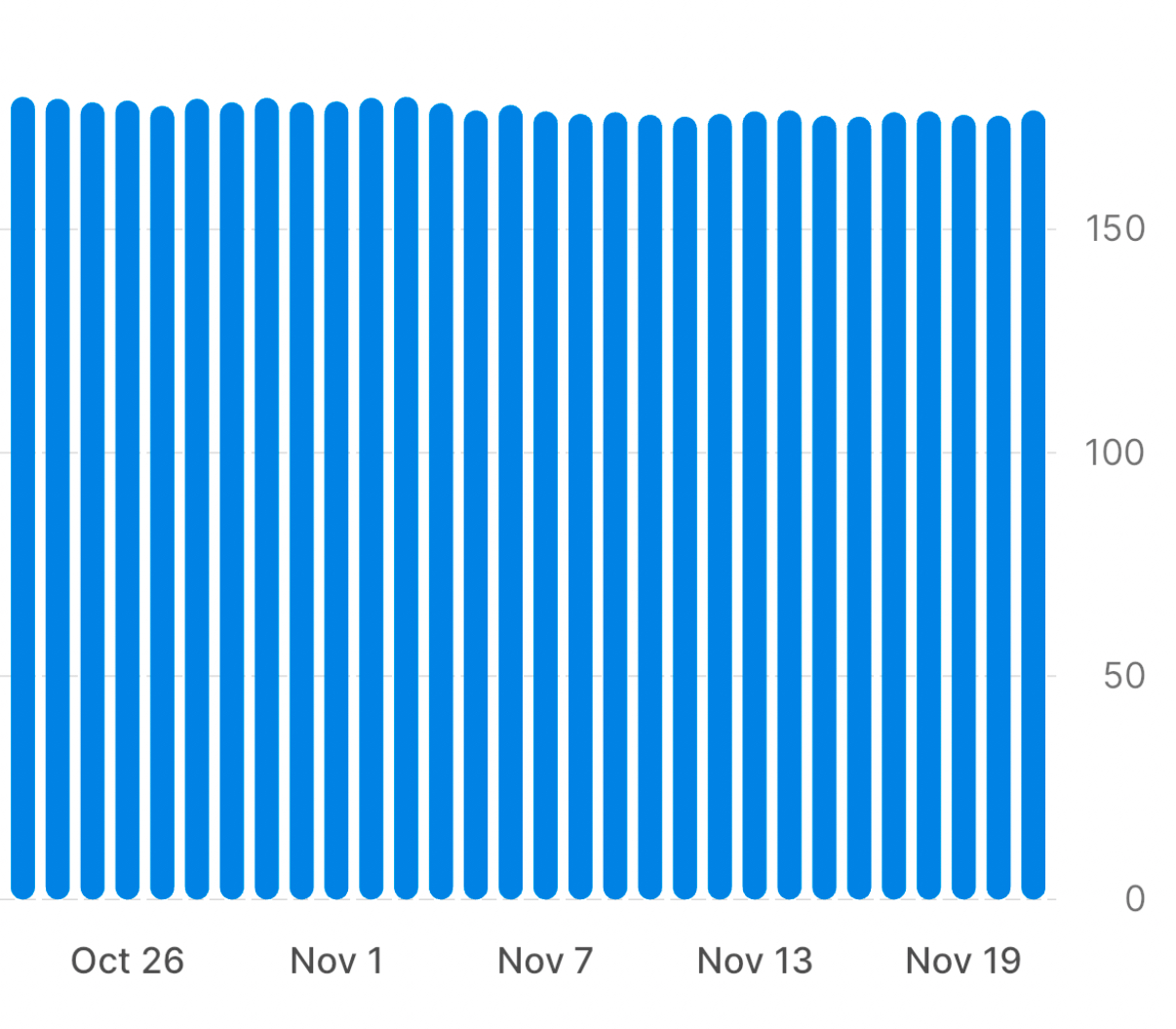
It doesn’t let you look at more than 30 days at a time, and it insists on starting the vertical axis at zero. So you can see only a narrow window of your history and all of your weight loss is jammed up at the top of the chart, making it seem like you accomplished very little.
The graph in the app is interactive, so touching on a column in the chart will show you your weight for that day, but the point of graphing data is to tell the story in the graph itself. Interactive features like that are a crutch commonly used nowadays to try to cover up for poor graph design.
What I want is something that looks like this:
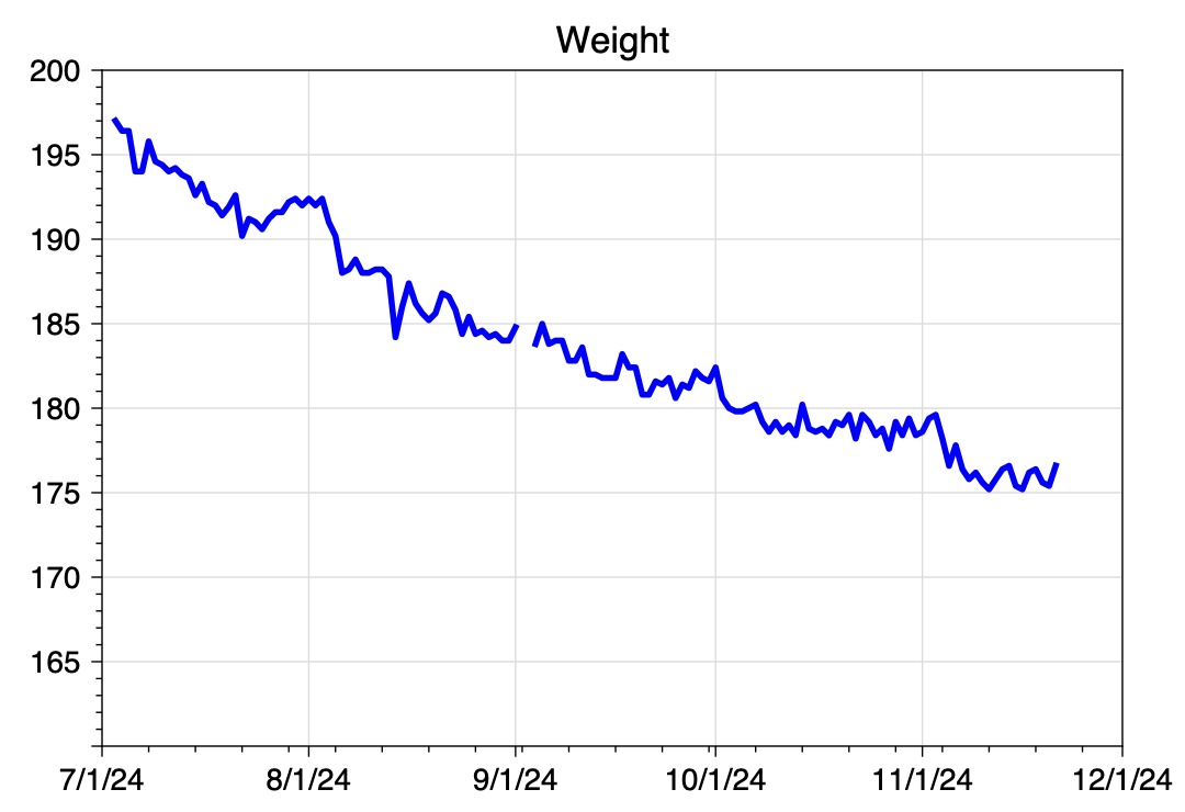
In this graph, I can see the entire scope of my time in the plan, and it looks like I’ve accomplished something. I don’t need interactivity to see where I am and where I’ve been.
As you might expect, I made this graph in Python using Matplotlib. I’ll get to the code in a minute, but first I need to talk about how I pulled the data out of the program app.
There is, of course, no export function in the app. I have a tech support question pending with the app’s developers, but I decided the likelihood of getting a satisfactory answer was small, so I went ahead and pulled the data out by hand. Or in this case, by mouth.
I paged back through my weight history, 30 days at a time, until I reached July. My plan was to use the app’s interactivity to get my weight on each day and dictate that value into a text file on my Mac, one line for each day. The plan worked, but not quite the way I expected.
I’ve written before about how well dictating numbers into my phone has worked. In this case, because I was reading the numbers off my phone, I’d have to do the dictating into my Mac, but that shouldn’t make any difference. Apple’s dictation software is the same on both platforms, isn’t it?
No. For reasons I can’t explain, the Mac doesn’t react to the commands “new line” and “new paragraph” in real time. Whenever I say “new line,” it inserts what looks like a space character and waits for me to dictate the next number. Now it’s true that after leaving dictation mode, all of those spaces turn into new lines, but because it doesn’t show what I’m saying as I say it (as it does on the iPhone), it made the dictation difficult.
So I adopted a hybrid dictation method. I dictated a number and then pressed the Return key to get a new line. After 10–15 minutes, I had a file that looked like this:
197.01
196.41
196.41
194.01
194.01
195.79
194.60
194.40
[and so on]
I then opened up a new spreadsheet in Numbers, pasted these values into the B column, and put the sequence of dates in the A column. I added a header row with “Date” and “Weight,” and exported the spreadsheet to a CSV file named weight.csv. It looks like this:
Date,Weight
2024-07-03,197.01
2024-07-04,196.41
2024-07-05,196.41
2024-07-06,194.01
2024-07-07,194.01
2024-07-08,195.79
2024-07-09,194.60
2024-07-10,194.40
[and so on]
Now we come to the Python. Here’s the code that reads the data from weight.csv and builds the graph:
python:
 1:  #!/usr/bin/env python3
 2:
 3:  import sys
 4:  import pandas as pd
 5:  from datetime import datetime
 6:  from dateutil.relativedelta import relativedelta
 7:  import matplotlib.pyplot as plt
 8:  from matplotlib.ticker import MultipleLocator, AutoMinorLocator
 9:  from matplotlib.dates import DateFormatter, MonthLocator, WeekdayLocator, MO
10:
11:  # Read in the weights
12:  df = pd.read_csv('weight.csv')
13:  x = pd.to_datetime(df.Date, format="%Y-%m-%d")
14:  y = df.Weight
15:
16:  # Figure out the first day of next month
17:  today = datetime.now()
18:  nextmonth = datetime(today.year, today.month, 1) + relativedelta(months=1)
19:
20:  # Format today's date for using in the file name
21:  today = today.strftime('%Y%m%d')
22:
23:  # Create the plot with a given size in inches
24:  fig, ax = plt.subplots(figsize=(6, 4))
25:
26:  # Add a line
27:  ax.plot(x, y, '-', color='blue', lw=2, label='Weight')
28:
29:  # Set the limits
30:  plt.xlim(xmin=datetime(2024,7,1), xmax=nextmonth)
31:  plt.ylim(ymin=160, ymax=200)
32:
33:  # Set the major and minor ticks and add a grid
34:  ax.xaxis.set_major_locator(MonthLocator())
35:  ax.xaxis.set_minor_locator(WeekdayLocator(MO))
36:  ax.xaxis.set_major_formatter(DateFormatter('%-m/%-d/%y'))
37:  plt.setp(ax.get_yticklabels()[1], visible=False)
38:  ax.yaxis.set_major_locator(MultipleLocator(5))
39:  ax.yaxis.set_minor_locator(AutoMinorLocator(5))
40:  ax.grid(linewidth=.5, axis='x', which='major', color='#dddddd', linestyle='-')
41:  ax.grid(linewidth=.5, axis='y', which='major', color='#dddddd', linestyle='-')
42:
43:  # Title and axis labels
44:  plt.title('Weight')
45:
46:  # Make the border and tick marks 0.5 points wide
47:  [ i.set_linewidth(0.5) for i in ax.spines.values() ]
48:  ax.tick_params(which='both', width=.5)
49:
50:  # Add the legend
51:  # ax.legend()
52:
53:  # Save as PDF
54:  plt.savefig(f'{today}-Weight.pdf', format='pdf')
Most of this will look familiar if you read this recent post or this one. I’ll just mention a few unique features.
First, Lines 16–21 deal with dates using a combination of the datetime and dateutil modules, the latter of which really should be in the standard library by now. This section of code uses today’s date—meaning the date on which the script is run—to figure out the upper limit of the x-axis and part of the graph’s filename. Line 18 uses dateutil’s relativedelta function to go forward one month from the first day of the current month. Although datetime has functions for certain time intervals, “one month” is not one of them, which is why I had to use dateutil.
You probably noticed that the tick marks on the x-axis are a little weird. This is an experiment, and I’m not sure yet what I think of it. The major tick marks are set on the first of every month and are labeled as such. The minor tick marks are set on the Monday of each week. This is why the frequencies of the two sets of marks aren’t in sync. The code that does this is in Lines 34–36.
Another oddity, which I definitely like, is that although the y-axis starts at 165 lbs, there’s no label for that bottom tick mark. This is handled by Line 37, which makes the label invisible. I did this because that label and the “7/1/24” label on the x-axis were too close to one another. There’s no doubt where the y-axis starts, so I figured I could eliminate it with no loss of clarity.
Finally, Line 54 saves the graph as a PDF file and uses the today variable from back on Line 21 as part of its filename. I prefer PDFs to PNGs for my own use; I used Preview’s Export command to get the PNG you see above.
As I was writing this, I got a response from the program app’s support team. As expected, there’s no way to export the weight data. Also, they think syncing the scale with two different apps is liable to cause connectivity problems, so that’s out, too. Which means that the time I took dictating my weight history was well spent. Also well spent was the few minutes it took to write this little five-step shortcut, called Weight Today. It asks me for today’s weight and adds a line to the CSV file with the date and that weight. This is a semi-automated way of keeping the weight.csv file up to date.
| Step | Action | Comment |
|---|---|---|
| 1 |  |
Get today’s date |
| 2 | 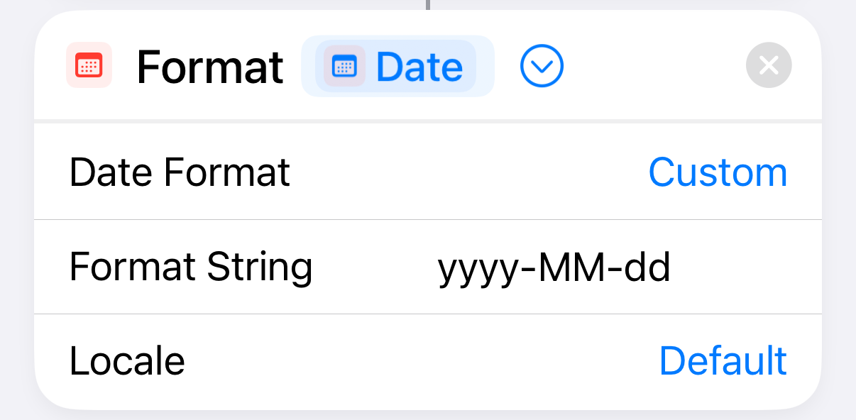 |
Format the date as yyyy-mm-dd |
| 3 | 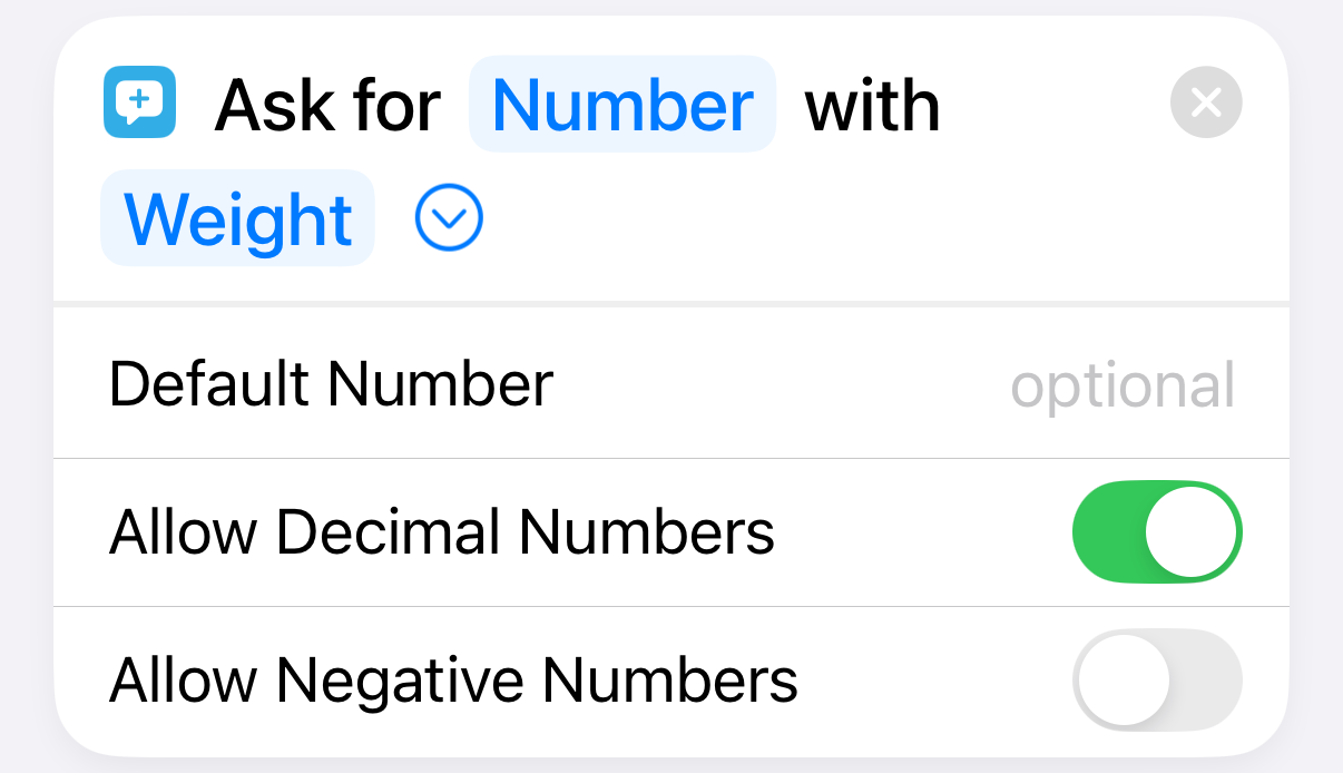 |
Ask the user for today’s weight |
| 4 | 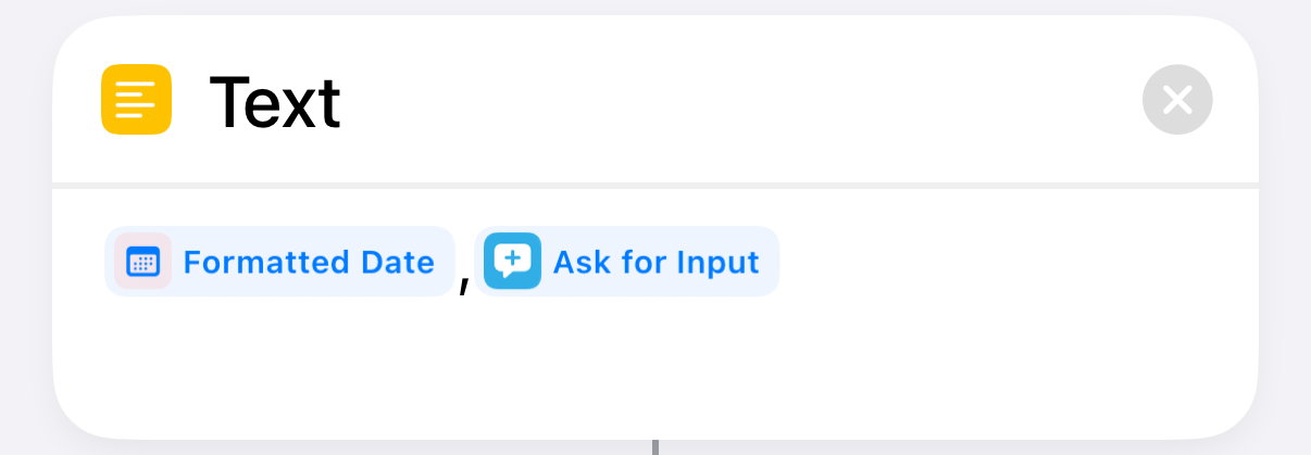 |
Assemble the date,weight line |
| 5 | 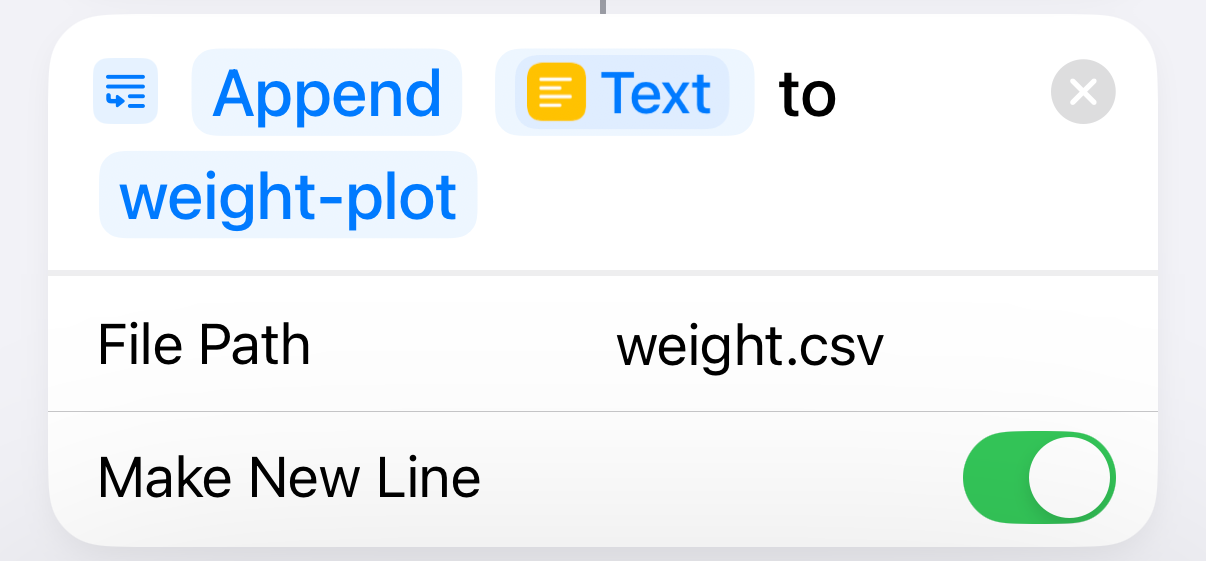 |
Append the line to the CSV file |
I’m not linking to a downloadable version of the shortcut because it has the path to the weight.csv file on my Mac built in to Step 5. It’s not hard to build yourself.
Although entering the weight myself (like an animal) isn’t my preference, I have to have the phone with me when I get on the scale to sync with the program app. So it’s only a matter of launching the shortcut, which I do from a widget on my home screen, and then typing a number. Probably takes less time than launching a dedicated smart scale app.
