Apple’s weather direction
February 23, 2025 at 4:17 PM by Dr. Drang
Back in January, I got a question from Adam Bodnar on Mastodon:1
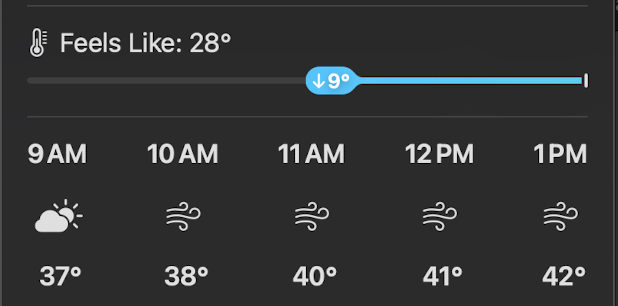
With the new macOS weather menu bar, can you explain what the blue line is indicating here?
I assume that it’s saying that it’s going to feel colder as the day goes along?
At the time, I hadn’t fiddled enough with Control Center to put Weather into my menu bar, so I wasn’t sure how to answer Adam. But a day or so later, I saw a similar graphic in iOS. It’s not one of Apple’s better attempts at graphical communication. And now that I’ve added Weather to my menu bar, I’d like to address it.
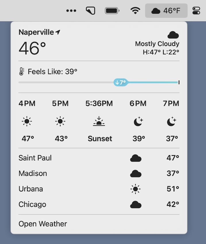
Here’s what Weather looked like earlier today on my MacBook Pro.

As you can see, I don’t use Dark Mode, but otherwise, the middle section of this screenshot is basically the same as what Adam was wondering about. What’s going on here is that Apple is using the blue line to emphasize the drop in “feels like” temperature due to wind chill. The graphic is redundant, because the two temperatures above it already show us that the wind chill is 7° below the actual temperature. But the redundancy isn’t what’s wrong with the graphic—having two ways of showing the same thing can often be helpful. What’s wrong is its placement and sense of direction.
The blue line is acting like a number line, and the little oval is meant to show us how far below the real temperature the “feels like” temperature is. Going left on a number line means going to a smaller number. Why that particular distance represents 7° is beyond me. Unlike the number lines you saw in grade school, this one has no scale.2
The more serious problem with the blue line is that it sits immediately above the timeline of temperatures and weather conditions, and it takes up the same horizontal space. This is what led to Adam’s confusion. At first glance—and a lot of graphical communication is about first glance—the blue line seems to have something to do with the next few hours.
It looks like Apple recognized the potential for confusion, but did a poor job of dediscombobulation. Tucked into the little oval with the 7° is a downward arrow. Because down means a reduction, right? Except we’ve already established that left means a reduction. And right means later in the day. The clarity is almost painful.
I assume that as we move into summer (going to the right), the blue line will change to red and it will start from the left edge to show us how much hotter it feels because of humidity. And there’ll be an upward arrow in the oval because Apple’s afraid we won’t understand that right means increase. Right?
-
I meant to link directly to Adam’s toot, but his account is locked. I hope he doesn’t mind this small quotation. ↩
-
You may remember Bezos Charts. ↩

