Chit chat about charts
February 10, 2025 at 9:06 AM by Dr. Drang
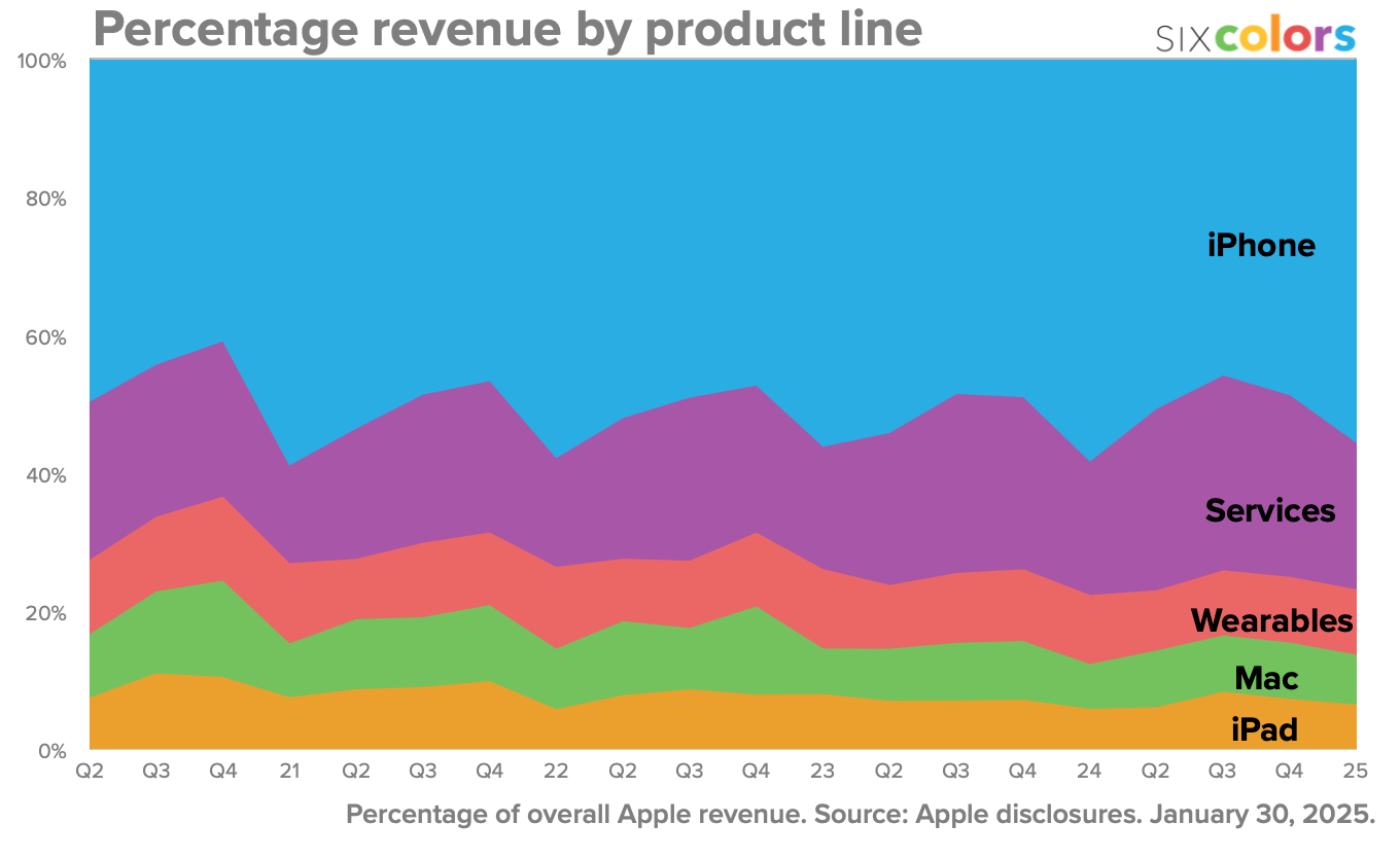
Speaking of Jason Snell, which I was in yesterday’s post, he recently gave an interesting interview to Allison Sheridan on her Chit Chat Across the Pond podcast. The topic was Jason’s longstanding series of charts following Apple’s quarterly results—the latest of which is here—and a few things stood out to me.

First, while I knew that Jason used Numbers to make his charts, I didn’t know how he pulled those charts out of Numbers to post on Six Colors. I guess I thought he copied them by right-clicking and saved them as PNG files using AppleScript or Automator or Shortcuts. But no. He has all his charts laid out on a single tab in Numbers, saves that tab as a PDF, and then has a script that extracts rectangles from the PDF, one for each chart, and saves those as individual PNGs. More automated than I would’ve thought possible when using Numbers. (Yes, I had forgotten that Jason wrote about this several years ago.)
I was happy to hear, though, that Jason’s charts are not fully automated. He still tweaks his graphs by hand when necessary to get them to look right. To me this is a sign of care. It’s virtually impossible to set up a graphing template that always produces good looking charts for every set of data that comes down the pike. Experienced graph makers give themselves the leeway to change settings to meet the needs of new data.
Finally, I was surprised to hear that Jason’s data table, which he updates by hand whenever a new earnings report comes out, puts each quarter in its own column and all the categories—like Mac, iPhone, and iPad sales—in rows. This is a violation of table orthodoxy, in which fields are columns and records are rows. This standard method of organization is, of course, arbitrary, but software tools that deal with tables assume that they’ll be laid out this way.1
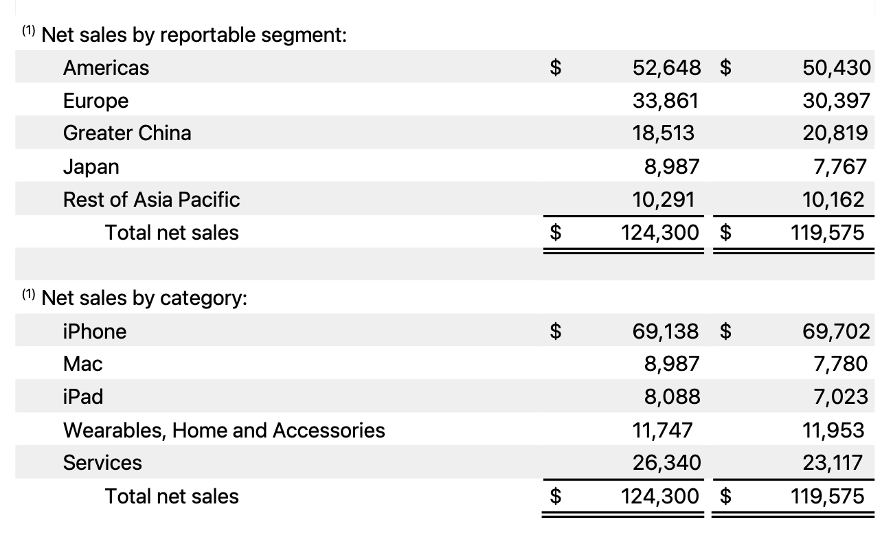
But Jason doesn’t use software tools like R or Pandas to build his charts, so he can organize his table as he sees fit. And after thinking about it for bit, I realized why this transposed table would be easier for him to work with. Here’s an excerpt from the most recent Apple earnings report:

The figures for the current quarter and the year-ago quarter are in columns and the categories are in rows. By having his Numbers table organized this same way, Jason can type in the values the way he sees them in the report. It’s much easier to proofread this way. Also, he can quickly look back a few columns to make sure his data for the year-ago quarter matches Apple’s. Affordances like this are invaluable when entering data by hand.2
Even though I’m wedded to using Python (and sometimes Mathematica) for graphing, it’s alway good to hear how people use other tools. Thanks to Allison and Jason for some topics to chew on the next time I want to make a few charts.
-
The orthodoxy is not entirely arbitrary. Tables tend to grow to have more records than fields, and it’s easier to lay out a long table on paper than a wide one. ↩
-
Many many years ago, I had to copy dozens of pages of numbers from a faded printout into a spreadsheet. OCR was out of the question. I made a paper template with cutouts so I could keep my eyes aligned and copy only the columns of interest. It was tedious, but it worked. ↩
