Graphing without empty spaces
June 23, 2025 at 12:27 PM by Dr. Drang
I’ve mentioned here before that I was on a dietary program to keep my Type II diabetes under control. The program and its associated app also kept track of my blood pressure with a Bluetooth-connected cuff that I used once a week. I left the program at the beginning of the year (insurance wouldn’t cover it anymore), but I’ve continued the diet and tracking my blood pressure. I don’t know if it’s possible to connect to the cuff’s Bluetooth signal, and even if it is, I don’t have the programming chops to do it. But I’ve kept taking my blood pressure once a week and entering it into the Health app on my phone.
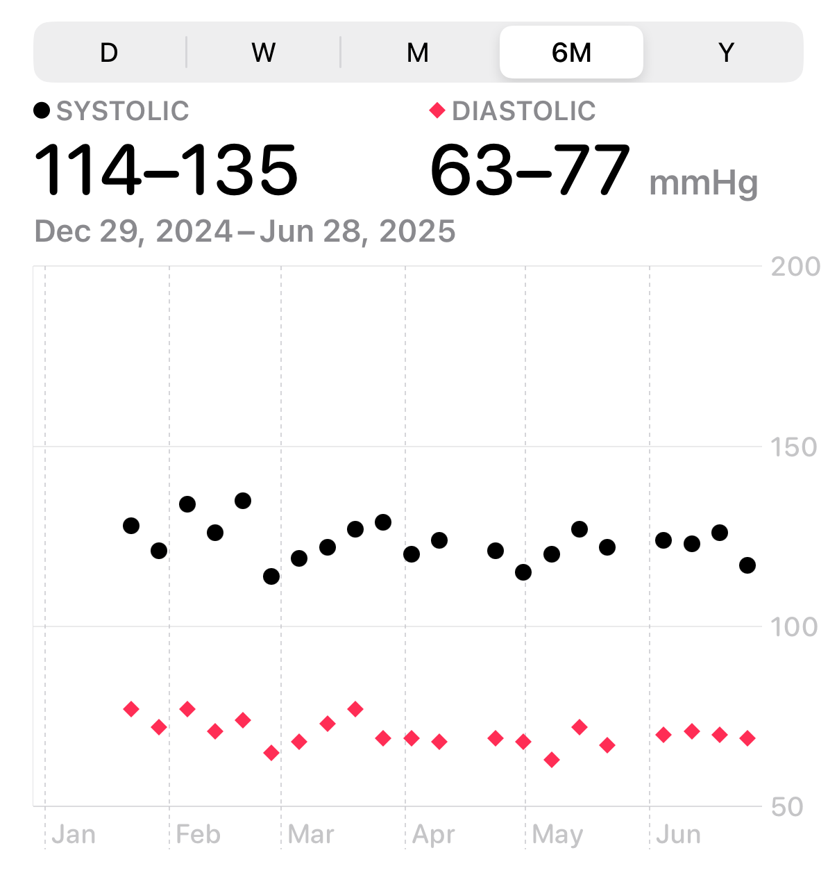
Unfortunately, the Health app’s way of plotting blood pressure is kind of crappy. Here’s what the past six months looks like:

Lots of wasted space in there, and because the range is so broad, I can’t see at a glance where I stand. Since seeing at a glance is sort of the whole point of plotting data, I would say this graph is basically useless.
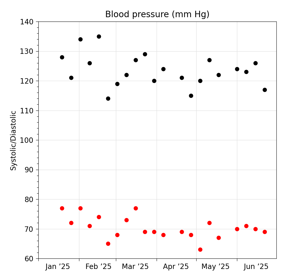
Plotting the data using a tighter range would be better, as it would give me a better chance to figure out the various values to within a couple of mm Hg. Here’s an example:

This still seems like it could be improved. We’ve traded a bunch of wasted space above the systolic readings for a bunch of wasted space between the systolic and diastolic values. In some situations, it’s good to see how a gap between two sets of values compares to the variation within a set, but I don’t see much use in it for this type of data.
This data could use a scale break. In effect, this means making two plots but arranging them into a single figure to take advantage of their common parts. Here’s one way to do it:

The scales of the two parts are the same, so the larger variation in systolic values is properly represented. We’ve just cut out the empty space between the systolic and diastolic and pushed them together.
William Cleveland, author of The Elements of Graphing Data, is not a fan of scale breaking:
Use scale breaking only when necessary. If a break cannot be avoided, use a full scale break. Do not connect numerical values on two sides of a break. Taking logs can cure the need for a break.
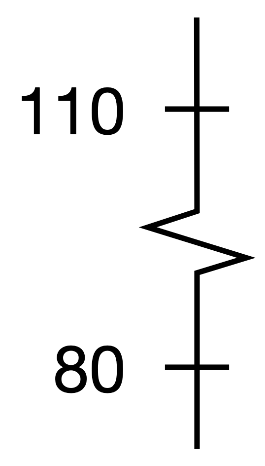
In this case, taking logs would make the cure worse than the disease, as it would make reading the values harder. If you’re wondering about the difference between full and partial breaks, a partial break is when an axis is broken by a wavy or zigzag line, like this:

Cleveland thinks partial breaks are too easy for readers to overlook. A full break is what we’ve done, so he may forgive it.
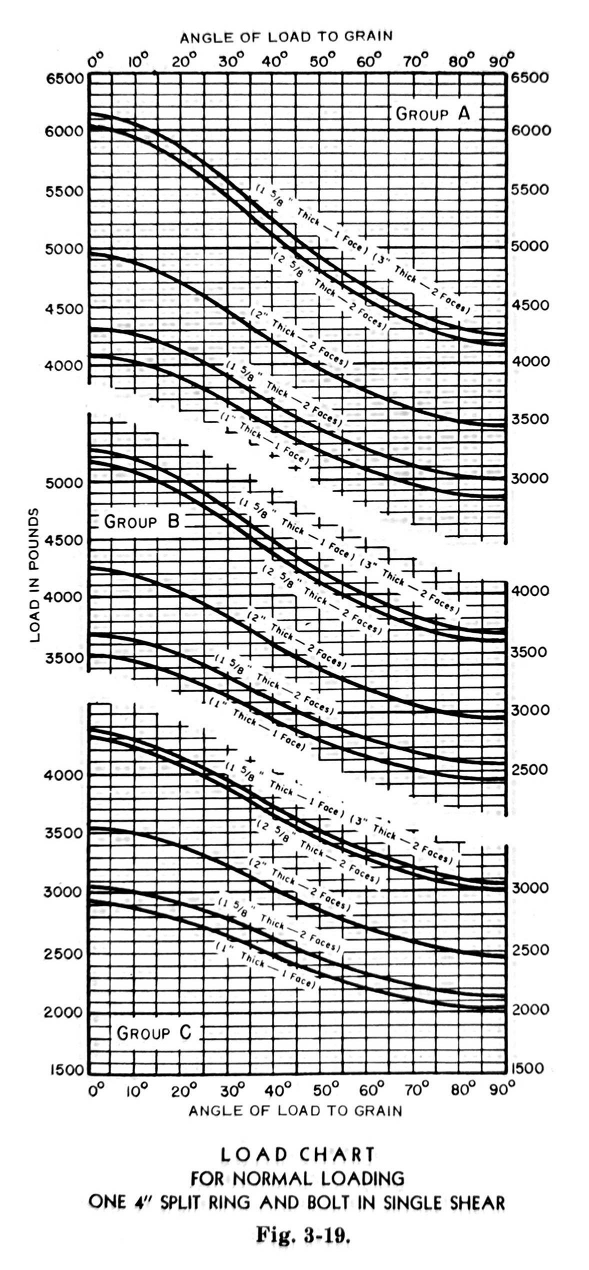
Despite Cleveland’s admonitions, scale breaks can be effective and attractive. Here’s an example from Modern Timber Engineering by Scofield and O’Brien:

This gives the capacities of a type of wood connector under a variety of conditions. The graph is broken into three groups according to wood species, and what makes scale breaks useful here is that the plots would overlap and be impossible to read without the breaks. The authors could have make this three separate graphs, of course, but putting them together into a single figure emphasizes the interrelatedness of the data. And the curving gaps between the sections look really cool.
I’m not saying Apple should try curvy scale breaks in the Health app, but it wouldn’t take much to make the blood pressure graphs a lot more useful.
