Baseball durations after the pitch clock
September 30, 2025 at 8:20 PM by Dr. Drang
A couple of years ago, after Major League Baseball announced they’d start using a pitch clock, I said I would write a post about the change in the duration of regular season games. I didn’t. My recent post about Apple’s Sports app and its misunderstanding of baseball standings reminded me of my broken promise. I decided to write a new game duration post after the 2025 season ended.
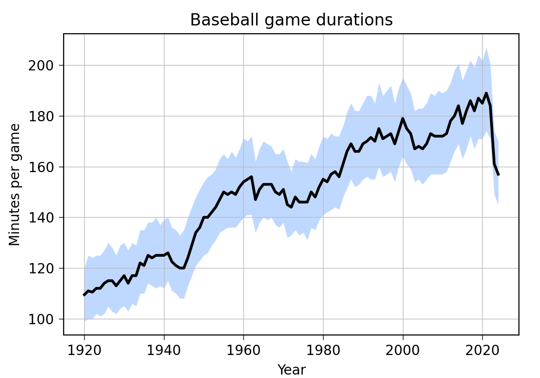
Unfortunately, Retrosheet, which is where I get my data, hasn’t published its 2025 game logs yet. I decided to go ahead with the post anyway, mainly because putting it off would probably lead to my forgetting again. So here’s the graph of regular season durations through the 2024 season. When the 2025 data comes in, I’ll update it (I hope).

The black line is the median duration, and the light blue zone behind it is the interquartile range. The middle 50% of games lie within that range.
Clearly, there was a huge dropoff in 2023, so I’d say the pitch clock was a big success. The further reduction in 2024 was within the historical year-to-year duration change—I wouldn’t attribute any significance to it.
Games are now roughly as long as they were in the early ’80s, so the powers at MLB have cut about four decades of fat from the game. And they did it without reducing the number of commercials, because they’d never do that.
I made the graph more or less the same way I made the last one, although I combined some of the steps into a single script. First, I downloaded and unzipped all the yearly game logs since 1920 from Retrosheet. They have names like gl1920.txt. Then I converted the line endings from DOS-style to Unix-style via
dos2unix gl*.txt
I got the dos2unix command from Homebrew.
I concatenated all the data into one big (189 MB) file using
cat gl*.txt > gl.csv
Although the files from Retrosheet have a .txt extension, they’re actually CSV files (albeit without a header line). That’s why I gave the resulting file a .csv extension.
I then ran the following script, which uses Python and Pandas to make a dataframe with just the columns I want from the big CSV file and calculate the quartile values for game durations on a year-by-year basis.
python:
 1:  #!/usr/bin/env python3
 2:
 3:  import pandas as pd
 4:  from scipy.stats import scoreatpercentile
 5:  import sys
 6:
 7:  # Make a simplified dataframe of all games with just the columns I want
 8:  cols = [0, 3, 4, 6, 7, 9, 10, 18]
 9:  colnames = 'Date VTeam VLeague HTeam HLeague VScore HScore Time'.split()
10:  df = pd.read_csv('gl.csv', usecols=cols, names=colnames, parse_dates=[0])
11:
12:  # Add a column for the year
13:  df['Year'] = df.Date.dt.year
14:
15:  # Use the dataframe created above to make a new dataframe
16:  # with the game duration quartiles for each year
17:  cols = 'Year Q1 Median Q3'.split()
18:  dfq = pd.DataFrame(columns=cols)
19:  for y in df.Year.unique():
20:    p25 = scoreatpercentile(df.Time[df.Year==y], 25)
21:    p50 = scoreatpercentile(df.Time[df.Year==y], 50)
22:    p75 = scoreatpercentile(df.Time[df.Year==y], 75)
23:    dfq.loc[y] = [y, p25, p50, p75]
24:
25:  # Write a CSV file for the yearly duration quartiles
26:  dfq.Year = dfq.Year.astype('int32')
27:  dfq.to_csv('gametimes.csv', index=False)
This code is very similar to what I used a couple of years ago. You can read that post if you want an explanation of any of the details.
Now I had a new CSV file, called gametimes.csv, that looked like this
Year,Q1,Median,Q3
1920,99.0,109.5,120.0
1921,100.0,111.0,125.0
1922,100.0,110.5,124.0
1923,102.0,112.0,125.0
1924,101.0,112.0,125.0
1925,102.0,114.0,127.0
[and so on]
The graph was made by running this script, which reads the data from gametimes.csv and uses Matplotlib to output the PNG image shown above:
python:
 1:  #!/usr/bin/env python3
 2:
 3:  import pandas as pd
 4:  import matplotlib.pyplot as plt
 5:  from datetime import date
 6:
 7:  # Import game time data
 8:  df = pd.read_csv('gametimes.csv')
 9:
10:  # Create the plot with a given size in inches
11:  fig, ax = plt.subplots(figsize=(6, 4))
12:
13:  # Add the interquartile range and the median
14:  plt.fill_between(df.Year, df.Q1, df.Q3, alpha=.25, linewidth=0, color='#0066ff')
15:  ax.plot(df.Year, df.Median, '-', color='black', lw=2)
16:
17:  # Gridlines and ticks
18:  ax.grid(linewidth=.5, axis='x', which='major', color='#bbbbbb', linestyle='-')
19:  ax.grid(linewidth=.5, axis='y', which='major', color='#bbbbbb', linestyle='-')
20:  ax.tick_params(which='both', width=.5)
21:
22:  # Title and axis labels
23:  plt.title('Baseball game durations')
24:  plt.xlabel('Year')
25:  plt.ylabel('Minutes per game')
26:
27:  # Save as PNG
28:  day = date.today()
29:  dstring = f'{day.year:4d}{day.month:02d}{day.day:02d}'
30:  plt.savefig(f'{dstring}-Baseball game durations.png', format='png', dpi=200)
I don’t know when the folks at Retrosheet will add the 2025 data. Maybe after the World Series. I’ll check back then and update the post if there’s a new year of game logs.
