Another Apple icon regression
February 9, 2026 at 10:19 PM by Dr. Drang
Apple’s *OS 26 icons have been getting some well-deserved criticism over the past couple of months. There was Jim Nielsen’s complaint about menu icons in macOS. Then came Nikita Prokopov’s more detailed criticism of those same icons.1 And a lot of fun has been poked at Tahoe’s app icons, reaching a peak in heliograph’s deadpan post on Threads.
My long-overdue icon complaint is about a CarPlay icon introduced in the fall of 2024 along with iOS 18. Apart from when an app is taking over the screen, there are two primary screens in CarPlay: the app icon view, which is sort of like the home screen on an iPhone,
![]()
and the split screen view, which is sort of like the old split view in iPadOS, but with more parts,

You switch between the two views by tapping the button in the lower left corner of the screen. The button with the 3×3 grid of little squircles is clearly a way to get back to the app icon view. Yes, it used to be a 2×4 grid, which actually matched the icon layout on my screen, but it’s still obvious what the button does. The single hollow squircle, on the other hand, just makes no sense. It doesn’t look anything like the split view screen it takes you to.
This wasn’t the case before the fall of 2024. Here’s what that button used to look like:2
![]()
Kind of obvious where this button takes you, isn’t it?
It’s not that I don’t know what the single hollow squircle button does—I’ve been using it for 16 months. The icon could look like Kurt Vonnegut’s drawing of an asshole in Breakfast of Champions and I’d soon work out what the button was for,3 but the purpose of an icon is to communicate, not just be a placeholder. There’s also parallelism to consider. The icon view button looks like the screen it leads to; so should the split screen view button.
It’s probably impossible to tell the upper echelon of Apple that it’s breaking revenue records in spite of its software design, not because of it. I hope the next regime knows better.
-
Brent Simmons figured out how to get rid of these abominations, a service to humanity deserving of a Nobel Prize. ↩
-
I couldn’t find an image of this button in my Photos library, so I stole it from this TidBITS Talk page. ↩
-
Of course, Apple wouldn’t use an asshole icon—that’s Anthropic’s branding. ↩
Pulling values from a graph without an LLM
February 4, 2026 at 9:48 AM by Dr. Drang
The inability of Claude and (especially) ChatGPT to extract data accurately from the chart discussed in the last post gnawed at me. It seemed like the sort of thing an LLM should be able to do pretty well, but Claude’s table of values needed some careful editing before I could use it. And ChatGPT just completely botched the job, even after several attempts to steer it right. I knew I could do a much better job in not much more time than I spent trying to get the LLMs to do it.
As a reminder, here’s the graph:
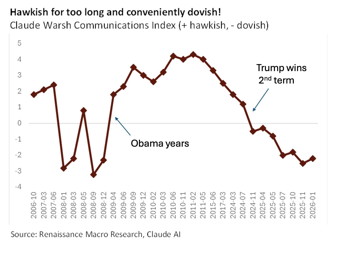
What I wanted was a CSV file with a column of dates (the x-values) and a column of floating point numbers (the y-values). One row for each of the 29 points.
I’ve done things like this in the past with OmniGraffle and AppleScript, so that’s how I approached the problem.
The first step was to get the x-values, which didn’t involve OmniGraffle or AppleScript. I opened the image in Preview, selected the text labels along the x-axis with TextSniper, and pasted the result into a new BBEdit window. Text Sniper had no trouble reading the rotated text, but it did have the values separated by space characters instead of line feeds. No problem; I just did a find/replace in BBEdit to get this:
2006-10
2007-03
2007-06
2008-01
2008-03
2008-05
2008-09
2008-12
2009-04
2009-06
2009-09
2009-12
2010-02
2010-03
2010-06
2010-11
2011-02
2011-05
2015-06
2017-03
2024-03
2024-07
2024-11
2025-04
2025-05
2025-07
2025-10
2025-11
2026-01
Update 5 Feb 2026 12:11 AM
Joe Rosensteel pointed out on Mastodon that I could have copied the text in Preview instead of TextSniper. While I knew that Preview could select text in an image, I didn’t know it could do it when the text was rotated. As long as the selection setting in the Tools menu is not Rectangular Selection, the pointer will change to the familiar I-beam shape when you move it over text. It looks a little funny because the I-beam is oriented as if it were selecting horizontal text, but the selection works.
I still prefer TextSniper and keep it in my menu bar, ready to invoke with ⇧⌘2, because it OCRs any text—regardless of orientation—within its rectangular selection, but I bought it back before macOS had built-in OCR tools. TextSniper is better, but if I didn’t already own it, I probably wouldn’t buy it today.
These dates are just months, and I figured it would be best for the plot to assume they were near the middle of each month, so I appended “-15,” to the end of each line. That set all the dates to the 15th of the month, and the comma prepared the file for pasting in the y-values:
2006-10-15,
2007-03-15,
2007-06-15,
2008-01-15,
2008-03-15,
2008-05-15,
2008-09-15,
2008-12-15,
2009-04-15,
2009-06-15,
2009-09-15,
2009-12-15,
2010-02-15,
2010-03-15,
2010-06-15,
2010-11-15,
2011-02-15,
2011-05-15,
2015-06-15,
2017-03-15,
2024-03-15,
2024-07-15,
2024-11-15,
2025-04-15,
2025-05-15,
2025-07-15,
2025-10-15,
2025-11-15,
2026-01-15,
Then came the real work. I pasted the image into a new OmniGraffle document with the scale set to “1 pt = 1 pt.” I did this because I knew that OmniGraffle’s AppleScript dictionary returns all coordinates and lengths in points with the origin at the upper left corner of the document. I then drew some thin-lined rectangles to get the y-coordinate of the horizontal axis and calculate the y-scale of the image.
A rectangle with its top edge along the horizontal axis told me that the y-origin of the plot was 581 points down from the top of the document. To get the scale of the plot, I drew another rectangle whose bottom edge was aligned with the negative sign in the “-4” label and whose top edge was aligned with the equivalent part of the “4” label. That rectangle was 512.6 points high, so the scale of the plot is
I then made a new layer called “Markers” and drew a diamond (OmniGraffle has a built-in diamond shape) sized to match the markers in the plot. By duplication and dragging, I put a diamond shape over every marker. Here’s what it looked like with every diamond selected:
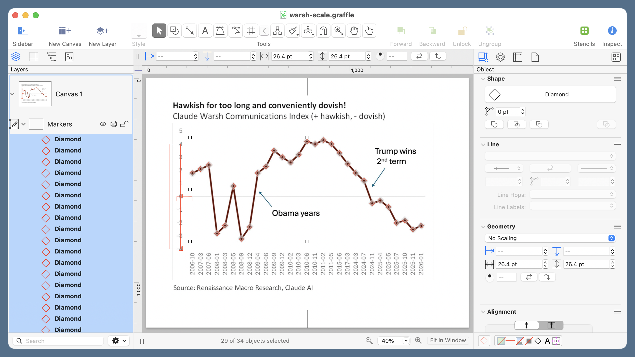
If you zoom in, you’ll see that the diamonds are 26.4 points tall, which means that the center of each diamond is 13.2 points below its top edge. We’ll need this value in the AppleScript because when OmniGraffle is asked for the location of an object, it returns the coordinates of the top left corner.
Here’s another useful tidbit I’ve learned when using OmniGraffle’s AppleScript dictionary in the past: when you ask for every shape in a layer, the list of shapes is returned in the top-to-bottom order shown in the left sidebar. You may think this is obvious, but it isn’t. As you add shapes to a layer, each new shape appears in the sidebar above its predecessor. So the order of the items in the every shape list is the opposite of the creation order. The upshot of this is that to get the y-values of the diamonds in left-to-right order (to match their date order), I created them in right-to-left order.1
Update 5 Feb 2026 12:11 PM
I forgot to mention here that the order of shapes in the sidebar is reverse chronological order only by coincidence. It’s actually the stacking order. The reason that usually corresponds to reverse chronological order is that new shapes stack above older shapes. You can, of course, take the shapes out of their original order by using the various Bring and Send commands in OmniGraffle’s Arrange menu.
Now it’s time to write and run the AppleScript that extracts the y-coordinates of the centers of the diamonds and scales them to match the plot. It’s pretty simple:
applescript:
 1:  set yValues to {}
 2:  set yOrigin to 581
 3:  set yOffset to 13.2
 4:  set yScale to 64.075
 5:
 6:  tell application "OmniGraffle"
 7:    tell layer "Markers" of canvas 1 of document 1
 8:      set diamonds to every shape
 9:      repeat with d in diamonds
10:        set pt to (origin of d)
11:        set end of yValues to (yOrigin - (item 2 of pt) - yOffset) / yScale
12:      end repeat
13:    end tell
14:  end tell
15:
16:  yValues
Line 1 initializes the list of y-values we’ll be building. Lines 2–4 set the values we established above. After the tell commands to establish that we’re focusing on the “Markers” layer, Line 8 creates the list of diamonds. Lines 9–12 loop through that list to get the location (origin) of each diamond and convert it to the value being plotted. The order in which the subtraction is done in Line 11 accounts for the fact that OmniGraffle’s coordinates increase as you go down but the plot’s coordinates increase as you go up.
Line 16 spits out the list of y-values in the Result section of Script Editor:
{1.777610453442, 2.105119526221, 2.417138303752,
-2.823376834196, -2.217843888773, 0.804769157205,
-3.225882114947, -2.315093559097, 1.802782567774,
2.308216918434, 3.517346715278, 3.011460781549,
2.606423024043, 3.211060498316, 4.212510467041,
4.018455838485, 4.315198697655, 4.018455838485,
3.316423039057, 2.512942396277, 1.803414490836,
1.203973154221, -0.507963600878, -0.304047453731,
-0.80360682595, -2.016491975871, -1.812215148741,
-2.521036825178, -2.2390063608}
That’s way more digits than is justified, but the extra digits don’t hurt anything. After turning each comma-space combination into a linefeed, I did a column paste to put the y-values after the dates. Adding a header line turned it into the CSV file I wanted for plotting:
Date,Hawk
2006-10-15,1.777610453442
2007-03-15,2.105119526221
2007-06-15,2.417138303752
2008-01-15,-2.823376834196
2008-03-15,-2.217843888773
2008-05-15,0.804769157205
2008-09-15,-3.225882114947
2008-12-15,-2.315093559097
2009-04-15,1.802782567774
2009-06-15,2.308216918434
2009-09-15,3.517346715278
2009-12-15,3.011460781549
2010-02-15,2.606423024043
2010-03-15,3.211060498316
2010-06-15,4.212510467041
2010-11-15,4.018455838485
2011-02-15,4.315198697655
2011-05-15,4.018455838485
2015-06-15,3.316423039057
2017-03-15,2.512942396277
2024-03-15,1.803414490836
2024-07-15,1.203973154221
2024-11-15,-0.507963600878
2025-04-15,-0.304047453731
2025-05-15,-0.80360682595
2025-07-15,-2.016491975871
2025-10-15,-1.812215148741
2025-11-15,-2.521036825178
2026-01-15,-2.2390063608
I still have the CSV file made by Claude. Let’s compare:
| Date | Claude | AppleScript | Difference |
|---|---|---|---|
| 2006-10-15 | 1.7 | 1.78 | -0.08 |
| 2007-03-15 | 2.0 | 2.11 | -0.11 |
| 2007-06-15 | 2.4 | 2.42 | -0.02 |
| 2008-01-15 | -2.9 | -2.82 | -0.08 |
| 2008-03-15 | -2.2 | -2.22 | 0.02 |
| 2008-05-15 | 0.8 | 0.80 | -0.00 |
| 2008-09-15 | -3.2 | -3.23 | 0.03 |
| 2008-12-15 | -2.5 | -2.32 | -0.18 |
| 2009-04-15 | 1.7 | 1.80 | -0.10 |
| 2009-06-15 | 2.2 | 2.31 | -0.11 |
| 2009-09-15 | 3.5 | 3.52 | -0.02 |
| 2009-12-15 | 3.0 | 3.01 | -0.01 |
| 2010-02-15 | 2.6 | 2.61 | -0.01 |
| 2010-03-15 | 3.1 | 3.21 | -0.11 |
| 2010-06-15 | 4.2 | 4.21 | -0.01 |
| 2010-11-15 | 4.0 | 4.02 | -0.02 |
| 2011-02-15 | 4.4 | 4.32 | 0.08 |
| 2011-05-15 | 4.1 | 4.02 | 0.08 |
| 2015-06-15 | 3.3 | 3.32 | -0.02 |
| 2017-03-15 | 2.5 | 2.51 | -0.01 |
| 2024-03-15 | 1.7 | 1.80 | -0.10 |
| 2024-07-15 | 1.2 | 1.20 | -0.00 |
| 2024-11-15 | -0.5 | -0.51 | 0.01 |
| 2025-04-15 | -0.3 | -0.30 | 0.00 |
| 2025-05-15 | -0.6 | -0.80 | 0.20 |
| 2025-07-15 | -2.1 | -2.02 | -0.08 |
| 2025-10-15 | -2.0 | -1.81 | -0.19 |
| 2025-11-15 | -2.5 | -2.52 | 0.02 |
| 2026-01-15 | -2.3 | -2.24 | -0.06 |
Claude’s values were off by only about 0.2 at worst, but recall that it originally included a spurious date and had the last seven y-values assigned to the wrong date. The “Claude” values shown above are after I figured out those obvious errors and corrected them.
An odd thing about Claude’s errors: they don’t show a consistent bias in either magnitude or direction. Like everyone who programs, I’m used to seeing output with incorrect numbers. (In my first draft of the AppleScript, I multiplied by yScale instead of dividing, which gave pretty wild results.) What I’m not used to is inexplicably wrong numbers—numbers that aren’t wrong in a predictable way.
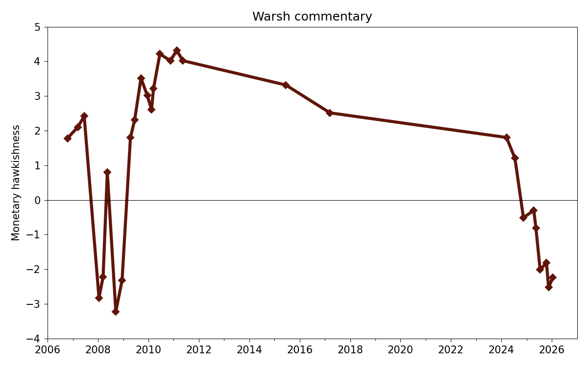
At the risk of lengthening this post even further, here’s the graph with the AppleScript-derived values:
And here’s the Python code that created it:
python:
 1:  #!/usr/bin/env python3
 2:
 3:  import pandas as pd
 4:  from datetime import datetime
 5:  import matplotlib.pyplot as plt
 6:  from matplotlib.ticker import MultipleLocator, AutoMinorLocator
 7:  from matplotlib.dates import DateFormatter, YearLocator, MonthLocator
 8:
 9:  # Import the data
10:  df = pd.read_csv('warsh-applescript.csv', parse_dates=[0])
11:  x = df.Date
12:  y = df.Hawk
13:
14:  # Create the plot with a given size in inches
15:  fig, ax = plt.subplots(figsize=(8, 5))
16:
17:  # Add a line
18:  ax.plot(x, y, 'D-', color='#60150a', lw=3, ms=5)
19:
20:  # Set the limits
21:  plt.xlim(xmin=datetime(2006,1,1), xmax=datetime(2026,12,31))
22:  plt.ylim(ymin=-4, ymax=5)
23:
24:  # Set the major and minor ticks and add a grid
25:  ax.xaxis.set_major_locator(YearLocator(2))
26:  ax.xaxis.set_minor_locator(YearLocator(1))
27:  ax.xaxis.set_major_formatter(DateFormatter('%Y'))
28:  ax.yaxis.set_major_locator(MultipleLocator(1))
29:  ax.axhline(y=0, color='k', lw=.5)
30:
31:  # Title and axis labels
32:  plt.title('Warsh commentary')
33:  plt.xlabel('')
34:  plt.ylabel('Monetary hawkishness')
35:
36:  # Make the border and tick marks 0.5 points wide
37:  [ i.set_linewidth(0.5) for i in ax.spines.values() ]
38:  ax.tick_params(which='both', width=.5)
39:
40:  # Reduce the whitespace around the plot
41:  plt.tight_layout()
42:
43:  # Save as PNG
44:  plt.savefig('20260202-Warsh commentary via AppleScript.png', format='png', dpi=150)
Importing Pandas is overkill just to read a CSV file, but it’s more efficient of my time. The rest of the code is basically just my typical Matplotlib boilerplate with a few tweaks for dealing with the limits and tick spacing.
Did this take longer than having Claude return the CSV file? Of course it did, but it didn’t take much more than half an hour or so, equally divided between the OmniGraffle drawing and the AppleScript coding. And that half-hour was much more satisfying than arguing with a random number generator and then editing its work after losing the argument.
Also, because I’ve now written up the process (which took significantly longer than doing it), I have a method I can use with confidence in the future.
-
There are, of course, many ways to reverse a list, but there’s no
reversecommand in AppleScript. It’s easier to remember to create the shapes in reverse order. It takes no more time to do it that way. ↩
Plotting via Claude
February 2, 2026 at 8:46 PM by Dr. Drang
Paul Krugman included a terrible plot in his Substack post this morning. It’s meant to support his contention that Kevin Warsh, Trump’s soon-to-be nominee for chair of the Federal Reserve, is a political hack. It does, but it’s still terrible.
Krugman’s not to blame—at least not entirely—for how bad the plot is. It was given to him by Neil Dutta, who apparently had Claude assess the monetary hawkishness of Warsh’s statements, assign a number to it, and plot those numbers against the dates on which the statements were made. Here’s the result:

If you look along the horizontal axis, you’ll see immediately why this is an awful plot. The points are uniformly spaced horizontally, even though the spacing of the dates is far from uniform. Apparently, Claude considered entries like “2006-10” as categories rather than dates. Not especially intelligent of Claude or Dutta.
Krugman—who probably did’t want to go to the trouble of replotting the data—alerted his readers to the problem without being mean to Dutta:
If you look carefully at that chart, you’ll see that there’s a gap in the timeline for several years after Warsh was passed over for Fed chair during Trump’s first term.
Had the data been plotted correctly, you wouldn’t have to look carefully:
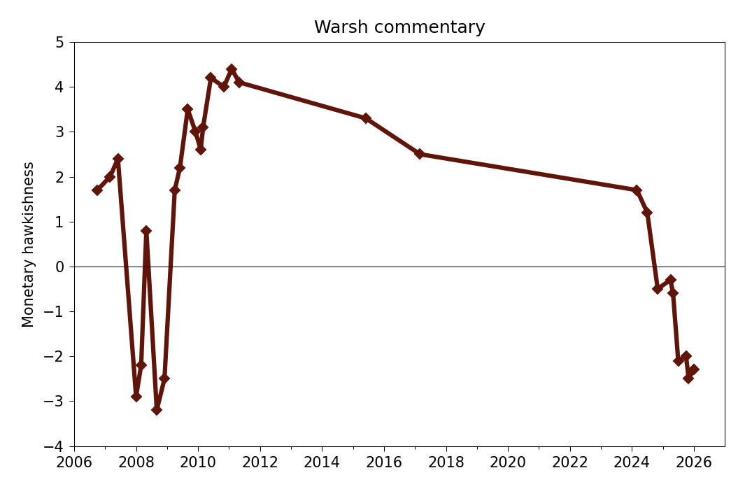
Because I didn’t want to go to too much trouble in making this plot, I didn’t adjust the labels on the horizontal axis the way I usually do. The labels are aligned with January 1 of each year.
You may also notice that the y-values in my graph aren’t a perfect match with the y-values in Dutta’s original. Using a “sauce for the goose” approach, I told Claude to assess Dutta’s plot and generate a CSV file with all the points. There were some serious errors in the resulting CSV—30 data points instead of 29 and 8 negative points at the right end of the graph instead of 7—but they were fairly easy to fix.1 And since the relative hawkishness of Warsh’s commentary is a pretty soft number, I’m not worried about the individual values being off by a few tenths. The main thing was to get the dates plotted as they should be.
-
I should point out that the fixing was done by me, not Claude. I tried to get Claude to fix its mistakes, but it just added more. I also tried to get ChatGPT to generate a CSV from Dutta’s plot, and it fucked the assignment so thoroughly—and was so smarmy in its apologies—it made me question whether I should ever use it again. ↩
On the average
January 26, 2026 at 8:42 AM by Dr. Drang
A few days ago, I was poking around in Apple’s Weather app and came across some interesting stuff hiding behind the sunrise/sunset box. First, there’s a plot that shows the movement of the sun throughout the day, followed by sunrise and sunset times:
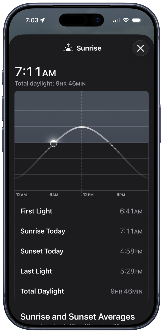
The little dots under the “horizon” represent the beginnings and endings of civil, nautical, and astronomical twilight, which is a nice addition to the plot. I assume the vertical axis has something to do with the Sun’s altitude angle, but since the plot gives no units, it must be an example of Bezos astronomy.
Scrolling down, we come to this odd graphic: the average sunrise and sunset times for each month of the year.
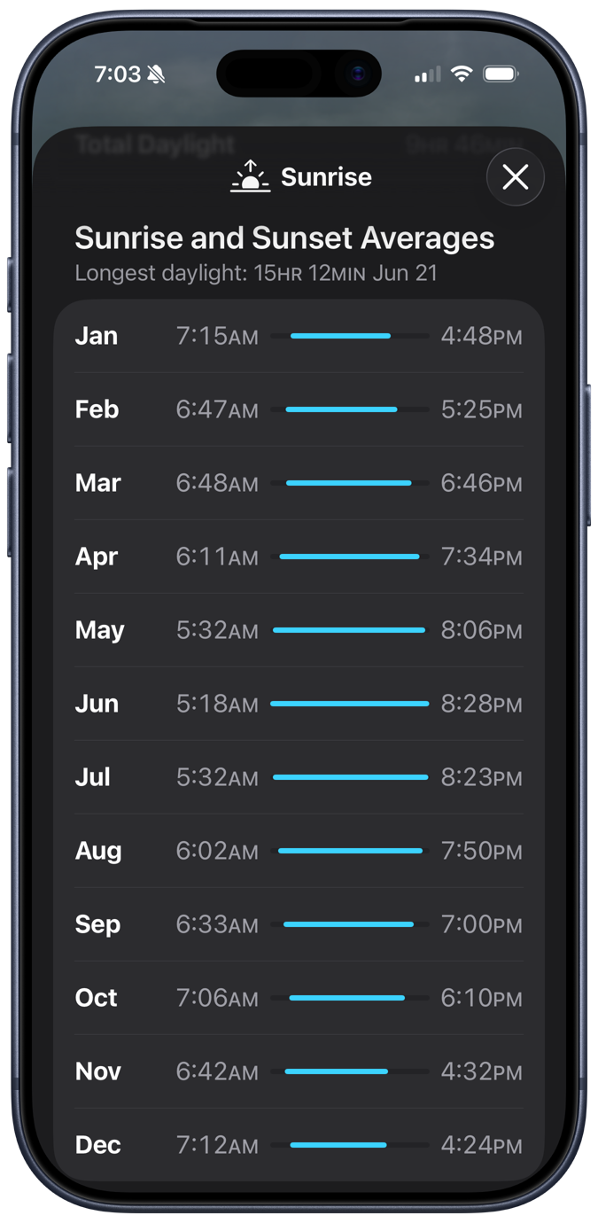
Given that I live in a state that switches between Standard Time and Daylight Saving Time, this is a troubling calculation. There’s no trouble making the calculation, of course: you just add up all the sunrise or sunset times and divide by the number of days in the month. And that’s clearly what Apple’s done. No, the trouble comes in March and November, the months when we switch from CST to CDT and back. What is the meaning of “average” when the individual values are measured differently?
On the second Sunday in March, sunrise and sunset suddenly become an hour later than they were, and the same thing happens in reverse on the first Sunday in November. Here in 2026, those days will be March 8 and November 1; in 2027, they’ll be March 14 and November 7. That the number of days we’re on CDT and CST in March and November changes from year to year makes the “averages” for those months even weirder.
After thinking about this for a while, I came to three conclusions:
- It’s nice to have on hand a simple display of how sunrise and sunset change over the course of a year.
- I may be the only person bothered by the way Apple presents this information.
- I’ve already shown how I’d like to see it done.
A couple of years ago, I wrote a Python script that used Matplotlib and data from the US Naval Observatory to generate plots like this:
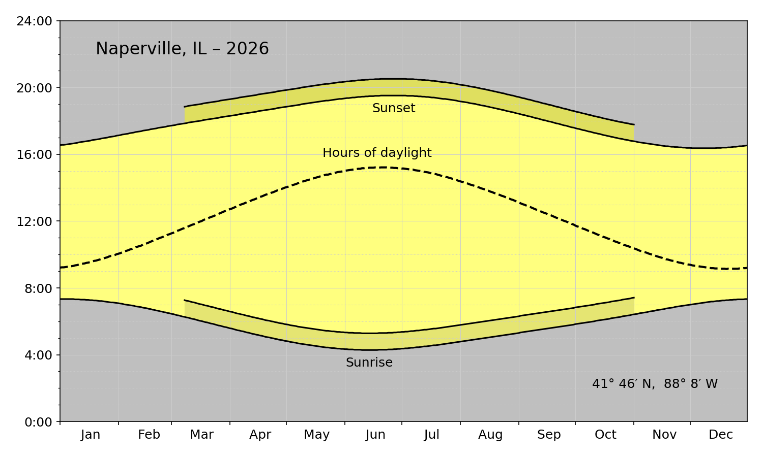
A graph like this wouldn’t work well on a phone because it’s wide instead of tall. But I figured it wouldn’t be too hard to redo it with the axes switched to give it a portrait format. I removed the various annotations because the location would be given in the Weather app. I also removed the “Hours of daylight” curve; without a 24-hour clock, I couldn’t cheat and treat the horizontal axis as both a time and a duration. I also got rid of the yellow and put everything in shades of gray to better match Apple’s aesthetic.
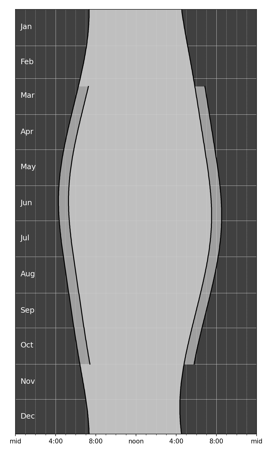
Apple would never include a plot with this many gridlines, but I couldn’t bring myself to get rid of them. They really help you track how the sunrise and sunsets change over the course of the year. Apple doesn’t want to scare its customers with complexity; when it feels the need to show detail, it puts it in a popup that appears when you tap inside the plot. Apple’s way is certainly cleaner looking, but I prefer seeing all the information at once.
Here’s the code that produced the plot above:
python:
  1:  #!/usr/bin/env python3
  2:
  3:  import sys
  4:  import re
  5:  from dateutil.parser import parse
  6:  from datetime import datetime
  7:  from datetime import timedelta
  8:  from matplotlib import pyplot as plt
  9:  import matplotlib.dates as mdates
 10:  from matplotlib.ticker import MultipleLocator, FormatStrFormatter
 11:
 12:
 13:  # Functions
 14:
 15:  def headerInfo(header):
 16:    "Return location name, coordinates, and year from the USNO header lines."
 17:
 18:    # Get the place name from the middle of the top line
 19:    left = 'o  ,    o  ,'
 20:    right = 'Astronomical Applications Dept.'
 21:    placeName = re.search(rf'{left}(.+){right}', header[0]).group(1).strip()
 22:
 23:    # If the place name ends with a comma, a space, and a pair of capitals,
 24:    # assume it's in location, ST format and capitalize the location while
 25:    # keeping the state as all uppercase. Otherwise, capitalize all the words.
 26:    if re.match(r', [A-Z][A-Z]', placeName[-4:]):
 27:      placeParts = placeName.split(', ')
 28:      location = ', '.join(placeParts[:-1]).title()
 29:      state = placeParts[-1]
 30:      placeName = f'{location}, {state}'
 31:    else:
 32:      placeName = placeName.title()
 33:
 34:    # The year is at a specific spot on the second line
 35:    year = int(header[1][80:84])
 36:
 37:    # The latitude and longitude are at specific spots on the second line
 38:    longString = header[1][10:17]
 39:    latString = header[1][19:25]
 40:
 41:    # Reformat the latitude into d° m′ N format (could be S)
 42:    dir = latString[0]
 43:    degree, minute = latString[1:].split()
 44:    lat = f'{int(degree)}° {int(minute)}′ {dir}'
 45:
 46:    # Reformat the longitude into d° m′ W format
 47:    dir = longString[0]
 48:    degree, minute = longString[1:].split()
 49:    long = f'{int(degree)}° {int(minute)}′ {dir}'
 50:
 51:    return placeName, lat, long, year
 52:
 53:  def bodyInfo(body, isLeap):
 54:    "Return lists of sunrise, sunset, and daylight length hours from the USNO body lines."
 55:
 56:    # Initialize
 57:    sunrises = []
 58:    sunsets = []
 59:    lengths = []
 60:
 61:    # Rise and set character start positions for each month
 62:    risePos = [ 4 + 11*i for i in range(12) ]
 63:    setPos = [ 9 + 11*i for i in range(12) ]
 64:
 65:    # Collect data from each day
 66:    for m in range(12):
 67:      for d in range(daysInMonth[m]):
 68:        riseString = body[d][risePos[m]:risePos[m]+4]
 69:        hour, minute = int(riseString[:2]), int(riseString[-2:])
 70:        sunrise = hour + minute/60
 71:        setString = body[d][setPos[m]:setPos[m]+4]
 72:        hour, minute = int(setString[:2]), int(setString[-2:])
 73:        sunset = hour + minute/60
 74:        sunrises.append(sunrise)
 75:        sunsets.append(sunset)
 76:        lengths.append(sunset - sunrise)
 77:
 78:    return(sunrises, sunsets, lengths)
 79:
 80:  def dstBounds(year):
 81:    "Return the DST start and end day indices according to current US rules."
 82:
 83:    # Start DST on second Sunday of March
 84:    d = 8
 85:    while datetime.weekday(dstStart := datetime(year, 3, d)) != 6:
 86:      d += 1
 87:    dstStart = (dstStart - datetime(year, 1, 1)).days
 88:
 89:    # End DST on first Sunday of November
 90:    d = 1
 91:    while datetime.weekday(dstEnd := datetime(year, 11, d)) != 6:
 92:      d += 1
 93:    dstEnd = (dstEnd - datetime(year, 1, 1)).days
 94:
 95:    return dstStart, dstEnd
 96:
 97:
 98:  # Start processing
 99:
100:  # Read the USNO data from stdin into a list of lines.
101:  # Text should come from https://aa.usno.navy.mil/data/RS_OneYear
102:  usno = sys.stdin.readlines()
103:
104:  # Get location and year from header
105:  placeName, lat, long, year = headerInfo(usno[:2])
106:
107:  # Month information, adjusted for leap year if needed.
108:  monthNames = 'Jan Feb Mar Apr May Jun Jul Aug Sep Oct Nov Dec'.split()
109:  isLeap = (year % 400 == 0) or ((year % 4 == 0) and not (year % 100 == 0))
110:  if isLeap:
111:    daysInMonth = [31, 29, 31, 30, 31, 30, 31, 31, 30, 31, 30, 31]
112:  else:
113:    daysInMonth = [31, 28, 31, 30, 31, 30, 31, 31, 30, 31, 30, 31]
114:
115:  # Get sunrise, sunset, and sunlight length lists from body
116:  sunrises, sunsets, lengths = bodyInfo(usno[9:], isLeap)
117:
118:  # Generate list of days for the year
119:  currentDay = datetime(year, 1, 1)
120:  lastDay = datetime(year, 12, 31)
121:  days = [currentDay]
122:  while (currentDay := currentDay + timedelta(days=1)) <= lastDay:
123:    days.append(currentDay)
124:
125:  # The portion of the year that uses DST
126:  dstStart, dstEnd = dstBounds(year)
127:  dstDays = days[dstStart:dstEnd + 1]
128:  dstRises = [ x + 1 for x in sunrises[dstStart:dstEnd + 1] ]
129:  dstSets = [ x + 1 for x in sunsets[dstStart:dstEnd + 1] ]
130:
131:  # Plot the data
132:  fig, ax =plt.subplots(figsize=(6,10))
133:
134:  # Shaded areas
135:  plt.fill_betweenx(days, sunrises, sunsets, facecolor='gray', alpha=.5)
136:  plt.fill_betweenx(days, 0, sunrises, facecolor='black', alpha=.75)
137:  plt.fill_betweenx(days, sunsets, 24, facecolor='black', alpha=.75)
138:  plt.fill_betweenx(dstDays, sunsets[dstStart:dstEnd + 1], dstSets, facecolor='white', alpha=.5)
139:  plt.fill_betweenx(dstDays, sunrises[dstStart:dstEnd + 1], dstRises, facecolor='black', alpha=.16)
140:
141:  # Curves
142:  plt.plot(sunrises, days, color='k')
143:  plt.plot(sunsets, days, color='k')
144:  plt.plot(dstRises, dstDays, color='k')
145:  plt.plot(dstSets, dstDays, color='k')
146:
147:  # Background grids
148:  ax.grid(which='major', color='#ccc', ls='-', lw=.5)
149:  ax.grid(which='minor', color='#ddd', ls=':', lw=.5)
150:
151:  # Vertical axis grid at month boundaries
152:  # ax.tick_params(axis='both', which='major', labelsize=12)
153:  plt.ylim(datetime(year, 1, 1), datetime(year, 12, 31))
154:  plt.tick_params(axis='y', length=0)
155:  m = mdates.MonthLocator(bymonthday=1)
156:  mfmt = mdates.DateFormatter('')
157:  ax.yaxis.set_major_locator(m)
158:  ax.yaxis.set_major_formatter(mfmt)
159:  ax.yaxis.set_inverted(True)
160:
161:  # Month labels inside the plot in white letters
162:  for m in range(12):
163:    middle = sum(daysInMonth[:m]) + daysInMonth[m]//2
164:    ax.text(.5, days[middle], monthNames[m], fontsize=12, color='w', ha='left', va='center')
165:
166:  # Horizontal axis labels formatted like h:mm
167:  plt.xlim(0, 24)
168:  xmajor = MultipleLocator(4)
169:  xminor = MultipleLocator(1)
170:  ax.xaxis.set_major_locator(xmajor)
171:  ax.xaxis.set_minor_locator(xminor)
172:  plt.xticks(ticks=[0, 4, 8, 12, 16, 20, 24], labels=['mid', '4:00', '8:00', 'noon', '4:00', '8:00', 'mid'])
173:
174:  # Tighten up the white border and save
175:  fig.set_tight_layout({'pad': 1.5})
176:  plt.savefig(f'{placeName}-{year}.png', format='png', dpi=150)
It’s a modification of the script given in my post from a couple of years ago. The main difference, apart from the color changes, is that instead of using Matplotlib’s fill_between function, I used the similar fill_betweenx function in Lines 135–139. Because the axes were switched, I needed to fill between vertical curves instead of horizontal curves.
The other unusual thing I did was use Matplotlib’s text function in Lines 161–164 to put the month labels inside the graph instead of along the left edge. That made the plot more compact. Because months are intervals of time, I centered the labels within their intervals. Apple (along with the rest of the world) puts labels like this at the start of each interval, but I refuse. Just because graphing software makes it easiest to do it that way doesn’t make it right.
Overall, I prefer the horizontal graph with the yellow sunlight hours, but it was fun figuring out how to make an alternative.
