A Zeckendorf table
January 10, 2026 at 9:29 AM by Dr. Drang
As a general rule, I don’t get the fascination mathematicians have with Fibonacci numbers, but I did enjoy this recent Numberphile video. It’s about the Zeckendorf representation of numbers, which I’d never heard of, and it inspired me to build a short Mathematica notebook that reproduces one of the things in the video.
Zeckendorf’s theorem says that any positive integer can be uniquely represented as the sum of non-consecutive Fibonacci numbers. For example,
which are the ninth, seventh, and fourth Fibonacci numbers. In the video, Tony Padilla uses this fact in a crappy magic trick to divine the number Brady guesses. The trick involves this table of numbers:
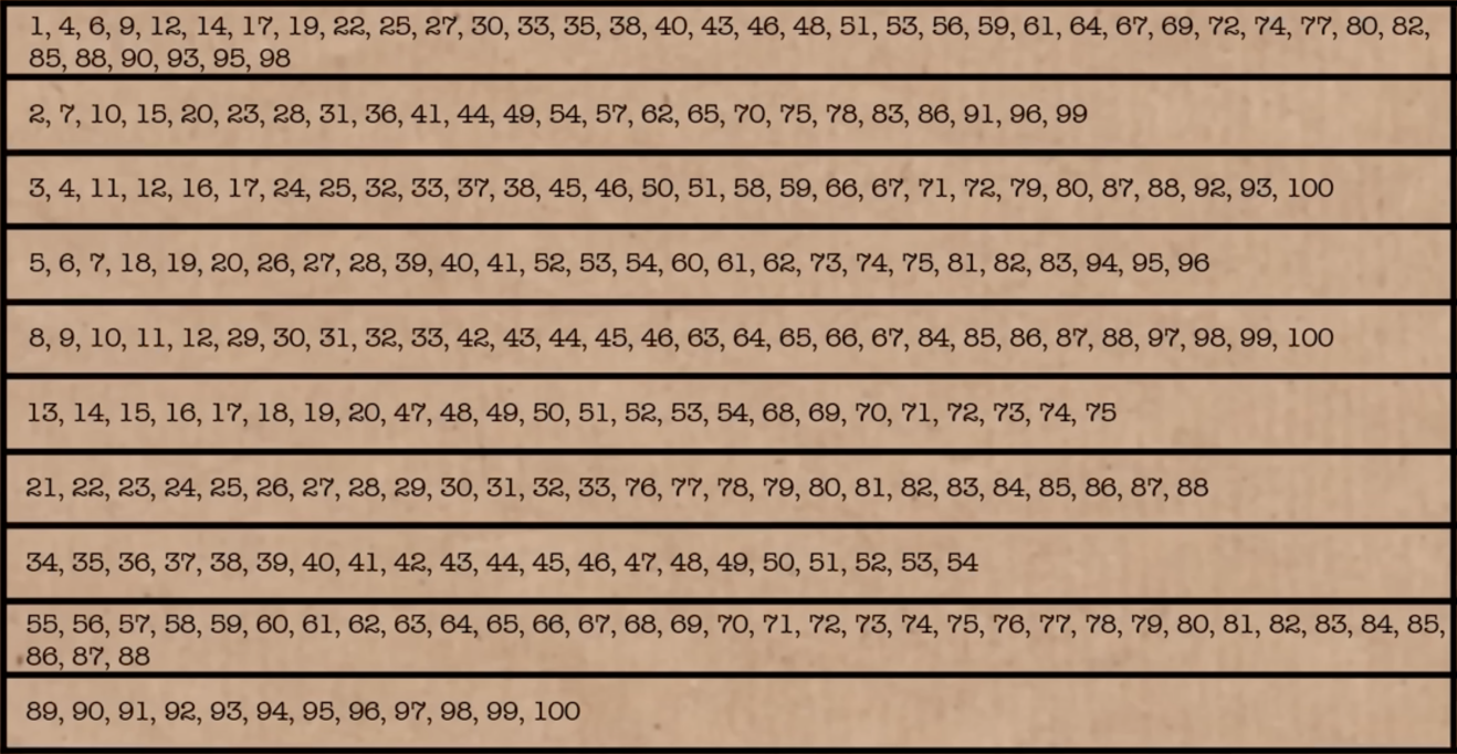
The trick goes like this: Brady chooses a number from 1 to 100. He then checks the rows in this table that contain his number. Tony then scans the table—not as quickly as he should to make it seem magical—and tells Brady the number he chose.
The trick is in the construction of the table. Each row of the table starts with a Fibonacci number and contains every number (from 1 through 100) that includes that Fibonacci number in its Zeckendorf representation. To determine the number guessed, the “magician” adds up the first number in each checked row.
I thought it would be fun to build the table. I opened Mathematica and started exploring its Fibonacci-related functions. It didn’t take long to see that the Wolfram Function Repository (a sort of external library for the Wolfram Language) has a ZeckendorfRepresentation function. When given a number, it returns a list of ones and zeros corresponding to the Zeckendorf representation of that number. For example,
ResourceFunction["ZeckendorfRepresentation"][50]
returns
{1, 0, 1, 0, 0, 1, 0, 0}
The Fibonacci numbers included in the Zeckendorf representation correspond to the ones, and those that are skipped correspond to the zeros. The most significant Fibonacci number (i.e., the largest) comes first in the list. You may have noticed that although 34 is the ninth Fibonacci number, the list above is only eight digits long. Recall that the Fibonacci sequence starts with two ones:
1, 1, 2, 3, 5, 8, 13, 21, 34, 55, 89, …
The first one is redundant in a Zeckendorf representation, so it’s ignored.
To make the table, I started with the list of Fibonacci numbers less than 100, not including the initial one. The Fibonacci function returns the nth Fibonacci number, so I built the list this way:
fibs = Select[Map[Fibonacci, Range[2, 15]], # < 100 &]
The call to Map created a list of the 2nd through 15th Fibonacci numbers. I couldn’t remember how many Fibonacci numbers are less than 100, but I figured the 15th had to be above 100. I then used Select and a pure function to filter the higher numbers out of the list.1 This returned
{1, 2, 3, 5, 8, 13, 21, 34, 55, 89}
Next I created a list of the Zeckendorf representations of every integer from 1 through 100. Because the Zeckendorf representations are themselves lists of varying length, I decided it would be easier to work with reversed Zeckendorf representations, where the least significant digit comes first.
rzeck = Map[Reverse,
            Map[ResourceFunction["ZeckendorfRepresentation"],
                Range[1, 100]
               ]
           ];
The rzeck list is kind of long, but here are the first ten and last two entries:
{{1},
 {0, 1},
 {0, 0, 1},
 {1, 0, 1},
 {0, 0, 0, 1},
 {1, 0, 0, 1},
 {0, 1, 0, 1},
 {0, 0, 0, 0, 1},
 {1, 0, 0, 0, 1},
 {0, 1, 0, 0, 1},
 [etc]
 {0, 1, 0, 0, 1, 0, 0, 0, 0, 1},
 {0, 0, 1, 0, 1, 0, 0, 0, 0, 1}}
The reversed Zeckendorf representation of 50 is
{0, 0, 1, 0, 0, 1, 0, 1}
so to get the Fibonacci numbers in that representation, we do this:
fibs[[Flatten[Position[rzeck[[50]], 1]]]]
The Position function returns a nested list of where the ones are,
{{3}, {6}, {8}}
which is why it had to be run through Flatten.
This idea is how I built a list of the Fibonacci terms from the Zeckendorf representations. I created a function like the code above and mapped it to every integer from 1 through 100.
fibTerms[n_] := fibs[[Flatten[Position[rzeck[[n]], 1]]]]
f = Map[fibTerms, Range[1, 100]]
So now I have a list of 100 lists. Each sublist contains the Fibonacci numbers of the Zeckendorf representation for the corresponding index number of the outer list. Like this:
  1: {1}                    51: {1, 3, 13, 34}
  2: {2}                    52: {5, 13, 34}
  3: {3}                    53: {1, 5, 13, 34}
  4: {1, 3}                 54: {2, 5, 13, 34}
  5: {5}                    55: {55}
  6: {1, 5}                 56: {1, 55}
  7: {2, 5}                 57: {2, 55}
  8: {8}                    58: {3, 55}
  9: {1, 8}                 59: {1, 3, 55}
 10: {2, 8}                 60: {5, 55}
 11: {3, 8}                 61: {1, 5, 55}
 12: {1, 3, 8}              62: {2, 5, 55}
 13: {13}                   63: {8, 55}
 14: {1, 13}                64: {1, 8, 55}
 15: {2, 13}                65: {2, 8, 55}
 16: {3, 13}                66: {3, 8, 55}
 17: {1, 3, 13}             67: {1, 3, 8, 55}
 18: {5, 13}                68: {13, 55}
 19: {1, 5, 13}             69: {1, 13, 55}
 20: {2, 5, 13}             70: {2, 13, 55}
 21: {21}                   71: {3, 13, 55}
 22: {1, 21}                72: {1, 3, 13, 55}
 23: {2, 21}                73: {5, 13, 55}
 24: {3, 21}                74: {1, 5, 13, 55}
 25: {1, 3, 21}             75: {2, 5, 13, 55}
 26: {5, 21}                76: {21, 55}
 27: {1, 5, 21}             77: {1, 21, 55}
 28: {2, 5, 21}             78: {2, 21, 55}
 29: {8, 21}                79: {3, 21, 55}
 30: {1, 8, 21}             80: {1, 3, 21, 55}
 31: {2, 8, 21}             81: {5, 21, 55}
 32: {3, 8, 21}             82: {1, 5, 21, 55}
 33: {1, 3, 8, 21}          83: {2, 5, 21, 55}
 34: {34}                   84: {8, 21, 55}
 35: {1, 34}                85: {1, 8, 21, 55}
 36: {2, 34}                86: {2, 8, 21, 55}
 37: {3, 34}                87: {3, 8, 21, 55}
 38: {1, 3, 34}             88: {1, 3, 8, 21, 55}
 39: {5, 34}                89: {89}
 40: {1, 5, 34}             90: {1, 89}
 41: {2, 5, 34}             91: {2, 89}
 42: {8, 34}                92: {3, 89}
 43: {1, 8, 34}             93: {1, 3, 89}
 44: {2, 8, 34}             94: {5, 89}
 45: {3, 8, 34}             95: {1, 5, 89}
 46: {1, 3, 8, 34}          96: {2, 5, 89}
 47: {13, 34}               97: {8, 89}
 48: {1, 13, 34}            98: {1, 8, 89}
 49: {2, 13, 34}            99: {2, 8, 89}
 50: {3, 13, 34}           100: {3, 8, 89}
To get Tony’s table, I have to do a sort of inversion of the list f. This consists of going through every Fibonacci number in fibs and selecting the indices of f in which that Fibonacci number appears. Here’s the code:
Table[Select[f, MemberQ[i] -> Index], {i, fibs}]
MemberQ is a Boolean function, returning True if the item is in the list. I’m using the operator form of it. The Wolfram Language has lots of test functions that end with Q, which I think of as meaning “Question” or “Query.” It’s a convention taken from Lisp, where predicate functions tend to end with the letter p.
Here’s the resulting table, formatted to make it easier to read:
1, 4, 6, 9, 12, 14, 17, 19, 22, 25, 27, 30, 33, 35,
38, 40, 43, 46, 48, 51, 53, 56, 59, 61, 64, 67, 69,
72, 74, 77, 80, 82, 85, 88, 90, 93, 95, 98

2, 7, 10, 15, 20, 23, 28, 31, 36, 41, 44, 49, 54,
57, 62, 65, 70, 75, 78, 83, 86, 91, 96, 99

3, 4, 11, 12, 16, 17, 24, 25, 32, 33, 37, 38, 45,
46, 50, 51, 58, 59, 66, 67, 71, 72, 79, 80, 87, 88,
92, 93, 100

5, 6, 7, 18, 19, 20, 26, 27, 28, 39, 40, 41, 52, 53,
54, 60, 61, 62, 73, 74, 75, 81, 82, 83, 94, 95, 96

8, 9, 10, 11, 12, 29, 30, 31, 32, 33, 42, 43, 44,
45, 46, 63, 64, 65, 66, 67, 84, 85, 86, 87, 88, 97,
98, 99, 100

13, 14, 15, 16, 17, 18, 19, 20, 47, 48, 49, 50, 51,
52, 53, 54, 68, 69, 70, 71, 72, 73, 74, 75

21, 22, 23, 24, 25, 26, 27, 28, 29, 30, 31, 32, 33,
76, 77, 78, 79, 80, 81, 82, 83, 84, 85, 86, 87, 88

34, 35, 36, 37, 38, 39, 40, 41, 42, 43, 44, 45, 46,
47, 48, 49, 50, 51, 52, 53, 54

55, 56, 57, 58, 59, 60, 61, 62, 63, 64, 65, 66, 67,
68, 69, 70, 71, 72, 73, 74, 75, 76, 77, 78, 79, 80,
81, 82, 83, 84, 85, 86, 87, 88

89, 90, 91, 92, 93, 94, 95, 96, 97, 98, 99, 100
If you compare it to the image of the table above, you’ll see that they match.
Here’s the complete notebook:
-
For the record, 89 is the 11th Fibonacci number. ↩
Choosing a driving route in CarPlay
January 6, 2026 at 9:05 PM by Dr. Drang
If you pay any attention at all to the Apple-centric web, you saw an explosion of links yesterday to this article by Nikita Prokopov, which rightly eviscerates the proliferation of menu icons in macOS 26. I may write up my thoughts on menu icons in a future post (short version: they don’t belong), but today I have something else on my mind. Like Prokopov’s post, it addresses the question, “Why the fuck has Apple forgotten the UI principles it knew forty years ago?”
If you’re using CarPlay and ask for directions, you’ll see a screen that looks like this:
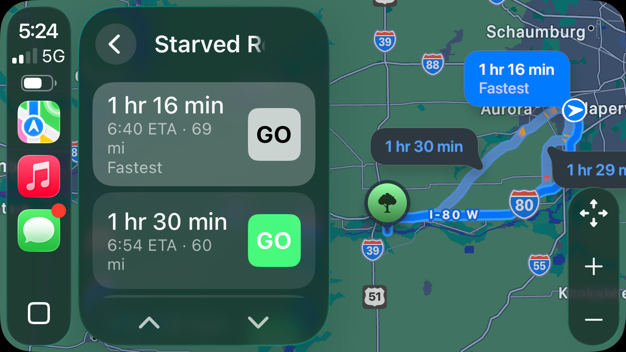
That the default route’s Go button is gray while the alternates are green is a stupidity addressed by Sage Olson and Joe Rosensteel1, so I won’t bother.
What I will address is that whichever route you choose, you have to tap its Go button. Even though the full description of each route looks like a button, the only part that’s tappable is the part that looks like a button inside another button.
Is this just as stupid as having a dull color as the default and a bright color as the alternate? Yes. And Apple has known that descriptions should be click/tap targets since the very beginning of the Mac. Here, courtesy of Infinite Mac, is MacWrite 1.0 running on a simulation of an original Macintosh.
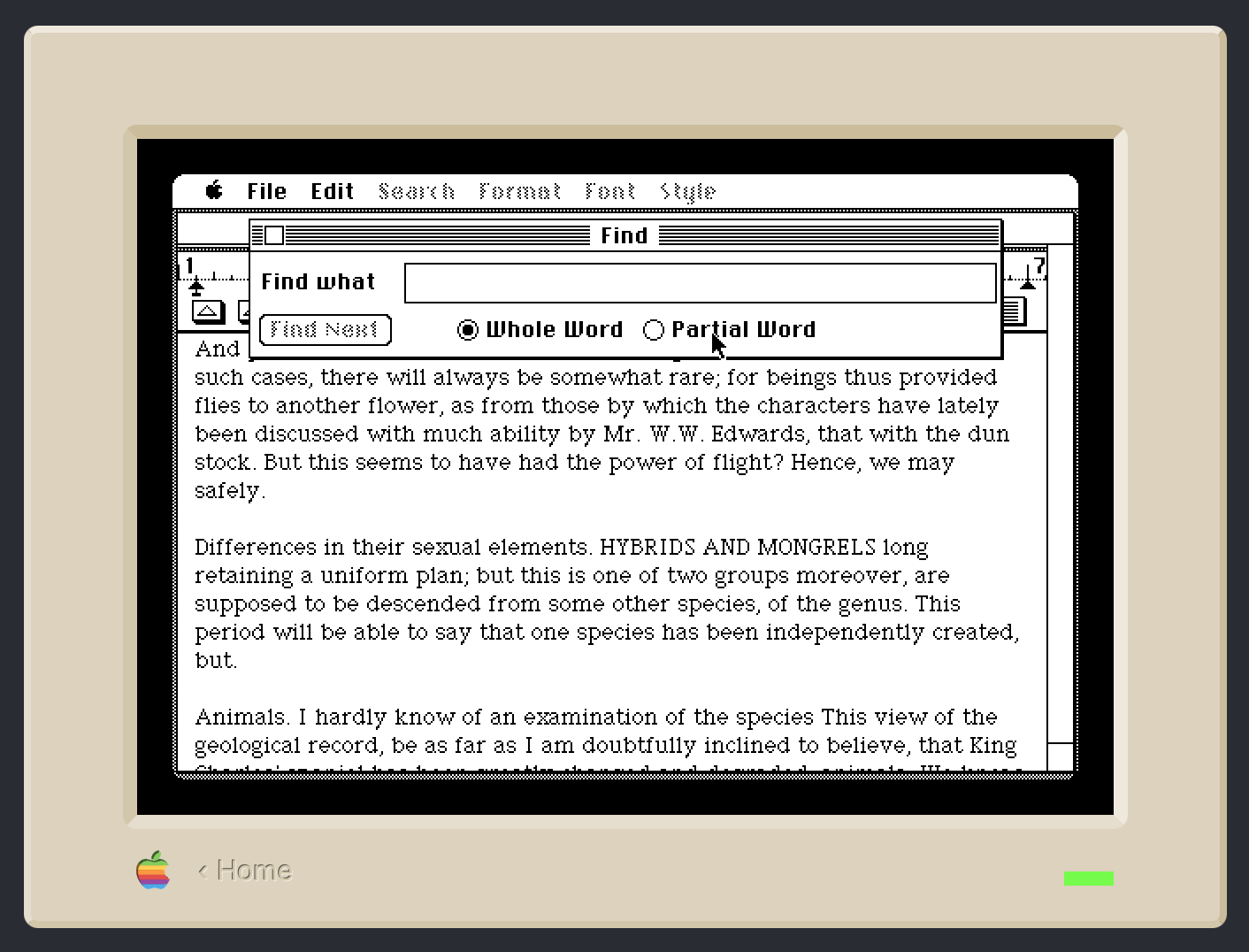
I’ve brought up the Find window. It’s currently set to do a Whole Word search, but I can switch to a Partial Word search by clicking on the Partial Word radio button or anywhere on that button’s label. Even with a label that doesn’t look like a button, Apple knew it would be helpful to select the radio button if I clicked on its label. After all, what else could I possibly mean if I clicked on the word Partial?
Apple understood this in 1984. But now, in 2026, if I’m driving and ask Siri for directions to Starved Rock State Park, CarPlay doesn’t understand what I mean if I tap in the middle of either of those large gray buttons-that-aren’t-buttons.
Why, you may ask, would I even consider tapping outside the Go button? Because Apple has trained me for forty years to expect that I can tap on its label.
-
Even Joe couldn’t find the Mastodon post where he complains about it, but we both remember that he did. ↩
Proofreading with the Claude API
January 2, 2026 at 3:57 PM by Dr. Drang
As an alternative to the Writing Tools proofreading macro I showed in yesterday’s post, I built another one, called Proofread With Claude, which gets the edited text through a call to Anthropic’s Claude API. I make the call in Python using Simon Willison’s llm module and the llm-anthropic extension.
Although I knew about the llm module a while ago, I hadn’t considered using it for proofreading until Giovanni Lanzani explained how he does it. His macro uses the llm command-line tool, and he has the LLM highlight the changes by making them bold, but it’s the inspiration for my macro below. I didn’t realize how easy Simon Willison had made using the various LLM APIs until I saw how Giovanni used it.
Here’s the macro:

It copies the text of the frontmost BBEdit document and passes it as standard input to this Python script:
python:
 1:  #!/usr/bin/env python
 2:
 3:  import llm
 4:  import sys
 5:  import subprocess
 6:
 7:  # Standard input is the Markdown source of the post to be proofread.
 8:  # cmd = 'tell application "BBEdit" to get text of front text document'
 9:  post = sys.stdin.read()
10:
11:  # The prompt for proofreading the document.
12:  prompt = f'''Find typographical errors and grammatical mistakes in the
13:  following Markdown text. Ignore all embedded URLs, quoted text, and
14:  programming code. Only report actual errors, not style suggestions.
15:  Return the edited text in plain Markdown format without any
16:  introductory text. After that, add a blank line, a line with 10
17:  asterisks, another blank line, and then the reasons for the changes
18:  you made. The Markdown text you're analyzing starts after a line with
19:  20 asterisks.
20:
21:  ********************
22:  {post}
23:  '''
24:
25:  # Do the proofreading and get the response.
26:  model = llm.get_model('claude-sonnet-4.5')
27:  response = model.prompt(prompt)
28:
29:  # Split the response into the edited post and the explanation.
30:  # Put them on the clipboard.
31:  edit, explanation = response.text().split('\n**********\n')
32:  subprocess.run('pbcopy', text=True, input=explanation)
33:  subprocess.run('pbcopy', text=True, input=edit)
The script creates a prompt consisting of the instructions given in Lines 12–21 and the text from BBEdit. It then passes that off to the Claude Sonnet 4.5 model (Lines 26–27).
The response comes back as the edited text with all the changes Claude thinks I should make, a line of ten asterisks, and more text explaining the reasons for the changes. Lines 31–33 split the response at the line of asterisks and copy each part to the clipboard—first the explanation, then the edited text.
Let me step in here and point out that Keyboard Maestro keeps a clipboard history, whether you use it interactively or not. After the script above runs, there are three new items in the history:
- The edited text.
- The explanation.
- The original text.
The edited text is the most recent and is the one used by BBEdit when the File>New>(with Clipboard) menu item is selected.
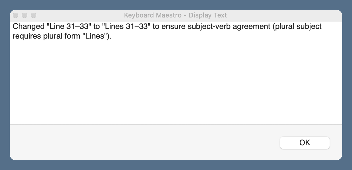
The rest of the macro follows much of the same logic as yesterday’s: it creates a new BBEdit text document with the edited text and compares it with the original text in a two-pane window. In addition, this macro displays the explanation in a floating window, which I refer to as I work my way through the proposed changes.
You’ll notice that I use the same keyboard shortcut, ⇧⌃⌥⌘P, for both the Writing Tools and Claude proofreading macros. When I press those keys, a conflict palette appears, and I choose the proofreader I want.
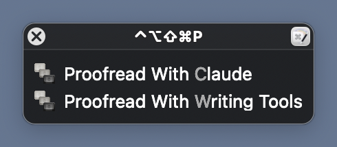
This is easier than remembering a different shortcut for each macro.
Claude’s API access isn’t free, nor is OpenAI’s, which I could switch to through a simple change of the model in Line 26 of the Python script.1 But they’re pay-as-you-go systems, charging for the input and output tokens you use, and neither costs more than a few cents per proofreading session. I don’t see this breaking the bank. I should mention, though, that API access is on top of any monthly subscription you might have. I don’t have a monthly subscription and don’t use LLMs for anything else. For me, pay-as-you-go will be cheaper than a monthly subscription.
There’s no particular reason I chose to make this macro with Claude’s API rather than OpenAI’s. I’ll probably make another one that uses OpenAI soon, just to see how the three variants compare. I don’t think I’ll add Gemini to the mix; if the rumors are correct, I’ll be getting that for free through Writing Tools soon enough.
Proofreading with Writing Tools
January 1, 2026 at 6:51 PM by Dr. Drang
Yes, it’s been less than a week since I wrote about LLM proofreading and showed you the “final” version of the Keyboard Maestro macro I’d been using. And that wasn’t a lie because it is the final version of that macro. It’s just that I’m now using two new macros with a different approach. Today’s post will be about the first of these new macros, which combines the Proofreading command in Apple’s Writing Tools with BBEdit’s document comparison system.
The new macros came about because of some conversations I had after my previous proofreading posts. Marc Zeedar (via email), Giovanni Lanzani (via Mastodon), and Jason Snell (via Slack, but he also talked about it on Upgrade) all told me how they were using LLMs for proofreading, and all of their ideas were good in different ways. I’ve stolen different parts of their systems to come up with my new macros. Today’s macro is based mainly on Marc Zeedar’s work.
Marc is the publisher of xDev Magazine, which is focused on cross-platform development with the Xojo app system. As you might expect, his main proofreading system, which uses the OpenAI API, is built in Xojo, but he also has a couple of simple Keyboard Maestro macros that use Writing Tools. Marc’s main contribution to my new method of proofreading was to convince me that I shouldn’t fear having the LLM create a new version of the document I’m working on, one with all the changes it wants.
I needed convincing because I had the wrong model in my head for applying changes. I thought that if I had two versions of a document, my original and the one with the LLM’s changes, I’d have to either accept or reject each change in turn. While that’s fine for many changes, I had learned that LLMs often point out a mistake but don’t give me the fix I want. It’s a situation in which neither accept nor reject is the right answer. But if you use the comparison tools in BBEdit, you get a third option: you can edit text directly in the two-pane comparison window.
Here’s an example. (I know it’s small, but you probably don’t need to see the details to follow along. And you can zoom in if necessary.)
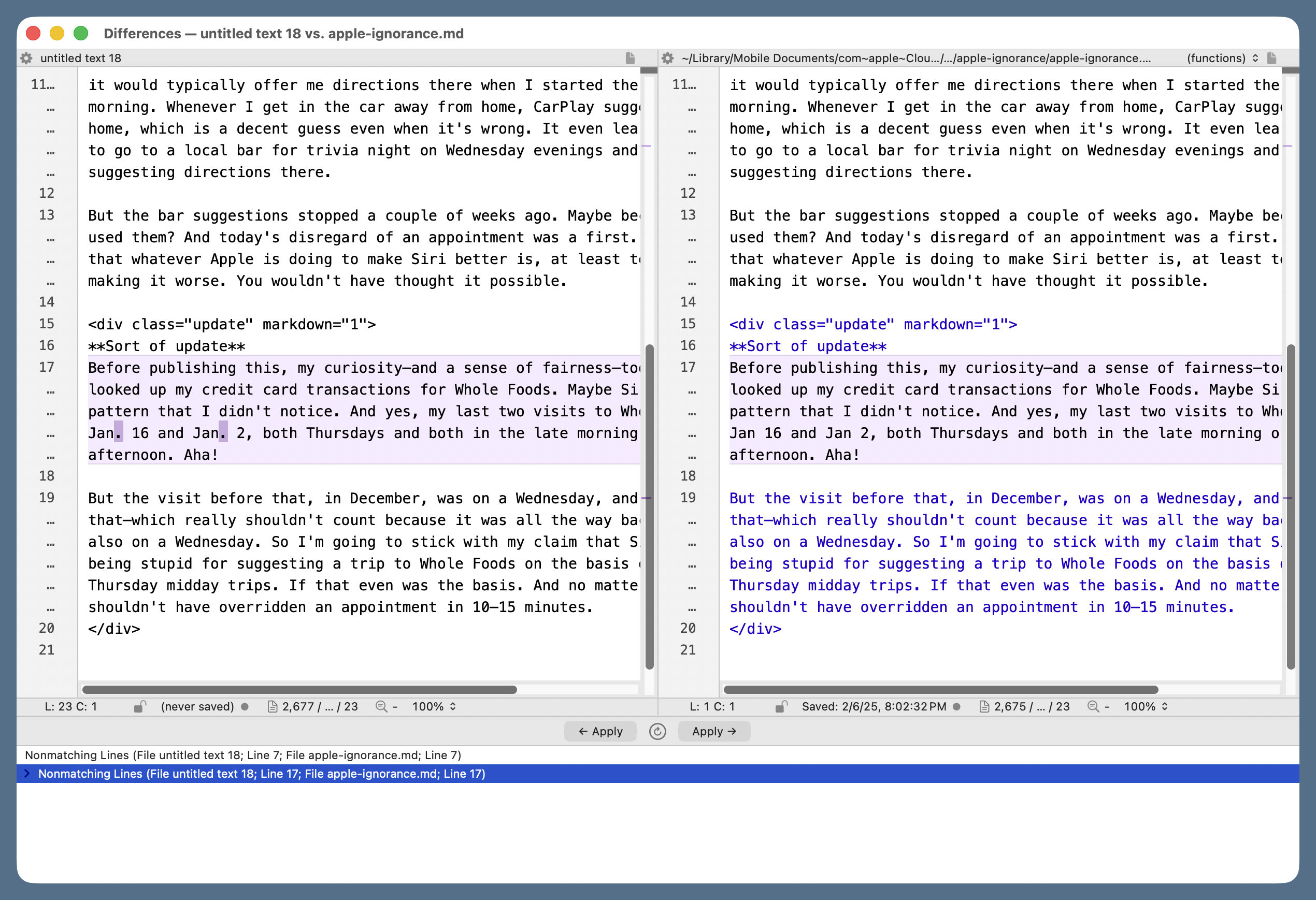
The document on the right is the original Markdown source for a post I wrote in February of last year. The document on the left has what the Writing Tools Proofread command thinks I should have written. The complaint is that I wrote “Jan 16 and Jan 2,” while Writing Tools thinks I should have written “Jan. 16 and Jan. 2,” with periods to make it clear that I was abbreviating “January.” Let’s say I agree that the text should be changed, but I don’t want what Writing Tools suggested; I want to use the full month name. I can just click in the right pane and add “uary” after each “Jan.” The regular text window with that file will be updated accordingly because the right pane isn’t just a view, it’s a live document. This makes the proofreading go very smoothly.
If you want to do this sort of thing by hand in BBEdit, choose Proofread from the Writing Tools submenu of the Edit menu.
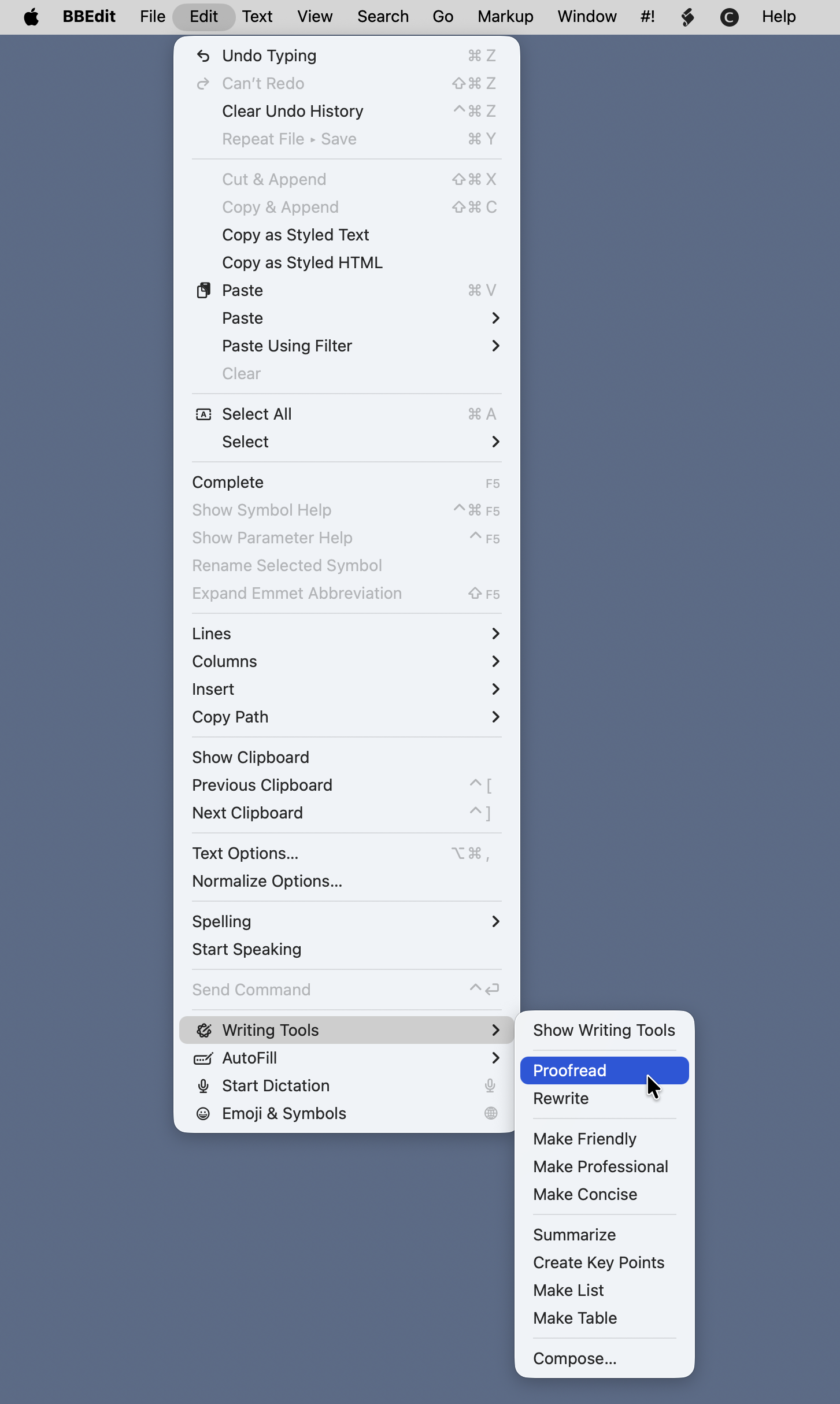
It’s quite a ways down. A new window will pop up next to the frontmost document, and Writing Tools will spend some time working out the edits that should be made. When it’s done, the buttons at the bottom of the popup window will become active, and you can click Copy to put the edited text on the clipboard.
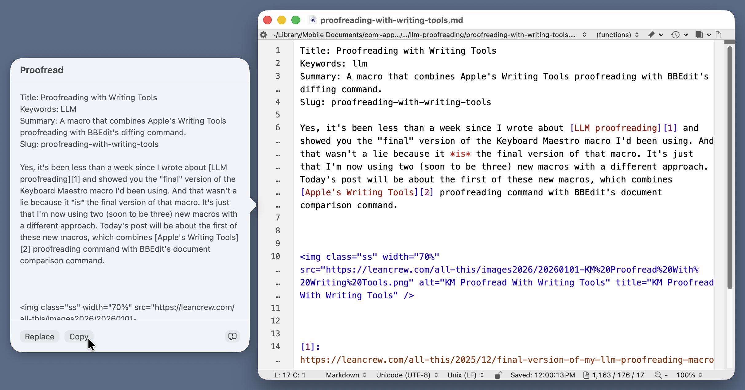
Now you create a new document in BBEdit, paste the clipboard contents into it, and choose Compare Two Front Windows from the Find Differences submenu in the Search menu.

That will bring up the two-pane comparison window we saw earlier, and you can step through the differences, applying the suggested changes, rejecting the suggested changes, or making your own changes as you see fit.
I, of course, refuse to do all that messing around with copying, pasting, and selecting menu items when I can write a Keyboard Maestro macro to do it for me. Here’s Proofread With Writing Tools (you may need to right-click the link to get it to download).
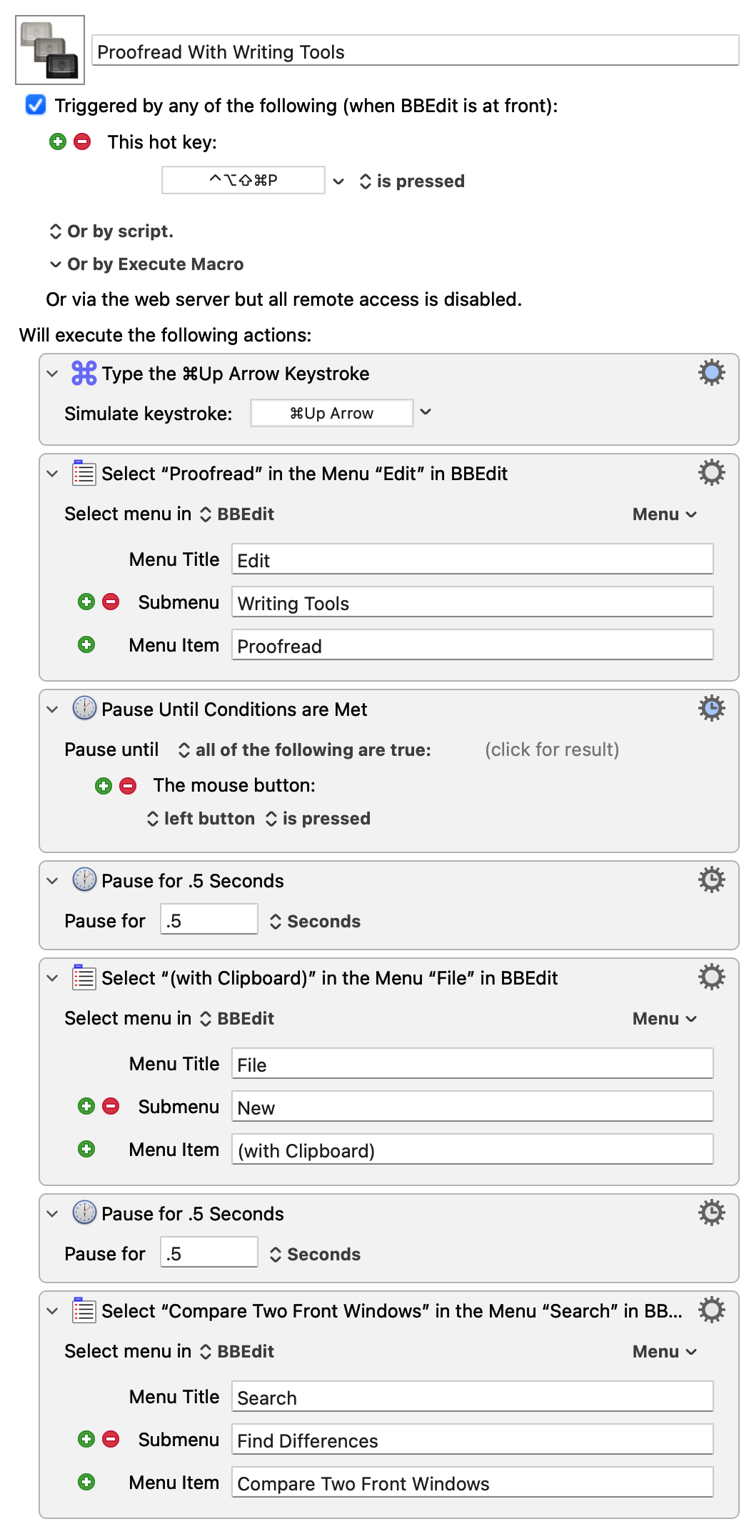
The only tricky thing about this macro is the Pause Until Conditions Are Met action. There’s no way to predict how long it will take for Writing Tools to generate the edited text. I initially thought I could pause until the Copy button became active, but that didn’t work. Then I realized that I could use my mouse click on the Copy button to get the macro going again.
You may be thinking, “Doesn’t Writing Tools suck? It is, after all, part of Apple Intelligence.” In my limited experience, it’s worked surprisingly well. I’ve had only two problems crop up:
- If the document is long and complex, Writing Tools may simply fail. It thinks for a long time and then puts up an error message saying it can’t do it. I don’t know what the underlying problem is, but it won’t finish unless you split the document into smaller chunks.
- It doesn’t understand Markdown footnote markers. Whenever I have something in the body of the document that looks like
[^note], it either replaces it with some other text (without the brackets and caret) or just deletes it. Obviously, I reject these changes, but it’s weird that it makes them. It’s never deleted the footnote text or the marker in front of it, just the marker in the body of the text.
My other new proofreading macro, which I hope to show you in the next few days, uses the Anthropic API instead of Writing Tools, but it still uses BBEdit’s comparison system. Thanks to Marc Zeedar for showing me its advantages.
Update 2 Jan 2026 7:59 AM
I added the last two actions to the macro this morning. The first of these (typing ⌘`) brings the text window with the edited text to the foreground, and the second closes it. Now when the macro finishes, the two-pane comparison window is in the foreground as before, but I no longer have to close the temporary text window.
