Breaking the rules
February 4, 2016 at 11:31 PM by Dr. Drang
Earlier this evening I was looking through tweets that link here,1 and after following a particular thread backward, I found this:
Transition
— Benedict Evans (@BenedictEvans) Feb 4 2016 2:13 PM
(You can see a larger version of the image by clicking on it.)
My animus to stacked area charts led me to tweet this:
Remember, kids, never use stacked area charts.
twitter.com/BenedictEvans/…
— Dr. Drang (@drdrang) Feb 4 2016 6:11 PM
That got a very quick response:
Remember kids, any charts ‘rule’ will produce bad charts. Judgement beats rules. twitter.com/drdrang/status…
— Benedict Evans (@BenedictEvans) Feb 4 2016 6:14 PM
Evans is right.2 Judgment does beat rules. I’m not averse to breaking rules occasionally, but you have to exercise good judgment when you do so. You have to have a reason.
My case against stacked area charts is here. In a nutshell, the problem with stacked area charts is that each of the items being graphed (except the one on the bottom) are distorted because they’re set upon a sloped and curving baseline, i.e., the top of the item graphed below it. This can hide behavior that’s present in the data and suggest behavior that isn’t.
In Evans’s graph, what’s being hidden is the iPad’s declining sales. Oh, it’s there, no doubt, but it isn’t as obvious as it should be because it’s sitting on top of the upward sloping iPhone.
Now, you might argue that the purpose of Evans’s graph wasn’t to show the iPad’s decline. That’s probably true, but if the purpose was to show Apple’s devices rising and overtaking Windows PCs, why bother breaking Apple’s sales into its components? Why not just show Apple’s composite sales of Macs, iPads, and iPhones as a single line, growing up and crossing the Windows PC line?
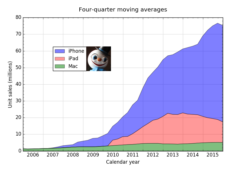
If you’re going to show the individual components, you have an obligation to show them clearly, and Evans’s graph doesn’t do that. Interestingly, if he had given it some thought, Evans could have made a stacked area chart that presented the data with less distortion. Simply plot the iPad sales between the Mac and the iPhone.3
The iPad sales are less distorted in this view because the Mac sales provide a relatively flat baseline for the iPad to sit upon. Of course, the iPhone sales are more distorted than in Evans’s graph because of the iPad hump, but that’s less of a worry, I think, because iPhone sales are so much higher. Also, the gridlines in the background aid in seeing the heights of the individual components.
Is there some rule that you have to stack the sales in the order that the products were introduced? It’s certainly natural to stack them in that order, but it isn’t a rule. And if it were, this would be a good place to break it.
By the way, I don’t want to give the impression that I actually like this graph. I just think it’s better than Evans’s.4 Lesser of two evils.
And as for judgment, it’s nice to talk about, but it’s better to apply.
-
Oh, don’t tell me you’ve never done that for your site. ↩
-
Not in the first sentence, of course. That’s just silly. But I realize he’s overstating to make a point, something he doesn’t seem to recognize when others do it. ↩
-
I don’t have the Windows PC data, and I’m not going to go looking for it because I have no argument with that part of the plot. I’m sticking with the color convention I used in earlier charts rather than adopting the colors Evans used. Similarly, I’m using a four-quarter moving average instead of a four-quarter total. This is not a knock on Evans’s choices for color or scale; it was just faster for me to make a plot that was consistent with my earlier choices. ↩
-
And not just in the order of the stacking. Although I do like Evans’s use of old-style numerals, his tick labels along the horizontal axis are an abomination. The eye-glazing repetition of Jun/Dec over 29 labels makes reading the labels harder than necessary, as does their vertical orientation. There’s no need for a label every six months, or even every year. They take up way too much vertical space and draw attention away from the data.
I don’t think much of his legend, either. Areas should be designated by blocks of color, not streaks that are only slightly thicker than the marker for lines. ↩


