Tweaking a legend
February 6, 2016 at 10:07 AM by Dr. Drang
To get the stacked area chart posted a couple of days ago, I used a slightly edited version of the Matplotlib script that generated the line-and-scatter chart from a week ago. I thought it might be helpful, mostly to future me, to discuss what I did and how the chart was improved by small changes.
This is the line-and-scatter chart I started with,
and this is the script that produced it:
python:
  1:  #!/usr/bin/env python
  2:
  3:  from dateutil.relativedelta import *
  4:  from datetime import date
  5:  from sys import stdin, argv, exit
  6:  import numpy as np
  7:  import matplotlib.pyplot as plt
  8:  import matplotlib.dates as mdates
  9:  from matplotlib.ticker import MultipleLocator
 10:  from PIL import Image
 11:
 12:  # Initialize
 13:  phoneFile = 'iphone-sales.txt'
 14:  padFile = 'ipad-sales.txt'
 15:  macFile = 'mac-sales.txt'
 16:  lastYear = 2000
 17:  plotFile = argv[1]
 18:  if plotFile[-4:] != '.png':
 19:     plotFile = plotFile + '.png'
 20:
 21:  # Get the last Saturday of the given month.
 22:  def lastSaturday(y, m):
 23:    return date(y, m, 1) + relativedelta(day=31, weekday=SA(-1))
 24:
 25:  # Read the given data file and return the series. Also update the
 26:  # global variable lastYear to the last year in the data.
 27:  def getSeries(fname):
 28:    global lastYear
 29:    qmonths = {'Q1': 12, 'Q2': 3, 'Q3': 6, 'Q4': 9}
 30:    dates = []
 31:    sales = []
 32:    for line in open(fname):
 33:      quarter, units = line.strip().split('\t')
 34:      units = float(units)
 35:      year, q = quarter.split('-')
 36:      year = int(year)
 37:      month = qmonths[q]
 38:      if month == 12:
 39:        qend = lastSaturday(year-1, month)
 40:      else:
 41:        qend = lastSaturday(year, month)
 42:      if qend.year > lastYear:
 43:        lastYear = qend.year
 44:      dates.append(qend)
 45:      sales.append(units)
 46:    ma = [0]*len(sales)
 47:    for i in range(len(sales)):
 48:      lower = max(0, i-3)
 49:      chunk = sales[lower:i+1]
 50:      ma[i] = sum(chunk)/len(chunk)
 51:    return dates, sales, ma
 52:
 53:  # Read in the data
 54:  macDates, macRaw, macMA = getSeries(macFile)
 55:  phoneDates, phoneRaw, phoneMA = getSeries(phoneFile)
 56:  padDates, padRaw, padMA = getSeries(padFile)
 57:
 58:  # Tick marks and tick labels
 59:  y = mdates.YearLocator()
 60:  m = mdates.MonthLocator(bymonth=[1, 4, 7, 10])
 61:  yFmt = mdates.DateFormatter('             %Y')
 62:  ymajor = MultipleLocator(10)
 63:  yminor = MultipleLocator(2)
 64:
 65:  # Plot the moving averages with major gridlines.
 66:  fig, ax = plt.subplots(figsize=(8,6))
 67:  ax.plot(macDates, macMA, 'g-', linewidth=3, label='Mac')
 68:  ax.plot(macDates, macRaw, 'g.')
 69:  ax.plot(phoneDates, phoneMA, 'b-', linewidth=3, label='iPhone')
 70:  ax.plot(phoneDates, phoneRaw, 'b.')
 71:  ax.plot(padDates, padMA, 'r-', linewidth=3, label='iPad')
 72:  ax.plot(padDates, padRaw, 'r.')
 73:  ax.grid(linewidth=1, which='major', color='#dddddd', linestyle='-')
 74:
 75:  # Set the upper limit to show all of the last year in the data set.
 76:  plt.xlim(xmax=date(lastYear, 12, 31))
 77:
 78:  # Set the labels
 79:  plt.ylabel('Unit sales (millions)')
 80:  plt.xlabel('Calendar year')
 81:  t = plt.title('Raw sales and four-quarter moving averages')
 82:  t.set_y(1.03)
 83:  ax.xaxis.set_major_locator(y)
 84:  ax.xaxis.set_minor_locator(m)
 85:  ax.xaxis.set_major_formatter(yFmt)
 86:  ax.yaxis.set_minor_locator(yminor)
 87:  ax.yaxis.set_major_locator(ymajor)
 88:  ax.set_axisbelow(True)
 89:  plt.legend(loc=(.15, .6), prop={'size':12})
 90:  fig.set_tight_layout({'pad': 1.5})
 91:
 92:  # Save the plot file as a PNG.
 93:  plt.savefig(plotFile, format='png', dpi=100)
 94:
 95:  # Add the head. Unfortunately, I don't know a way to get its
 96:  # size and location other than trial and error.
 97:  plot = Image.open(plotFile)
 98:  head = Image.open('snowman-head.jpg')
 99:  smallhead = head.resize((86, 86), Image.ANTIALIAS)
100:  plot.paste(smallhead, (300, 162))
101:  plot.save(plotFile)
This itself is an evolved version of a script that was discussed in a post back in July. If I were writing it from scratch today, I’d use Pandas to read in and manipulate the data, but I see no reason to do a full rewrite on a script that works—especially one that I’m doing for fun instead of profit.
The first thing I did to turn it into a stacked area chart was delete Lines 70–72, which produce the scatter portion of the chart. Then I added a section to create new series with composite sales figures:
python:
# Generate summed sales
x = macDates
y1 = macMA
y2 = [0.0]*(len(macMA)-len(padMA)) + padMA
y2 = [ a + b for a, b in zip(y1, y2) ]
y3 = [0.0]*(len(macMA)-len(phoneMA)) + phoneMA
y3 = [ a + b for a, b in zip(y2, y3) ]
This is certainly not the most elegant way to do this, but it was quick, and I didn’t want to spend a lot of time making a chart that I don’t really like in the first place. With this in place, x is the (redundant) list of dates for the entire domain of the plot; y1 is the (also redundant) list of Mac sales; y2 is the sum of Mac and iPad sales; and y3 is the sum of Mac, iPad, and iPhone sales. The x and y1 lists are unnecessary, but I wanted a new set of variable names to use in the later plotting commands.
Then I deleted Lines 67–72 from the original script (these are the commands that did the line and scatter plotting) and replaced them with these:
python:
ax.fill_between(x, 0, y1, facecolor='green', label='Mac')
ax.fill_between(x, y1, y2, facecolor='red', label='iPad')
ax.fill_between(x, y2, y3, facecolor='blue', label='iPhone')
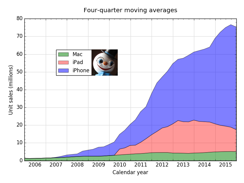
This gave me my first iteration of the stacked area chart:
The fill_between command does pretty much what you’d think. It fills the space between two data series with the given color. It’s clever enough to know that 0 should be treated as the entire x axis, saving you the trouble of generating a list of zero values.
The problem with the graph at this point was that the colors were far too bright. I don’t mind saturated colors in lines and points, but they’re distracting when used in big areas. I’m plotting data here, not designing a superhero costume.
There are a couple of ways to fix this. One is to choose colors that are less saturated. The other is to increase the transparency of the fill. This allows the white background to show through and reduce the perceived saturation of the fill colors and has the added benefit of making the background grid visible in the filled areas.
To turn the fills from opaque to translucent, add an alpha parameter to the fill_between commands:
python:
ax.fill_between(x, 0, y1, facecolor='green', alpha=.5, label='Mac')
ax.fill_between(x, y1, y2, facecolor='red', alpha=.4, label='iPad')
ax.fill_between(x, y2, y3, facecolor='blue', alpha=.5, label='iPhone')
The values I chose for alpha came from trial and error. To my eye, they make the grid lines appear about as dark in each of the filled areas.
I almost published the post with the chart in this form. Because I’d been focused on getting the data plotted the way I wanted, I’d ignored the legend. Matplotlib had automatically taken care of changing the markers in the legend from lines to blocks of color, so I didn’t think much about it. But after getting the plotting done, I realized that the legend needed tweaking.
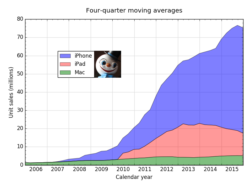
The legend is certainly accurate in its depiction of which color goes with which area, but the order can be improved. In the original line-and-scatter chart, the order didn’t matter too much, and having it in Mac-iPhone-iPad order made sense chronologically. Now that we have a stacked area chart, the stacking order of the legend should match the stacking order of the data. The purpose of a legend is to tell you what’s what, and by using position as well as color, we reinforce that communication.
One way to change the order of the legend is to change the order of the fill_between commands. This order would work:
python:
ax.fill_between(x, y2, y3, facecolor='blue', alpha=.5, label='iPhone')
ax.fill_between(x, y1, y2, facecolor='red', alpha=.4, label='iPad')
ax.fill_between(x, 0, y1, facecolor='green', alpha=.5, label='Mac')
But I learned from this Stack Overflow discussion that creation order doesn’t always translate into legend order. A more robust way to set the legend order is to understand the legend command a little better and not rely on its defaults.
One of the parameters you can pass to legend is a list of handles to the individual data plots. The handles are the return values of the plotting commands, so first I had to change
python:
ax.fill_between(x, 0, y1, facecolor='green', alpha=.5, label='Mac')
ax.fill_between(x, y1, y2, facecolor='red', alpha=.4, label='iPad')
ax.fill_between(x, y2, y3, facecolor='blue', alpha=.5, label='iPhone')
to
python:
mac = ax.fill_between(x, 0, y1, facecolor='green', alpha=.5, label='Mac')
pad = ax.fill_between(x, y1, y2, facecolor='red', alpha=.4, label='iPad')
phone = ax.fill_between(x, y2, y3, facecolor='blue', alpha=.5, label='iPhone')
With variables associated with each plot, I could now set the order of the legend by including a handles parameter in the legend command, switching from
python:
plt.legend(loc=(.15, .6), prop={'size':12})
to
python:
plt.legend(handles=[phone, pad, mac], loc=(.15, .6), prop={'size':12})
That gave me the version I finally published:
The handles trick is something I know future me will want to use. Sometimes the order of the plotting commands can’t be changed because the chart is using opacity and the z position of its component plots to achieve a certain effect. In those situations, being able to change the legend order without changing the plotting order will save me the trouble of opening the chart PDF in a program like OmniGraffle or Graphic (née iDraw) and editing the legend by hand.


