Weight and measure
November 21, 2024 at 12:53 PM by Dr. Drang
Back in the summer, I decided to get more serious about controlling my Type 2 diabetes, and I enrolled in a program that I found through my insurance company. Overall, things have gone quite well: my blood glucose is down, my weight is down, and I’ve been able to cut my medications to about a third of what I was taking before.
But nothing is perfect, and the iPhone app that comes with the program (which I’ll call the “program app” here) is kind of clumsy and limited. I don’t imagine that the most talented programmers work for the company that runs this program. For example, the app monitors my weight by syncing with a smart scale, but the way it graphs the data is just silly:
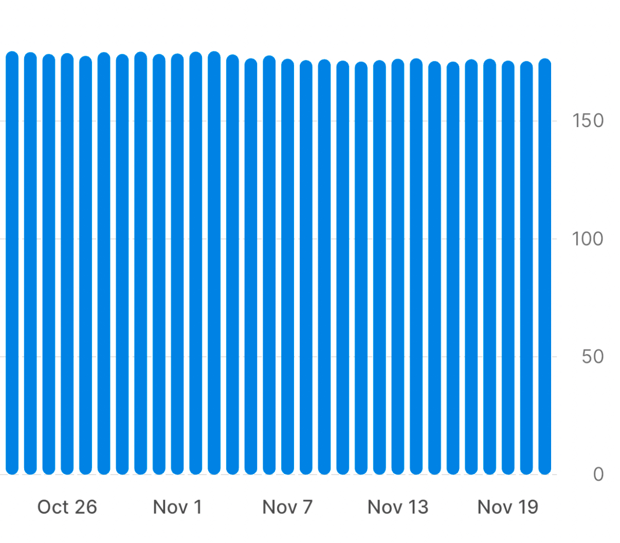
It doesn’t let you look at more than 30 days at a time, and it insists on starting the vertical axis at zero. So you can see only a narrow window of your history and all of your weight loss is jammed up at the top of the chart, making it seem like you accomplished very little.
The graph in the app is interactive, so touching on a column in the chart will show you your weight for that day, but the point of graphing data is to tell the story in the graph itself. Interactive features like that are a crutch commonly used nowadays to try to cover up for poor graph design.
What I want is something that looks like this:
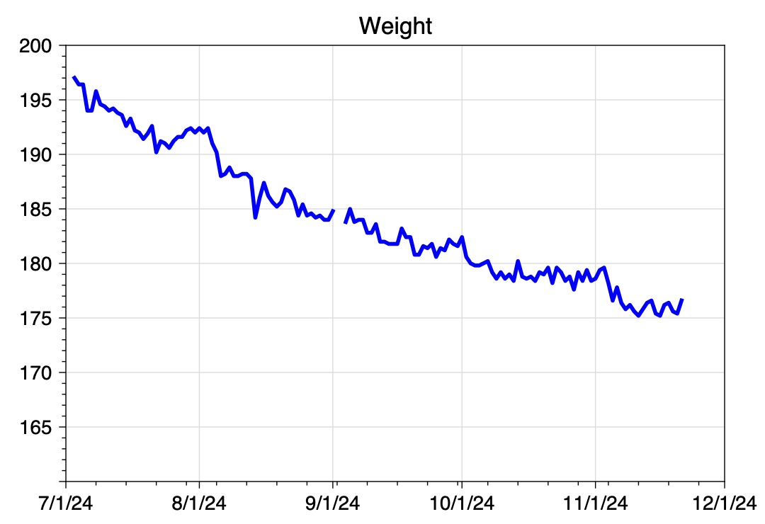
In this graph, I can see the entire scope of my time in the plan, and it looks like I’ve accomplished something. I don’t need interactivity to see where I am and where I’ve been.
As you might expect, I made this graph in Python using Matplotlib. I’ll get to the code in a minute, but first I need to talk about how I pulled the data out of the program app.
There is, of course, no export function in the app. I have a tech support question pending with the app’s developers, but I decided the likelihood of getting a satisfactory answer was small, so I went ahead and pulled the data out by hand. Or in this case, by mouth.
I paged back through my weight history, 30 days at a time, until I reached July. My plan was to use the app’s interactivity to get my weight on each day and dictate that value into a text file on my Mac, one line for each day. The plan worked, but not quite the way I expected.
I’ve written before about how well dictating numbers into my phone has worked. In this case, because I was reading the numbers off my phone, I’d have to do the dictating into my Mac, but that shouldn’t make any difference. Apple’s dictation software is the same on both platforms, isn’t it?
No. For reasons I can’t explain, the Mac doesn’t react to the commands “new line” and “new paragraph” in real time. Whenever I say “new line,” it inserts what looks like a space character and waits for me to dictate the next number. Now it’s true that after leaving dictation mode, all of those spaces turn into new lines, but because it doesn’t show what I’m saying as I say it (as it does on the iPhone), it made the dictation difficult.
So I adopted a hybrid dictation method. I dictated a number and then pressed the Return key to get a new line. After 10–15 minutes, I had a file that looked like this:
197.01
196.41
196.41
194.01
194.01
195.79
194.60
194.40
[and so on]
I then opened up a new spreadsheet in Numbers, pasted these values into the B column, and put the sequence of dates in the A column. I added a header row with “Date” and “Weight,” and exported the spreadsheet to a CSV file named weight.csv. It looks like this:
Date,Weight
2024-07-03,197.01
2024-07-04,196.41
2024-07-05,196.41
2024-07-06,194.01
2024-07-07,194.01
2024-07-08,195.79
2024-07-09,194.60
2024-07-10,194.40
[and so on]
Now we come to the Python. Here’s the code that reads the data from weight.csv and builds the graph:
python:
 1:  #!/usr/bin/env python3
 2:
 3:  import sys
 4:  import pandas as pd
 5:  from datetime import datetime
 6:  from dateutil.relativedelta import relativedelta
 7:  import matplotlib.pyplot as plt
 8:  from matplotlib.ticker import MultipleLocator, AutoMinorLocator
 9:  from matplotlib.dates import DateFormatter, MonthLocator, WeekdayLocator, MO
10:
11:  # Read in the weights
12:  df = pd.read_csv('weight.csv')
13:  x = pd.to_datetime(df.Date, format="%Y-%m-%d")
14:  y = df.Weight
15:
16:  # Figure out the first day of next month
17:  today = datetime.now()
18:  nextmonth = datetime(today.year, today.month, 1) + relativedelta(months=1)
19:
20:  # Format today's date for using in the file name
21:  today = today.strftime('%Y%m%d')
22:
23:  # Create the plot with a given size in inches
24:  fig, ax = plt.subplots(figsize=(6, 4))
25:
26:  # Add a line
27:  ax.plot(x, y, '-', color='blue', lw=2, label='Weight')
28:
29:  # Set the limits
30:  plt.xlim(xmin=datetime(2024,7,1), xmax=nextmonth)
31:  plt.ylim(ymin=160, ymax=200)
32:
33:  # Set the major and minor ticks and add a grid
34:  ax.xaxis.set_major_locator(MonthLocator())
35:  ax.xaxis.set_minor_locator(WeekdayLocator(MO))
36:  ax.xaxis.set_major_formatter(DateFormatter('%-m/%-d/%y'))
37:  plt.setp(ax.get_yticklabels()[1], visible=False)
38:  ax.yaxis.set_major_locator(MultipleLocator(5))
39:  ax.yaxis.set_minor_locator(AutoMinorLocator(5))
40:  ax.grid(linewidth=.5, axis='x', which='major', color='#dddddd', linestyle='-')
41:  ax.grid(linewidth=.5, axis='y', which='major', color='#dddddd', linestyle='-')
42:
43:  # Title and axis labels
44:  plt.title('Weight')
45:
46:  # Make the border and tick marks 0.5 points wide
47:  [ i.set_linewidth(0.5) for i in ax.spines.values() ]
48:  ax.tick_params(which='both', width=.5)
49:
50:  # Add the legend
51:  # ax.legend()
52:
53:  # Save as PDF
54:  plt.savefig(f'{today}-Weight.pdf', format='pdf')
Most of this will look familiar if you read this recent post or this one. I’ll just mention a few unique features.
First, Lines 16–21 deal with dates using a combination of the datetime and dateutil modules, the latter of which really should be in the standard library by now. This section of code uses today’s date—meaning the date on which the script is run—to figure out the upper limit of the x-axis and part of the graph’s filename. Line 18 uses dateutil’s relativedelta function to go forward one month from the first day of the current month. Although datetime has functions for certain time intervals, “one month” is not one of them, which is why I had to use dateutil.
You probably noticed that the tick marks on the x-axis are a little weird. This is an experiment, and I’m not sure yet what I think of it. The major tick marks are set on the first of every month and are labeled as such. The minor tick marks are set on the Monday of each week. This is why the frequencies of the two sets of marks aren’t in sync. The code that does this is in Lines 34–36.
Another oddity, which I definitely like, is that although the y-axis starts at 165 lbs, there’s no label for that bottom tick mark. This is handled by Line 37, which makes the label invisible. I did this because that label and the “7/1/24” label on the x-axis were too close to one another. There’s no doubt where the y-axis starts, so I figured I could eliminate it with no loss of clarity.
Finally, Line 54 saves the graph as a PDF file and uses the today variable from back on Line 21 as part of its filename. I prefer PDFs to PNGs for my own use; I used Preview’s Export command to get the PNG you see above.
As I was writing this, I got a response from the program app’s support team. As expected, there’s no way to export the weight data. Also, they think syncing the scale with two different apps is liable to cause connectivity problems, so that’s out, too. Which means that the time I took dictating my weight history was well spent. Also well spent was the few minutes it took to write this little five-step shortcut, called Weight Today. It asks me for today’s weight and adds a line to the CSV file with the date and that weight. This is a semi-automated way of keeping the weight.csv file up to date.
| Step | Action | Comment |
|---|---|---|
| 1 |  |
Get today’s date |
| 2 | 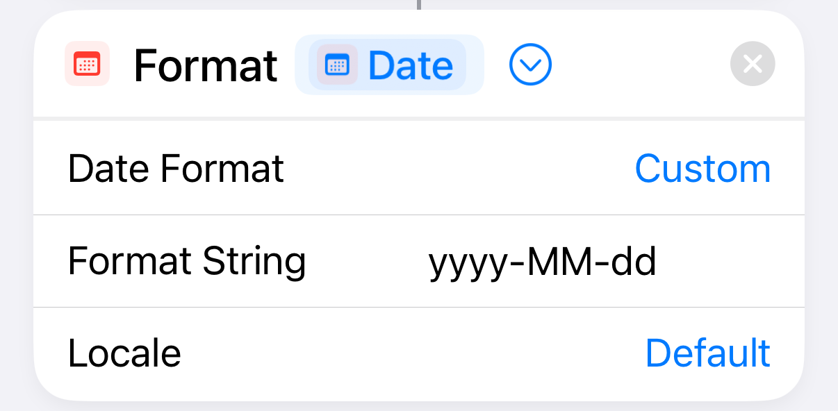 |
Format the date as yyyy-mm-dd |
| 3 | 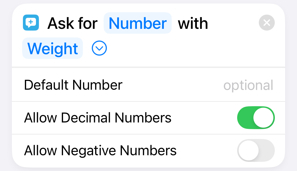 |
Ask the user for today’s weight |
| 4 | 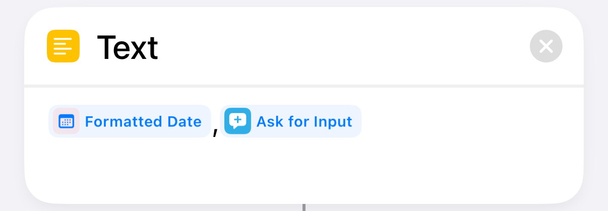 |
Assemble the date,weight line |
| 5 | 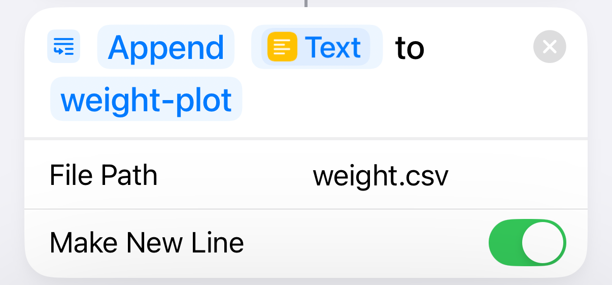 |
Append the line to the CSV file |
I’m not linking to a downloadable version of the shortcut because it has the path to the weight.csv file on my Mac built in to Step 5. It’s not hard to build yourself.
Although entering the weight myself (like an animal) isn’t my preference, I have to have the phone with me when I get on the scale to sync with the program app. So it’s only a matter of launching the shortcut, which I do from a widget on my home screen, and then typing a number. Probably takes less time than launching a dedicated smart scale app.
An unexpected bit of forward thinking
November 20, 2024 at 10:43 PM by Dr. Drang
I think I’ve mentioned here before that sometimes I’ll run into a computer problem and Googling for the answer leads me to a post I wrote (and forgot about) years earlier. I had a similar experience today in the physical world.
I needed to turn an electrical outlet in the spare bedroom from unswitched to switched. The room is being reconfigured, and I wanted a lamp by that outlet to be controlled by the wall switch at the door. I knew the wiring to the switch was in the outlet box because I’d changed that outlet from switched to unswitched several years ago.
As I went down into the basement to flip the circuit breaker and cut power to the outlet, I thought about my previous forays into rewiring outlets, installing ceiling fans, etc., and expected I’d have to experiment a little to figure out which breaker was on the circuit for the outlet in question. As I recalled, two of the breakers were labeled “Bedrooms,” so I had a 50-50 chance of flipping the right one first.
This certainly isn’t the biggest burden in the world, but it would mean that I have to flip one of the breakers, go from the basement to the second floor to see if the outlet was live, and then possibly repeat the process with the other breaker. I really should label those breakers more clearly, I told myself.
But when I opened the breaker box, here’s what I saw:
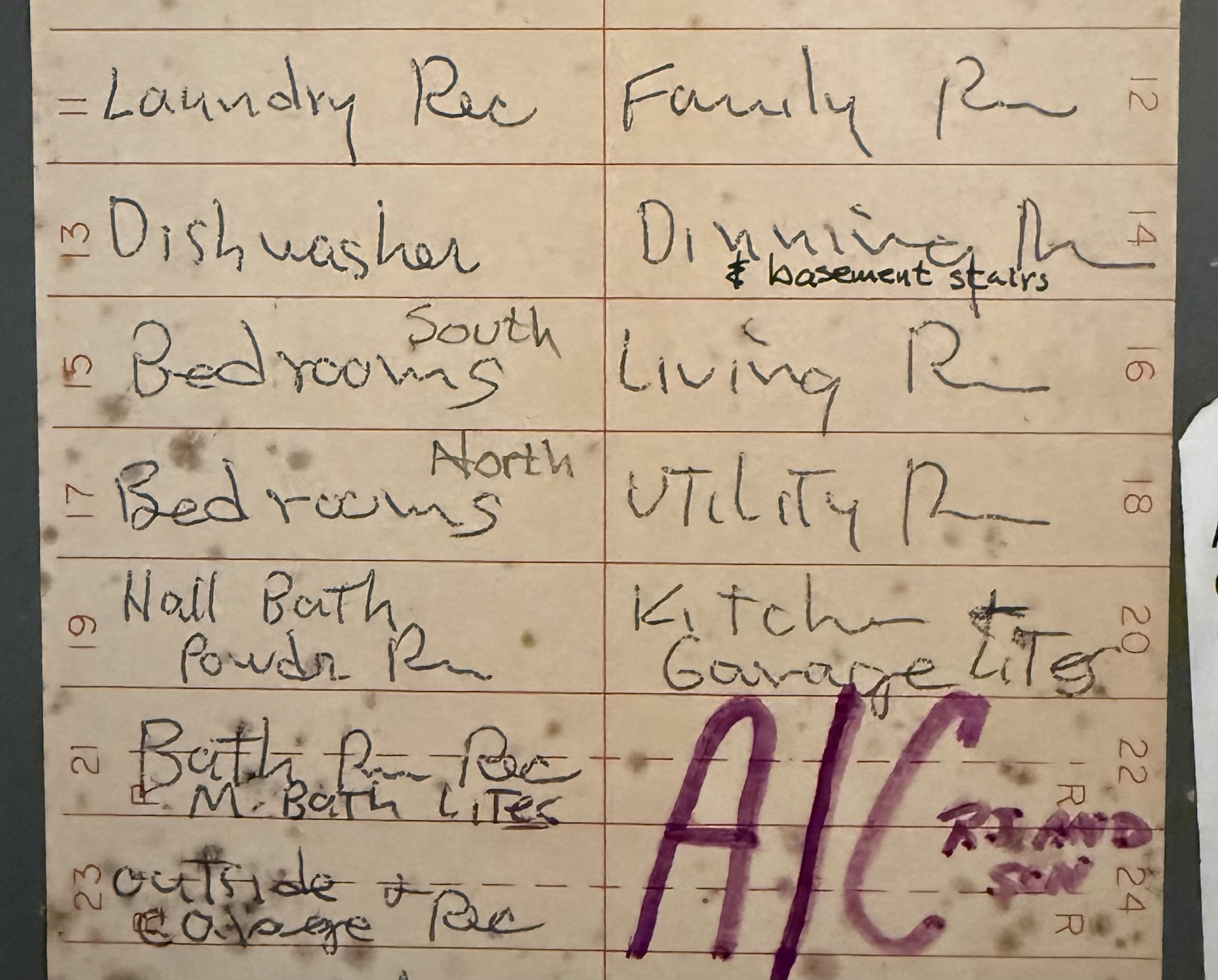
The large writing was done by the electrician who first wired the house some 40 years ago. The small writing is mine. Yesterday’s me had already done what today’s me planned to do by writing “South” and “North” on the labels for circuits 15 and 17. Because the outlet being changed is in one of the two north bedrooms, I cut the power to circuit 17 and had to climb the stairs only once.
Note also that yesterday’s me—on a different occasion, as evidenced by the use of a pen instead of a pencil—figured out that the lights for the basement stairs were on the same circuit as the “dinning” room. This must have taken quite a bit of experimentation, because the stairs aren’t especially close to the dining room, but at least I was able to do those experiments entirely from the basement.
So good for yesterday’s me. Not only did he preserve useful information, he wrote it down where today’s me would have to find it. Frankly, I’m kind of surprised at his forethought; yesterday’s me often thought he’d remember things that he didn’t.
Tweaking settings (or not) on my new MacBook Pro
November 12, 2024 at 11:42 AM by Dr. Drang
I got my new MacBook Pro last Friday, and so far only two things have annoyed me. The first I got used to much faster than I thought I would, and the second I’ve turned off in System Settings.
The initial surprise was how thick the menu bar was. For literally decades, I’ve been using Macs in which the menu bar is only slightly thicker than the height of the menu fonts. Here’s what the menu bar looks like on my 2020 MacBook Air:

And here it is on my new MacBook Pro:

I assume the menu bar is thicker because of the notch. I remember a lot of complaints about the notch when it first came out but not about the thicker menu bar. Maybe I just wasn’t paying attention because I wasn’t in the market for a new computer back then.
The notch itself doesn’t bother me, although it looks like I’ll have to start using some Bartender-like utility, as I’ve found that several apps I use regularly have menus that jump over to the right side of the notch and cover up some of my menu bar apps. I stopped using Bartender a couple of years ago when I noticed that I was no longer using enough menu bar apps to make it worthwhile. So I didn’t care about the recent kerfuffle regarding its change of ownership. Now I do, and I’ll have to look into alternatives.
Anyway, I’m happy to say that although I found the thick menu bar extremely annoying at first, it took less than a week for me to accept it. Now when I open my MacBook Air (as I did to take the screenshot above) its menu bar looks weird.
The second annoyance has to do with window tiling. I’m not a fan of tiling and have always thought that people who complained about the Mac’s lack of it were either crybabies or control freaks. Is it really that hard to manage windows? But live and let live. I assumed that whatever tiling features Apple added to Sequoia wouldn’t affect me. And they haven’t in the month or so that I’ve been using Sequoia on my MacBook Air.
But for some reason, as soon as I started using the MacBook Pro, windows were jumping to full size as I dragged them around. Apparently, I was dragging them up to touch the menu bar, which is the trigger for making a window fill the screen.1 After this happened a few times, I went into System Settings to see what I could do about it. Basically, all the tiling options were turned on, and I turned almost all of them off.
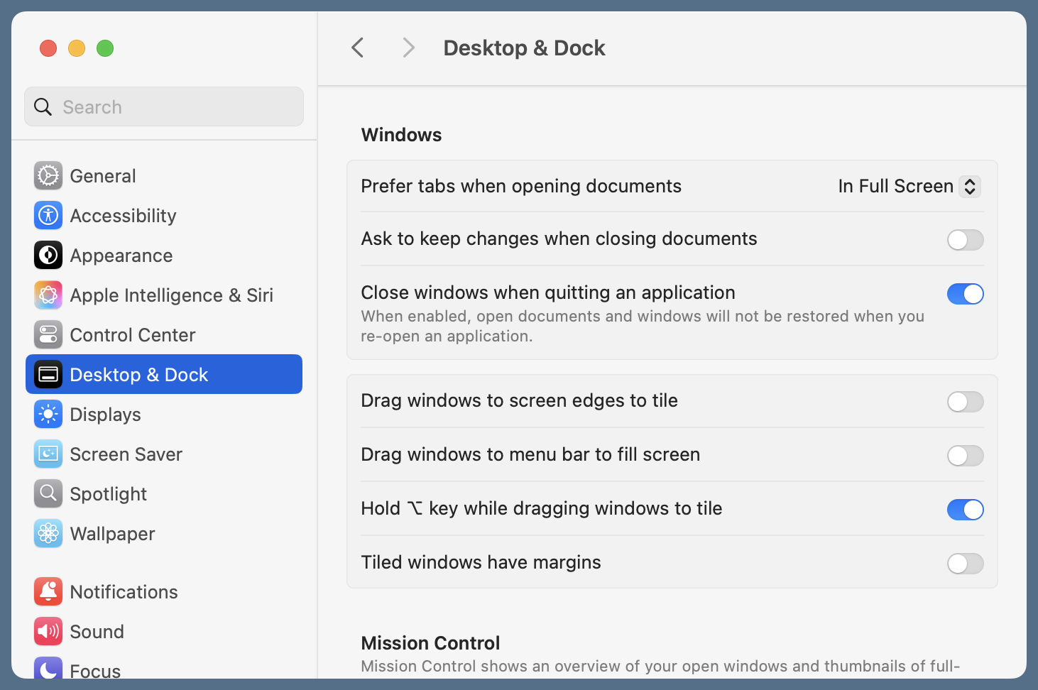
I kept the option for tiling when holding down the Option (⌥) key because I’m a tolerant person at heart. Maybe someday I’ll use it.
-
Could it be that I hit the menu bar while dragging windows because the menu bar is thicker? Or is that just a coincidence? ↩
Kilometers, miles, Fibonacci, and Lucas
November 11, 2024 at 3:31 PM by Dr. Drang
Earlier this month, I got an email from Anthony SEROU about my post on the golden ratio and converting between miles and kilometers. They suggested using consecutive Fibonacci numbers as a quick way to do the conversion, e.g., 5 miles is 8 kilometers. And if the amount you’re converting from is one away from a Fibonacci number, you can add or subtract 0.6 or 1.6, depending on which way you’re converting. So 6 miles is about 9.6 kilometers and 7 kilometers is about 4.4 miles.
I had my doubts about the value of this until this weekend. I went out on a bike ride with a friend, and when we were about finished, I looked at my watch and saw that we’d gone 13 km. When I told him, and he asked “What’s that in miles?” I had the answer almost immediately because of Anthony’s email. I say “almost” because I spent fraction of a second being surprised that I actually had a Fibonacci number in front of me.
But my answer was fast enough to raise a question in my friend’s mind. He texted me later to say that I was right about it being 8 miles. I didn’t explain how I knew it so quickly—I have enough of a reputation as a oddball. Letting him think I could multiply quickly was easier than explaining Fibonacci numbers, the golden ratio, and the coincidence regarding the conversion between miles and kilometers.
Today it occurred to me that the ratio of consecutive Lucas numbers also converge to the golden ratio, so maybe they could be used the same way. So I fired up Wolfram and made a plot of the ratio of consecutive numbers against the larger of the two. In other words, I plotted y values of
against x values of for the Fibonacci numbers and similarly for the Lucas numbers. Here’s the result, where the golden ratio is the dashed black line:
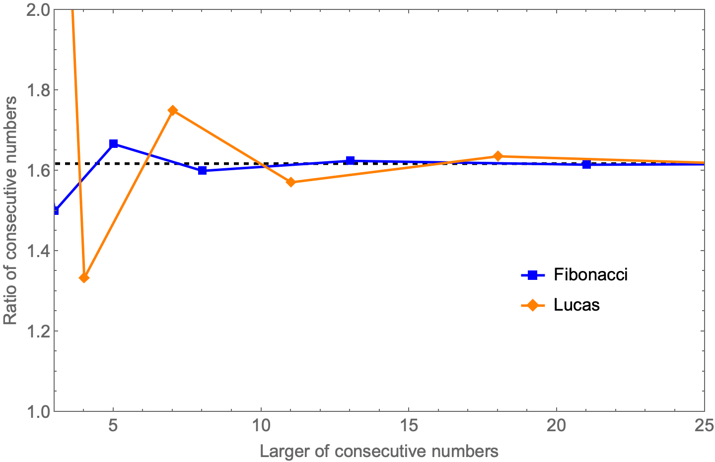
So while the Lucas number ratios converge to the golden ratio, they don’t do so as quickly as the Fibonacci numbers. Just as well. Only real oddballs know the Lucas numbers.

