
PCalc for iPhone, part 2—visuals
December 1, 2008 at 5:47 PM by Dr. Drang
This is the second in my Definitive Series of Posts on PCalc for the iPhone. The first post covered, in brief, my reasons for using PCalc instead of the iPhone’s built-in calculator. This one describes PCalc’s various “looks” and how you can, within limits, customize its appearance to fit your taste and needs.
Like a Dashboard widget, PCalc has an icon with a circled i which, when pressed, shows you its configuration options. PCalc has quite a few.
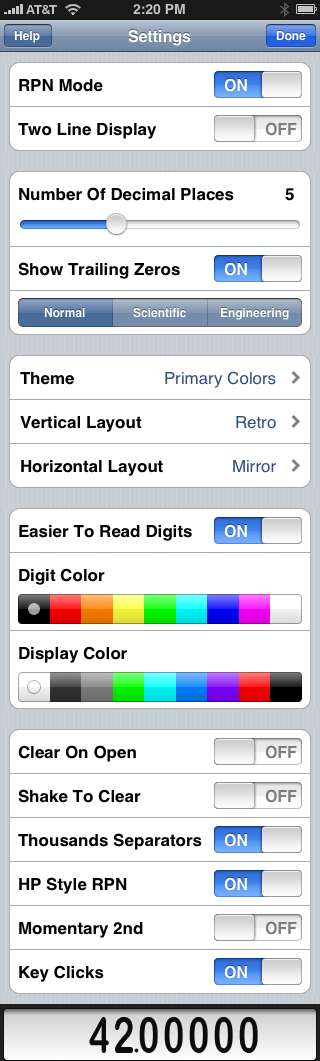
In this post, we’ll focus on the settings that control the way PCalc looks. Related settings are grouped in the white rounded rectangles.
(I should mention here that although the screenshot above shows the calculator display at the bottom of the list of settings, that’s not how it looks on the phone. When you’re fiddling with the settings, the calculator display is actually always visible at the bottom of the iPhone screen1, and the list of settings scrolls behind it. Changes you make to the settings are immediately visible in the display, which means you usually don’t have to keep going back and forth between the settings and the calculator to see the effect of your changes. A nice touch.)
The first group of appearance settings is in the second rounded rectangle. These are what I consider to be the structural settings for the number display—how many digits are shown and how they’re arranged. The slider controls the number of decimal places and the checkbox controls whether a number like 5.375 is displayed as 5.375 or 5.37500. If you have the iPhone upright, you’ll see the digits in the display get smaller as you slide the control farther to the right.
The difference between “Normal,” “Scientific,” and “Engineering” is best shown with an example. The equatorial circumference of the Earth is 24,900 miles. The Normal, Scientific, and Engineering displays of this number would be as follows:
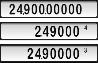
The little numbers in the Scientific and Engineering displays represent the exponents in the expressions 2.49000×10⁴ and 24.9000×10³, respectively. In Scientific, there’s always one digit to the left of the decimal point; in Engineering, the exponent is always a multiple of 3. The thousands-separating comma in the Normal display is a setting we’ll get to in a bit.
The next rounded rectangle lets you choose the theme and layout of your calculator. Themes are basically color schemes, and PCalc has six of them.
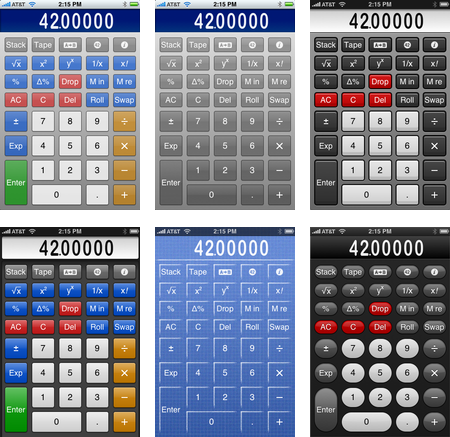
From left to right and top to bottom, the themes are A Touch Of Color, Blue Sun, High Power, Primary Colors, Rough Draft, and Seventy Three. Seventy Three has a more rounded key shape in addition to its own color scheme.
Layouts are key arrangements. PCalc has four portrait layouts: Basic, Classic PCalc, Default, and Retro:
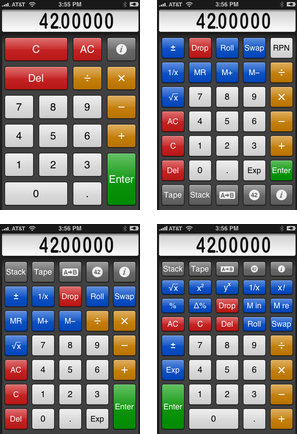
And five horizontal layouts: Classic PCalc, Default, Mirror, Retro Hex, and Retro Scientific:
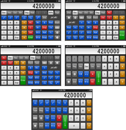
I use the Primary Colors theme (the theme I’ve used to show all the layouts) and the Retro vertical layout. I’m torn between the Default and Mirror horizontal layouts—Default puts the number keys closer to my right hand, but there’s something about Mirror that looks better to me.
PCalc doesn’t let you create your own themes or layouts; you’ll just have to live with one of the 24 vertical and 30 horizontal combinations.
The next rounded rectangle contains the aesthetic settings for the number display. PCalc has two fonts for the display: a retro font that mimics the old LCD-segment displays and a solid font with rounded numerals.
As you might guess from the earlier screenshots, I much prefer the easier-to-read font. In fact, if PCalc had only the LCD segment font, I would never use it. I appreciate the work that went into ghosting the “unlit” segements, but it’s just too hard to read—harder to read than real LCD displays, oddly enough.
(A bit of trivia: The decimal point in the easy-to-read font got bigger between PCalc versions 1.0 and 1.1 because I begged the developer, James Thomson of TLA Systems, to take pity on my middle-aged eyes. Which he kindly did.)
(Would it sound ungrateful if I wished it were a bit bigger still? Yes? I’ll keep still, then.)
The two color settings in this group are pretty self-explanatory. The theme will supply the digit and background colors, but you can override them here.
The last appearance setting is in the final rounded rectangle (which seems to be a grouping of “Miscellaneous” items). It’s the Thousands Separator option, which sticks a comma between every set of three digits to the left of the decimal point. I find this very helpful in dealing with large numbers in Normal mode and always have it turned on.
The Key Clicks setting at the bottom of the last rounded rectangle isn’t an appearance setting, but I’ll mention it here anyway because it’s a sensory option. Like the Keyboard Clicks option in the iPhone’s Settings app, you may want to turn this off if you’re working in a library. Otherwise, hearing a little click noise as you tap a key is a helpful bit of feedback.
In later posts in this Definitive Series, I’ll cover the other settings and actually discuss using the calculator(!).
Update (12/2/08)
I should have mentioned that the all the layouts shown above are for RPN mode, which is what I use all the time. The layouts for algebraic mode are similar; of course, they have an = key instead of Enter, and they don’t have the stack manipulation keys.
-
In a slick bit of animation, the display slides from the top of the screen to the bottom when you go from the calculator to the settings and slides back up when you go from the settings back to the calculator. ↩