
Last word on weight loss and Gnuplot
December 21, 2010 at 11:13 PM by Dr. Drang
Well, it’s my last word on weight loss, anyway. I’m sure I’ll have more to say about Gnuplot.
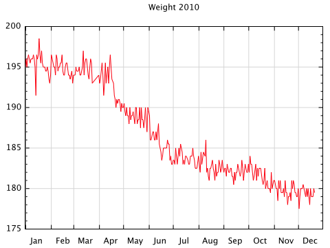
As I’ve mentioned before, I started tracking my weight this year with the hope of seeing it go down. That’s been a success.
I weigh myself every morning and record the weight in a note-taking app on my iPhone. I chose this method rather than buying some dedicated weight-tracking app because:
- I’m cheap; and
- I wanted the flexibility of plain text files for the data. The prospect of someday having my data locked up in an app that’s no longer supported didn’t appeal to me.
When the year started, my note-taking app was Simplenote. I later switched to Elements because it uses Dropbox for syncing and gives me the option of using a monospaced font, which works well with tabular data.
Here’s a sample of the data file, named “Weight.txt.”
01/01/10   195.0
01/02/10   196.0
01/03/10   195.0
01/04/10   196.0
01/05/10   196.5
01/06/10   196.0
01/07/10   195.5
01/08/10   196.0
01/09/10   196.0
01/10/10   196.0
I enter the date using a TextExpander snippet, so I don’t have to type in—or even remember—the date. Because TextExpander is so smooth and Elements launches so quickly, weighing myself and recording it typically takes very little time. The speed is important, because if it took a long time I might not do it.
Which raises the question: Why record my weight every day? Most diet advice says you shouldn’t weigh yourself every day. This has, frankly, always struck me as stupid. If I didn’t get on the scale every day, I could easily fool myself into thinking I was eating less and exercising more than I really was. The scale keeps me honest.
But it doesn’t make me obsess over every pound. I’ve come to understand my normal day-to-day variation in weight. I know that single-day gains and losses are par for the course; it’s the changes that persist over a few days that matter.
The year is almost over, and I’ve lost the 15 pounds I wanted to lose. Now I just need to maintain, which most people find more difficult than losing. I’m going to keep weighing myself and try to prevent the upward creep. Unless something odd happens, I won’t be blogging about my weight again.
I will be blogging about Gnuplot again, because I find it the most convenient way to make plots. Simple plots like the one above could be made faster using something like Excel, but because I often need to make complex plots and plots that need to be repeated again and again with different data sets, it’s better for me to learn one tool really well and use it for everything. With repetition, the Gnuplot commands become second nature.
The biggest problem with using Gnuplot is its manual. The manual has all the information you need, but because it’s organized alphabetically instead of by topic, it’s very hard to use and virtually impossible to learn from. I’ve basically abandoned it in favor of a PDF of Gnuplot in Action by Philipp Janert. GiA, while not as complete a reference as the Gnuplot manual, is organized by topic and is much, much easier to work with. On those rare occasions when GiA doesn’t answer my question, it at least lets me know where to look in the manual.
Here’s the Gnuplot script I used to plot my weight:
 1:  #!/usr/bin/env gnuplot
 2:
 3:  # Overall plot settings
 4:  set terminal aqua 0 title "Timeline" size 512 384 fname "Lucida Grande" fsize 12
 5:  set title "Weight 2010"
 6:  unset key
 7:
 8:  # x data settings
 9:  set xdata time
10:  set timefmt '%m/%d/%y'
11:  set xrange ["01/01/10":"12/31/10"]
12:  set format x '%b'
13:  set xtics offset 2.25, 0
14:  set mxtics 1
15:  set grid xtics
16:
17:  # y settings
18:  set ytics 5
19:  set mytics 5
20:  set grid ytics
21:
22:  # Plot it
23:  plot "Weight.txt" using 1:2 with lines
The version of Gnuplot I use is prebuilt for OS X and is packaged with a similarly-prebuilt version of Octave. This makes it very easy to install, but it doesn’t have some of the features I’d like. Specifically, its support for generating PNG files directly is quite poor. So I generate the plots in AquaTerm (Line 4) and take screenshots to get PNGs.
The key settings are those that tell Gnuplot that the x data are a series of dates in mm/dd/yy form. Lines 9 and 10 do that. Once the input format is set, the output range (Line 11) will use the same format to define the minimum and maximum x values. The output format for the tic labels is set in Line 12 to be the three-letter abbreviation for the month.
Line 13 is a bit unusual. The tic marks on the x-axis represent the first day of each month. Normally, the labels would be centered directly under these tic marks, which wouldn’t look right. By giving the labels an offset to the right (the value of which was determined through trial and error), the month names fall between the tic marks for a more natural and easily interpreted appearance.
Line 14 prevents minor tic marks from appearing on the x-axis. The trick of the mxtics and mytics settings is to remember that they set the number of subdivisions between major tic marks, not the number of minor tic marks. We see that in Line 20, too.
The grid lines, which make it much easier to see where we are in the middle of the plot, are set in Lines 15 and 20.
With all the setup done, the plot itself is made in Line 23.
The nice thing about having a plot generated by a script is that I’ll never have to figure out the settings again. My plan is to archive each year’s weight data to a file called “Weightyyyy.txt” (this year’s will be “Weight2010.txt”). “Weight.txt” will always be the data for the current year. A simple change to the file name in Line 23 and the range in Line 11 will allow me to plot any year.