A little chart adjustment
November 13, 2019 at 10:11 PM by Dr. Drang
One of the best things about today’s introduction of the 16″ MacBook Pro was that it inspired Marco Arment to write a new blog post—a rare treat. I am perhaps unusual in that I think Marco is a better writer than he is a talker. I like his talking; I just like his writing more.
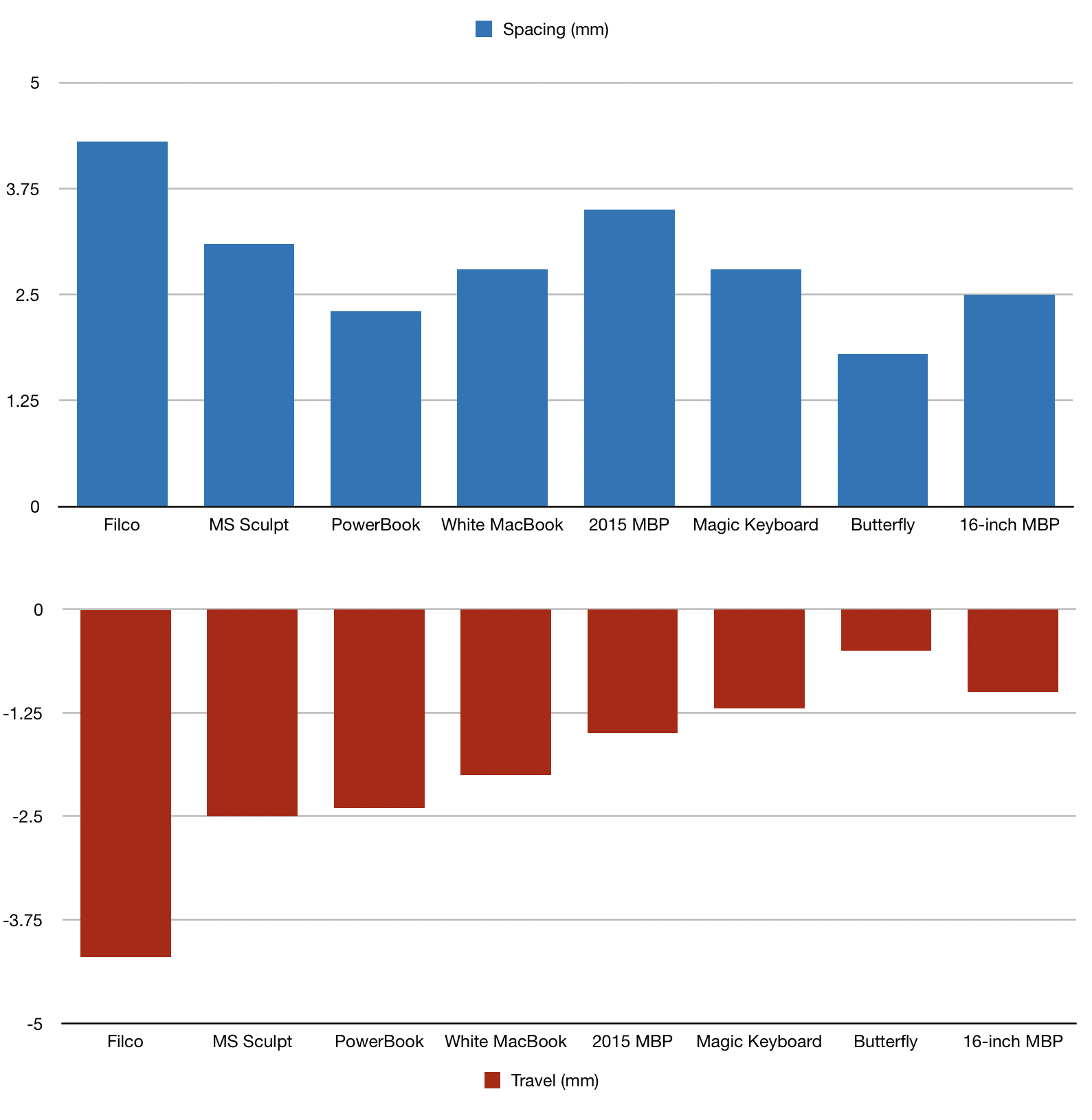
Of course he commented on the new keyboard, and his comments were accompanied by this cute graph comparing the new keyboard with the old one and some others:

It’s nicely done. Displaying the key spacing and travel as a stacked pair of charts was a good idea. Putting them together in a single chart with the spacing and travel columns next to one another would have been the easy choice, but it wouldn’t be nearly as clear. And the decision to show the key travel columns growing down—the direction of travel—was inspired. It does what good charts do: give you an instant understanding of the point being made while also providing a clear way to explore the data further.
But I have opinions about chart style, and I think a handful of small improvements could be made. Most of these could not be made within the charting software Marco was using (Numbers, I think); the charts would have to be imported into a drawing package and manipulated there. But the small extra effort would be worth it.
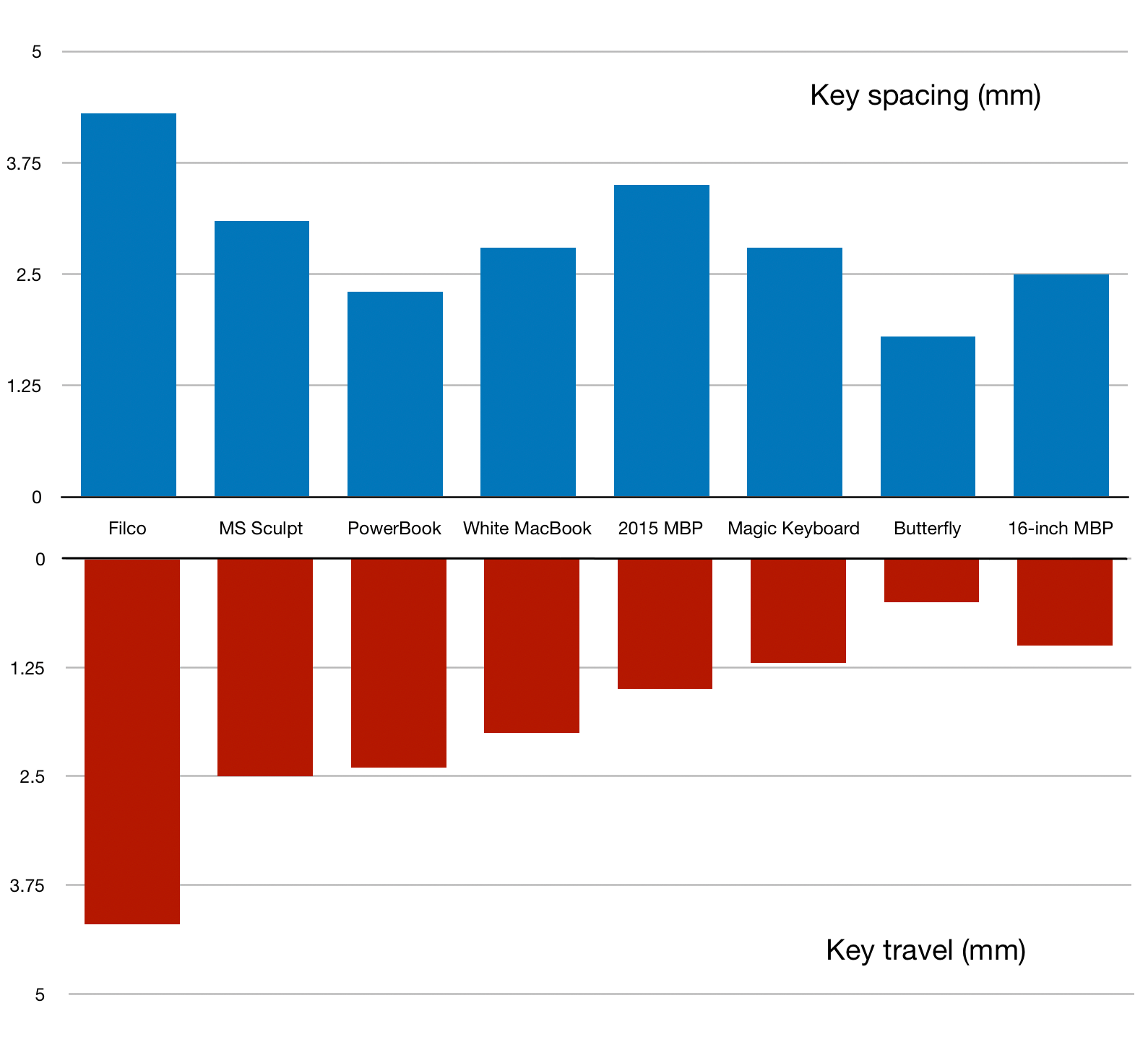
I don’t have the data Marco was working from, and I wanted some practice editing images in Pixelmator on my iPad, so I edited his PNG image instead of creating a new chart from scratch. Here’s his chart with my edits:

First, I made it seem more like a single chart by getting rid of the superfluous second set of categories and moving the lower chart up to make it more obvious that it and the upper chart are sharing the categories. The legends were Marco’s only bad idea, so I got rid of them. A chart with only one data set doesn’t need a legend, it needs a title. I confess my placement of the titles could be better.
I also changed two of the grid lines in the lower chart, thickening the one at 0 and thinning the one at 5 to make it clear which was the base from which the red columns were growing. And I deleted the minus signs in front of the ordinate labels. I’m sure Marco used negative values to trick the charting software into making his columns grow downward, but we think of key travel as a positive number, and that’s how it should be labeled.
One change I couldn’t make in Pixelmator, but is the change I first thought of when looking at Marco’s original, is to adjust the ticks and grid lines to whole millimeters. This is a pet peeve of mine: charting algorithms often make unnatural decisions about default tick spacing, setting the marks at places that no human would. In this case, the algorithm no doubt felt that four divisions was best, leaving us with a silly grid spacing of 1.25 mm. It is true that adding an extra grid line would make the chart a little more busy, but the advantage of having simple numbers as the labels outweighs the additional clutter. This is especially true given that one of the main points of the new keyboard is that it’s travel is 1.0 mm.
My apologies to Marco for this. His chart really is good. I just can’t help myself.
