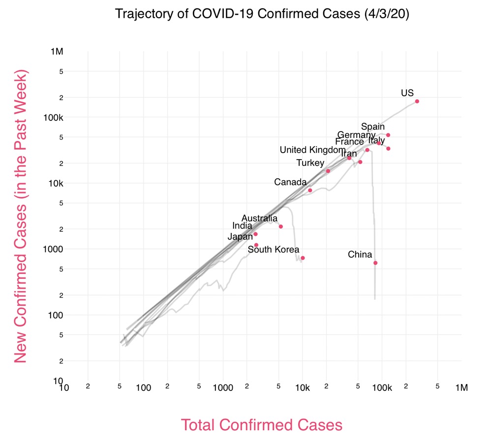
Exponentials and derviatives
April 4, 2020 at 2:57 PM by Dr. Drang
After writing this post a few weeks ago, I started a followup on other features of exponential growth. But it languished as a few disconnected paragraphs in my Drafts Inbox and on several pages of equations in a notebook. Then a friend pointed me to this video by Henry Reich, the Minute Physics YouTuber.
There’s a lot I liked in the video and a lot I didn’t like. Similarly with Aatish Bhatia’s Covid Trends interactive graph that goes along with the video.

I decided to clean up my scattered notes and use Reich and Bhatia’s log-log chart as my point of focus. It might take a few posts to work my way through this, and it will definitely seem at times like I’m not focused on the log-log chart, but eventually I hope to get to a better understanding of exponential growth and how it can be represented.
Let’s start with some math. We’ll call the thing we’re keeping track of and if it grows exponentially with time, its value at any time can be represented by this equation:
where is the value of at time and is a parameter that determines the rapidity of the growth.
Applying a little dimensional analysis, we see that must have the same units as , so if the units of is confirmed cases of COVID-19, so will be the units of . The units of might seem unusual to you. Because the exponent has to be dimensionless—a pure number with no units—the units of must be the reciprocal of the units of . So if we’re measuring in days, we have to measure in . Similarly, if we’re measuring in weeks or months, we have to measure in or . As we said last time, taking the logarithm of both sides of our exponential equation gives us
which is the equation of a straight line with slope if we graph vs. on a semilog plot. To avoid concerns about dimensions (what are the units of ?), it might be better to think of this relationship as
so we have pure numbers on each side of the equation. The line on a semilog plot now goes through the origin but still has a slope of .
(I’m being a little handwavy with regard to the base of the logarithm. Typically, we don’t use a natural log scale in a semilog plot, so the slope of the semilog plot would be multiplied by a scale factor. If we’re using base-10 logs in our plot [the most common case], the scale factor is .)
(And while I’m being parenthetical, I’ll mention that engineers typically use to mean natural logs and with no subscript to mean base-10 logs, mathematicians, computer scientists, and most programming languages use (or log())to mean natural logs and (or log10()) to mean base-10 logs. I’m going to go against my instincts here and use the math/computer terminology because it will fit in better with any scripts we develop.)
One of the cool features of the exponential function is that its derivative is also exponential.
where I’ve used the common notation (inherited from Newton) of a dot to represent differentiation with respect to time.
Since the derivative is an exponential function, that means it too will appear as a straight line on a semilog plot. By extension, we can keep taking derivatives as long as we like and never change the fundamental nature of the result. It’s exponentials all the way down.
This is all very well and good for functions, but what does it mean for plotting data we suspect is exponential? It means that we can not only graph the cumulative value, , on a semilog plot and see if it appears as a straight line, we can also plot the daily (or weekly or monthly) change in and see if it graphs as a straight line on a semilog plot, too. For the COVID-19 data, the daily change has the units of cases per day, which is exactly the kind of units we would expect for a derivative.
It’s the use of daily data that’s the first step in Bhatia and Reich’s approach. I started doing the same thing a few days ago with the US data from the COVID Tracking project. Here’s a comparison of the cumulative and daily data for confirmed cases.
These clearly aren’t linear over the entire month, although the cumulative cases look pretty linear in the first half of March. I’ve added a locally-weighted regression line (lowess) to give your eye a path to follow through the scatter.
One thing you probably noticed right away was that the daily graph is more noisy than the cumulative one. That’s normal for real data—the process of accumulation tends to smooth out short-term variations.
Another thing to notice is that changes in direction tend to be sharper in the daily plot, which makes them easier to see. The bend that starts around March 20 is certainly more distinct in the daily plot. That’s one of the things Reich and Bhatia take advantage of in their log-log plot.
With the mathematical preliminaries out of the way, we’ll start the next post looking at other ways to plot the cumulative and daily data. In particular, we’ll look at Reich and Bhatia’s log-log plot of daily vs. cumulative and see what advantages it presents. We’ll also see whether we lose information in plotting the data that way. (Spoiler: yes.)
