Development, Shortcuts, and Warhol
August 7, 2020 at 9:28 AM by Dr. Drang
For the past several days, I’ve been annoying my family with a shortcut. If there are people in your life you want to annoy, you might want to use it. And apart from the annoyance value, it has some Shortcuts programming techniques that I want to memorialize for future use.
My daughter has a dog named Daisy, and on a per-kilobyte basis, she is the biggest topic of conversation in the family texts. There are lots of texts about Daisy, and most of them are photos of her. Even so, there’s never enough Daisy, so I wrote a shortcut to amplify the Daisy content. It takes a single picture of Daisy,
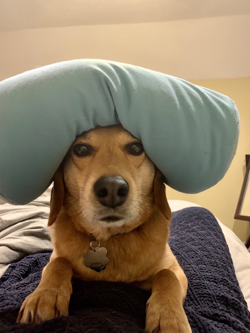
and makes a grid (or small multiple, as Tufte would have it) of Daisys.
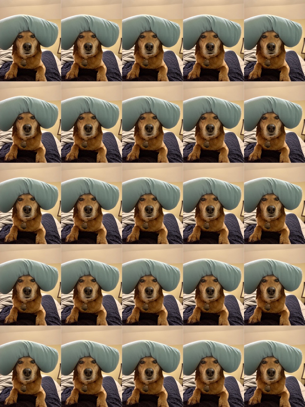
As an option, I can apply a random tint to the component images.
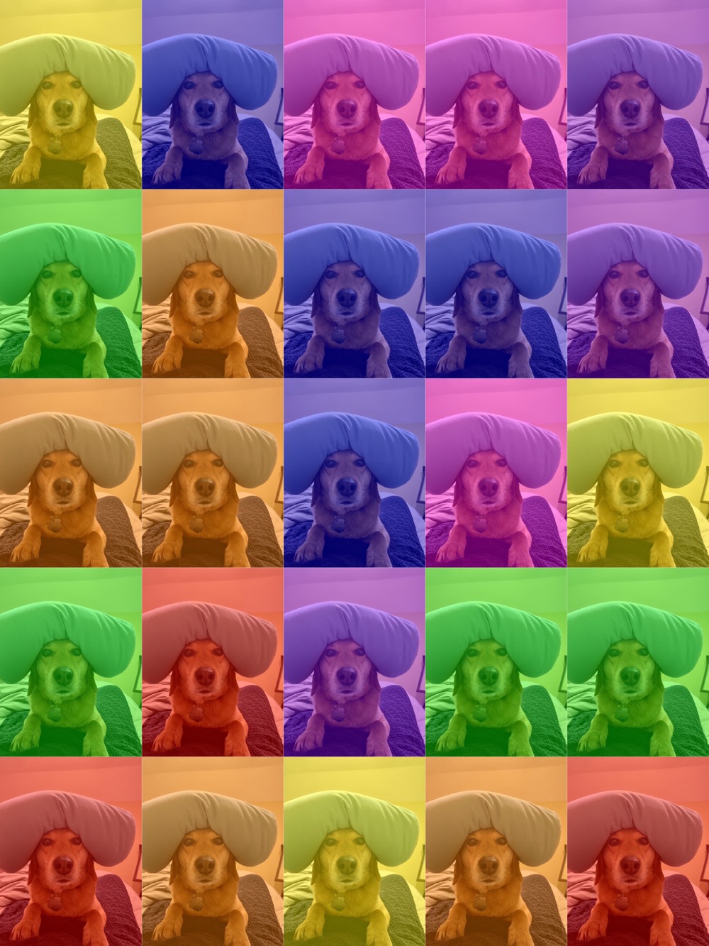
I’ve called this shortcut for what should be obvious reasons.
Using the shortcut is simple. Upon launching Warhol, you’re asked to choose an image from Photos.1 When that’s done, you’re asked to choose the grid size:
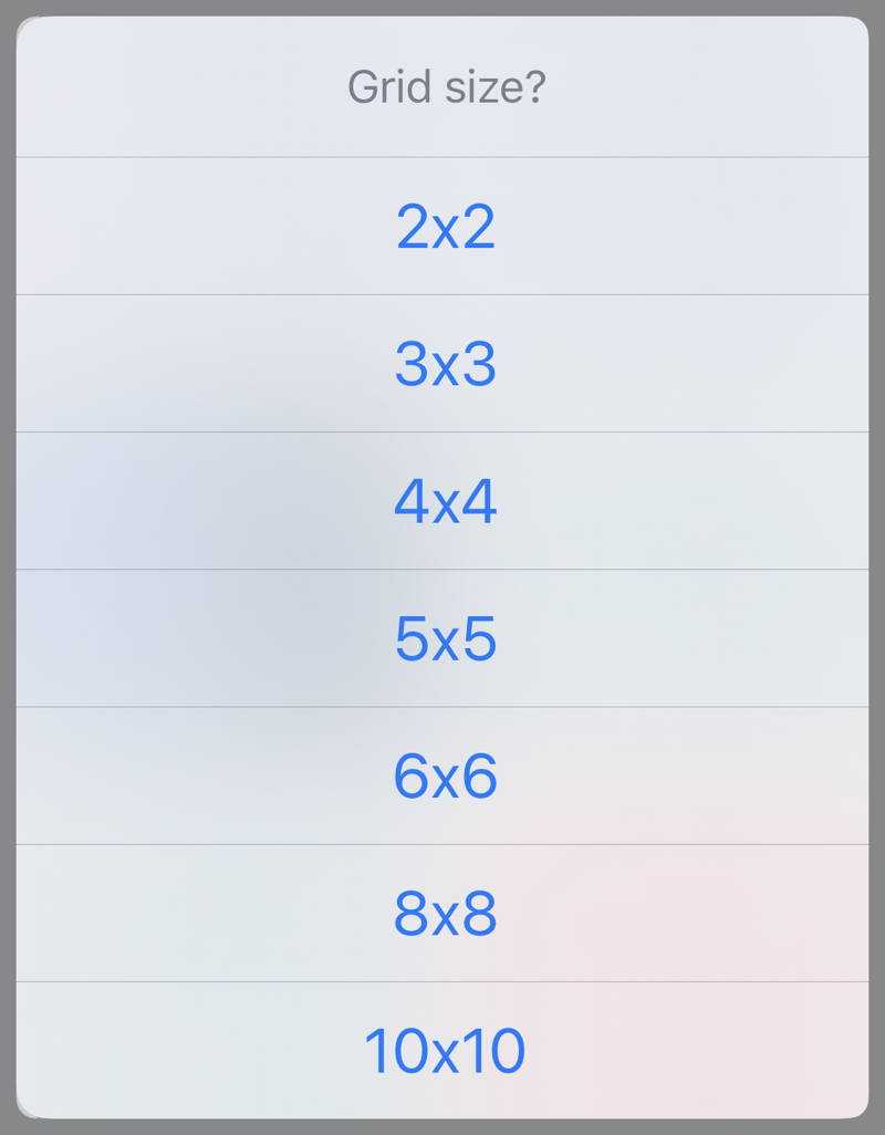
Finally, you’re asked if you want the images tinted or not.
You can download the shortcut and install it. As we’ll see in the description, Warhol does require a bit of external setup: a Photos album named Tints that contains 1×1 PNG images of a single color. Here’s what my Tints album looks like:
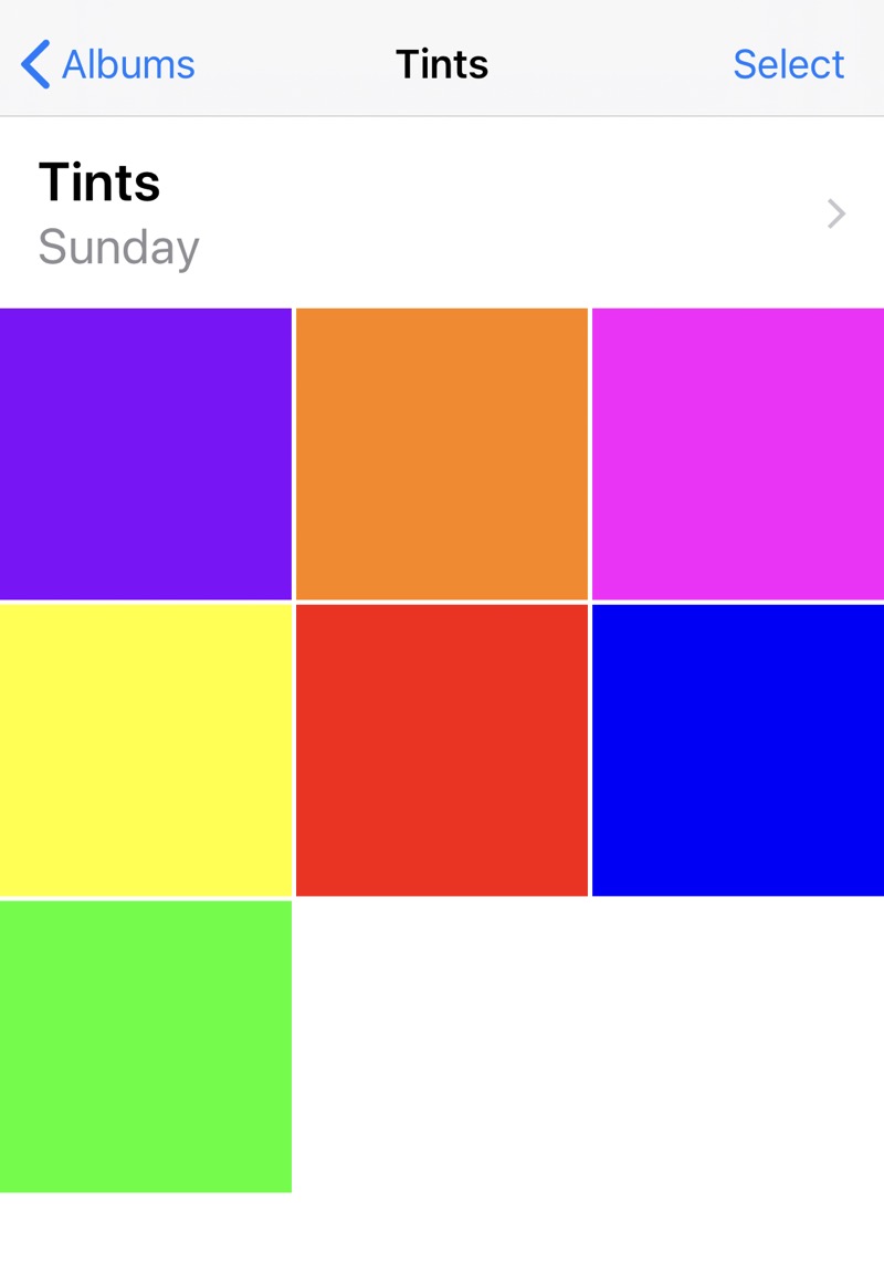
You can download this zip file of my tints, but don’t feel restricted to these colors. Warhol will work with whatever you put in the Tints album. The only restriction—unless you change the Warhol source code—is that the album must be named Tints.
Here are the steps of Warhol:
| Step | Action | Comment |
|---|---|---|
| 1 | 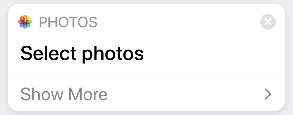 |
Put up the usual Shortcuts photo picker. You’re allowed to choose only one. |
| 2 | 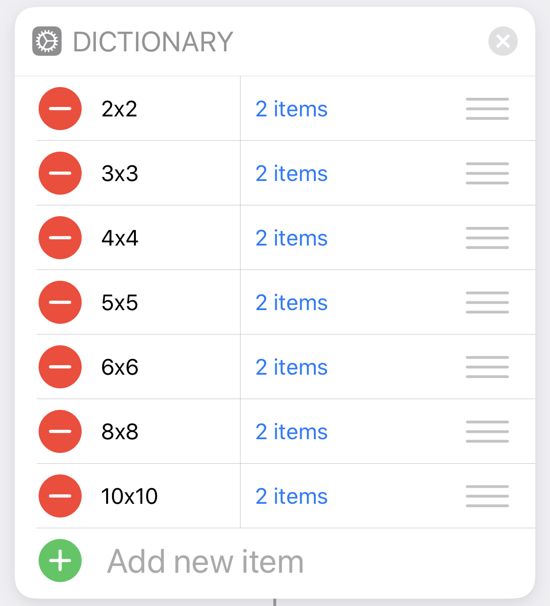 |
This is a dictionary of dictionaries, which we’ll use to resize the images and assemble the grid. The keys of the “outer” dictionary are the grid sizes you see in the left column. The keys of the “inner” dictionaries are count and width. A table of values and an explanation of how the values were determined is below. |
| 3 | 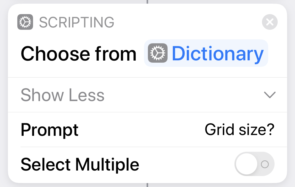 |
Put up a menu for choosing the grid size from the dictionary in Step 2. |
| 4 | 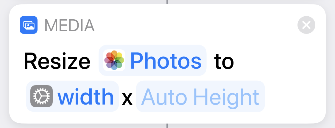 |
Resize the photo chosen in Step 1 to the width value from the dictionary item chosen in Step 3. |
| 5 | 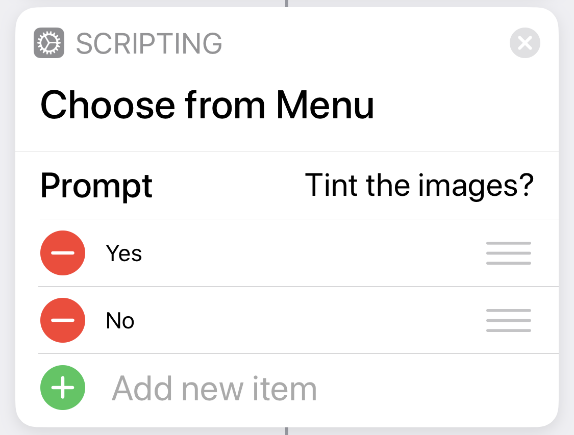 |
Ask if the photos in the grid should be tinted. |
| 6 |  |
If yes… |
| 7 |  |
For the number of photos in the grid, which is the count value from the dictionary chosen in Step 3… |
| 8 | 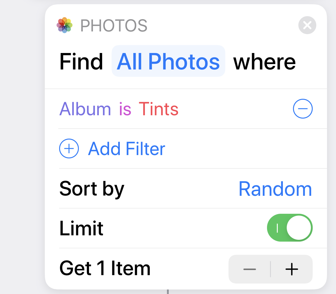 |
Select an image at random from the Tints album. |
| 9 | 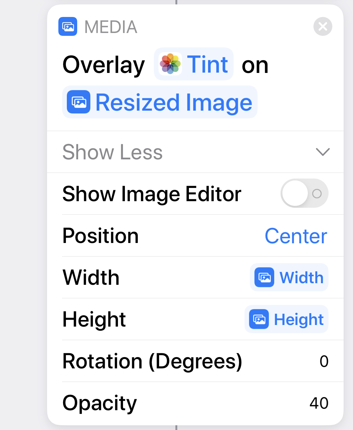 |
Resize the tint image and overlay it onto the photo selected in Step 1 and resized in Step 4. Width and Height are the width and height of the resized photo. For the opacity of the overlay, I tried several values and landed on 40%. You may prefer something else. |
| 10 |  |
Add the tinted image to the photos list. |
| 11 |  |
We’re done assembling the tinted photos. |
| 12 |  |
If no tinting… |
| 13 |  |
For the number of photos in the grid, which is the count value from the dictionary chosen in Step 3… |
| 14 |  |
Add the photo selected in Step 1 and resized in Step 4 to the photos list. |
| 15 |  |
We’re done assembling the untinted photos. |
| 16 |  |
We’re done handling the tinted/untinted option. |
| 17 | 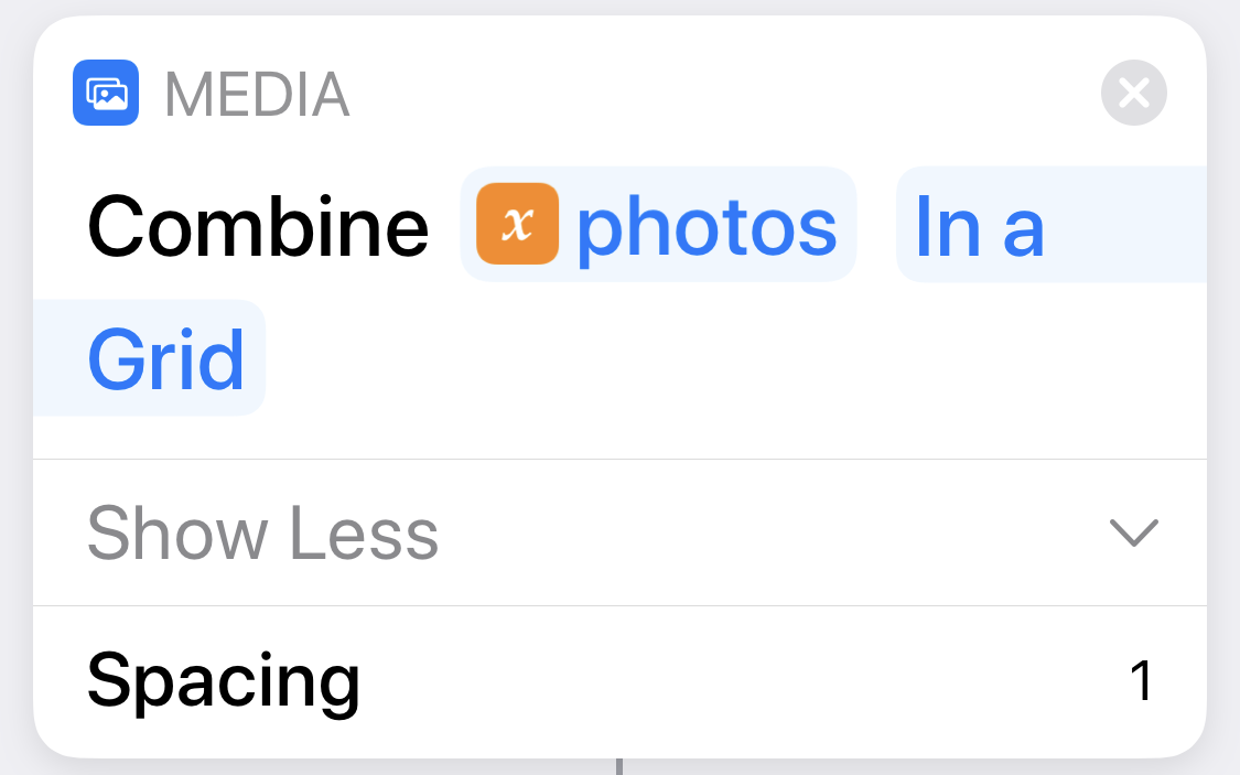 |
Arrange the images collected in photos into a grid with a 1-pixel white line between them. |
| 18 |  |
Save the grid image to Photos. |
The dictionary of dictionaries defined in Step 2 contains these values:
| grid | count | width |
|---|---|---|
| 2x2 | 4 | 1920 |
| 3x3 | 9 | 1280 |
| 4x4 | 16 | 960 |
| 5x5 | 25 | 768 |
| 6x6 | 36 | 640 |
| 8x8 | 64 | 480 |
| 10x10 | 100 | 384 |
The numerical trick in choosing the sizes is to come up with a multiple of 2, 3, 4, 5, 6, 8, and 10 that is the width you want for the final image (ignoring the 1-pixel separator lines). This will have to be a multiple of 120, which is the least common multiple of those numbers. I chose a final image size of 3840, which I sometimes think is too large, but I do like to zoom in on the individual images and still have decent detail. If you don’t want to use storage space and bandwidth as profligately as I do, choose a smaller multiple of 120 (1200? 2400?) and divide that by 2, 3, 4, 5, 6, 8, and 10 to get the widths.
It’s not obvious how to use a variable as the repetition count in a Repeat loop, as is done in Steps 7 and 13. When you first add a Repeat step, you’re given a count that you can change by tapping the plus or minus buttons that appear when you touch the count button.
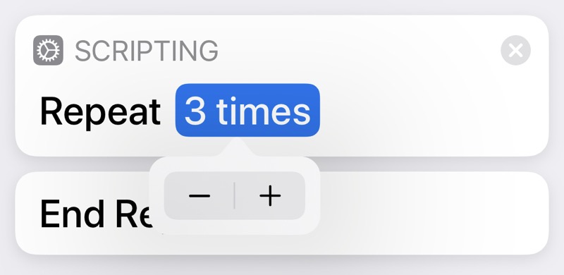
To use a variable for the count instead of a predefined number, you have to press and hold on the count button. A menu like this will appear,
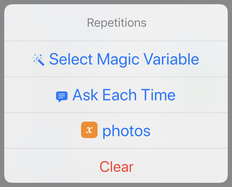
and you’ll be able to choose either a regular variable or a magic variable for the number of repetitions. This is a terrible, undiscoverable design decision. And even after I did discover it (through Googling), I was disappointed to see that the step reads “Repeat count” instead of “Repeat count times.”
You may be wondering where the photos variable in Steps 10 and 14 came from. Basically, it gets made up on the spot and accumulates additional values in a list with each pass through the loop. Here’s the description of :
Appends this action’s input to the specified variable, creating the variable if it does not exist.
This allows you to make a variable hold multiple items.
If you’re used to writing in stricter languages, it may bother you that you don’t have to initialize photos with an empty list before adding values to it. If you’ve programmed in Perl, you’ll probably feel right at home.
I often feel guilty about presenting a completed automation, one that I’ve spent a lot of time writing and rewriting to make clearer, more efficient, and more idiomatic to the language in which it’s written. I can assure you that even a silly program like Warhol didn’t spring out fully formed, like Athena from Zeus’s head. It started out both much simpler, in that it handled fewer grid sizes and couldn’t tint the images, and more complicated, in that it didn’t take advantage of some of the niceties of Shortcuts.
For example, the earliest versions of Warhol presented only a few grid sizes and used a repetitive section to set the size of the list of images. It was only after I had the basic logic of the shortcut worked out that I switched to using the dictionary of dictionaries to handle the different grid sizes. That change cleaned up a lot of code.
The earlier versions of Warhol also had no logic for resizing the base image before assembling it into a list of images. The step came at the end, only after had created a truly enormous grid image, usually well over 10,000 pixels wide. These early versions often ran very slowly because of all the data they were slinging around.
I don’t consider any of these inefficiencies in code size or running time to be bugs. They were part of my normal process of development:
- Order my thoughts to understand what the problem is and how to solve it.
- Work out some code that implements that solution.
- Improve the code to make it tighter, easier to understand, and, if necessary, faster.
Steps 2 and 3 usually lead to revisions in what I came up with in Step 1. Working out a solution almost always gives me a better understanding of what the problem really is.
Ultimately, Warhol is a solution in search of a problem. It’s the kind of automation I create because I think writing it would be fun and I would learn something in the process. On those terms, it was a success.
