Font memories of old Macs
May 14, 2025 at 4:18 PM by Dr. Drang
I don’t know about you, but I’ve enjoyed the hell out of a couple of recent Daring Fireball posts. There was Monday’s, in which John Gruber excoriated the childish “single-story” a that Apple uses in the Notes app. And then today’s post about the short-lived single-story a in the Geneva 9-point font at the dawn of the Macintosh. This second one got Gruber so excited he actually put images in the post.
Because I didn’t own a Mac until 1985, I missed the single-story a in Geneva 9, but I definitely remember another, less obnoxious variation in font design with size: The descender on Geneva’s lowercase y.
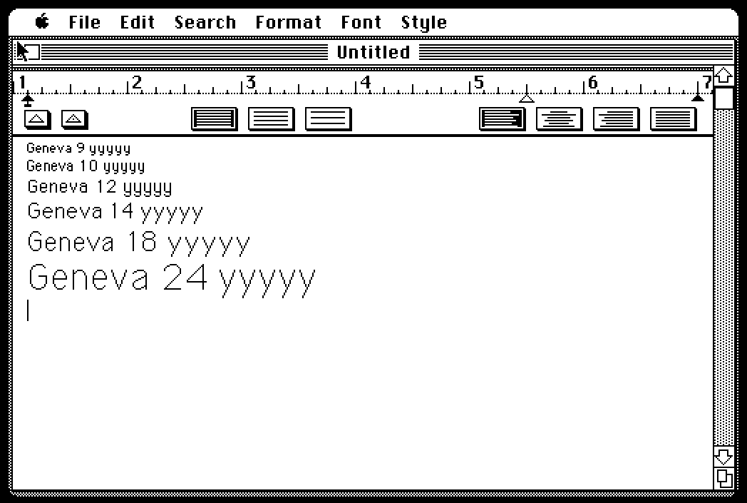
Following Gruber’s lead, I went to Infinite Mac, fired up a 1985-vintage System 2.1 emulator, and made this simple MacWrite document:

As you can see, the descenders for the 9-, 10-, and 12-point sizes are curved, but the descenders for the larger sizes are straight. I remembered this 40 years after the fact not because I used large fonts very often, but because of an interesting feature of the ImageWriter printer.
Back before the LaserWriter and PostScript (it’s an all InterCaps day here at ANIAT) made resolution independence commonplace, most printers were of the dot-matrix variety, usually at a fairly low resolution. The original ImageWriter had a higher resolution than most: 144 dpi. And this led to the interesting feature.
You may have noticed that the 144 dpi resolution of the ImageWriter is exactly twice that of the Mac’s 72 dpi screen. The ImageWriter printer driver on the Mac took advantage of that. If you were writing a document using a 12-point font, and your Mac had a 24-point version of that font, the Mac would send the 24-point font’s bitmaps (all Mac fonts were bitmapped in those days) to the printer so it could render smoother text.
The upshot of this was a very slight breaking of the WYSIWYG principle. On the screen, your Geneva 12 document would appear with curly ys, but when you printed it out, it would have straight ys. A fun idiosyncrasy that disappeared when PS fonts and Adobe Type Manager took over.
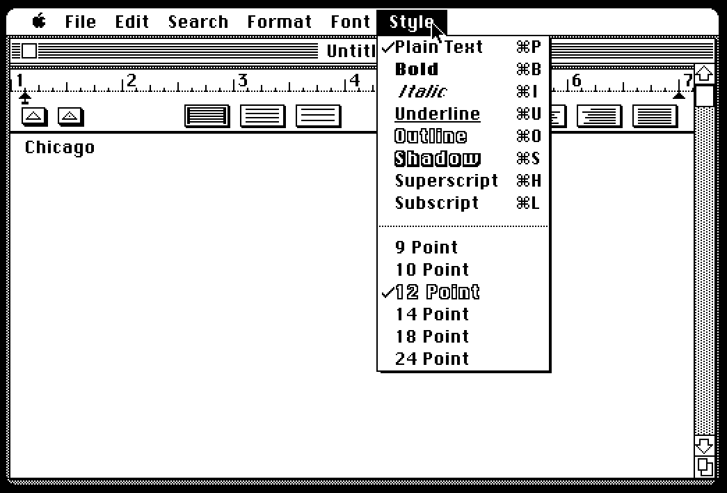
By the way, how did you know if your Mac had a double-sized bitmap of a font? Well, you could fire up ResEdit, but the easier way was to pull down the Style menu.

Sizes present as bitmaps on your Mac were displayed in an outlined style. Sizes that weren’t (and would be scaled—often looking ugly as a result) were displayed in a plain style. While the workhorse document fonts Geneva and New York had bitmaps in several sizes, other fonts, like Chicago, had just one.
