
Old icons
July 7, 2026 at 9:30 PM by Dr. Drang
There’s been a lot of talk lately about Mac application icons and “squircle jail.” Inspired by this post from Paul Kafasis on the Rogue Amoeba blog,1 many Mac-adjacent people have taken up his cause to “Free the Icons.”
I agree, but Apple’s 50th anniversary has gotten me thinking a lot lately about the early days of the Mac, so it’s only natural that my mind shifted to the highly constrained icons Mac applications had back then.
In those days, icons were 32×32 pixel images, and every pixel was either black or white. The classic original Mac application icons were the ones for MacWrite and MacPaint.2
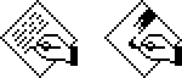
You can see that Apple liked the idea of app icons being a tilted rectangle with some image inside the rectangle to indicate what the app did. The hand was Apple’s way of telling you that this icon was for doing things, and the rectangle was tilted to match the orientation of the hand. (If you were left-handed, this was just another injustice inflicted on you by a cruel right-handed world.)
Document icons were typically upright rectangles with dog-eared corners and similar designs inside the rectangle—no hands because documents don’t do anything. But we’re not here to talk about document icons.
Other Apple app icons that fit this pattern were the ones for MacDraw and HyperCard:
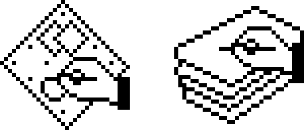
The HyperCard icon was a bit of a departure, in that it had a stack of rectangles, but the idea was the same. There was no image on the top card of the stack, probably because there wasn’t enough room.
Many of the complaints about squircle jail are about the loss of icon elements that “stick out” from the rest of the design. As you can see, this idea was there from the very start; the hands stick out from the tilted rectangles.
Most other software publishers followed Apple’s lead. Here are the icons for Aldus PageMaker and QuarkXPress:
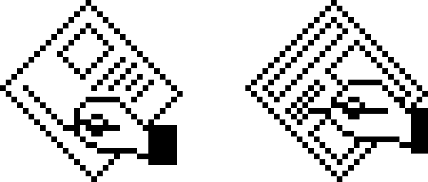
Aldus had a slightly different idea for what the hand should look like.
It’s important to recall that the Mac didn’t have a Dock back then. You launched an app by finding its icon on your disk and double-clicking.3 The icon always had the name of the app underneath it, which was good. If you had both PageMaker and XPress, I imagine it would be easy to confuse such similar icons in a Dock.
The folks at THINK took a slightly different approach for their Pascal editor/compiler. They kept the idea of hands, but because nobody programs with a pencil, they put two hands on a keyboard and showed them generating a flowchart:

Other publishers abandoned either the hands or the tilted rectangle or both. As people got more used to working with Macs, these clues for what’s an app and what isn’t became unnecessary, and icon design became less constrained. Even Apple gave up on them for utilities like Disk First Aid and Font/DA Mover:
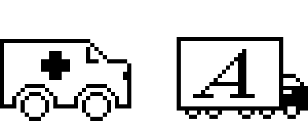
And there was, of course, my favorite Apple icon of this era, the one for ResEdit:
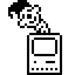
This is what old-timers mean when they talk about Apple and whimsy.
-
As opposed to his wonderful personal blog, One Foot Tsunami. ↩
-
All of the icon images in this post are screenshots taken from an Infinite Mac session. ↩
-
Yes, you could also launch an app by double-clicking on the icon of one of its documents. But I told you we’re not here to talk about document icons. ↩