
Plotting of and by students
July 9, 2026 at 9:54 PM by Dr. Drang
I saw this article at Inside Higher Ed this morning, guided by a Mastodon post from Techmeme. The title of the article is “Brown Professor Suspects Majority of His Class Used AI to Cheat,” so if you’re sick to death of reading about AI—pro, con, or caveated—don’t feel obligated to follow the link. I’m interested in a plot included in the article more than the article itself.
An economics professor gave his class a take-home midterm, and the grades on it were much higher than usual. He suspected the high marks came from the students using LLMs to answer the questions, so the final exam was done in class and the marks were generally much lower. Here’s the plot given in the article:
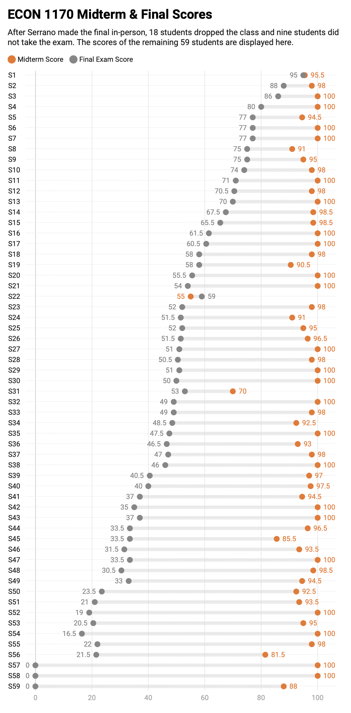
Image from Inside Higher Ed.
Let me start by saying I have no criticisms of the plot, just some comments about things that struck me.
First, the upper portion of the chart made me think the students, S1 through S59, were ordered according to their score on the final exam (the gray dots and figures). But as you go down the list, you soon see that that isn’t the case. After reading past the chart, I saw that the professor decided to throw out the results of the midterm and use the final exam as 80% of the course grade. Presumably, the students were sorted by their course grade.
More important, though, was the chart’s layout. When plotting a pair of scores for every student, the usual convention would be to have the students (the categories) laid out along the horizontal axis and their scores (the values) plotted on the vertical axis. This does it the other way around. There’s nothing wrong with doing it that way; it’s just unusual. Sort of like seeing a time series chart in which time is on the vertical axis. There can be good reasons to do it, but usually people don’t.
I first read the article on my phone, so I wondered if the layout was driven by the aspect ratio of most phones in portrait mode. In fact, since the chart is not actually an image but some sort of JavaScript thingy from Datawrapper. At least I think that’s what it is—I couldn’t select the chart as an image, and when I looked at the page’s HTML, I saw it was in an <iframe> element.
This made me wonder if the chart would flip to a more conventional layout if the aspect ratio of the browser were different. Turning my phone to landscape mode didn’t flip the axes, nor did opening the page on my MacBook Pro with a wide Safari window. Clearly the author of the article, Emma Whitford, thought it was best to have the students running down the vertical axis.
I decided to see what a more conventional layout would look like. I used the link on the page to download the plot’s data as a CSV file—a very thoughtful addition to the article and something I wish more authors did—and whipped out a quick plot in Matplotlib. Here it is:
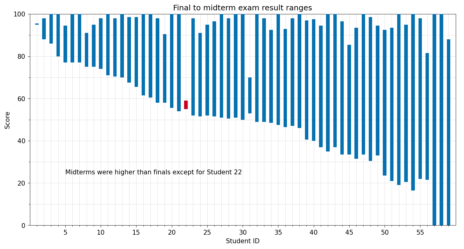
Even in a wide browser window, it’s pretty tightly constrained, mainly because I have a width limit on the content portion of ANIAT (that’s to keep lines of text of reasonable length). If you click on the chart, it’ll open to the full width of your browser window, which will make it easier to peruse.
Here’s the code that produced the chart:
python:
 1:  #!/usr/bin/env python3
 2:
 3:  import pandas as pd
 4:  import numpy as np
 5:  import matplotlib.pyplot as plt
 6:  from matplotlib.ticker import MultipleLocator, AutoMinorLocator
 7:
 8:  # Read in the exam scores
 9:  df = pd.read_csv('scores.csv')
10:
11:  # Create the plot with a given size in inches
12:  fig, ax = plt.subplots(figsize=(12, 6))
13:
14:  # Bar colors are based on whether midterm was higher than final
15:  colors = ['#0571b0']*59
16:  for i in range(59):
17:    if df.Final[i] > df.Midterm[i]:
18:      colors[i] = '#ca0020'
19:
20:  # Plot the scores as columns between the final and midterm scores
21:  ax.bar(df.Student, df.Midterm-df.Final, bottom=df.Final, width=.5, color=colors, zorder=10)
22:
23:  # Set the limits
24:  plt.xlim(xmin=0, xmax=60)
25:  plt.ylim(ymin=0, ymax=100)
26:
27:  # Set the major and minor ticks and add a grid
28:  ax.xaxis.set_major_locator(MultipleLocator(5))
29:  ax.xaxis.set_minor_locator(AutoMinorLocator(5))
30:  ax.yaxis.set_major_locator(MultipleLocator(20))
31:  ax.yaxis.set_minor_locator(AutoMinorLocator(2))
32:  ax.grid(linewidth=.5, axis='x', which='both', color='#dddddd', linestyle='-', zorder=0)
33:  ax.grid(linewidth=.5, axis='y', which='both', color='#dddddd', linestyle='-', zorder=0)
34:
35:  # Title and axis labels
36:  plt.title('Final to midterm exam result ranges')
37:  plt.xlabel('Student ID')
38:  plt.ylabel('Score')
39:
40:  # Make the border and tick marks 0.5 points wide
41:  [ i.set_linewidth(0.5) for i in ax.spines.values() ]
42:  ax.tick_params(which='both', width=.5)
43:
44:  # Add a note
45:  ax.text(5, 25, 'Midterms were higher than finals except for Student 22', va='center')
46:
47:  # Save as PDF
48:  plt.savefig('20260709-Midterm and final exam results.png', format='png', bbox_inches='tight', dpi=150)
A few comments on this:
- I didn’t put dots where the midterm and final scores were. The ends of the columns do the job (but see below).
- I didn’t include the test scores in the chart. Although that can be helpful in situations in which a data file isn’t provided, my tendency is to let tables be tables and charts be charts. A chart should give you a feel for the data without including the numbers themselves. I don’t always follow this principle, and it doesn’t bother me when others don’t—as long as the numbers don’t detract from the plot.
- I didn’t label every student. It makes the horizontal axis too busy and doesn’t help the reader.
- I changed the color of the column for the one student who got a higher score on the final than the midterm and also added an explanatory note. This may be too cute. Colored dots for the two scores, as in the IHE chart, are certainly more obvious, even though they make the chart more cluttered.
- I got the two column colors,
#0571b0and#ca0020, from ColorBrewer. - If you run the code yourself, you’ll find ticks and labels for nonexistent students 0 and 60. Rather than adding a bunch of Matplotlib code to get rid of those ticks and labels, I opened the PNG file in Acorn and erased them. I don’t consider this cheating.
Overall, I think my chart works, and I had fun thinking about how to make it. But it’s not better than the original.
Update 10 Jul 2026 5:07 AM
Sometimes I just want to be done with a post, and I publish it before I should. That’s what happened last night. While it’s true that categories are usually laid out horizontally, I shouldn’t have left the impression that it’s tremendously rare for them to be laid out vertically. There are plenty of good vertical examples.
A clear reason for a vertical layout is a large number of categories, and while 59 categories isn’t especially large, it’s definitely heading in that direction. I made my chart mainly to see if a horizontal layout can work with 59 categories, and I think it can—at least if you can give your plot enough horizontal space.
(Another good reason for a vertical layout is that it works better typographically. Sometimes the categories have long names, and they fit better in a column than in a row. That isn’t the case here, but it happens.)
Thanks to Janne Moren for making me realize that this post was too blunt as originally written.