
Making a tall, skinny plot in Mathematica
October 7, 2026 at 12:12 PM by Dr. Drang
Yesterday’s post included this plot:
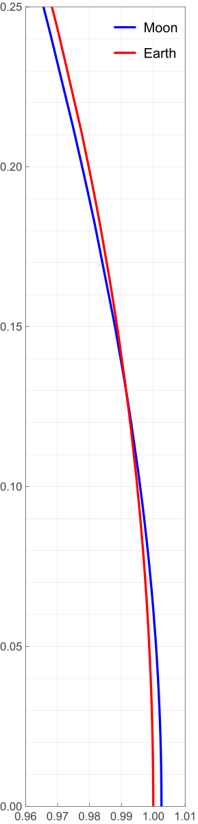
I figured it was worth a quick post to show how I made it.
I had already done most of the work back in 2022 in a Mathematica notebook I made to support my original orbital curvature post. So I copied the pertinent calculations from that notebook, pasted them into a new one, and made the adjustments necessary to produce the plot. Here’s the new notebook:
The bottom half of the notebook is where the plotting commands are. The key items are:
- The definitions of
xGrid,xTicks,yGrid, andyTicks. These produce lists of values used to lay out the grid spacing and tick mark labels. Most of this is self-explanatory, but I do want to call out the use ofNumberFormto format the tick labels with two decimal places.NumberForm[x, {3, 2}]is very much like Python’s{x:3.2f}in an f-string. Like most things in Mathematica, it’s kind of verbose, but it is readable. The call to
ParametricPlotincludes the optionAspectRatio -> .25/.05AspectRatiosets the ratio of height to width for the plot as a whole, so the value I set it to was based on the ratio of the values given in thePlotRangeoption. The overall plot is 0.25 units high and 0.05 units wide, so to make the x and y units the same size,AspectRatiois set to that ratio. I entered it as a division instead of as the number 5 because I wanted the reasoning behind it to be clear. I suppose I could have been even more explicit by sayingAspectRatio -> (.25 - 0)/(1.01 - .96)but there are limits to my verbosity, even when using Mathematica.
To get the image out of the notebook, I right-clicked on it, selected from the popup menu, and chose SVG as the format. That’s why the plot stays smooth if you zoom in on it.