Playing the percentages
January 22, 2026 at 3:19 PM by Dr. Drang
In his excessively long speech to the World Economic Forum yesterday in Davos, Donald Trump did some surprising backtracking. Not the stuff about Iceland Greenland, but on his method of calculating price reductions.
For weeks—maybe months, time has been hard to judge this past year—Trump has been telling us that he’s worked out deals with pharmaceutical companies to lower their prices by several hundred percent. Commentators and comedians have pointed out that you can’t reduce prices more than 100% and pretty much left it at that, suggesting that Trump’s impossible numbers are due to ignorance.
Don’t get me wrong. Trump’s ignorance is nearly limitless—but only nearly. I’ve always thought that he knew the right way to calculate a price drop; he did it the wrong way so he could quote a bigger number. And that came out in yesterday’s speech:
The embedding code is supposed to start the video just after the 47-minute mark. If it doesn’t, that’s where you should scroll to.
If you can’t stand listening to him for even 15 seconds, here’s what he said:
Under my most-favored nation policy for drug prices, the cost of prescription drugs is coming down by up to 90%, depending on the way you calculate. You could also say 5-, 6-, 7-, 800%. There are two ways of figuring that.
Apparently, Trump or his staff decided that this particular audience wouldn’t swallow his usual percentage calculation, so he decided to do it the right way, even though he went on to defend his usual method. Trump has testified that his net worth is whatever he feels it should be on a given day, so why wouldn’t there be more than one way to calculate a price drop?
It’s hard to know what goes on in Donald Trump’s head, but I’m confident of two things:
- He knows that price increases and decreases are opposites. Therefore, if a price jump from $10 to $100 is a 900% increase, then a price drop from $100 to $10 must be a 900% decrease. It’s just logic.
- If you were selling him something and agreed to lower your price from $100 to $10, he would call it a 90% decrease, not a 900% decrease. If he were giving you the same discount (ha!), it would be a 900% decrease. The numbers he uses are whatever sound best to him at the time.
Of course, the key thing about Trump’s deals with drug companies isn’t how percentages are calculated; it’s whether these deals will have any real effect.
Freezing pipes
January 21, 2026 at 4:03 PM by Dr. Drang
The Midwest is expected to have very cold temperatures this weekend, which got me thinking about burst water pipes. Water expands about 9% as it freezes, and a lot of people think it’s pressure from the outward expansion of ice that ruptures pipes, but it’s more complicated than that.
My favorite reference for this phenomenon is this 1996 paper by Jeffrey R. Gordon of the Building Research Council at the University of Illinois. It’s entitled “An Investigation into Freezing and Bursting Water Pipes in Residential Construction,” and it goes through the testing that the BRC did on behalf of the Insurance Institute for Property Loss Reduction.
Why do I have a favorite reference for burst pipes? I used to get hired by insurance companies to investigate burst pipes and the subsequent damage in high-end residences. When the pipe failed in a heated area, it was nice to have this paper to back up my explanation of how freezing in one part of a pipe can lead to failure in another. Also, the report is quite easy to read. There’s not a lot of jargon, and you don’t need much scientific or engineering background to understand it.
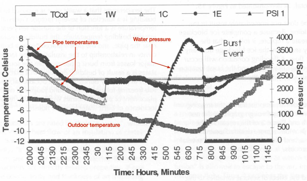
Here’s Figure 15 from the report, which graphs the data collected during the testing of a 3/4″ copper pipe running through an unheated attic. The pipe was instrumented with thermocouples to capture its temperature at three locations and a pressure gauge to capture the water pressure inside it. The red annotations are mine. As you can see, the pressure rose to about 4,000 psi, at which point the pipe bulged—that’s the drop in pressure as the pipe increased in diameter and decreased in wall thickness—and then burst.
The best explanation of what happened in the test—and what commonly happens in real-world pipe bursts—comes from the report itself:
This shows the central, and often least understood, fact about burst water pipes: freezing water pipes do not burst directly from physical pressure applied by growing ice, but from excessive water pressure. Before a complete ice blockage, the fact that water is freezing within a pipe does not, by itself, endanger the pipe. When a pipe is still open to the water system upstream, ice growth exerts no pressure on the pipe because the volumetric expansion caused by freezing is absorbed by the larger water system. A pipe that is open on one end cannot be pressurized, and thus will not burst.
Once ice growth forms a complete blockage in a water pipe the situation changes dramatically. The downstream portion of the pipe, between the ice blockage and a closed outlet (faucet, shower, etc.) is now a confined pipe section. A pipe section that is closed on both ends can be dramatically pressurized, water being an essentially incompressible fluid. If ice continues to form in the confined pipe section, the volumetric expansion from freezing results in rapidly increasing water pressure between the blockage and the closed outlet. As figure 15 shows, the water pressure in a confined pipe section can build to thousands of pounds per square inch.
Read that second paragraph again. It’s really a perfect explanation of how, for example, a pipe or joint under a bathroom sink can fail even though that part of the pipe was never exposed to freezing temperatures. It’s the ice buildup in the pipe elsewhere—typically in an unheated area on the other side of the drywall—and the continued growth of ice in the isolated zone between that blockage and the faucet at the sink that leads to a huge increase in pressure. The pipe will fail at whatever point is weakest within that zone.
Which leads to some common advice given when temperatures are going to drop.
- For sinks up against an outside wall, leave the cabinet doors open so the warm air of the house gets a chance to circulate around the pipes. You want them to get as much exposure to warm air as possible so they can conduct that heat to the colder parts on the other side of the drywall.
- Open faucets that are against an outside wall and let them drip. I’ve never done this because I added extra insulation around and on the cold side of my pipes many years ago, but it can help. Not, as some people say, because moving water doesn’t freeze (have they never seen a river frozen over?) but because a slightly open valve prevents the buildup of pressure shown in Figure 15. As the report says, “A pipe that is open on one end cannot be pressurized, and thus will not burst.”
Belaying follow-up
January 20, 2026 at 4:46 PM by Dr. Drang
At the end of last week’s belaying post, I said we’d look into the condition in which the climber and belayer don’t weigh the same. And we will. But first, I want to talk about stretchy ropes.
One of my assumptions in the last solution was that the rope connecting the climber and the belayer was inextensible. Now, no ropes are truly inextensible, but I thought it was a reasonable assumption, at least for a first-pass solution. But Rob Nee (via Mastodon), Dirk KS (also via Mastodon), and Kenneth Prager (via email) thought the extensibility of climbing ropes was worth discussing. Dirk KS even sent me a link to the Samson Rope Technologies page that includes this nice graph of its ropes’ compliance:

(If you’re an engineer, you’re used to seeing load-deflection curves with the load on the vertical axis and deflection on the horizontal axis. Be aware that this one is drawn the opposite way.)
I can certainly understand why climbers consider their ropes’ compliance to be important: it makes for a more gentle stop at the end of a fall. For our purposes, what’s important is the potential energy absorbed by the rope as it stretches. If the rope is linearly elastic, the potential energy in a rope that extends by an amount x from its natural length is
where k is the stiffness of the rope and F is the tension. The Samson graph tells us that their ropes are linearly elastic for loads of up to about 400 lbs, so let’s use this equation and see where it gets us.
You may recall that Prof. Allain did some motion analysis of the video and came to the conclusion that the climber was about 7.2 m above the belayer when he started his fall. I took this value and some scaling of the video frames I showed in the previous post to estimate the following values:
- Length of rope (L): 24 ft.
- Height of loop (h): 18 ft.
- Initial distance of climber above loop (d): 6 ft.
I’ll also assume the climber and belayer each weigh 150 lbs. These are rough, rounded estimates because I don’t feel greater precision is warranted.
When the climber and belayer come to a halt and are just hanging there, the tension in the rope is equal to each man’s weight: 150 lbs. According to the Samson chart, the more compliant ropes will stretch about 0.75% under this load, which means the rope will stretch
So the elastic energy in the rope is
The gravitational potential energy lost during the initial drop of twelve feet by the climber (which is when the rope first becomes taut) is
The energy that goes into stretching the rope is small potatoes compared to this, so it’s not unreasonable to ignore it in our energy accounting system.
Let’s move on to consider unequal weights. We’ll say the climber has a mass of m, as before, but now the mass of the belayer is βm. As before, the potential energy before the climber falls is
and there’s no kinetic energy:
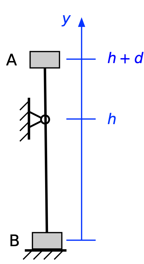
When the rope becomes taut (we’re assuming an inextensible rope again), the potential energy has dropped to
so the kinetic energy must be
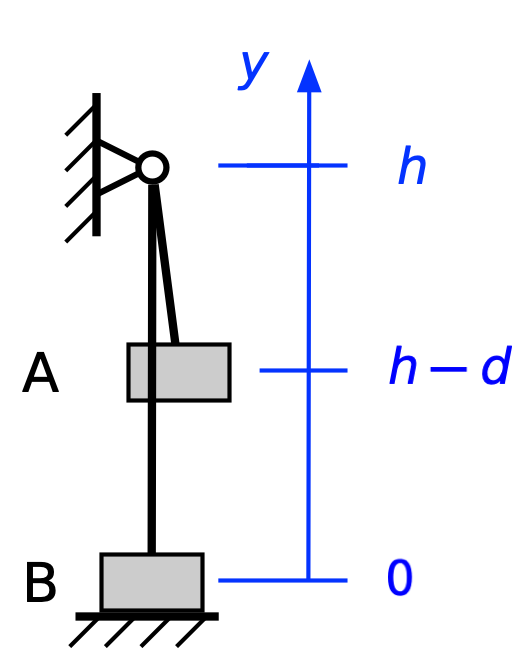
From this point on, the rope keeps climber A and belayer B moving in concert, so
and the change in potential energy will be
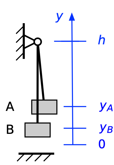
Ignoring frictional losses, the change in kinetic energy will be
Now we have three situations to consider:
- means and (without friction) the movement never stops.
- means and (without friction) the movement never stops.
- means and the movement might stop, at least momentarily, even without friction.
The second condition is what we covered last time, so I won’t repeat that.
For the third condition, where the belayer weighs more, the system might stop momentarily with the belayer at his highest point and the climber at his lowest, even if there’s no friction in the system. If and where this happens depends on the specific values of β, h, and d. The key concern is whether the climber hits the ground before this momentary stop occurs.
To me, the first condition is the most interesting. It says that the system won’t stop if the belayer weighs less than the climber. In fact, if there’s no friction in the system, the climber would go down to the ground even if the two started hanging statically at the same elevation. But the fact is, lighter belayers can safely control heavier climbers (Kenneth Prager told me he often belays his son, who outweighs him by over 50 lbs). You can see that in this video from the American Alpine Club:
In this video, the rope is running through several carabiners; in the subject video, it appears to be running through just one. Either way, this way of using the friction of a rope running over a stationary curved surface to control movement has been known for ages. It’s called the capstan problem, and it’s covered in the friction section of most elementary engineering mechanics classes.
Update 20 Jan 2026 5:34 PM
Gus Mueller (developer of Acorn) is a climber, and he showed me that the rope in the subject video passes through two carabiners, not one. I have the top one identified correctly; the lower one is about a body length below the top one. The second carabiner doesn’t affect any of the calculations, but it does give another place for friction to do its job.
At this point, longtime readers are expecting me to go through the capstan problem, but really longtime readers know I already did that back in 2010. Oddly enough, that post was inspired by my acting as a belayer at my younger son’s school while his fourth-grade gym class did a rock-climbing unit. That son will be visiting me this weekend; he’s coming into town on a business trip for client meetings in the area early next week. I’m still trying to figure out how a fourth-grader has clients.
Resting heart rate and the Apple Watch
January 15, 2026 at 8:31 PM by Dr. Drang
My apologies to those of you hoping for another pulse-pounding post on the mechanics of belaying, but I’m going to talk about Apple again. The belaying follow-up should come out this weekend.
What prompted this post was being chastised by my phone this morning for getting only about an hour of sleep last night. This was unwarranted. What actually happened was that I fell asleep for maybe an hour and a half while reading last night. When I woke up, I took off my watch, put it on the charger, and got ready for bed. I slept pretty well.
I could take this opportunity to say that since my watch knew damned well that it was on the charger instead of my wrist overnight, it should have shared that information with my phone and told it not to scold me. But my expectations of Apple software have been lowered to the point where that wasn’t even a blip on my radar. It did remind me, though, that I’ve been meaning to write about errors the Apple Watch makes in measuring resting heart rate.
Note the word resting. I think the watch’s heart rate monitor itself does a good job. Whenever I’ve checked its reading against a manual pulse count, the two are very close—close enough that the difference could be a real minute-to-minute variation. But the resting heart rate is supposed to be… well, here’s what Apple says in the Health app:
Your resting heart rate is the average heart beats per minute measured when you’ve been inactive or relaxed for several minutes. A lower resting heart rate typically indicates better heart health and cardiovascular fitness. An increase in resting heart rate at times may be normal and expected, such as during an illness or a pregnancy.
You may be able to lower your resting heart rate over time by staying active, managing your weight, and reducing everyday stress. Resting heart rate does not include your heart rate while you’re asleep and is validated for users over the age of 18.
Emphasis mine.
So the resting heart rate is based not only on the watch’s heart rate monitor, which, as I just said, is quite good, but also on its assessment of whether you’re sleeping or not. Like Santa Claus, the Apple Watch sees you when you’re sleeping and knows when you’re awake. Or does it?
I’ve had an Apple Watch since the Series 3, and over most of that time I’ve taken the watch off when I go to bed and let it charge overnight. In July of 2024, though, I started a diet program to control my Type 2 diabetes. The diet program included an app that wanted the sleep data from my watch, so I started wearing it overnight.
I left the program about a year ago because my insurance changed and my new plan wouldn’t pay for it. Don’t worry, I’m still eating right and my A1C has continued to go down. And I kept wearing my watch overnight because I was in the habit of doing so.
Then came iOS and watchOS 26 this fall and with them came the Sleep Score, which was on by default after the upgrade. My Sleep Scores stunk because I am a gentleman of a certain age, and I get up to pee overnight—sometimes twice. This was annoying, so my first reaction was to remove the Sleep Score from the Pinned section of the Health app’s Summary. But then I thought, Why am I still wearing my watch overnight? Doing so means I have to find a time during the day to charge the watch, and it’s much easier to just charge it overnight and wear it all day.
So I started wearing my watch overnight in July of 2024 and went back to not wearing it overnight in November of 2025. Let’s take a peek at my resting heart rate for the six-month periods surrounding those months.
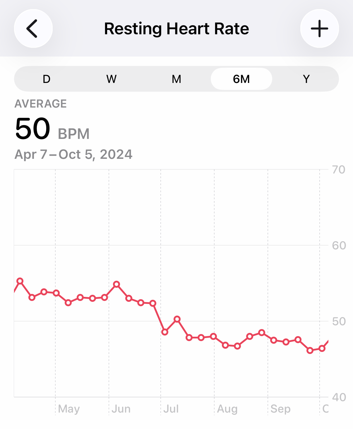

Oh, look! My heart rate went from the mid-50s down to the high-40s in July 2024 and from the high-40s to the low-50s in November 2025. What a coincidence!
What really happened, of course, was that the watch was treating some of my sleep time as awake-but-relaxed time and was counting my heart rate during those periods as resting. The Apple Watch is not as perceptive as Santa Claus.
So if you’ve always worn your watch overnight because you like getting sleep statistics from it, recognize that it may be giving you lower readings for your resting heart rate. If that matters to you, you may want to sleep without your watch for a while to see if you get a different resting heart rate.
