When logarithmic scales hide information
April 5, 2020 at 1:30 PM by Dr. Drang
We left off yesterday with semilog plots of a quantity (cumulative confirmed cases of COVID-19 in the example) and its derivative (daily confirmed cases of COVID-19) vs. time. If the quantity, which we called , is undergoing exponential growth,
then its time derivative, , will also undergo exponential growth,
and they’ll both appear as straight lines when plotted against on a semilog plot. We saw that with real data, the plot has more scatter than the plot and deviates from linearity more readily. We could, presumably, use the greater sensitivity of to more quickly recognize the much-desired “flattening of the curve” when it comes.
In his “How To Tell If We’re Beating COVID-19” video, Henry Reich of Minute Physics does a good job of discussing the value of looking at , but then he goes in a slightly different direction. His Idea 3 is “Don’t Plot Against Time,” and he recommends we plot against as the best way to see the start of any curve flattening that may occur. I’m not convinced.
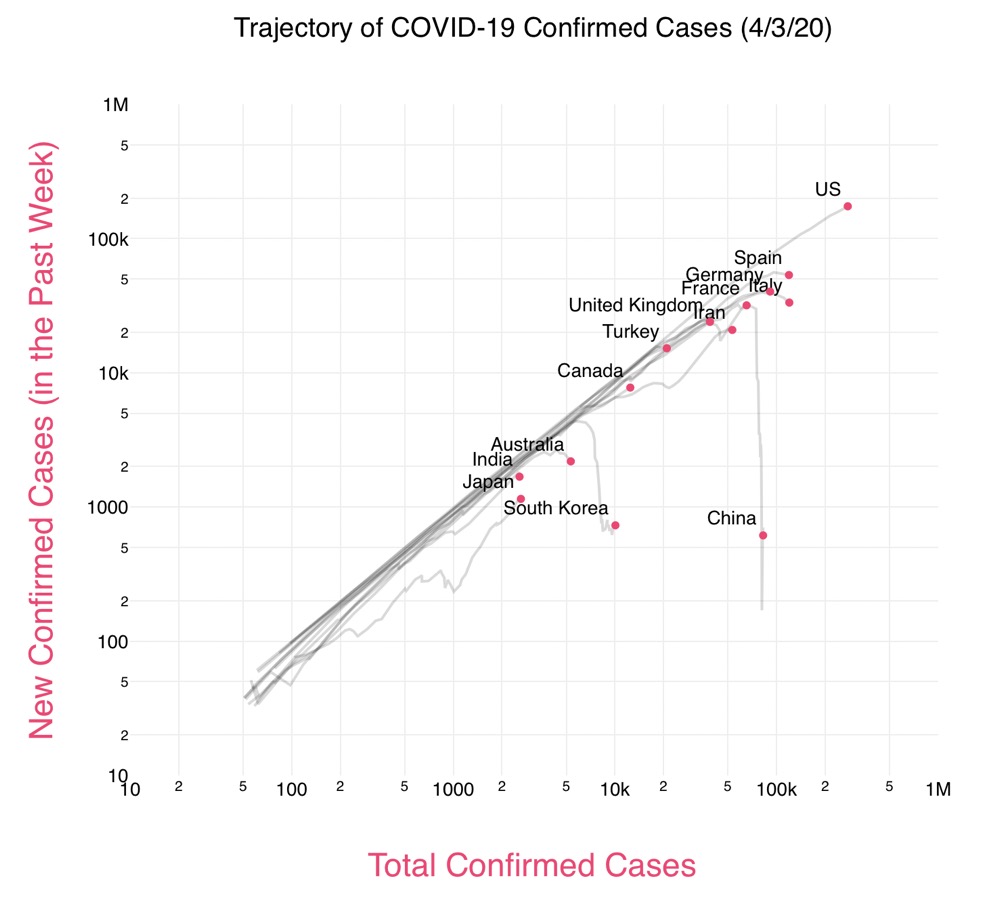
Looking at Aatish Batia’s Covid Trends plot, which is featured in the video, we see that South Korea’s exponential growth tails off significantly when the total number of cases is nearing 5,000.

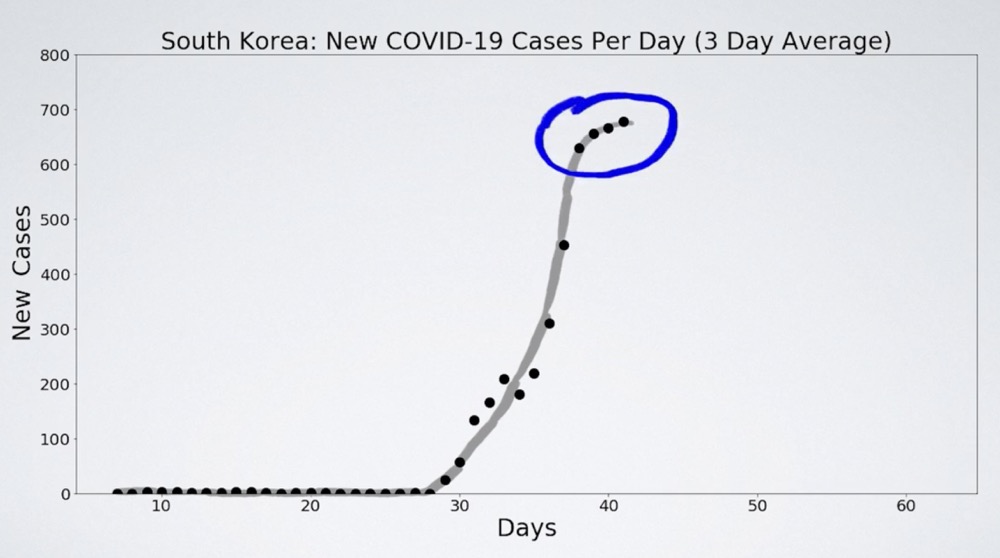
Reich shows this near the 4-minute mark in the video. But earlier, starting at around 2:20, he shows exactly the same thing looking only at new cases vs. time. Here’s the plot:

In this graph, we see new cases leveling off at about Day 40. That’s when the cumulative number of cases got to about 5,000. So even in Reich’s own example, the vs. plot doesn’t give us a better sense of when growth deviates from exponential than the vs. plot.
And there is a serious disadvantage to plotting vs. , at least if you do it on a log-log scale as is done in the video. Returning to our expressions for exponential growth, notice that we can express in terms of :
So if we have exponential growth of , plotting vs. , both on linear scales, will give us a straight line with slope .
(By the way, this trick of noting that is a multiple of is nearly as old as calculus itself. It is the fundamental fact we use to get the characteristic equation when solving linear differential equations with constant coefficients.)
But in watching the video, you’ll note that Reich generally doesn’t plot against on linear scales. He uses log scales for both. And log scales are the default in the Covid Trends plot.
So what happens when we use log scales? Taking the log of both sides of the above equation, we get
which will look like a straight line with a slope of 1 no matter what the value of is. The effect of on a log-log plot is to shift the line up or down.
This is why the Reich-Bhatia plot above shows every country bundled together. During exponential growth, they have the same slope and differ only by slight shifts up and down.
How slight are the up/down shifts? We can get a sense of that by looking at different values of that come out of the data. Note first that Reich and Bhatia are using weekly changes rather than daily changes.1 If cumulative cases increase by a factor of 8 over one week (which has happened),
and therefore
The term comes from the fact that we’re measuring in weeks and we’re looking at the ratio between today and one week ago.
Similarly, if the cumulative case count is increasing by a factor of 4 over one week (which has also happened), then . Both of these have units of reciprocal weeks.
Now let’s look at the change in confirmed cases over the past week:
If we’re plotting this on a base-10 log scale, we’re really plotting
and the up/down shift from one value of to another will be due to the difference in the final term. If , then that term will be
and if , then that term will be
The difference between these is only 0.0669, where the distance between successive powers of ten (what’s typically called a decade on a logarithmic scale) is 1. In other words, a fairly significant shift in results in a very small shift in the line as plotted on a log-log graph. This is why the countries are bundled so closely together in the Reich-Bhatia plot.
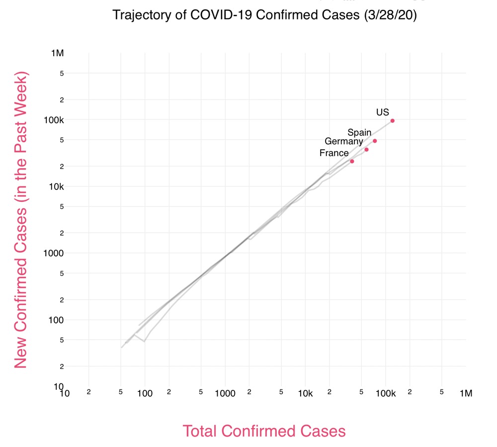
Let’s look at some specific examples. We’ll take France, Germany, Spain and the US as of about a week ago, before any of the plots started curling over. Here’s the log-log plot:

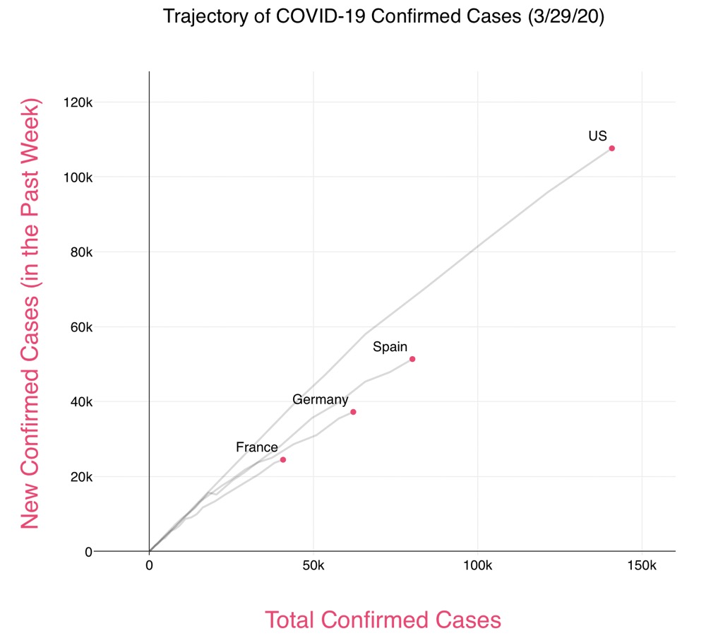
And here’s the same data plotted with linear scales.

The difference between the countries when the cumulative count is above 10,000 cases is certainly possible to see on the log-log plot, but it’s more obvious on the linear-linear plot. You’d also see the differences if you plotted the change in cases against time, as we did yesterday and as Reich does in the South Korea example.
To Bhatia’s credit, he made the graph on the Covid Trends page in a way that allows visitors to switch between linear and logarithmic scales and to pick the countries they want to plot. That’s how I made the two plots above. So you can make uncluttered plots that more clearly show differences in if you choose to do so.
But it appears that the downplaying of differences is one of the goals of the log-log plot. At the top of the Covid Trends page is this:
This interactive charts the new confirmed cases of COVID-19 in the past week vs. the total confirmed cases to date. When plotted in this way, exponential growth is represented as a straight line that slopes upwards. Notice that almost all countries follow a very similar path of exponential growth. We’re all in this together.
We are in this together, but if you make it look as if three doublings per week is about the same as two doublings per week, you’re leaving your viewers with a mistaken impression. Because there is no cure, achieving a low through behavioral changes is important, even before there’s any flattening of the curve, because it gives each country’s health care system and the world’s medical manufacturing base more time to ramp up to meet the demand.
Using the values of we calculated, if , we’ll see cases increase by a factor of 4,096 in 4 weeks. If , it will take 6 weeks to get that same increase.2 Think of how long two weeks seems nowadays.
If we’re all in this together, we should learn from each other’s successes and failures. And to do that, we need to see what those successes and failures are. Making it look as if everything is the same doesn’t help.
-
Undoubtedly this is because daily changes are too noisy to give a nice looking graph, especially when plotting lots of countries. ↩
-
Yes, I know (and so do Reich and Bhatia) that confirmed case counts are an inaccurate way to express the true spread of the disease. They’re highly dependent on how much testing is being done, how the tests are being performed, and how accurately the results are being reported. All of these things can vary widely within a country and perhaps even more so from one country to another. But our discussion here concerns graphing as a way to express the information in the data; it is not about the accuracy of that data. That can only be judged by using information from outside the data set. ↩
