Closing out 2020
February 21, 2021 at 9:24 AM by Dr. Drang
The pandemic has produced more graphs than any other event I can think of. It’s virtually impossible to keep up with the news without running across time histories or maps of cases and deaths, and it’s been that way for about a year.
Update Feb 24, 2021 7:48 PM
I guess 2020 didn’t want to be closed out. The CDC updated its figures today, and there were enough differences at the end of the year to update the post. The new cumulative values are placed just after the old ones, which are struck through. The new graphs are added at the end of the post.
The best graph, for both its simplicity and explanatory power, is Kieran Healy’s comparison of US mortality in 2020 with the previous five years. He first presented it in late September and has since updated and expanded it to look at individual states and other countries. I made my own version of Kieran’s graph for reasons I’ll explain later.
It’s the clarity of the graph that makes it so striking. You understand immediately what it’s telling you: 2020 was an extraordinarily bad year, nothing like any year we’ve had recently. Since March, anywhere from 5,000 to 25,000 more people died each week than would have in a typical year.
The data for the graph come from the Centers for Disease Control. The 2015–2018 figures are in this CSV file, and the 2019–2020 figures are in this one. The newer data are still being updated, but now that we’re 6–7 weeks past the end of the year, the changes are minimal.
The graph plots weekly death counts because that’s how the CDC provides the data. In Kieran’s original graph, the horizontal axis was a series of week numbers. He later changed that take pity on those of us who don’t immediately understand where, say, “Week 18” lies on the calendar. His horizontal axis now is divided into seasons. This is still a little hazy for some of us, which is why my version of the graph is divided into months. Each data point is plotted at a Saturday and represents the number of deaths for the week ending on that Saturday.1
The data set for 2020 also includes two values for weekly COVID-19 deaths. One is labeled “Multiple Cause of Death” and the other “Underlying Cause of Death.” The latter is the more conservative figure.2 We can use this to extend Kieran’s graph slightly. Subtracting it from the “All Causes” value and including the result in our plot, we get this:
That the light red line is still substantially above the gray lines over most of the year raises its own questions:
- Was there a distinct undercount of COVID-19 deaths, especially in the spring and summer?
- Was the medical system overwhelmed by the number of COVID-19 patients, such that other patients didn’t get the attention they normally would?
I tend to think the answer to both questions is “yes.” There will probably be a lot of research into determining how many of the extra deaths that weren’t attributed to COVID were due to incorrect attribution and how many to a medical system that had reached capacity.
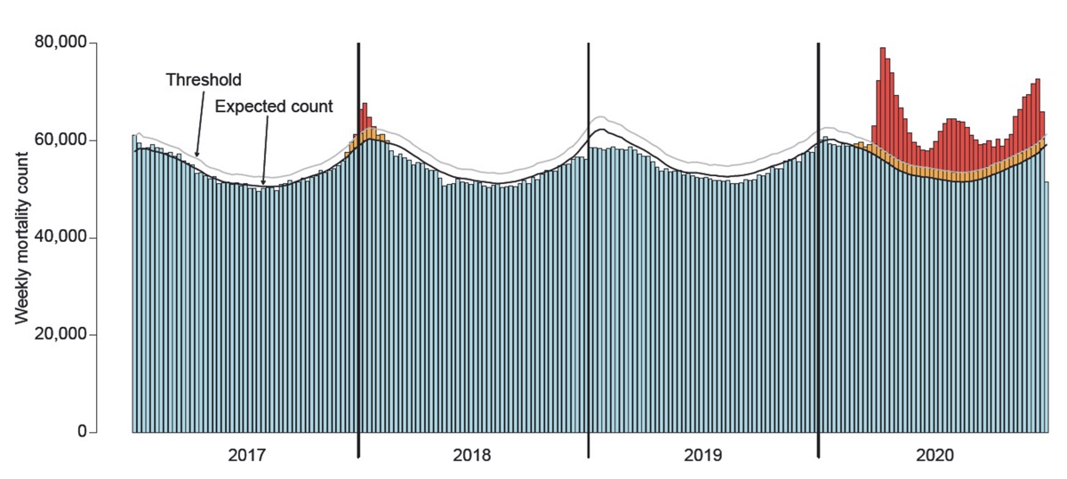
The latest issue of Significance from the Royal Statistical Society has an article by Ron Fricker that studies this same data. Fricker’s graph looks like this:

It was made a little too early to get decent figures for the last few weeks of the year, but it tells the same story and also has some interesting analytical work built into it. Still, I think Kieran’s graph tells the story better. By folding previous years into the same space as 2020, it makes the point in a more compelling way.
Here are newer versions of the graphs, updated with the CDC figures published on February 24, 2021.
The new figures make for a distinct change at the right end of the graphs.
-
You could argue that I should be plotting the points on the Wednesday of each week, as that’s the center of the week whose value is being plotted. Since doing so wouldn’t change the plots’ shape, I decided to avoid that one extra calculation. ↩
-
You may have heard stupid stories from COVID deniers, like “This guy got run over by a bus, and they tested him afterwards and found he had COVID, so they listed his death as COVID.” I question whether anyone or anything can get through to someone that dense, but using “Underlying Cause” is your best bet. ↩
