A Drafts custom syntax for book lists
April 20, 2021 at 1:42 PM by Dr. Drang
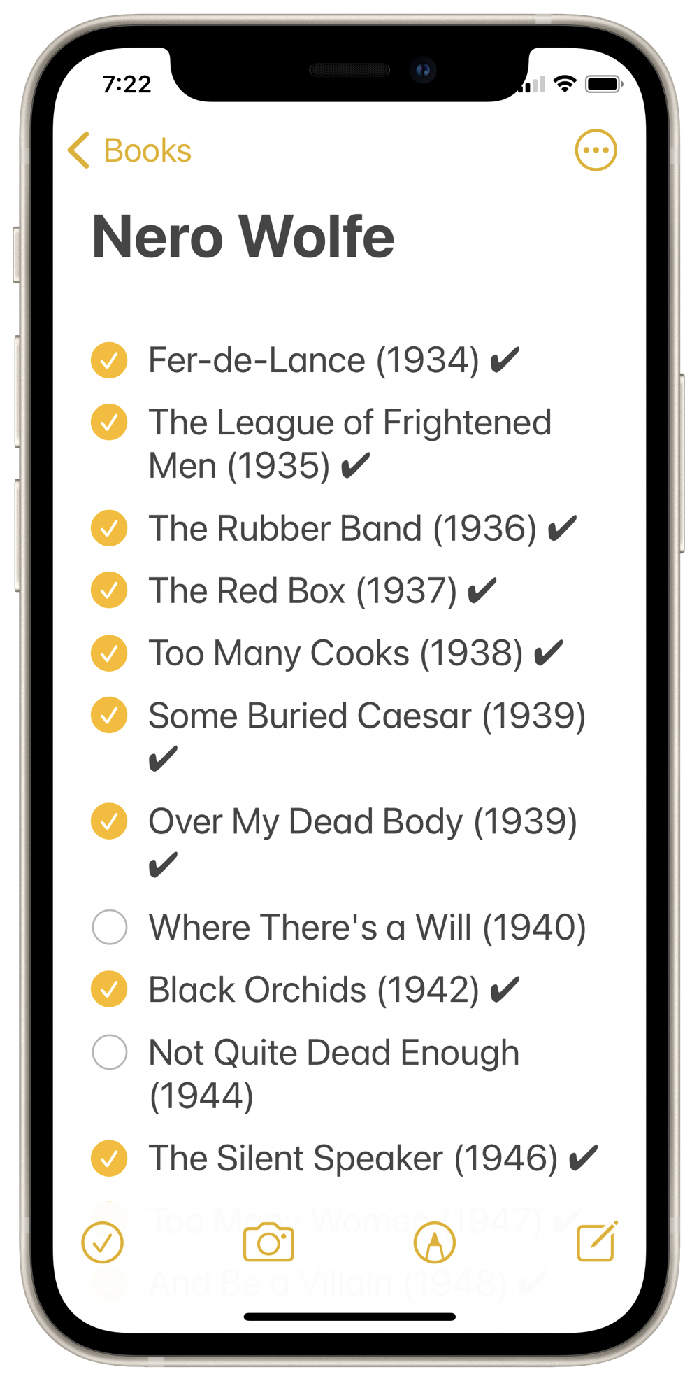
One of the things I use Notes for is to keep track of books I’ve bought and read. It works well enough but not the way I’d really like it to. I want two checkmarks for each item—one saying I own the book and the other saying I’ve read it—and Notes allows only one. My compromise is to use the real checkmark for ownership and a checkmark character (✔, the Unicode heavy check mark) for read status after the title.

The obvious downside to this compromise is that I have to set the cursor after the title and then type in the second checkmark. If it were a real checkmark, I could just tap it.
Recently, David Sparks made a video about using Drafts for lists. While I was watching it, I started thinking about using Drafts for my book lists. Drafts now allows custom syntaxes and themes, so it seemed likely I could start with the Simple List syntax and rewrite it to fit my needs.
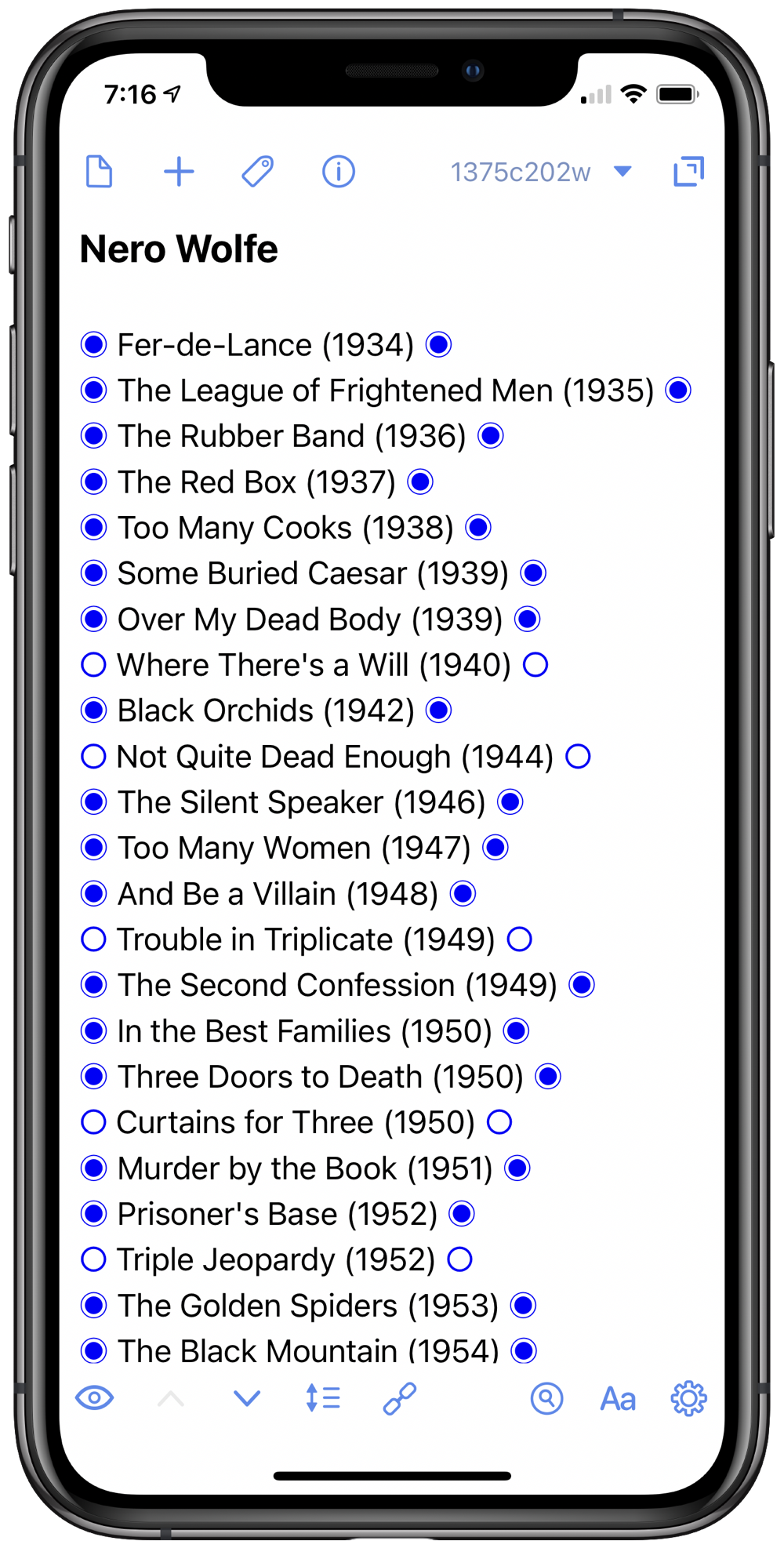
After a bunch of trial and error, I got more or less what I wanted:

The theme is not yet in final form—I’m still experimenting with line spacing and font sizes—but the syntax is working well. I can now tap to toggle both the owned and read status.
The syntax rules are very simple:
- If a line starts with any character other than a ○ (Unicode white open circle), a ◉ (Unicode fisheye), a space, or a newline, it’s a heading.
- If a line starts with a ○ or a ◉, it’s a list item.
- The ○ and ◉ characters act as checkboxes wherever they appear in a line. Tapping on one toggles to the other.
Here’s the custom syntax definition:
 1:  {
 2:    "name": "Media List",
 3:    "description": "Checklist for books, movies, etc. Checkbox before title indicates ownership; checkbox after title indicates completion.",
 4:    "sampleText": "Media List\n\n○ Not owned or completed ○\n◉ Owned but not completed ○\n◉ Owned and completed ◉",
 5:    "author": "Dr. Drang - adapted from Simple List",
 6:    "scopeName": "text.medialist",
 7:    "rangeExtensionType": {
 8:      "default": "lineExtended"
 9:    },
10:    "listCompletionDefinitions": [
11:      {
12:        "comment": "",
13:        "enabled": true,
14:        "match": "^( *)(([\\u25CB\\u25C9]) )(.*)",
15:        "captures": {
16:          "indent": "1",
17:          "prefix": "2",
18:          "line": "4",
19:          "sequence": ""
20:        },
21:        "replacements": {
22:          "◉": "○"
23:        }
24:      }
25:    ],
26:    "fileExtensions": [
27:    ],
28:    "patterns": [
29:      {
30:        "match": "^([^\\u25CB\\u25C9 \\n].*)$",
31:        "exclusive": true,
32:        "comment": "Heading or title",
33:        "captures": {
34:          "1": {
35:            "scope": "text.heading"
36:          }
37:        }
38:      }
39:   ],
40:    "navigationPatterns": [
41:      {
42:        "match": "^([^\\u25CB\\u25C9 \\n].*)$",
43:        "rangeCapture": "0",
44:        "comment": "Header or title",
45:        "prefix": "Header",
46:        "labelCapture": "1",
47:        "identifierCapture": "1",
48:        "level": 0
49:      }
50:    ],
51:    "taskMarkDefinitions": [
52:      {
53:        "enabled": true,
54:        "match": "([\\u25CB\\u25C9︎])",
55:        "comment": "Checkboxes",
56:        "rangeType": "task",
57:        "captures": {
58:          "interactive": "1",
59:          "state": "1"
60:        },
61:        "states": [
62:          "○",
63:          "◉"
64:        ],
65:        "scopes": {
66:          "interactive": "text.checkbox"
67:        }
68:      }
69:    ]
70:  }
I started with the Simple List syntax file, altered the definitions in the heading, navigation, and task mark sections, and stripped out everything else.
I’m not saying that building a custom syntax is easy, but it is relatively straightforward if you read the documentation with one of the built-in syntax files open in front of you. The main things I had to remember were to double the backslashes (a common requirement when strings are interpreted in two stages) and to use Unicode hex codes (\u25CB and \u25c9) within the regular expressions and the characters themselves (○ and ◉) elsewhere.
As for the theme, I made a copy of the built-in Light theme, changed the color of headings to black (I dislike the brownish purple headings of the Light theme) and added a section for the new text.checkbox scope:
"text.checkbox": {
    "name": "Checkbox Text",
    "settings": {
        "fontWeight": "normal",
        "fontSize": "normal"
    }
},
At present, this scope is sort of a placeholder. It’s basically the same as the text.normal style, but it gives me the ability to alter the style of the checkboxes in the future without changing the syntax.
You’ll notice that the checkboxes in the screenshot are blue even though there’s no such color specification in the theme. I think that’s because clickable text in Drafts is always blue. According to the documentation, the foreground color of a task mark cannot be changed. Maybe in a future version.
One last thing. The ○ and ◉ characters may appear quite different in size here in the blog, but they are the same size in Drafts. Do I know why? No. I do know that I chose those two characters because my original choices, ☐ and ☑︎, were different sizes in Drafts, and when I tapped to toggle between the two states, the different sizes for those characters caused the line to jump up or down. I didn’t like that, so I switched from boxes to circles.1
I suspect the character size differences are due to some sort of font substitution going on behind the scenes, but I don’t feel like digging into the problem.
-
Although I keep calling them checkboxes. ↩
