Trains and tables
July 27, 2021 at 9:24 PM by Dr. Drang
For as long as I’ve had an iPhone, I’ve had a stripped-down version of the commuter train schedule between my town and Chicago. It started as a small set of web pages, then rotated through whatever text editing app was my current favorite, and finally went into Notes. Overall, the schedule has been pretty stable; I think I’ve had to change the actual data only once. But there were some pretty big changes made earlier this month, so I decided it was time to redo my copy.
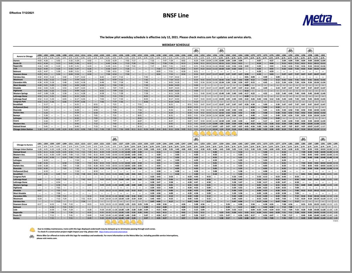
Metra publishes the schedule of my line as a PDF with a set of tables: weekday, weekend, eastbound, and westbound. Here’s an image of one of the pages:

To extract the data in the tables, I turned to a tool that I use fairly often in my job: Tabula. It’s built specifically to turn grids of information in a PDF into a nice CSV that you can import into all kinds of data analysis software. I didn’t need to do any analysis for the train schedules, but the conversion to CSV would make the table easy to edit into the form I wanted.
Tabula is an unusual app. It’s basically a web server that runs locally, but instead of forcing you to deal with the mess of server configuration, Tabula packages all that into a standard-looking Mac app. You double-click it, the server starts, and Safari (or whatever your default browser is) launches with a home page that asks you for a PDF to import. Very neat.
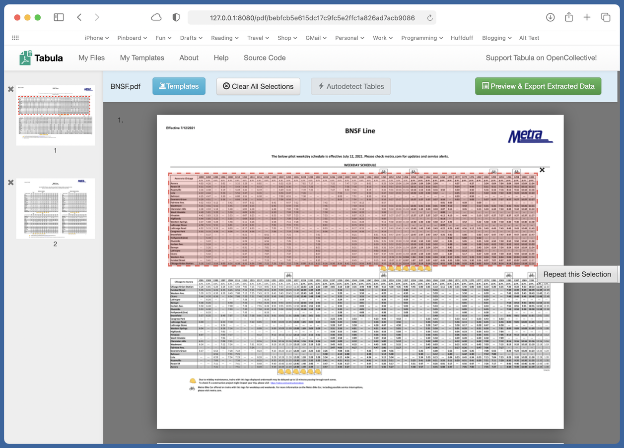
After Tabula has read the PDF, it presents it to you so you can select the table to extract.

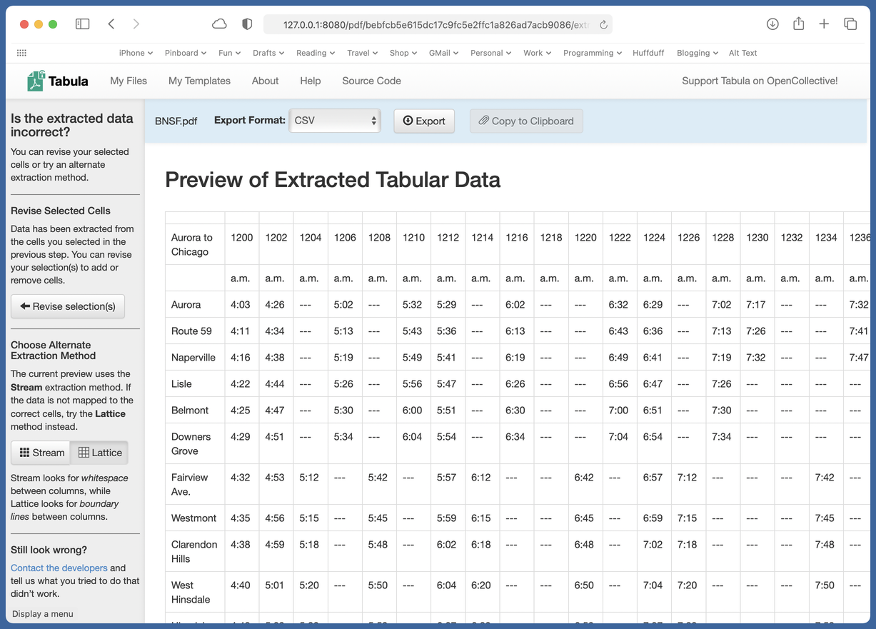
After processing the stuff in the pink rectangle, it shows you what it found:

If the form of the data isn’t what you expected, you can change some of the options in the left sidebar and try again. With the train schedule, which has a grid of lines between the entries, the Lattice option worked better than the default Stream method.
With the table saved as a CSV file, the editing was easy. I opened it in Numbers, deleted all the rows except those for Union Station and Naperville, deleted the trains that don’t stop in Naperville, and transposed the rows and columns to give me a table that was vertically oriented instead of horizontally.
This left me with all the parts of the schedule I wanted and none that I didn’t, but I still had a couple of tweaks to go before pasting the table into Notes. First, I wanted suffixes of a and p added to the times to distinguish between AM and PM. That would be time-consuming in Numbers but was a snap in BBEdit. I copied the table out of Numbers, pasted it into BBEdit, and used a combination of column selection and the command to put the as and ps where they belong.
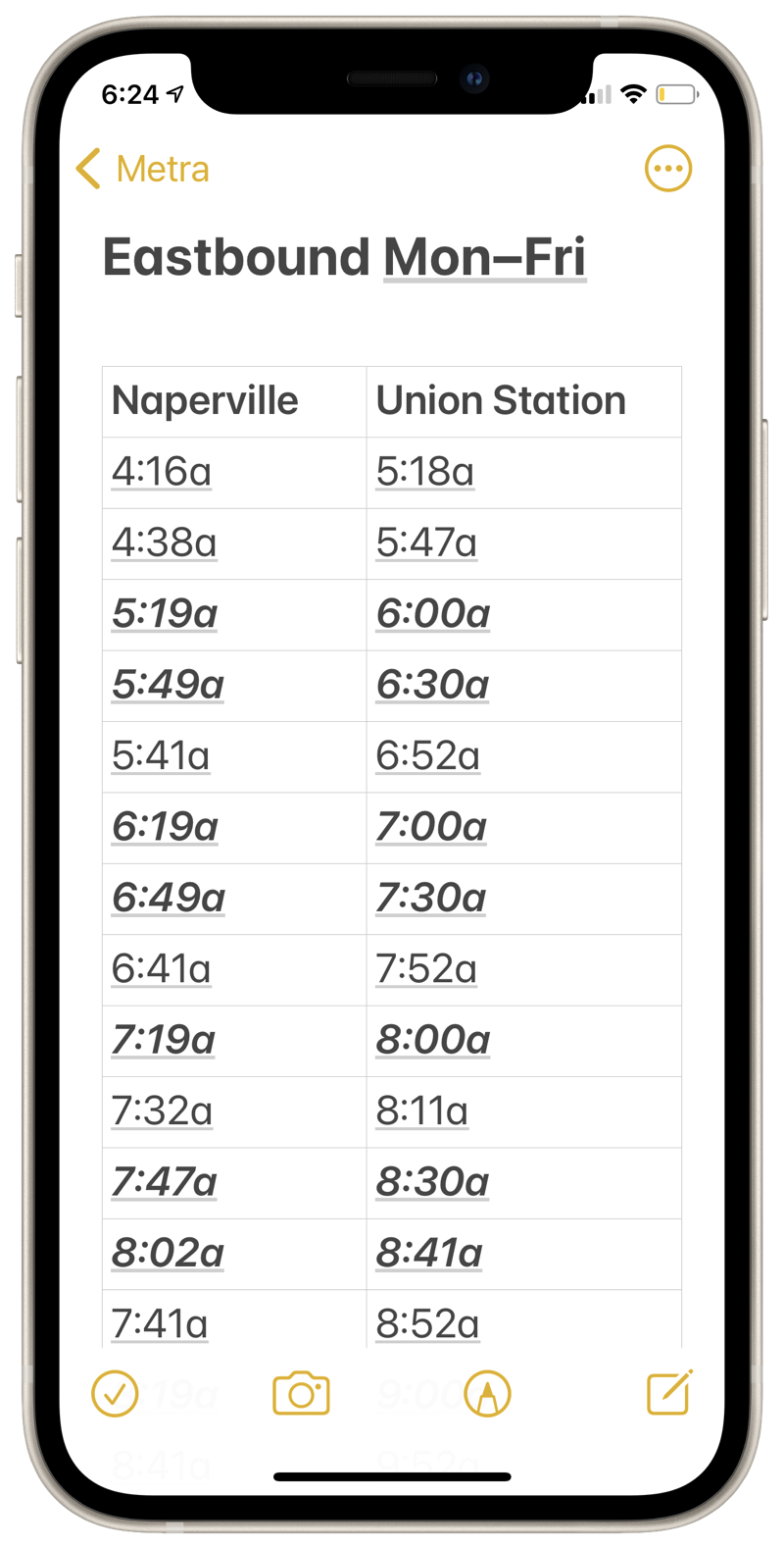
After pasting the edited data back into Numbers, I selected the rows for express trains and used ⌘B and ⌘I to make them bold and italic. That put everything in the format I wanted for pasting the table into Notes. Here’s what one of the schedules looks like on my iPhone:

This is an example of what I call the “render unto Caesar” strategy. Although we all have a tendency to want to do every part of a task with just one tool, it’s often best to break the task up and use different tools for each part. In this case, it was Tabula for data extraction, Numbers for the big deletions, and BBEdit for the fine tuning. The keys to success in this strategy are being able to recognize which tool is best for each subtask and being able to move the results from one tool smoothly into the next.

