
Plotting baseball team progress
July 23, 2026 at 8:36 PM by Dr. Drang
I noticed today that the Cubs and Yankees have the same record. I knew that the Cubs have had some extreme ups and downs this year, but I wasn’t sure if the Yankees had, so I decided to plot their progress over the course of the season so far.
A plot of how far above or below .500 they were seemed like the best way to compare their seasons, so I got their records from baseball-reference.com (Cubs results, Yankees results) and cleaned up the data through a combination of Numbers and BBEdit. The result was a pair of CSV files that looked like this:
Date,Home,Opponent,Win
Mar 26 2026,TRUE,WSN,-1
Mar 28 2026,TRUE,WSN,1
Mar 29 2026,TRUE,WSN,-1
Mar 30 2026,TRUE,LAA,1
Mar 31 2026,TRUE,LAA,-1
Apr 1 2026,TRUE,LAA,1
Apr 3 2026,FALSE,CLE,-1
Apr 5 2026,FALSE,CLE,1
Apr 5 2026,FALSE,CLE,-1
Apr 6 2026,FALSE,TBR,-1
[etc.]
These are the first ten games for the Cubs. The Win field contains a +1 for wins and a -1 for losses. The plot of their progress looks like this:
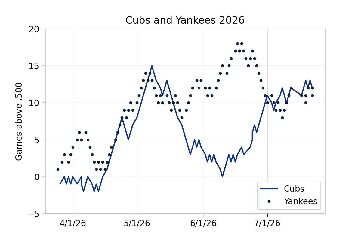
The teams were running in parallel from mid-April through early May, before the Cubs’ disastrous slide. The Yankees had their own smaller slide starting in mid-June but seem to have recovered. History has taught Cub fans not to trust the team’s recent success; 60 more games is plenty of time for another slide (or two).
The plot was made with Python, Pandas, NumPy, and Matplotlib. Here’s the code:
python:
 1:  #!/usr/bin/env python3
 2:
 3:  import pandas as pd
 4:  import numpy as np
 5:  from datetime import datetime
 6:  import matplotlib.pyplot as plt
 7:  from matplotlib.ticker import MultipleLocator, AutoMinorLocator
 8:  from matplotlib.dates import DateFormatter, YearLocator, MonthLocator
 9:
10:  # Read the files into dataframes
11:  dfCubs = pd.read_csv('cubs-2026.csv', parse_dates=[0])
12:  dfYankees = pd.read_csv('yankees-2026.csv', parse_dates=[0])
13:
14:  # Calculate the games above .500
15:  dfCubs['Above'] = np.cumsum(dfCubs.Win)
16:  dfYankees['Above'] = np.cumsum(dfYankees.Win)
17:
18:  # Create the plot with a given size in inches
19:  fig, ax = plt.subplots(figsize=(6, 4))
20:
21:  # Add lines for each team. Team colors from teamcolorcodes.com.
22:  ax.plot(dfCubs.Date, dfCubs.Above, '-', color='#0E3386', lw=1.5, label='Cubs')
23:  ax.plot(dfYankees.Date, dfYankees.Above, '.', color='#0C2340',ms=5, label='Yankees')
24:
25:  # Set the limits
26:  plt.ylim(ymin=-5, ymax=20)
27:
28:  # Set the ticks and add a grid
29:  ax.xaxis.set_major_locator(MonthLocator())
30:  ax.xaxis.set_major_formatter(DateFormatter('%-m/%-d/%y'))
31:  ax.yaxis.set_major_locator(MultipleLocator(5))
32:  ax.grid(linewidth=.5, axis='x', which='major', color='#dddddd', linestyle='-')
33:  ax.grid(linewidth=.5, axis='y', which='major', color='#dddddd', linestyle='-')
34:
35:  # Title and axis labels
36:  plt.title('Cubs and Yankees 2026')
37:  plt.ylabel('Games above .500')
38:
39:  # Make the border and tick marks 0.5 points wide
40:  [ i.set_linewidth(0.5) for i in ax.spines.values() ]
41:  ax.tick_params(which='both', width=.5)
42:
43:  # Add the legend
44:  ax.legend(loc='lower right')
45:
46:  # Save as PDF
47:  plt.savefig('20260723-Cubs and Yankees 2026.png', format='png', dpi=200)
I wanted to use lines for both teams and let the team colors distinguish them, but the team colors are too close, so I used markers for the Yankees and added a legend. I did still use the team colors, which I got from the Team Color Codes website. I fiddled with the marker size and line width until the two looked to be of roughly equal importance.
It may seem like this is a lot of code to write for a simple plot, but I use a Typinator abbreviation to insert a code template and just tweak the template to get things looking the way I want. The Pandas and NumPy part of the code, Lines 10–16, was trivial.